
Textile design trends 2027 are forming around a noticeable swing away from the muted, anxious palettes that dominated the post-2023 cycle. SS27 and AW27 buyers are signing off on saturated, ornamented, culturally rooted work — paisley, damask, painterly floral, Japanese folk reinterpretation. This piece is a working forecast for designers planning collections now: where the color is going, which motif families are gaining traction, which print methods are worth the investment, and how to read the research sources without getting sold a story.
This is written for in-house print designers building seasonal ranges, freelancers pitching for 2027 placements, and studio designers speculating on collections to license. It assumes you already know what a textile designer does day to day and are looking for direction, not definitions.
How to read the forecast sources
Before any specific call on color or motif, a note on methodology — because the trend industry sells more confidence than it earns.
The paid forecast services — WGSN, Stylus, Promostyl, Trendstop, Fashion Snoops — each have their own bias. WGSN is the largest, most influential, and most likely to become self-fulfilling: enough buyers subscribe that the forecast and the market converge. Stylus is sharper on consumer behavior and lifestyle signals. Promostyl is stronger on European prêt-à-porter. Fashion Snoops leans American mass-market. None of them are correct in isolation, and the smart move is triangulation, not subscription loyalty.
Coloro and Pantone publish color forecasts roughly 18 months out. Pantone Color of the Year is a marketing exercise — useful for press, not for buying yarn. Coloro's seasonal palettes (released with WGSN) are more practical because they ship with actual SCOTDIC and Pantone TPX references you can spec to a mill.
Social listening is now part of any serious forecaster's workflow. Pinterest Predicts (published each December) tracks search-query growth and is unusually honest about its methodology — it publishes the lift percentages. Instagram and TikTok signals are noisier but useful for catching motif revivals early. The pattern is consistent: a motif trends on TikTok roughly 12-18 months before it lands in mass-market retail, and 6-9 months before it shows up in independent design studio collections.
The most reliable single signal is what fabric mills are sampling. If Como, Bursa, and Tirupur are all weaving the same novelty construction at the same time, that's a trend. The forecast services are downstream of mill activity by about six months.
Textile Design Trends 2027 — SS27 Direction: Saturated Jewel Tones and Painterly Heritage
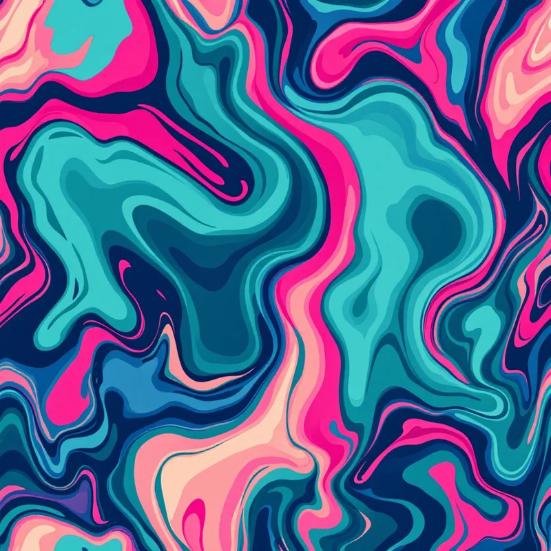
SS27 is reading warm, saturated, and ornamented. The clean, dusty palette of quiet luxury patterns that dominated 2024-2025 has run its cycle. Buyers — particularly in womenswear contemporary and elevated streetwear — are responding to richer, more decorated work.
Specific color movements for SS27:
- Sapphire and lapis blues are replacing the dusty French blue that anchored recent seasons. Deeper, more pigmented, often pushed slightly toward violet. Coloro 016-42-40 territory.
- Magenta and fuchsia continue from 2026 but shift cooler — less coral-adjacent, more cold pink. Schiaparelli's influence on the contemporary market is now fully metabolized.
- Emerald and forest green as a standalone, not as a neutral. The 2025 sage cycle is over.
- Marigold and turmeric yellow in warm gold territory — saturated but not acidic.
- Off-black holding strong as the dominant ground for ornamented prints.
The palette logic is roughly: take the jewel tones of 1970s heritage prints, push the saturation slightly past comfortable, and ground them on darker neutrals than the current cycle has been using. This is a deliberate countermove to the bleached, beige-on-beige aesthetic that has defined the last three years.
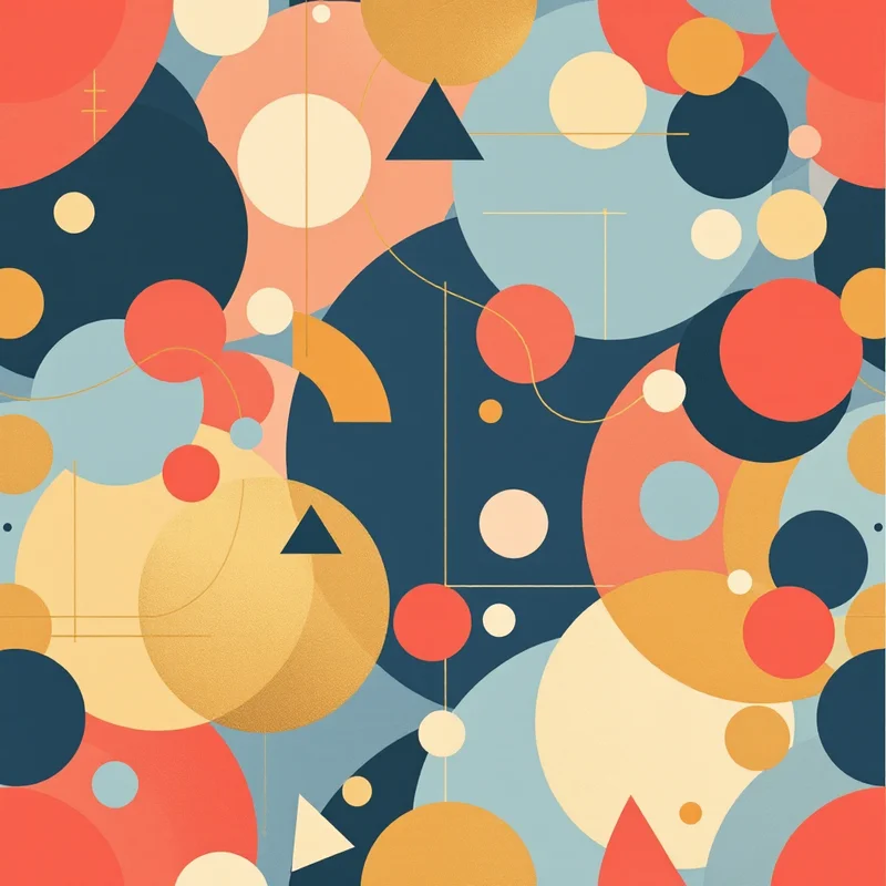
Motif direction for SS27 is painterly rather than graphic. Watercolor florals, ink-wash botanicals, hand-painted paisley, brushy abstracts. The trade press will overuse "artisanal," but the operative quality is visible mark-making — the viewer should be able to see that something human or human-adjacent made the marks. Pattern that reads as obviously vector-drawn or stamped from a library is on the decline.
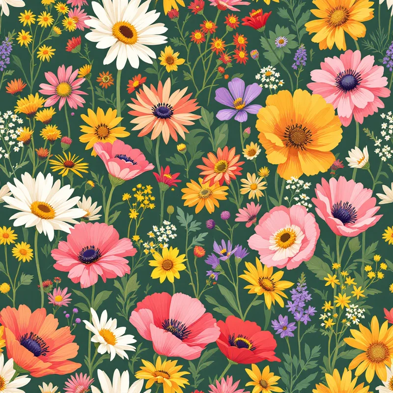
Painterly florals are the SS27 commercial center of gravity. Specifically: dense, mid-scale, multi-color floral grounds with depth — meaning you can see undergrowth, layering, atmospheric perspective. The 2025 cycle of large, isolated, single-stem florals on cream is finishing. What replaces it is closer to 1840s English chintz, restaged for contemporary print proportions. You can build this kind of layered painterly ground with a seamless pattern maker by stacking motif elements at different scales and letting the densest layer set the repeat.
AW27 direction: warm earth tones and maximalist coordination
AW27 pulls the color story warmer and the ornamentation denser. If SS27 is jewel-toned painterly, AW27 is heritage maximalist — Persian rugs, English country house, Japanese folk craft, Mexican folk embroidery, all coexisting on the same mood board.
Core AW27 palette:
- Burgundy and oxblood — deep, slightly browned reds. Not the cherry red of 2025.
- Camel and cognac in tobacco territory, replacing the gray-beige of recent seasons.
- Burnt orange and rust as accent rather than ground.
- Chocolate brown as the dominant neutral, with off-black retreating slightly.
- Forest, moss, and olive as the green family — no more sage.
- Mustard and ochre holding from prior seasons but pushed deeper.
- Plum and aubergine for ornament accent.
The neutrals are warmer, the accents are richer, and the overall temperature of the season is reading rust-and-bourbon rather than gray-and-cream. This matches roughly with what mills in Italy and Turkey are already sampling for AW27 — heavy on dyed-yarn jacquards in earth palettes, with mélange grounds that read warm under retail lighting.
Maximalist coordination is the dominant AW27 styling strategy. Brands are buying prints in families — two or three coordinated grounds plus a focal print, all sharing palette but varying scale and motif. This is a real opportunity for designers selling collections rather than singles. A well-built five-piece AW27 collection (large floral + small repeat + stripe + geometric + statement) priced as a bundle is more sellable than five unrelated singles, and the licensing terms tend to be cleaner.
Motif families gaining traction
Four specific motif families are moving up the forecast for 2027. None of them are entirely new — that's the point. Trend cycles in textile run on revival, and the question for the working designer is which revival, and how it's being reinterpreted.
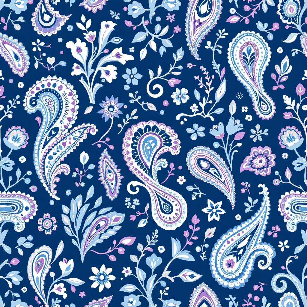
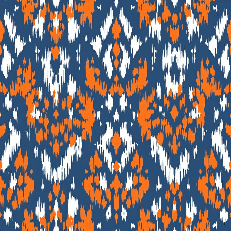
Paisley revival through luxury streetwear
Paisley has been quietly building for three seasons through the menswear contemporary and luxury streetwear segments. Etro never stopped, but the broader market is now catching up — bandana-scale paisley on graphic tees, paisley-printed silk linings in tailoring, paisley dressing gowns. The 2027 reading is more confident: full-scale paisley as primary print, not as accent.
The contemporary reinterpretation has three modes:
- Heritage faithful — traditional Kashmiri proportions, jewel palette, dense ground. This is the safest commercial play.
- Deconstructed — paisley elements broken out of their traditional grid, scaled up, used as standalone motifs. Strong in luxury contemporary.
- Punk paisley — high-contrast, often two-color, sometimes black-and-white, drawing on the bandana lineage. This is the streetwear reading.
If you're building a paisley collection for 2027, the rule of thumb is: skip the muted, dusty paisley palettes of 2022-2024 entirely. Saturation is the differentiator.
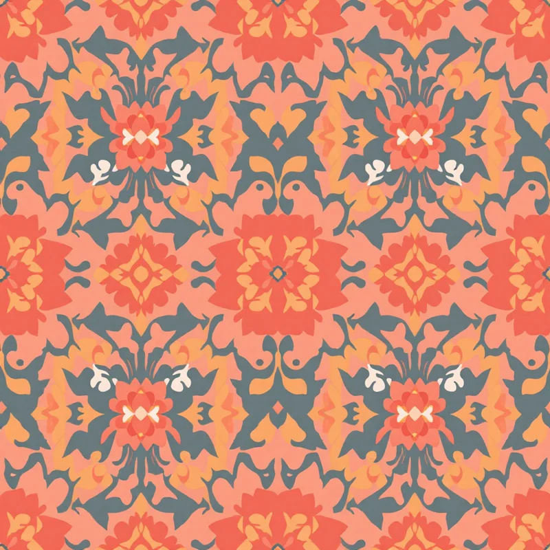
Damask deconstruction
Traditional damask had a moment in 2024-2025 as part of the dark academia patterns and gothic romance microtrends. That moment closed, but damask is returning in a different form for AW27 — deconstructed damask, where the symmetrical, mirror-axis structure is broken and the ornament floats more freely.
The 2027 damask reads less like wallpaper and more like a fragmented ornamental ground. Sometimes the symmetry is preserved but the motif is interrupted by gaps, washes, or scribbled overdraws. Sometimes the damask elements are scaled radically differently within the same repeat. The operative move is treating damask as a vocabulary rather than a fixed grammar.
This is a particularly strong direction for licensed home textile collections — bedding, upholstery, drapery — where the AW27 buyer is looking for ornamentation that doesn't read as period costume. Resources at /fashion-print-design/ and the textile design portfolio guide cover how to present deconstructed work in pitch decks without it reading as unfinished.
Japanese folk reinterpretation
Sashiko, katagami, asanoha, seigaiha, and the broader Japanese folk-craft vocabulary are moving up the trend forecast across multiple agencies. The 2027 reading is broader than the recent indigo-and-cream sashiko cycle — it now includes katagami-style figurative prints, edo-komon micro-repeats scaled for contemporary apparel, and yukata-derived seasonal florals.
The commercial draw is the combination of pattern density and visual calm. Japanese folk pattern is often dense without being chaotic — the geometry resolves into restful surfaces. That's a useful counterweight to the maximalist coordination trend, and explains why both can coexist in the same AW27 mood board.
A practical note: the line between respectful reinterpretation and appropriation is real, and the trade press is paying attention. If you're building a Japanese-influenced collection for 2027, the defensible positions are (a) using the geometric vocabulary — asanoha, seigaiha, kikkō — rather than the figurative or religious motifs, and (b) being honest in the collection notes about what you're drawing from. Studios that are vague about sources are being called out, and the buyer-side legal teams have noticed.
Botanical maximalism
The 2025 minimalist botanical — single stems on cream, generous negative space, "Scandinavian" styling — is finishing. What's replacing it is botanical maximalism: dense, multi-species, atmospheric florals that fill the entire ground. Closer to William Morris and Indian chintz than to the Scandinavian minimalism of recent years.
The construction logic is layering — foreground hero blooms, mid-scale supporting florals, background foliage, with depth handled through value and saturation rather than outline weight. The hardest part of building this kind of print well is keeping the ground readable at retail scale (typically 12-18 inches of repeat for womenswear). Patterns that look gorgeous at portfolio scale and turn into mud on a 60-inch roll print are the most common failure mode.
This is where good textile design software and an AI pattern generator start to earn their cost. The faster you can iterate scale, density, and color variants, the more confidently you can hit the actual production conditions.
Color palette direction summary
Rolling up the SS27 and AW27 work into one paragraph: the 2027 cycle is warmer, more saturated, and more ornamented than the 2024-2026 baseline. Cycles that defined the prior baseline — quiet neutrals and softer coastal grandmother patterns — are reading distinctly behind the curve now. Neutrals are shifting from gray to brown, accents are shifting from dusty to jewel, and grounds are getting darker overall. The buyer fatigue with "quiet" palettes is real and increasingly explicit in trade reports.
For palette planning, a practical checklist:
- 1Build three core palettes per season — a saturated jewel-tone palette for the painterly direction, a warm earth-tone palette for the heritage maximalist direction, and a neutralized version of one or both for buyers who haven't fully metabolized the shift.
- 2Anchor every palette on a brown or off-black ground rather than cream — this is the simplest single move that will read as 2027 rather than 2025.
- 3Hold two accent colors at high saturation. The accents are doing the trend-signaling work.
- 4Spec to Coloro or Pantone TPX from day one. The painterly direction lives or dies on color accuracy, and mills will not save you.
Print method trends
The production side of textile is shifting alongside the aesthetic.
Digital print continues to grow but the growth is now concentrated in two segments: short-run direct-to-fabric for independent designers, and high-throughput pigment digital for fast-fashion mass production. The middle — mid-volume digital — is getting squeezed by improved rotary screen pricing and by the consolidation of digital print bureaus.
Sublimation print is expanding beyond polyester sportswear into broader apparel as polyester blends and treated cellulosics expand the substrate range. The 2027 forecast has sublimation moving into elevated swimwear, athleisure, and contemporary womenswear at price points that previously belonged to discharge or pigment print. The implication for designers: sublimation rewards saturated, painterly work — exactly the SS27 direction — and the technique is becoming commercially viable for ranges where it previously wasn't.
Digital fabric mills are expanding — particularly in Turkey, India, and Portugal — and the minimum order quantities are dropping. A 2027 freelance designer can realistically run a 50-meter sample run for a small brand without going through a print bureau intermediary. This changes the economics of speculative collection development.
Discharge and pigment print on cotton is holding steady but losing share to digital pigment, which now matches discharge hand-feel on most cotton constructions.
Knitted jacquard and dyed-yarn weaves are growing for AW27 as the heritage maximalist direction pushes brands toward constructions that read as substantial. The trade-off is lead time — woven jacquard runs at roughly 4x the lead time of digital print — and that's pushing brands to commit earlier and reducing the window for trend-driven design changes.
For freelance and studio designers, the practical implication is that production knowledge is now part of the sales pitch. Buyers expect designers to know which constructions will execute their work cleanly. The textile design jobs guide covers what that knowledge looks like for in-house roles; for freelance, it mostly comes from time on the mill floor and from the clothing design production side.
The role of AI generation in shaping trends
A note on what AI image generation is doing to the trend cycle itself, because it's now material to forecasting.
The first-order effect is speed. A designer can now sketch, color, and produce production-ready repeats in hours rather than days. That compresses the development cycle and lets brands respond to trend signals closer to the season.
The second-order effect is more interesting and less discussed: AI generation tools have a strong stylistic prior toward whatever was in their training data. For 2026-vintage models, that means strong defaults toward Instagram-popular aesthetics from 2020-2024. Designers using AI tools without intervention tend to produce work that reads as slightly behind the trend curve, because the model's defaults are anchored in the recent past.
The countermove — and this is what separates competent AI-assisted designers from the rest — is treating the AI as a production accelerator rather than a creative director. The trend direction comes from human research, mill visits, color forecast subscriptions, and original hand-drawn work. The AI fills in repeats, generates colorways, tests scale variants, and handles the production-prep work that used to eat half the schedule.
The 2027 forecast has AI-generated pattern moving from a curiosity to a standard tool in the in-house designer's stack, with the differentiator being how thoughtfully it's used. Brands that use AI to chase the model's default aesthetic will read as derivative. Brands that use AI to execute their own trend point of view faster will pull ahead.
What to do with this forecast
Concrete steps for the next two quarters:
- 1Build one SS27 painterly floral collection. Five pieces, jewel palette, dense ground, brown or off-black background. This is the most commercially clear opportunity in the forecast.
- 2Build one AW27 heritage coordination set. Three coordinated grounds plus a focal print, warm earth palette, layered ornament. Pitch as a bundle to home textile and elevated womenswear buyers.
- 3Develop a paisley point of view. Pick one of the three paisley modes (heritage faithful, deconstructed, punk) and build three pieces in it. Paisley demand is broad enough that a clear point of view sells.
- 4Spec to Coloro from day one. Don't develop in screen RGB and try to translate later.
- 5Track mill samples, not just forecasts. If you can see what's loomed at Première Vision and Milano Unica in autumn 2026, you'll be six months ahead of the published forecast.
For background on how this kind of trend work fits into a working textile designer's calendar, the how to become a textile designer guide covers the seasonal cycle, and the textile design tools 2026 roundup covers the software stack most studios are currently running. The 2027 forecast is going to reward designers who move fast, hold an opinion, and execute cleanly — which is most of the job in any season.
Explore related pattern styles

