
# 80s Pattern Design: Memphis, Neon, and Geometric Revival
80s pattern design is loud, geometric, and gloriously unbothered by good taste. Squiggles collide with triangles, neon pink screams against black, and scattered confetti dots refuse to line up. Four decades later the look is everywhere again, on apparel, phone cases, gift wrap, and packaging, because nothing else reads as instantly nostalgic. This guide breaks down where the style came from, what makes it work, and how to generate your own seamless 80s pattern design in minutes.
What is 80s pattern design
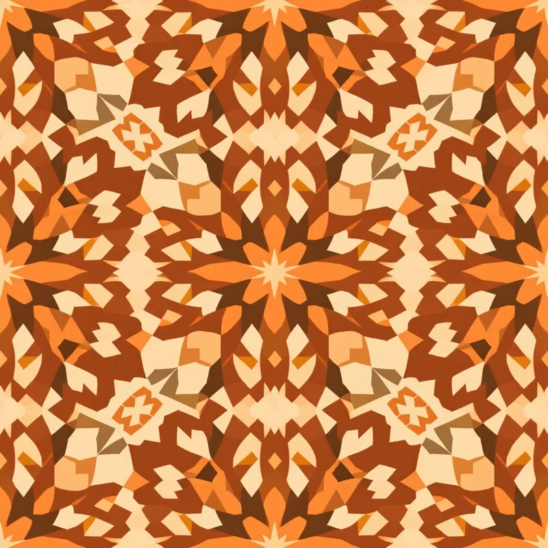
80s pattern design is a family of bold graphic styles that peaked between roughly 1981 and 1989. It is defined by high-contrast color, playful asymmetry, and hard geometric shapes that clash on purpose. Where earlier decades chased harmony, the 80s chased energy. A typical 80s pattern throws squiggle lines, jagged triangles, dots, and zigzag bands onto a stark ground and lets them fight for attention. The result is chaotic but rhythmic, and it survives at any size, which is part of why 80s pattern design works so well for print today.
Origins of the look
The most famous strand of 80s pattern design came from the Memphis Group, a Milan design collective founded by Ettore Sottsass in 1981. Memphis rejected the clean minimalism of the 1970s in favor of bright laminate, squiggles, and shapes that looked like they fell out of a video game. Alongside Memphis ran a parallel pop-culture wave: neon graphics from arcade cabinets, the pastel cool of Miami, airbrushed gradients, and the glowing grids of early synthwave. Terrazzo, the speckled stone surface, got a graphic second life as a flat pattern. All of these threads feed the 80s pattern design revival we see now.
Visual hallmarks
A few signatures show up again and again in 80s pattern design:
- Squiggles and confetti scattered without obvious order, the core Memphis move.
- Hard geometry including triangles, circles, and zigzags with crisp edges.
- Clashing color where two or three saturated hues sit side by side instead of blending.
- Black linework that outlines shapes and separates them so the geometry stays readable.
- Asymmetry that avoids tidy mirror repeats in favor of a busier, looser rhythm.
- Terrazzo speckles as a calmer, more usable cousin of full Memphis chaos.
If you want to understand how these elements lock into a repeating tile, our walkthrough on how to create seamless patterns covers the mechanics of edge matching.
How to generate it in Pattern Weaver
Here is the fastest path to a finished 80s pattern design in five steps.
- 1Pick a retro starting point. Open the studio and choose a geometric or retro style. Set the substyle toward Memphis, neon, or terrazzo to anchor the era before you touch anything else.
- 2Describe the motifs. Brief the squiggles, confetti dots, zigzags, and triangles you want. Say whether the mood is loud neon on black or soft Miami pastel, so the engine knows which direction to push the geometry.
- 3Set color and density. Choose two or three saturated accent colors plus black or white. Keep density moderate so the shapes have room to breathe and the eye can read each one.
- 4Generate and refine. Generate the pattern, study the geometry, and adjust scale or palette. If the squiggles feel cramped, lower the density; if it reads flat, swap in a hotter accent.
- 5Make it seamless and export. Run the tiling tools to repair the edges so the tile repeats with no visible seam, then export a high-resolution PNG, TIFF, or SVG.
That whole loop takes a few minutes inside Pattern Weaver, and you can branch any result into a dozen variations without redrawing a single shape.
Color palette ideas
Color carries most of the load in 80s pattern design. Three palettes cover the bulk of the era:
- Hot neon: electric pink, cyan, and lime on solid black. Maximum punch, perfect for apparel graphics.
- Miami pastel: peach, mint, lavender, and aqua, often with a teal and coral accent. Softer, more wearable, very Memphis.
- Primary clash: bold red, blue, and yellow with heavy black linework, the building-block look.
The shared rule is contrast. Pick one or two loud hues, let neutrals separate them, and resist the urge to harmonize. Browse the create gallery for ready-made retro starting points if you want a head start on color.
Best use cases
80s pattern design is a workhorse for product makers. The bold contrast survives small store thumbnails, so it is ideal for print on demand apparel, phone cases, tote bags, and stationery. It also shines on gift wrap, party supplies, skate decks, and home textiles like cushions and shower curtains. Because the geometry scales cleanly, the same tile can run on a tiny sticker or a full wall mural. For sizing, format, and storefront tips, our print on demand guide lines up the practical details.
Pro tips
A few things separate a convincing 80s pattern design from a costume-party version:
- Limit your palette. Three or four colors maximum. The era looks busy but the best patterns are color-disciplined.
- Vary shape scale. Mix large hero shapes with small confetti so the eye has a path to follow.
- Keep edges crisp. Flat color and sharp outlines define the look; gradients belong only in deliberate airbrush or synthwave variants.
- Test the repeat. Always preview the tiled version before exporting, since scattered confetti is where seams hide.
- Export big. Use 8K for full-coverage apparel or wall art so neon edges stay sharp up close.
If you are new to text-to-pattern workflows, our primer on how to make a pattern with AI covers the briefing habits that get sharper results faster.
Start designing
The 80s revival is not slowing down, and 80s pattern design remains one of the easiest retro looks to make commercially useful. Pick your palette, brief the squiggles, and let the studio handle the repeat. Head to the studio to generate your first tile, and check pricing when you are ready to scale up exports across the Free, Starter, Pro, and Max plans.