

A textile design portfolio is the single document that decides whether a studio replies to your email, an agent signs you, or a fashion brand hires you for a season. It is not a gallery of every print you have ever made. It is a tightly edited argument for why a buyer should trust you with their next collection. Build it like a sales tool, not a scrapbook, and the bookings follow.
This guide is written for two readers: the junior designer assembling a first book after school or a career pivot, and the mid-career textile designer refreshing a portfolio that has gone stale. The principles are the same. The cuts are different.
What a textile design portfolio actually is
A working textile design portfolio is a curated body of 8 to 15 designs, organized into 3 to 5 cohesive collections, presented in a format buyers can scan in under five minutes. That is the entire definition. Everything else is decoration.
A few things it is not. It is not a portfolio of "art." Buyers are not evaluating you as a fine artist; they are evaluating whether your prints will sell on garments, sheets, wallpaper, or licensed product. It is not a chronological diary. Nobody cares what you made in your second year of school. It is not a dump of "everything I can do." Range, presented without curation, reads as a lack of point of view.
The portfolios that book work share three traits. They are tight. They are coherent. And every piece earns its place by either selling the designer's strongest hand or proving a specific capability the buyer needs.
The cardinal rule: collections beat singles
If you remember nothing else from this guide, remember this. A textile designer portfolio that shows 15 standalone designs will lose every time to one that shows three collections of five designs each, even when the standalones are individually stronger.
The reason is structural. Apparel studios buy collections because they print collections. Home goods brands buy collections because they merchandise collections. Licensing agents pitch collections because retailers want a story across a shelf, not a one-off SKU. Showing single designs signals that you do not think the way the industry buys, which is the fastest way to get filed under "talented but not ready."
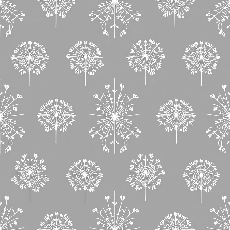
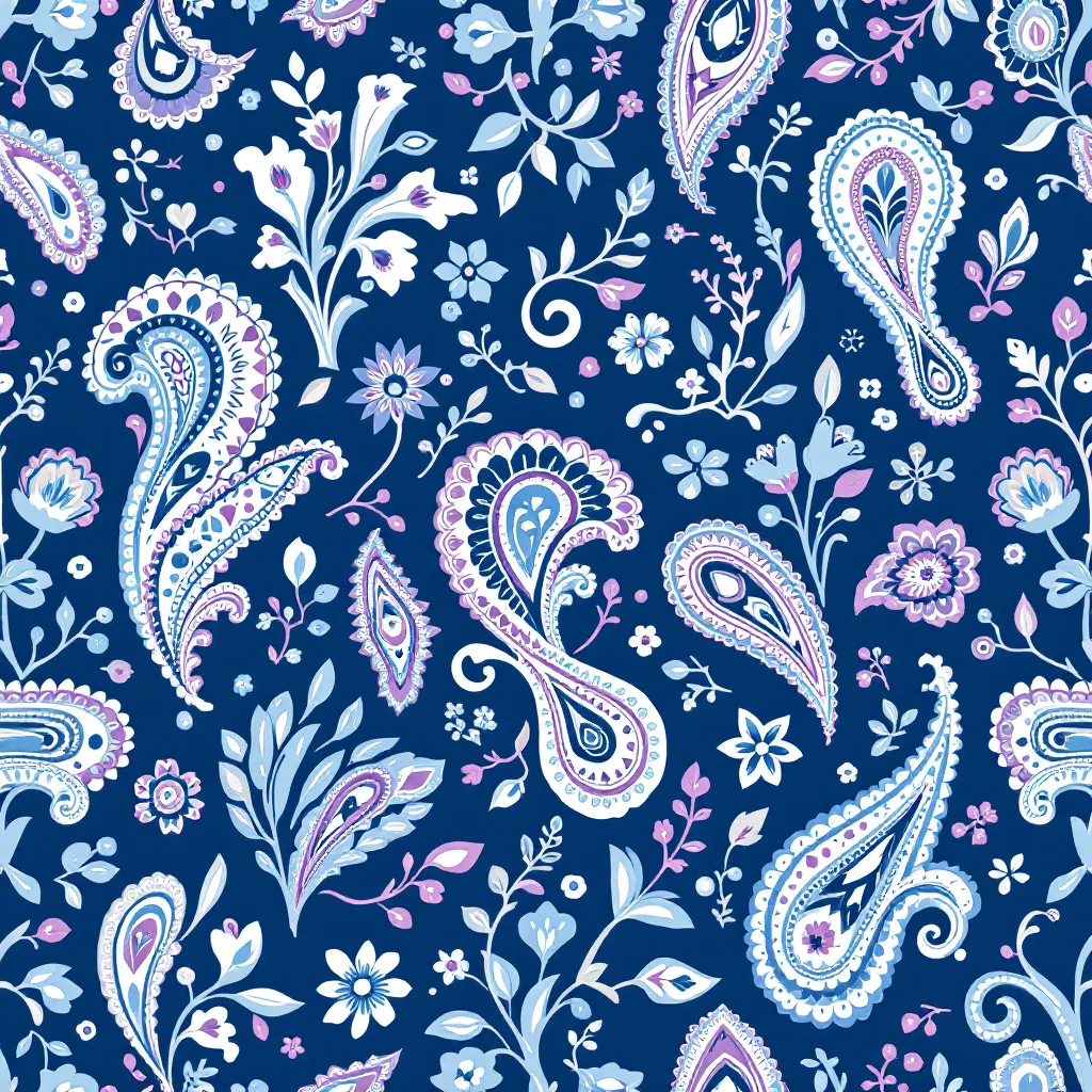
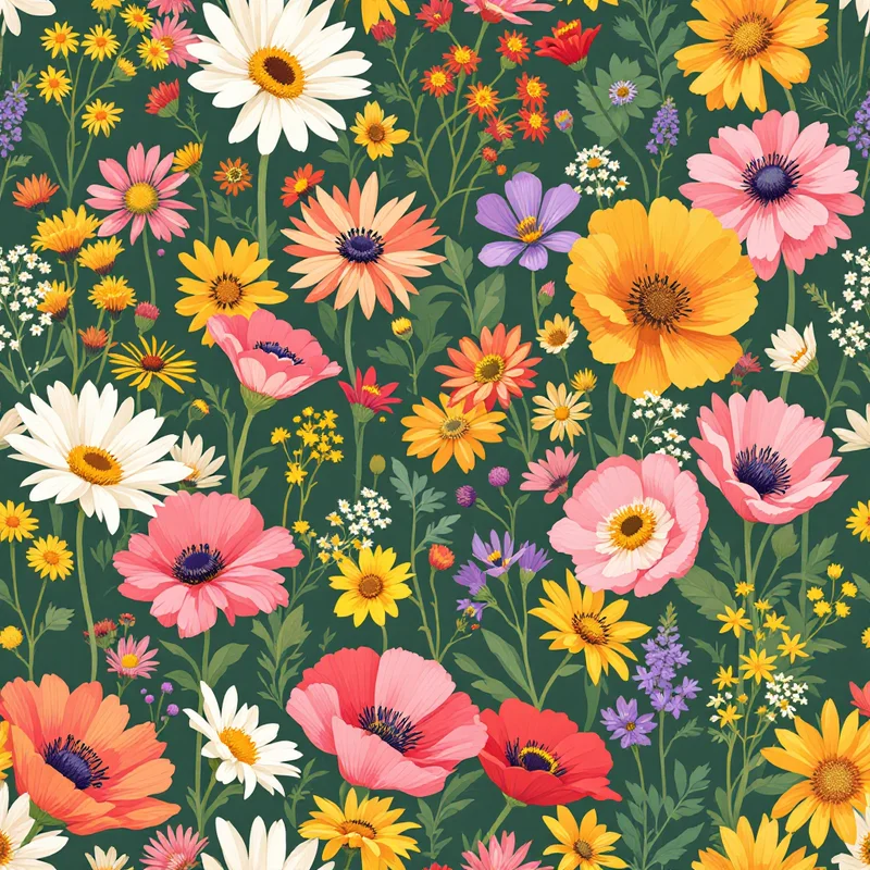
A collection is a hero print, two to four supporting prints, and a coordinating geometric or texture, all built in a shared palette. Every piece reads as part of the same conversation. A floral hero with a ditzy companion — the kind of ditsy floral patterns that work as breathing-room supporting prints — and a tonal stripe is a collection. Three unrelated paisleys with different color stories is not.
Build each collection with a clear use case in mind. "Spring/Summer 2027 womenswear, contemporary mid-tier." "Bedding for a heritage-leaning home brand." "Kids apparel, ages 2 to 6, joyful but not loud." The use case constrains your choices and signals to the buyer that you understand the commercial context the way real textile design jobs demand. Vague collections labeled "Botanical Dreams" with no end use stated read as student work.
For most working designers, a portfolio of three to five collections plus two or three standout standalones is the right shape. The standalones are reserved for capability pieces — proof you can render a specific technique — and we will come back to those.
Portfolio formats: PDF, site, Instagram, hybrid
You need at least two formats. One is the sales document you send when someone asks. The other is the discovery surface that brings people to you. Most working designers run a hybrid of three.
The PDF book is the workhorse. It is what agents and studios ask for after a first reply. Build it landscape, 16 to 24 pages, optimized to about 10 to 20 MB so it lands in an inbox without bouncing. Include a cover, a one-page bio with contact details, a contents page listing collections, then a page or spread per design. Close with credits and a clean back cover. PDFs win because they are portable, they cannot be reordered by an algorithm, and they show the buyer exactly the sequence you intended.
The dedicated portfolio site is your professional address. Use a clean platform — Cargo, Format, Squarespace, or a hand-built site if you are comfortable. Group by collection, not by year. Put contact information on every page. The site is where buyers go after they have seen one of your prints somewhere else and want to verify you are real. It should load fast and present your collections without forcing scrolling through a blog.
Instagram is your top-of-funnel discovery surface. Treat the grid as a curated portfolio in its own right. Post collections as carousel sets, not single images, and pin the strongest three sets to the top. Use the bio link to drive to your site or a PDF download. The grid is where art directors stumble onto you when they are scrolling at 11pm looking for next season's freelancer.
The hybrid works because each format does a different job. The site converts warm leads. Instagram surfaces you to people who did not know to search for you. The PDF closes the deal. Pick the two that fit your situation if three is too much to maintain, but never run only on Instagram. Algorithms change, accounts get suspended, and you do not own the audience.
What to include in a textile design portfolio
A working portfolio has three layers: hero collections, capability pieces, and at most one process piece. That is the entire stack.
Hero collections
These are your strongest two or three collections, front-loaded. The first collection in the book is the most important page in your portfolio. It tells the buyer what you do. Lead with the work you most want more of. If you want to book florals for fashion print design, the front of the book is a knockout floral collection. If you want home goods licensing, lead with a story-driven collection in a palette a retailer can merchandise.
Each hero collection should show the hero print at scale, the supporting prints at proportional scale, and one or two colorways per design. Apparel buyers in particular will not take a collection seriously without colorways, because that is how the work shows up on the production calendar.
Capability pieces
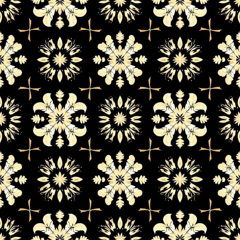
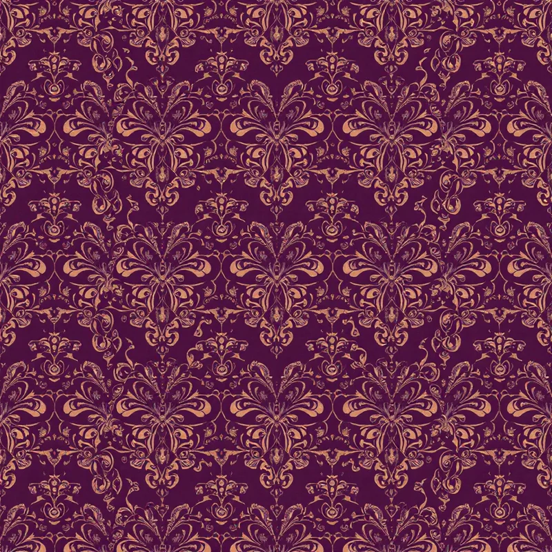
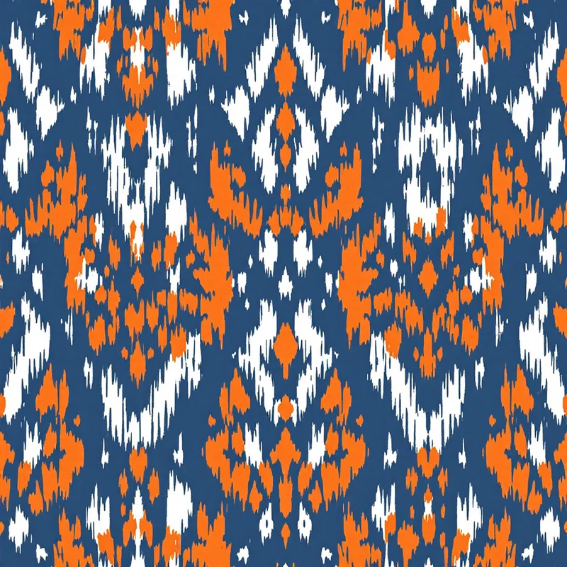
These prove you can do the techniques a buyer might need but that do not fit inside your hero collections. Standout examples: a watercolor floral if your hero work is graphic, a geometric or stripe if your hero work is painterly, a small-scale ditzy if your hero work runs large. The pattern styles index is a useful shorthand reference when you are auditing whether your book covers the categories agents and studios scan for. Capability pieces signal range without diluting your point of view, because they sit clearly framed as "here is what else I can do" rather than competing with the hero work.
Limit yourself to two or three capability pieces. More than that and the portfolio reads as scattered. If you are using an AI pattern generator to develop these efficiently, build them in cohesive mini-sets of two to three designs rather than dropping in singles, so they still read as intentional.
One process piece
A single spread or page that shows how you work. A mood board, a hand sketch or motif study, a colorway exploration, the final design, and a mockup on product. One sequence. The point is to prove you have a real process, not to walk the buyer through every project. Process pieces are most valuable for junior designers building credibility, and for any designer pitching in-house roles where studios want to know how you think.
For mid-career designers, the process piece is often optional. Your published work speaks for the process. If you include one, keep it to a single design and a single page.
What to leave out
The cuts matter more than the additions. Most portfolios fail not because the work is weak but because the weak work was not cut.
School work that does not show market sensibility. If you can look at a design and tell that it was a brief about exploring "form and gesture" with no commercial reading, leave it out. Studios buying your work need to see you can hit a brief with an end use. Even strong school pieces should be reframed with a commercial use case before they go in.
Single designs without colorways. A print without at least one alternate colorway looks unfinished to any apparel or home buyer. Either build the colorways or cut the design. The exception is licensing-focused portfolios where art is sold as-is with colorways generated downstream, and even then most agents want to see you can drive color yourself.
Anything older than two years. The market moves. Palettes shift. Scale conventions change. Showing 2023 work in 2026 reads as a designer who has not been working, which is the wrong signal whether or not it is true. Refresh annually. If a piece is too good to retire, redo the colorways to a current palette and call it a refresh.
Designs you cannot legally show. NDAs are real. If a design was produced for a client and not released, do not put it in the public book. Put it in a private supplemental PDF you send only when relevant, with credits.
Anything you do not want more of. This is the cut most designers fail to make. If you put a wildlife print in the book to "show range" but you do not want wildlife commissions, cut it. The portfolio sets the brief for the work you get hired to do. Every piece in the book is a request for more of that kind of work.
Presentation craft: mockups, color cards, briefs
The work in your portfolio could be world-class and still lose to a designer with weaker prints and better presentation. Presentation is the cheapest, fastest lever you can pull.
Mockups
Every collection needs at least one mockup. A floral on a dress. A geometric on a pillow. An ikat on a wallpaper roll. The mockup tells the buyer's brain what the print is for, which is the single hardest cognitive leap to make when looking at a flat repeat tile. Use realistic product mockups — there are plenty of free and paid mockup files — and avoid over-styled lifestyle photography that distracts from the print itself.
For apparel-focused portfolios, show the print on the actual garment category you are pitching. Womenswear collections need dresses or blouses. Activewear needs leggings or jackets. Putting a swimwear print on a pillow signals you do not know who you are pitching.
Color cards
A small color card next to each design — five to seven swatches with Pantone or hex codes — does enormous work. It shows the buyer you think about color systematically, it makes the print easier to evaluate against their existing palette, and it lets a production team imagine the design in their CMYK or spot setup without guessing.
Brief and context
Each design or collection should have a short paragraph: end use, target market, inspiration, and any production notes. Not a sales pitch. Three or four sentences of context. "Spring/Summer 2027 contemporary womenswear. Inspired by 1970s Italian printed silks. Three colorways, repeat tile 24 by 24 inches, suitable for digital printing on viscose and silk." That single paragraph tells the buyer you think like a working designer, not a portfolio student.
If you are not sure how to scale or set up the repeat for production, the practical mechanics of repeat construction and printable file prep are covered in our clothing pattern guide and our fashion print design guide.
Building portfolios for different audiences
The single biggest mistake mid-career designers make is running one portfolio for every audience. The three main buying audiences want different things.
In-house apparel studios
Studios hiring permanent or contract designers want to see speed, range within a defined brand zone, and a feel for the production calendar. Heavy on collections, heavy on mockups on actual garments, light on art-for-art's-sake pieces. Include at least one collection that fits the studio's aesthetic before you send. Research the brand, look at last season's prints, and reorder the book so the most on-brand collection is first.
Process pieces help here because studios are evaluating how you will work inside their team. A clean process spread signals you are easy to brief and revise. Reference our textile design overview if you are coming from an adjacent discipline and need to frame your work in studio-relevant terms.
Licensing agents
Agents want to see commercially viable art that they can pitch across multiple categories. Heavier on standalone hero prints with clear emotional hooks (giftable florals, seasonal stories, characterful animals), lighter on technical capability pieces. Each design needs to be strong enough to anchor a product line — a phone case, a notebook, a bedsheet, a wallpaper. Show range across categories rather than depth in one.
Licensing portfolios benefit from explicit category framing. A page titled "Stationery and Gift" with three designs that obviously fit. A page titled "Bedding and Bath" with two or three soft, scalable patterns. You are making the agent's pitch deck for them.
Freelance and direct clients
Freelance buyers — small brands, independent fashion labels, clothing design studios, print-on-demand operations — want to see that you can deliver against a brief, hit a budget, and produce print-ready files. They often skim portfolios faster than agents do, so the front of the book matters disproportionately. Lead with the most "buyable" collection, not the most artistically ambitious one. Include at least one piece that is obviously production-ready: clean repeat, named colorways, suggested fabric.
Freelance portfolios benefit from a one-page rate and process sheet at the back: how you scope, how you bill, what your file deliverables look like. It removes friction from the conversation that follows. For freelancers working with mills or print-on-demand vendors, our surface pattern overview and the fabric pattern generator workflow notes show how to position production-readiness as part of the offer.
Putting it together: a build plan
If you are starting from scratch, work in this order. Pick the audience you most want to book. Decide on three collections that fit that audience. Build each collection as a hero print, two or three supporting prints, and one tonal or geometric companion. Develop two colorways per design. Build mockups on the relevant product category for each collection. Write a four-sentence brief for each collection. Add two capability pieces. Add one process piece if you are junior. Sequence the book so the most on-target collection is first. Build a PDF, a one-page site, and an Instagram grid that mirrors the book.
If you are refreshing, audit first. Pull every piece in your current book and ask three questions about each. Does it fit the audience I want next? Is it under two years old or recently re-colored? Does it have colorways and a mockup? Cut anything that fails. Build whatever the gaps reveal. Most refreshes need one fresh hero collection and a palette update on the rest, not a full rebuild.
Either way, set a re-audit cadence. Twice a year, before SS and AW briefing seasons, sit with the book and ask whether it still represents the work you want next. The portfolio that booked you last year is rarely the portfolio that books you next year. The designers who stay busy are the ones who treat the book as a living document, not a one-time project.
Build the textile design portfolio you would hire from. Be honest about what is in it. Cut the work that does not earn its page. The rest is follow-up.
Explore related pattern styles


