A print that looks gorgeous on a flat artboard can collapse on a draped sleeve, shift hue against the wrong skin tone, or band out on a sublimation press because the file was prepped for screen. Fashion print design is not the same as designing wallpaper, gift wrap, or generic surface pattern. The substrate moves, stretches, drapes, and lives against a body, and the design has to survive all four conditions at the scale and palette the specific garment requires. Get any of those wrong and the print returns from sampling looking like a different design than the one approved on screen.
This guide covers fashion print design end to end: how it differs from adjacent disciplines, the four print methods you will encounter in production, the design decisions specific to garments, the major print categories and their unwritten conventions, and the pre-production checks that separate a print that ships from a print that gets returned.
What Fashion Print Design Actually Is
Fashion print design is the practice of creating repeating or placement artwork that will be printed onto fabric and cut into garments. The discipline includes color separations, repeat construction, scale calibration to body geometry, palette decisions that work against skin tones, and file preparation that survives the chosen print process.
It overlaps with — but is not the same as — three adjacent fields:
- Surface pattern design is the broader umbrella covering any repeating artwork applied to any surface: stationery, ceramics, wrapping paper, home goods. Fashion print design is a specialized branch where the surface is fabric and the end product is a garment.
- Textile design as a textile design discipline historically includes weave structure, yarn dyeing, jacquard, and woven construction — not just the printed pattern on top. A fashion print designer typically works only on the printed layer. A textile designer may work on the cloth itself.
- Graphic design in apparel is usually placement art: a chest hit, a back graphic, type-led logo work. Fashion print design is repeating coverage — the print becomes the fabric.
The distinction matters because it determines the toolkit. A surface pattern designer can ship a single 12-inch repeat to a print-on-demand marketplace and walk away. A fashion print designer has to think about how that repeat will land on a dropped shoulder, where the side seam will cut the motif, and whether the palette will read on a deep midnight base versus a bleached white.
The Four Print Methods Used in Fashion
Every print decision starts with the production method. The four methods below cover roughly 95% of printed apparel produced in 2026. Each has palette implications, file specs, and design constraints you need to design around — not against.
Digital Direct-to-Fabric
Digital printing onto rolls of fabric (sometimes called DTF roll printing or digital textile printing) is the closest fashion equivalent to commercial inkjet. Ink is jetted directly onto woven or knit greige goods, then heat-fixed and washed.
- Strengths: unlimited color count, photorealistic gradients, no screen setup cost, viable from one yard upward.
- Weaknesses: ink penetration depth limits hand-feel — heavy ink coverage can stiffen lightweight fabrics. Color management is the hardest of any method: every fabric base reacts to ink differently.
- Palette implication: you can use as many colors as you want, but stay aware of dark navy/black grounds where ink-on-ink wet bleed muddies fine line work.
- File spec: 150 DPI at print size is industry standard, with a print width that matches the mill's roll width (commonly 54", 58", or 62"). CMYK or RGB workflows both exist depending on the printer's RIP — confirm before sending.
Dye Sublimation
Sublimation transfers dye from a paper carrier into the fibers of polyester (or polyester-blend) fabric via heat and pressure. The dye becomes part of the fiber rather than sitting on top of it, which is why sublimated activewear feels exactly like blank polyester.
- Strengths: zero hand-feel, full-bleed all-over prints, vibrant gradients, ideal for sportswear, swimwear, athleisure.
- Weaknesses: polyester only (cotton will not sublimate), and white is the absence of ink — meaning your fabric base color is your white. Sublimating onto colored polyester is not viable for accurate color reproduction.
- Palette implication: stay away from designs that rely on pure white highlights unless your base fabric is bleached optical white. Cool tones (blues, greens, teals) reproduce more accurately than warm reds and oranges, which tend to shift toward magenta on press.
- File spec: 150 DPI at full panel size, RGB color space, designed to the full cut-and-sew pattern shape — not as a continuous repeat. Sublimation favors a seamless pattern maker that exports tileable repeats which can then be panel-mapped to garment pieces.
Screen Print (Rotary and Flat)
Screen printing forces ink through a stenciled mesh, one color at a time. Rotary screen is used for continuous yardage at mills; flat screen is used for placement prints and lower-volume runs.
- Strengths: unmatched color saturation, vintage hand-feel, durable on cotton, cost-effective at high volumes.
- Weaknesses: each color is a separate screen — every additional color adds setup cost. Halftone gradients require dot screens that limit subtlety. Fine line work below ~0.5pt drops out.
- Palette implication: restrict to 4–8 spot colors for most production runs. Spec each color as a Pantone reference. No gradients unless you commit to halftones.
- File spec: vector or 300 DPI raster, with separated color layers (one channel per screen). Trapping decisions matter — overlapping colors need either intentional overlap or a knock-out gap, depending on the printer.
This is the format used by most classic clothing print design houses for the cotton T-shirt and woven shirting categories. If you are designing for a heritage brand or a vintage-aesthetic label, you will most likely be designing for screen.
Direct-to-Garment (DTG)
DTG prints inkjet ink directly onto an already-sewn garment. It is the dominant method for one-off and short-run print-on-demand.
- Strengths: zero minimum quantity, full color, no screen setup, ideal for on-demand business models.
- Weaknesses: ink sits on top of the fabric and has a noticeable hand-feel. Print durability after washing is shorter than dye-based methods. White ink underbase is required for dark garments, which limits how soft the print feels.
- Palette implication: designs with large solid coverage areas will feel plasticky. Designs with negative space and broken coverage feel better. Avoid edge-to-edge bleeds — DTG print zones are bounded by the platen, typically 14" × 16".
- File spec: PNG with transparent background at 300 DPI, sized to the actual print zone. Keep the maximum dimension under 13" for safe printing on standard adult sizes.
Design Considerations Specific to Garments
This is where fashion print design diverges most sharply from generic surface design. A flat artboard does not predict how artwork will behave on a moving body.
Body-Aware Scale
Scale on screen is meaningless. Scale on a body is everything. A motif that looks balanced at 6" on your monitor may read as a single oversized blob on a fitted bodice, or as confetti on an oversized kaftan.
The working rule: design at the actual print size you intend to use, then mock the repeat onto a flat technical sketch of the garment silhouette before signing off. A 2" repeat reads "ditsy" on a fitted dress and "miniature texture" on a wide-leg trouser. A 9" repeat reads "statement" on a fitted dress and "single motif" on a cropped top.
- Underwear, baby clothes, fitted activewear: 1–3" repeat.
- Standard apparel (shirts, dresses, mid-weight knits): 3–6" repeat.
- Statement and outerwear (kaftans, coats, kimonos): 6–18" repeat.
Drape Behavior
A print on a stiff cotton poplin holds its grid. The same print on a silk crêpe collapses into folds — the eye no longer reads the repeat, only the fragments inside each shadow.
- High-drape fabrics (silk, viscose, modal): favor higher-contrast, larger-scale motifs so the print survives the folds.
- Structured fabrics (canvas, denim, poplin): can carry fine detail because the surface stays flat.
- Stretch fabrics (jersey, spandex blends): account for stretch in scale calibration. A motif at rest stretches ~20% on the body. Design accordingly.
Palette Against Skin Tones
This is the consideration most often skipped. A palette that looks beautiful on a moodboard can wash out an undertone, clash with warm skin, or strobe against cool skin.
- Saturated jewel tones (emerald, sapphire, ruby) flatter across most skin ranges and are the safest commercial palette.
- Warm earth tones (terracotta, ochre, olive) flatter warm undertones, can muddy against cool undertones.
- Cool pastels (lavender, mint, powder blue) flatter cool undertones, can wash out warm undertones.
- High-contrast monochrome (black/white, navy/cream) works universally but reads more graphic than romantic.
A working textile designer tools habit: never approve a palette without rendering it against three skin-tone backgrounds (light, medium, deep). Anything that disappears against one of the three needs adjustment.
Repeat Direction and Cut-and-Sew
The repeat axis matters once the print meets the pattern cutter. A directional print (one-way florals, paisleys with a clear top-and-bottom) means the cut-and-sew operator can only lay pattern pieces in one orientation — which can add 15–25% to fabric consumption versus a non-directional print.
- Non-directional (tossed motifs, geometric grids, abstract textures): cheapest to produce, motifs read correctly from any angle.
- One-way directional (florals on stems, paisleys, scenic toiles): higher fabric consumption, must be specified on the spec sheet.
- Two-way directional (stripes, gridded geometrics): all pieces must align to one axis but can flip 180°.
Major Fashion Print Categories
Each commercial print category carries unwritten conventions. Knowing them is what separates a competent print from a print that gets picked up by a buyer.
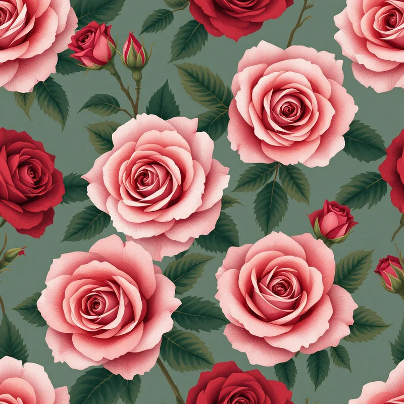
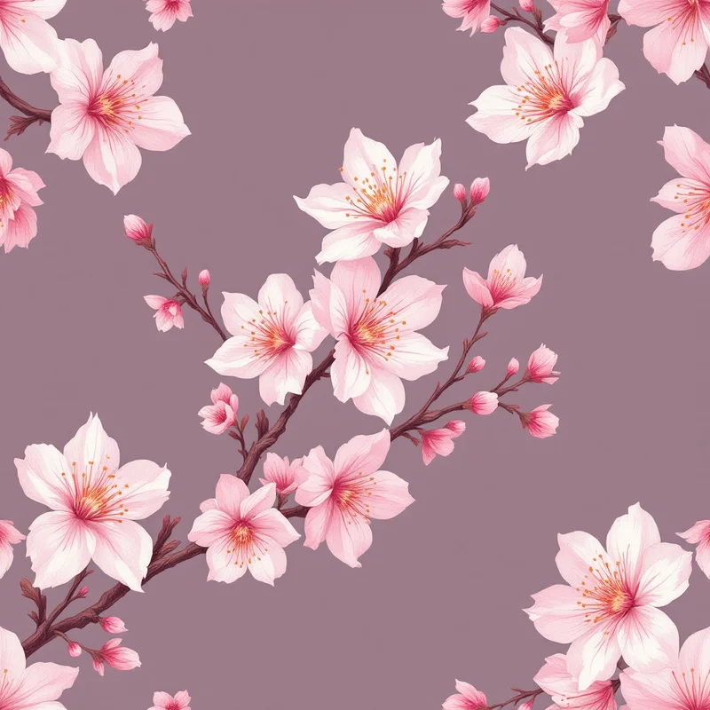
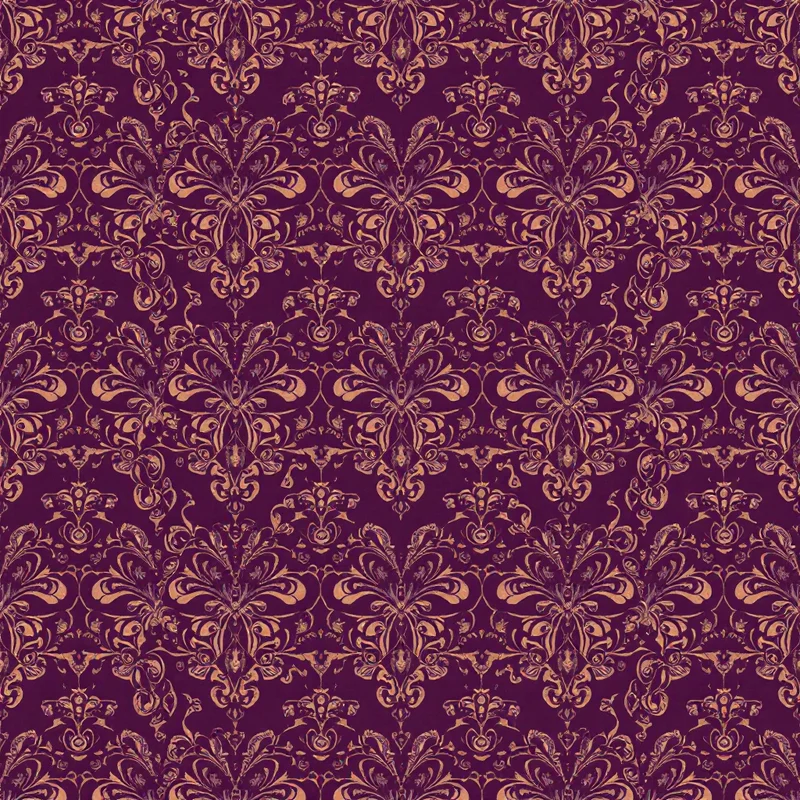
Florals
The largest commercial category by volume. Floral prints split into three rough modes:
- Ditsy florals — small-scale, tossed, non-directional. The workhorse of summer apparel.
- Statement florals — large-scale, directional, often on a contrasting ground. Resort, eveningwear, statement dresses.
- Botanical illustration — observational, sometimes with stems and leaves rendered at near-photographic detail. Premium positioning.
Paisley and Boteh
Paisley is one of the most enduring fashion print design motifs and remains a perennial in shirting, scarves, and bohemian apparel. Convention: paisley reads "luxe" in jewel tones, "boho" in earth tones, "preppy" in navy-and-cream. The boteh itself ranges from 1" (shirting) to 9" (statement scarves).
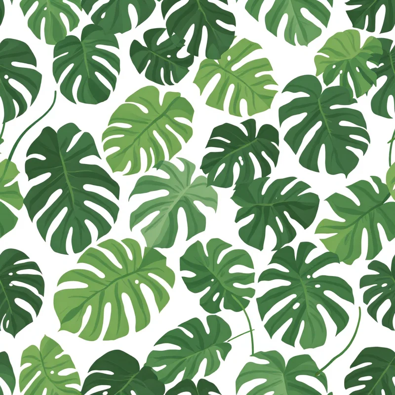
Tropical and Botanical
Resort and swimwear category. Conventions: large-scale leaves (monstera, banana, palm) at 8–14" repeat for kaftans and shirts; tighter 3–5" for swimwear panels. Saturation is expected — washed-out tropicals do not sell.
Animal Prints
Leopard, zebra, snake, and python remain commercial perennials. The rules: real animal markings are irregular. Designs that look too gridded read "fake fur" rather than "animal print." Leopard scale: 1–3" for fashion apparel, larger for outerwear and statement pieces.
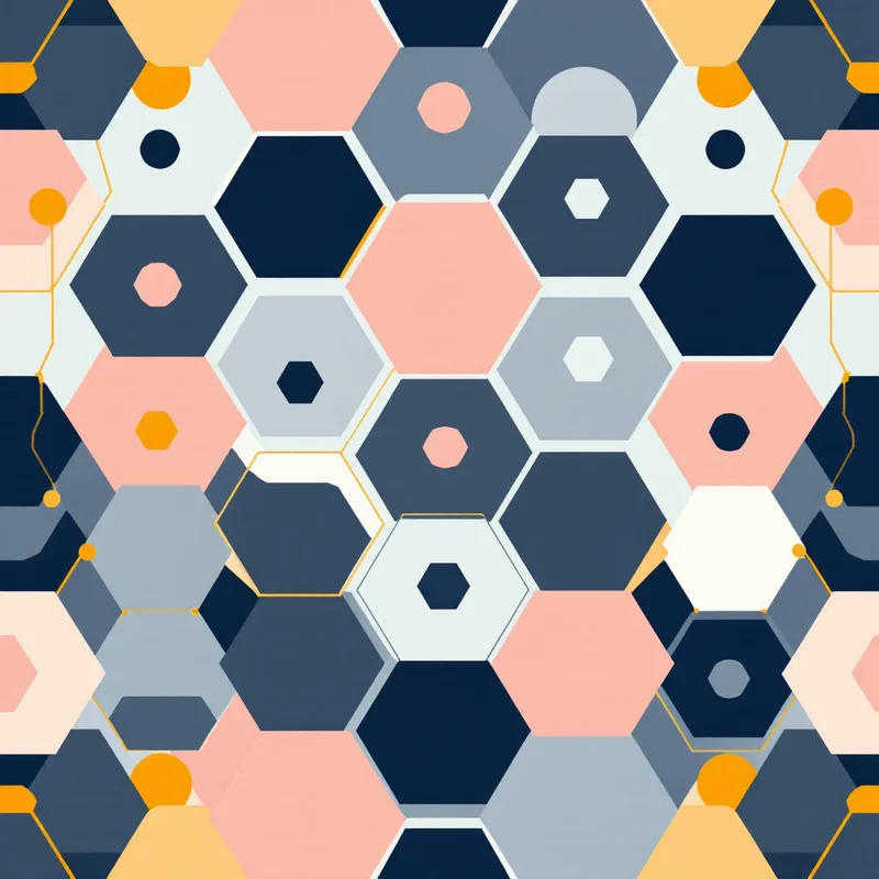
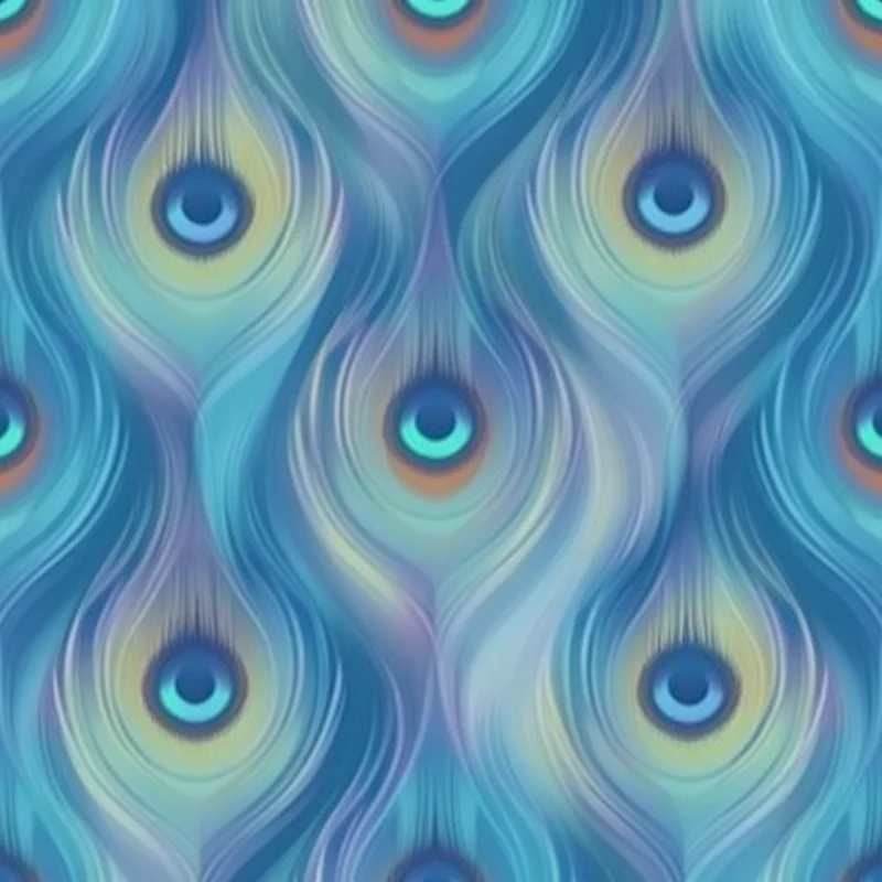
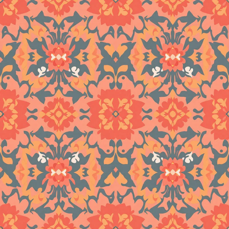
Geometric and Abstract
Geometric prints reward precision in repeat construction — any seam mismatch is immediately visible. Abstract prints are more forgiving but require strong color decisions to avoid feeling generic.
Cultural and Heritage Prints
Suzani, ikat, chinoiserie, toile de Jouy, and damask all carry centuries of cultural and decorative history. Treat them with respect to the source tradition — and check the legal and ethical status of any motif you draw from a specific cultural origin before commercializing it.
Pre-Production Review
Before any print file leaves your machine for the printer, work through this checklist. It catches the failures that cost real money once they reach a production run.
- 1Repeat seamlessness. Tile the artwork into a 2×2 grid and inspect every seam. Any visible line where tiles meet means the repeat is broken.
- 2Print method match. Confirm the file spec (DPI, color space, channel structure) matches what the chosen printer requires. Screen-printed files need separated channels. DTG needs transparent PNGs. Sublimation needs RGB at full panel size.
- 3Color accuracy. Soft-proof the file in the destination color space. For Pantone-based screen printing, spec each color by Pantone reference. For digital, request a strike-off on the actual production fabric before approving bulk.
- 4Scale validation. Print a tabloid-size proof at 100% scale, lay it on a dress form or against a body, and look at it from 6 feet away. Anything that disappears at viewing distance is mis-scaled.
- 5Directional spec. Mark the repeat as directional, two-way, or non-directional on the tech pack. Pattern cutters will assume non-directional otherwise.
- 6Bleed and registration. All-over prints need at least 1/4" bleed on every panel edge. Placement prints need registration marks for multi-screen alignment.
- 7Test on the actual fabric. A strike-off on the wrong fabric base is not a real test. Insist on the production fabric.
The Fashion Print Designer's Role in 2026
The discipline has changed faster in the last three years than in the previous three decades. AI-assisted AI pattern generator tools and fabric pattern generator workflows now compress what was a one-to-two-week sampling cycle into hours.
What AI handles well in 2026: rapid ideation, palette exploration, motif variation, generating a clean tileable base from a rough concept. What it does not handle: the cut-and-sew specification, the printer-specific file prep, the palette decisions against skin tone, and the strike-off review on actual production fabric. The designer's role has shifted upstream toward concept and downstream toward production engineering. The middle — the drudgery of building a clean repeat from scratch — is the part that has been automated.
For designers selling through marketplaces, Spoonflower-ready fabric patterns and other on-demand printers have lowered the barrier to launching a print collection without inventory risk. The trade-off: those marketplaces handle the print engineering for you but take their margin in return.
Career Paths in Fashion Print Design
Three viable paths in 2026, each with different risk and reward profiles.
In-House Print Designer at a Fashion Brand
You work as part of a design team at a label or retailer, designing prints for seasonal collections. The brand handles production, sales, and inventory. You design to a brief, work within the brand's aesthetic, and your output ships at scale. Compensation is salary-based; creative freedom is bounded by the brand's identity.
Freelance or Studio-Based Print Designer
You sell prints — either bespoke commissions or pre-made designs from a studio collection — to brands that need print artwork but do not employ a full-time print team. Income is project-based and lumpier. Creative freedom is higher but client management is half the job.
Indie POD Seller With Own Prints
You design prints, list them on a print-on-demand platform, and earn margin on each unit sold. No inventory risk, no production headaches, no client management — but also no built-in audience. Marketing becomes as important as design. This path has expanded dramatically as on-demand print quality has caught up to wholesale production.
Fashion print design rewards designers who treat the discipline seriously on both the creative and the technical layer. The print method dictates the palette. The garment dictates the scale. The body dictates the contrast. The fabric dictates the drape behavior. Get those four right and the print will work in production. Get them wrong and the most beautiful artboard in the world will still come back from the printer looking nothing like the file you sent.
The designers thriving in fashion print today hold the full stack — concept, repeat construction, print method, garment fit, production specs — in their head at once, and use AI tooling to compress the manual hours without surrendering any of the four creative judgments.
Explore related pattern styles
Patterns for