T-shirt print design rewards designers who plan for the printer before they plan for the screen. A graphic that looks crisp at 100% zoom in Illustrator can land on cotton as a muddy blob, a stretched logo, or a $14 unit cost that kills the margin. This tutorial walks through how to design a t-shirt print from first sketch to print-ready file — covering single-placement graphics, all-over prints, the four placement zones every garment uses, palettes that survive DTG and screen, file specs printers actually want, and the rookie mistakes that ruin first runs.
The audience here is the indie designer doing a first run, the print-on-demand seller building a catalog, and the fashion student who needs a workflow that maps to real production. Aesthetic taste matters, but production literacy is what gets the shirt out the door at the right margin.
Graphic-on-tee vs all-over print: pick one before you draw
Every t-shirt design falls into one of two structural categories. Decide which one you're making before you open a single tool.
A graphic-on-tee is a single bounded artwork placed in a specific zone of the garment — center chest, full back, left sleeve, hem. The garment fabric shows around it. The artwork is finite, has a clear edge, and is printed with DTG (direct-to-garment), screen printing, or vinyl heat transfer. This is the category most band tees, brand merch, slogan shirts, and indie POD listings live in.
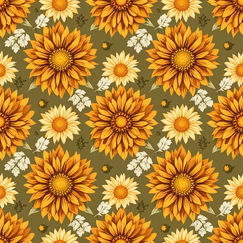
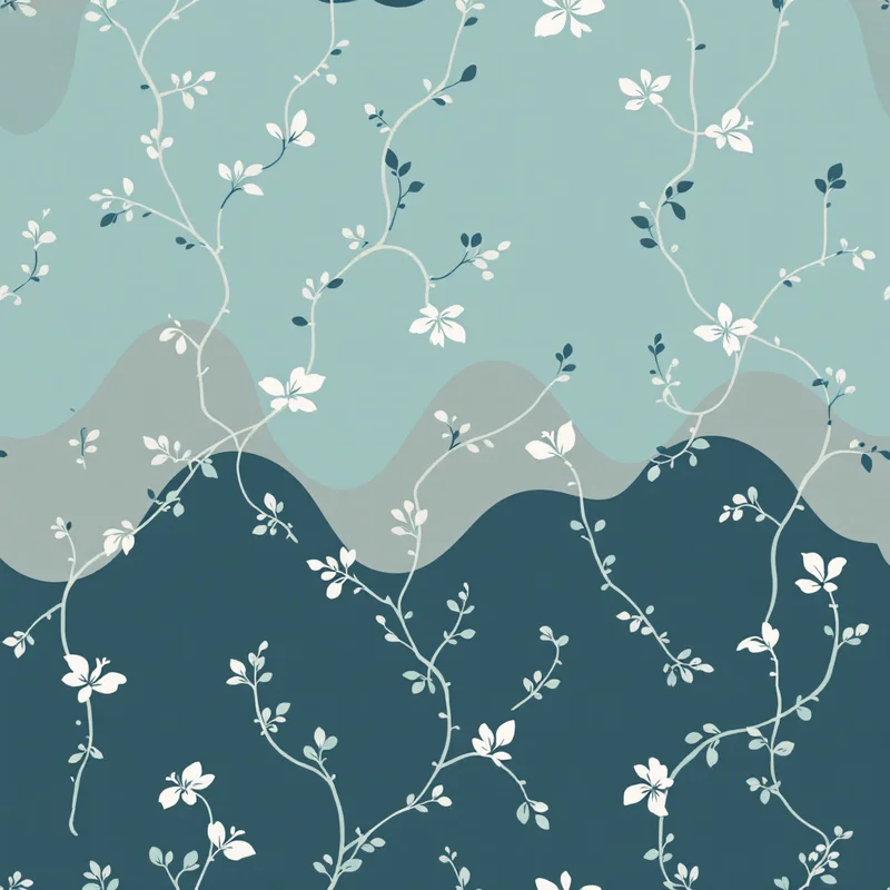
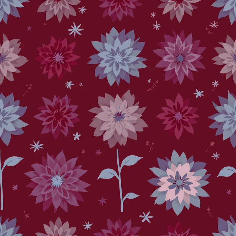
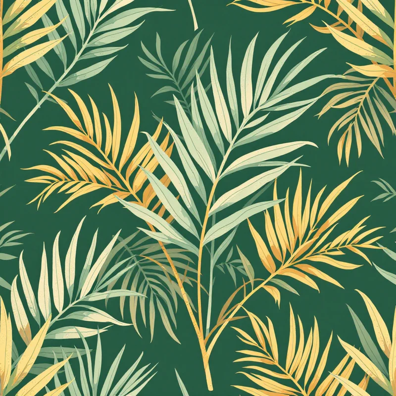
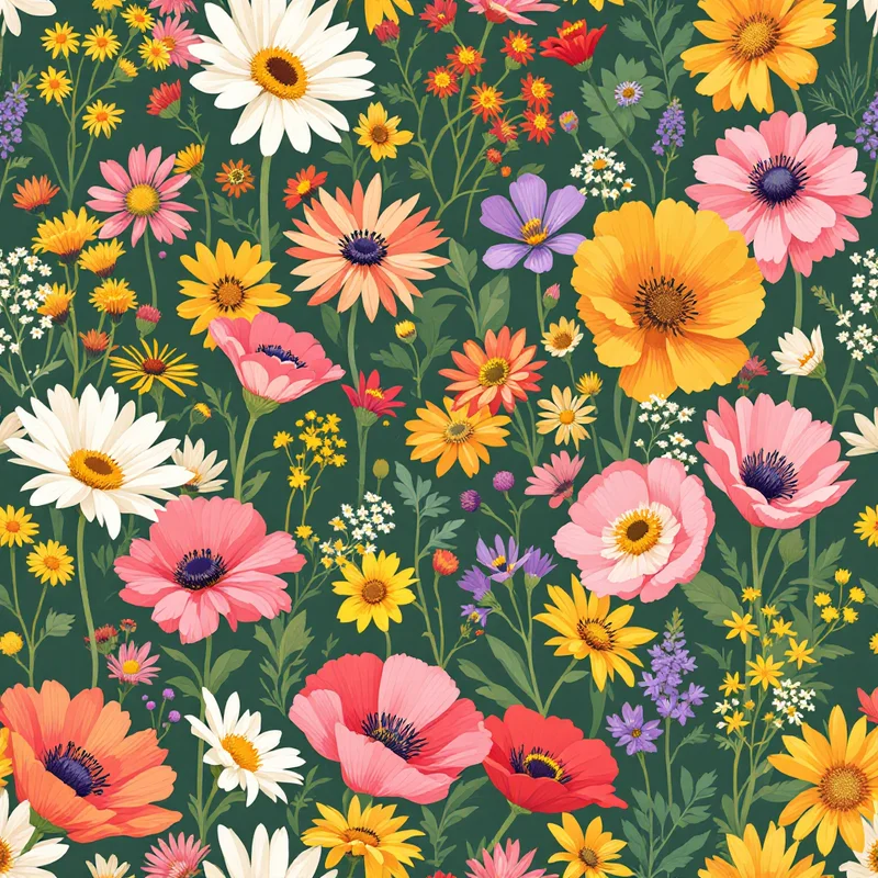
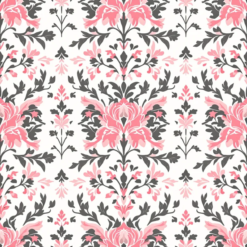
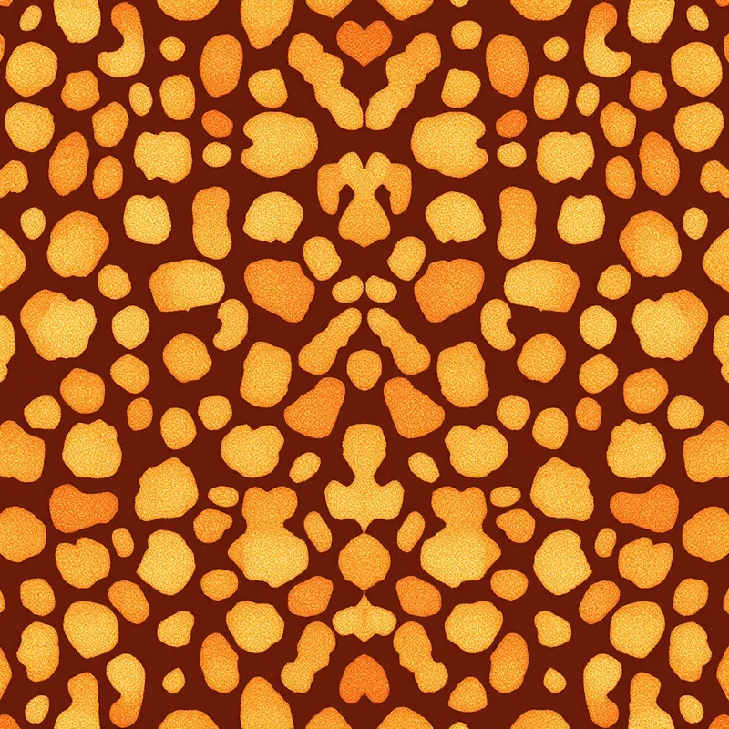
An all-over print (AOP) covers the entire cut-and-sew panel of the shirt — front, back, sleeves, sometimes seam-to-seam — and is produced through digital textile printing routes. The artwork is a seamless repeating pattern, not a bounded graphic — anything from florals and abstract camo to bold leopard patterns. AOP shirts are produced via dye sublimation on polyester or specialised AOP DTG, almost always cut-and-sew rather than printed on a finished blank. This is where florals, animal prints, abstract camo, and statement maximalist shirts live.
These two categories have almost nothing in common production-wise. Different file specs, different placement logic, different palette constraints, different fabric requirements, different unit economics. Choosing wrong wastes a week.
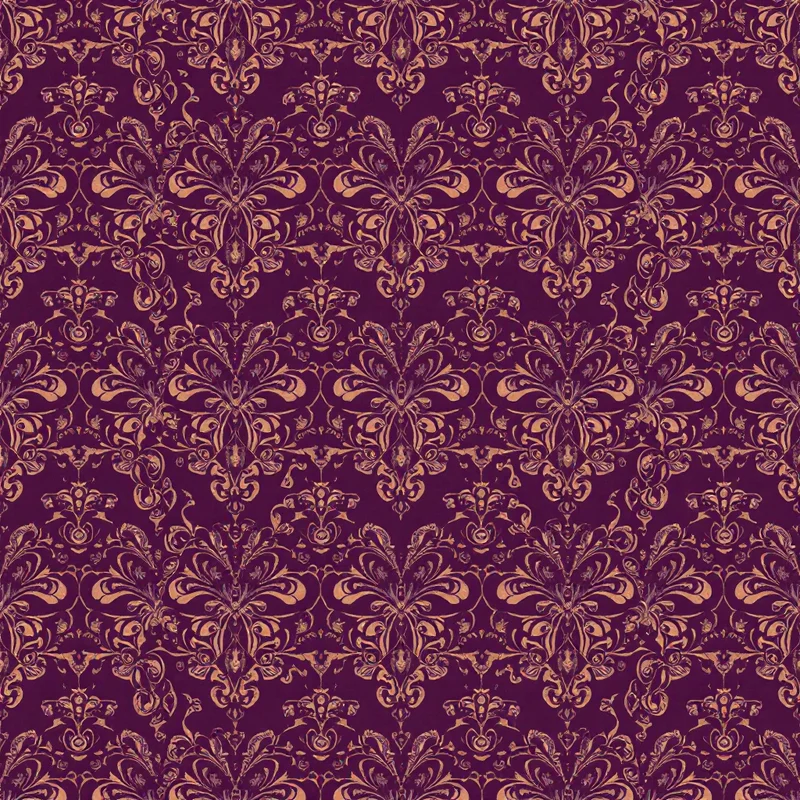
Rule of thumb: if a customer would describe your design as "a shirt with X on it," it's a graphic. If they'd describe it as "an X shirt," it's probably all-over. A shirt with a tiger on the chest is a graphic; a tiger-pattern shirt is AOP.
For a deeper grounding in how textile professionals approach this distinction, the textile design and surface pattern design workflows cover the wider repeating-pattern discipline that AOP inherits from.
The four placement zones (and the dimensions that actually matter)
Graphic-on-tee work lives inside four standard placement zones. Each has its own size envelope, sight line, and design constraint. Memorize these before you scale anything.
Front center (chest). The default. Typical print area: 12 in wide × 14 in tall on an adult unisex shirt; 10 × 12 on women's fitted; 8 × 10 on youth. The center of the artwork sits roughly 3.5 inches below the collar. Don't max out the print area — a graphic that nearly touches the side seams looks cheap and distorts when the shirt is worn. Aim for 9-10 inches wide on adult unisex for a confident, balanced front.
Back center. The biggest canvas you get. Up to 14 × 16 on adult unisex. Used for big statement art, tour-style typography, large illustrations. Centered horizontally; top of artwork roughly 3 inches below the collar seam. This is where you put the work that does the heavy aesthetic lifting.
Sleeve. The smallest zone. Typical print area: 3-4 in wide × 3 in tall on a short sleeve. Used for small logos, secondary marks, edition numbers, supplementary type. Sleeve prints are read at conversational distance, not across a room — keep them minimal. Note that sleeve print position differs between left and right sleeve and short vs long; confirm with your printer.
Hem (bottom front or back). A trendier placement: small print near the bottom hem, usually 2-4 inches up from the bottom edge, centered or offset. Print area around 4 × 4. Used for sub-brand marks, tags, secret-club graphics. Be aware that the hem rolls and curls when worn — anything text-heavy here gets distorted.
For clothing design projects with multiple SKUs, lock these four zones as your design template and produce variants per zone. It's how internal teams keep merch programs coherent.
Designing the graphic: source resolution and scale
A t-shirt printer doesn't care how clever your composition is if the source file is 800 pixels wide. The rule for any DTG or screen-print graphic is the same: design at print size and at 300 DPI minimum.
For a front-center adult unisex graphic at 12 × 14 inches, that's a 3,600 × 4,200 pixel canvas. Back-center at 14 × 16 is 4,200 × 4,800. Build in vector wherever possible — Illustrator, Affinity Designer, Figma with vector export — because vector scales without loss. Raster work (Photoshop, Procreate) needs to start at print size and stay there. Never upscale a small raster image and hope; it always shows.
Bleed is not usually required for bounded graphic-on-tee prints since the design sits inside the garment with fabric around it. Bleed becomes critical only for AOP and edge-to-edge designs.
For AOP work, the requirements shift. The artwork is a seamless tile, typically supplied at 150-300 DPI across the full garment panel. Most AOP printers ask for a tileable PNG or TIFF sized to the largest panel dimension — often around 10,000 × 12,000 pixels for an adult shirt. Use a seamless pattern maker or an AI pattern generator to produce tiles that repeat cleanly, then test the repeat at scale before sending to print.
A common rookie mistake: designing a small repeat that looks busy on screen but ends up reading as visual noise on the shirt. Scale up the repeat motif before committing — for AOP fashion tees, motifs of 4-8 inches usually read better than tight 1-2 inch repeats.
Palettes that survive DTG, screen, and sublimation
Color behaves differently on cotton than it does on a 6500K monitor. This is where most first-time t-shirt designers get burned.
DTG (direct-to-garment) prints water-based inks directly into the fibers using inkjet heads. It handles full-color photographic detail well on white and light garments. On dark garments, DTG requires a white underbase pass — this raises print cost, can make colors look slightly chalky, and can crack over time if the curing is sloppy. Soft pastels, warm beiges, and subtle gradients are DTG's strength. Saturated neons and pure CMYK-process colors are weaker — they often desaturate noticeably on cotton.
Screen printing pushes plastisol or water-based ink through a mesh screen, one color per screen. It excels at bold, flat, limited-palette art — 1 to 4 spot colors. Solid coverage, vivid saturation, durable for hundreds of washes. The constraint: every additional color is another screen, another setup fee, another registration step. A 2-color screen print is cheap at volume; a 6-color screen print is not. Design within a 1-4 color palette if screen is the target.
Dye sublimation is the standard process for AOP polyester shirts. Ink converts to gas under heat and bonds into the polymer. Output is vivid, photo-quality, and won't crack because it's part of the fiber. Constraints: only works on polyester or poly-blends, and only on light base colors (white, cream, light heather). Sublimation on dark fabric is not a thing.
Palette rules that hold across all three:
- Test on the actual garment color you're printing on. White-ground artwork looks different on a heather grey blank, and very different on black.
- Avoid pure black (#000000) for line art on dark garments via DTG — it can flatten and look smudged. Use a near-black (#1A1A1A) or contrast it with a colored stroke.
- For screen prints, build with Pantone Solid Coated references, not screen RGB. The printer matches to ink, not pixels.
- For DTG, design in sRGB and accept that you'll lose 5-10% saturation on the cotton. Plan for it.
- For sublimation AOP, design in RGB at full saturation; the sublimation process holds color well.
Plan the palette around the garment color from day one. A jewel-tone floral that sings on white turns muddy on navy. A pastel hand-drawn graphic disappears on cream. Pick the blank first, then pick the palette.
Choosing between DTG and screen for your run size
For graphic-on-tee work, the DTG vs screen question is mostly economic, not aesthetic.
DTG wins under ~50 units. No setup fee, no screen prep, no minimum order at most POD platforms. Per-unit cost is higher (often $7-12 for a multi-color graphic on a dark garment) but total cost stays small. Perfect for: testing a design, drop releases under 50, single-customer custom orders, full POD catalog.
Screen wins above ~75-100 units per design. Setup costs (screens, ink mixing, registration) are amortized across the run. Per-unit cost drops fast: a 2-color front print can hit $2-3 per unit at 200+ pieces. Total cost is lower above the breakeven, and the print itself is more durable. Perfect for: confirmed bestsellers, wholesale orders, merch for events, branded staff uniforms.
The gray zone (50-100) goes either way depending on color count and garment color. A 1-color print on white is cheap to screen even at 50 units; a 5-color print on black might still favor DTG at 100.
For all-over print, the math is different again — sublimation has a higher per-unit cost (typically $15-25 to produce a finished AOP cut-and-sew shirt) but no setup fee, so it stays linear with volume. AOP rarely competes on price; it competes on aesthetic differentiation.
If you're building a print-on-demand catalog where each design might sell 5 units or 500, DTG-first is the safer infrastructure. You can move proven bestsellers to screen later.
File specs printers actually want
The exact spec varies per printer, but the requests are consistent enough that you can prep files once and resubmit anywhere. Build your export checklist around this:
For DTG graphic-on-tee:
- PNG with transparent background
- 300 DPI at final print size
- sRGB color profile
- No layer masks, no smart objects — flattened
- Filename includes garment color (e.g. `front-chest-darkbg-v2.png`)
For screen print:
- Vector AI or PDF preferred, layered by spot color
- Each color on a named layer matching Pantone code
- All type converted to outlines
- 100% scale at print size
- Halftones if you need shading — screen can't print smooth gradients without halftone or simulated process
For dye-sublimation AOP:
- Tileable PNG or TIFF at the printer's panel template size
- RGB color profile (sublimation workflow expects RGB input)
- Full bleed including seam allowance — the panels get cut after printing
- Repeat motif tested by previewing the tile placed 4× side-by-side
- A reference flat showing how the pattern should orient
Always request the printer's blank panel template before designing AOP. Templates differ — what counts as "front panel" varies by manufacturer, and putting the focal point in the wrong place wastes a sample.
For a structured tour of how seasoned designers prep production files, the textile designer workflow and fashion print design guide both cover file prep at length.
Mockups: client and customer preview
A mockup is the bridge between your flat PNG and the client's "yes" or the customer's "add to cart." Two categories matter.
Garment mockups for product listings. Use mockup PSDs or generators that show the design on a realistic shirt — folded, on a model, flat-lay, or hanging. Free options: Placeit (paid tier for premium), Mockey, Smartmockups. Paid: Mockup World PSDs, ARK template packs. For higher-end brand work, photograph an actual sample on a model — a real photo always converts better than a generated mockup.
Technical mockups for production approval. These are flat front/back/sleeve views showing exact placement, dimensions, and color references. Used to confirm with the printer that placement matches your intent before they go to plate or panel. Build these in Illustrator using the printer's garment template.
For all-over prints, mockups need to wrap the pattern onto curved fabric realistically. Generic flat mockups don't convey scale or repeat behavior on a real garment. Either use AOP-specific mockup PSDs or photograph a sample shirt.
For brand-tier mockups, the fabric pattern generator workflow makes it possible to generate the pattern and preview it on a garment in the same session, which collapses what used to be a multi-day client review into an afternoon.
Common rookie mistakes (and the fix for each)
Text on a curve when it doesn't need to be. Curved text along the bottom of a chest graphic gets distorted when the wearer's torso moves or the fabric folds. If the type doesn't need the curve for design reasons, leave it straight.
Low-resolution source. Designing in Procreate on a 2,000 × 2,000 canvas and trying to push it to a 14-inch back print. The art will be soft. Always start at final print size at 300 DPI minimum.
Wrong color mode. Submitting an RGB file when the printer wants CMYK separations, or vice versa. Read the printer's spec sheet and convert before export. Sublimation expects RGB; offset and some screen workflows want CMYK; DTG runs sRGB.
Ignoring fabric color in palette planning. Pastel artwork on a black shirt requires a heavy white underbase, which adds cost, weight, and a chalky hand-feel. Either pick lighter base garments or rebuild the palette for dark-ground.
Maxing out the print area. A graphic that fills the full 12 × 14 print envelope looks oversized and amateur. Pull the artwork in 1-2 inches on each side.
Not testing the repeat (AOP). Designing one tile in isolation and never previewing it tiled. The seams will show, the motifs will clash, or the scale will be wrong. Always preview at 4× or 9× tile before locking the file.
Tiny line weights. Hairline strokes (0.25pt) disappear in DTG and especially in screen printing. Minimum line weight for screen is usually 0.75pt; for DTG, 1pt is safer.
Type that's too small. Anything below 8-10pt on a chest graphic stops being readable from across the room. If the type matters, scale it up. If it doesn't matter, cut it.
Skipping a strike-off or sample. Approving production from a screen mockup without ordering one physical sample. The sample is cheap insurance. Order it.
A practical workflow, start to finish
Putting it together — the workflow for a first t-shirt print run looks like this:
- 1Decide graphic vs AOP. Sketch concepts in both categories if you're undecided.
- 2Pick the garment. Brand, blank, color, fabric. This sets the palette and process constraints.
- 3Lock the placement zone(s). Build a template at print size with the zones marked.
- 4Design at print size, in the right color mode. 300 DPI minimum for raster, vector preferred for screen.
- 5Test palette on garment color. Place the artwork over a mockup in the actual garment color before committing.
- 6Choose the print process. DTG under 50, screen above 100, sublimation for AOP poly.
- 7Build a mockup for review. Garment mockup for marketing, technical mockup for the printer.
- 8Send to printer with their spec. Match their template, color profile, file format, and naming convention.
- 9Order a physical sample. Always. No exceptions on a first run.
- 10Adjust based on the sample. Saturation, scale, placement — fix once before the full run.
For pattern-driven AOP work, the floral patterns, animal patterns, and cultural patterns generators are good starting points for building seamless tiles that hold up at garment scale. For statement graphic-on-tee work, the fashion print design discipline maps directly across.
A first t-shirt print run is mostly a documentation exercise: capture the placement, the palette, the process, the printer, and the sample notes. Once you have one shirt produced correctly, every shirt after it follows the same template. The first one is the hardest; the tenth one takes a morning.
Explore related pattern styles
Patterns for


