Swimwear is one of the most demanding categories in textile pattern design. The fabric is technical, the body is bare, the construction is tight, the customer is photographed and photographed in the product, and the seasonal economics force production cycles that compress timeline and decision-making. A great swimwear print can carry a brand for an entire season; a weak print can sit on the rack until clearance regardless of how the brand markets it, which is why swim sits at the intersection of print expertise and serious clothing design. The designers who succeed in this category understand the technical realities of swim fabric, the visual conventions of the swim market, and the specific commercial logic that drives seasonal collections.
The market itself is enormous and segmented. Athletic swim — competitive swimming, lap suits, training wear — runs on different aesthetics than resort swim, which runs on different aesthetics than family beachwear, premium designer swim or kids' swim. Each segment has its own pattern conventions, palette norms and silhouette traditions. A designer who understands the technical fundamentals can adapt across segments; a designer who only knows resort prints will struggle if asked to deliver athletic competition wear.
How Swimwear Behaves
Swim fabric is the most demanding substrate most pattern designers will work with. The dominant fabrics are nylon-spandex blends and polyester-spandex blends with stretch typically between 40 and 80 per cent in the horizontal direction and 30 to 50 per cent vertically. Chlorine-resistant variants for athletic competition wear have specific dye chemistry requirements. Quick-dry fabrics for performance swim have additional finish considerations.
When swim fabric stretches across the body, the print stretches with it but unevenly. The highest-distortion zones are typically the bust on a women's one-piece, the hips on bikini bottoms, and the shoulder area on men's swim shirts. Patterns with critical detail in these zones get distorted in worn use. Patterns with even visual interest distributed across the design tolerate this distortion gracefully.
Sublimation is the dominant print method for swimwear inside the broader digital textile printing family. The dye-sublimation process transfers dye from paper into the polyester fibres at high heat, producing prints that are highly durable, chlorine-resistant when paired with the right fabric, and quick-drying because the print does not sit on top of the fabric. The colour gamut is wide for warm colours and slightly more limited for cool blues and certain greens. Pure black is difficult to achieve through sublimation and typically prints as a deep charcoal. White is not printed — it is simply the absence of dye, which means areas you want as white will show the natural fabric colour (typically a clean white but sometimes slightly off-white depending on substrate).
The other notable swimwear print method is plastisol or pigment printing on woven covers and resort wear, which behaves more like standard textile printing but is less common for performance swim categories.
Scale and Composition
Swimwear pattern scale needs to be calibrated against the very small fabric surfaces involved. A bikini top cup may show only fifteen by fifteen centimetres of fabric surface. A bottom panel may show twenty by twenty-five centimetres. These dimensions are smaller than almost any other apparel category outside of accessories.
The scale strategy that works across most swim applications is medium to small motif scale. Patterns with motifs in the three to eight centimetre range tend to read well across the small fabric surfaces and survive the body's distortion zones gracefully. Larger statement-scale patterns can work for resort wear and full-coverage swim where the available fabric surface is larger, but they tend to read awkwardly on bikinis and athletic wear.
Density should be moderate to high for most swim applications. Very low-density patterns with significant negative space can read as visually empty across small swim fabric surfaces. Higher density patterns provide enough visual interest to register clearly while still allowing the body silhouette to read.
The specific zones to attend to in compositional design depend on the silhouette. For women's bikini tops, the centre of each cup is a primary attention zone — patterns whose centres land at these positions get more visual presence. For bikini bottoms, the front centre and the lower hip lines are primary attention zones. For one-piece swimsuits, the bust and the lower abdomen are the primary zones, with the side waist often providing supporting visual continuity.
Palette Strategy
Swimwear palettes have well-established conventions that shift across market segments. Resort swim conventions include tropical brights — coral, turquoise, hot pink, sunset orange, ocean blue — that signal vacation, sunshine and warm-weather lifestyle. Premium designer swim conventions favour more sophisticated palettes — terracotta and cream, sage and ivory, deep navy and white, black and gold — that signal restraint and elevated taste. Athletic competition swim conventions favour bold high-contrast palettes that align with team colours and signal energy and performance.
The dominant colour shift over the past decade has been toward more sophisticated, design-led palettes even in segments traditionally associated with bright tropical palette. The premium resort segment, in particular, has moved toward earth-tone, muted and tonal palettes that feel current rather than dated. Designers entering the category today should generally lean toward palette sophistication unless they are specifically targeting bright-tropical retail channels.
Skin tone considerations matter. Swim fabric placed directly against bare skin in the high-contrast environment of beach or pool lighting interacts visually with the wearer's skin in ways that affect how the print reads. Colours that read beautifully against the white background of a portfolio render can read unflatteringly against actual skin. Successful swim designers test palettes against mockups with a range of skin tones to confirm the colour relationships hold up.
Theme and Motif Strategy
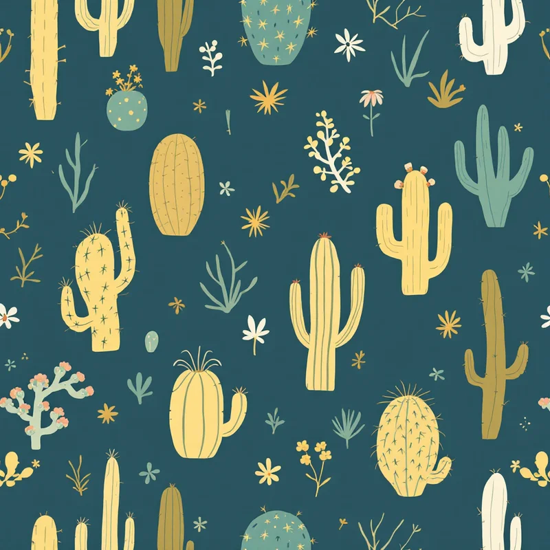
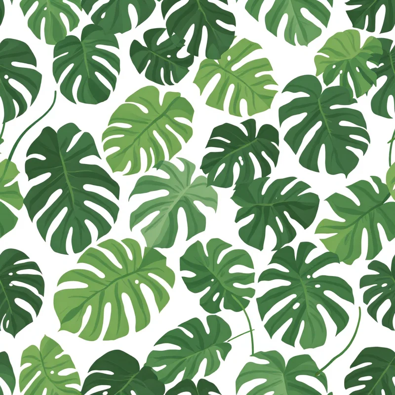
Tropical motifs — palm leaves, hibiscus, monstera, exotic florals, banana leaves, fruits — dominate resort swim and have for decades. The successful contemporary interpretations tend to update the rendering rather than abandon the motif vocabulary. Watercolour palms instead of literal palm illustrations. Botanical line drawings instead of busy tropical scenes. Abstracted fruit instead of detailed produce illustrations. The customer still wants the tropical signal but rendered with more design ambition.
Animal print motifs — leopard, snake, zebra, abstracted animal textures — are a perennial swim category. The successful renderings tend toward stylised, painterly or modernised interpretations rather than literal realism. Animal prints work particularly well in the premium resort and designer swim segments where the customer is buying signal as much as function.
Abstract motifs — painterly washes, geometric compositions, brushwork patterns — represent a growing segment of premium and contemporary swim. These designs allow for more aesthetic distinctiveness and tend to age well across multiple seasons because they are not tied to seasonal trend cycles in the same way as literal motifs.
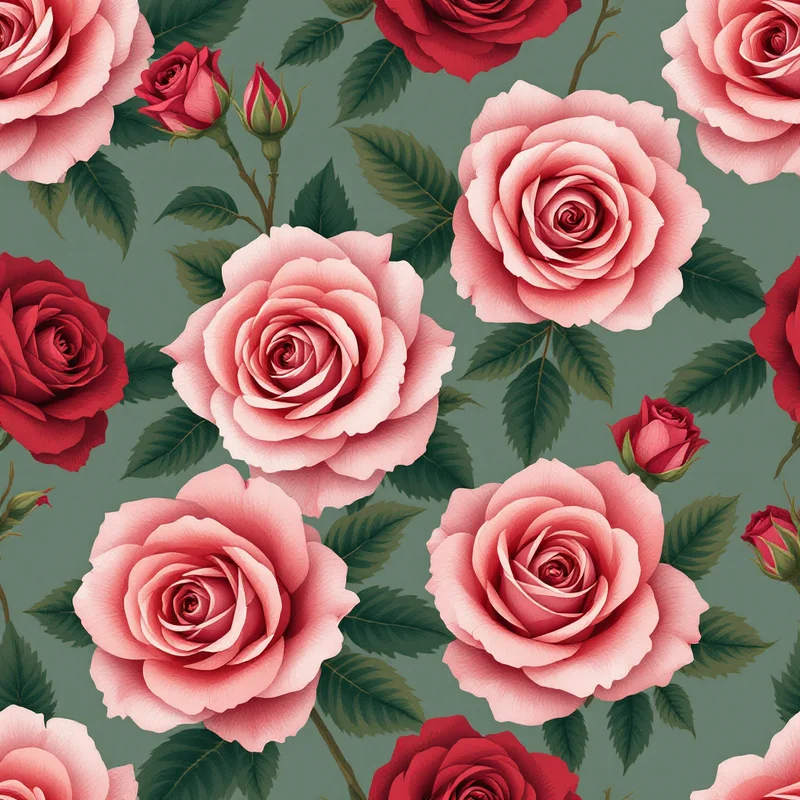
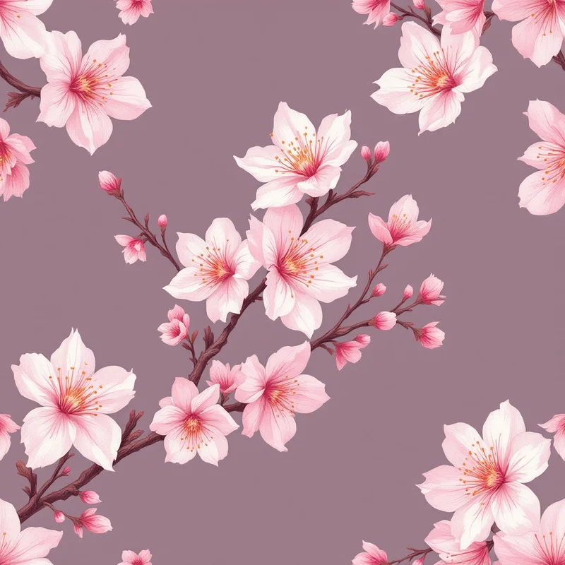
Floral motifs outside the tropical vocabulary — dahlias, peonies, abstract florals, romantic florals — work for the resort and contemporary segments and tend to skew toward the premium end of the market. Botanical motifs including leaves, ferns and abstract botanical compositions provide flexible options that work across multiple market segments.
Cultural and heritage-inspired motifs — Mediterranean tiles, Moroccan geometrics, batik, ikat, paisley — have strong premium-resort market presence. These designs require careful attention to cultural respect and accuracy, particularly for designers working outside the originating cultures.
Production File Specifications
For sublimation swimwear printing, the standard file specifications are 200 to 300 DPI in CMYK with embedded ICC profile. The reliable choice when no specific profile is requested is sRGB with CMYK-safe palette, though many sublimation production houses prefer working in CMYK from the start.
Repeat tile dimensions should be sized to match the print bed dimensions of the producer. Common sublimation print beds are 64 inches (162 cm) wide or 110 inches (280 cm) wide for larger formats, with the tile fitting either format depending on the producer.
Bleed margins for sublimated cut-and-sew swimwear are typically three to five millimetres at all panel edges. The dye saturates slightly during transfer and cut edges need to extend past actual seam lines. The exact specification varies by producer.
Black challenges in sublimation should be addressed proactively. If your design depends on a true rich black, work with your producer to identify a printable equivalent — often this is a deep charcoal with a slight colour cast (cool blue-black, warm brown-black) that prints reliably while reading as black in the finished garment. Pure black files often print as a flat dark colour that customers perceive as muddy.
The Seasonal Reality
Swimwear is a fiercely seasonal category. Design cycles for spring-summer collections typically run twelve to eighteen months ahead of in-store delivery, with brands placing pattern orders in October to December for the following May to August retail season. Independent designers selling directly through print-on-demand or boutique channels operate on shorter cycles but still face seasonal demand concentration.
This compressed timeline rewards designers who can deliver pattern collections rather than individual designs. A licensee placing swim orders wants to populate a multi-product collection — bikinis, one-pieces, cover-ups, swim shorts — and may need ten to fifteen coordinated patterns within a single collection. Independent designers who can deliver coherent collections move faster through licensee evaluation than designers showing scattered individual works.
Swimwear pattern design is among the most demanding commercial categories in surface design. The technical constraints are real, the visual conventions are tight, the seasonal economics are compressed, and the customer is bringing high standards to a product that is intimate and personal. The designers who thrive understand the technical fundamentals, respect the body and the construction, build collections rather than individual designs, and develop the aesthetic distinctiveness that justifies the difficulty of the work. The category supports significant licensing income for designers who put in the time to learn its specific commercial logic.
Explore related pattern styles
Patterns for


