A retro print is three decisions made together: a motif, a palette and a printing look. Take all three from the same decade and the pattern snaps into its era. Mix a 1950s motif with a 1980s neon palette and it just looks confused. Here is the signature print of each decade, with the details that carry the look.
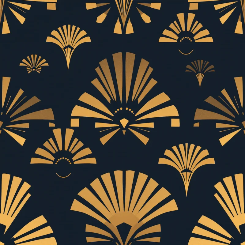
The 1920s and 30s: Art Deco
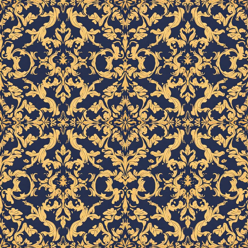
Motifs. Sunbursts, fans, stepped skyscraper shapes, chevrons and stylized flowers. The name comes from the 1925 Paris exposition of decorative and industrial arts. Palette. Black, gold (#C9A227), jade (#2F7F6A), ivory and deep navy. Look. Flat metallic-feeling color with razor-sharp edges and strict symmetry. Use. Wallpaper, packaging, jewelry boxes, formal stationery. The Art Deco pattern guide goes deeper.
The 1950s: Atomic and mid-century
Motifs. Boomerangs, starbursts, kidney shapes, orbiting dots and simple line-drawn atoms. Kitchen novelties such as cherries and coffee pots show up alongside gingham. Palette. Turquoise (#2BB3B1), coral pink (#F28B82), mint, charcoal and mustard. Look. Flat color, thin spindly lines and generous white space. Use. Kitchen textiles, diner-style packaging, barware. Browse mid-century patterns.
The 1960s: Mod and psychedelic
Motifs. Bold geometrics, op art checks, concentric circles, daisies and, later in the decade, swirling psychedelic paisley. Palette. Hot pink, orange, black and white early on, then saturated purple, lime and turquoise. Look. High contrast, large scale, sometimes vibrating colors. Use. Fashion, posters, phone cases.
The 1970s: Earth tones and groovy curves
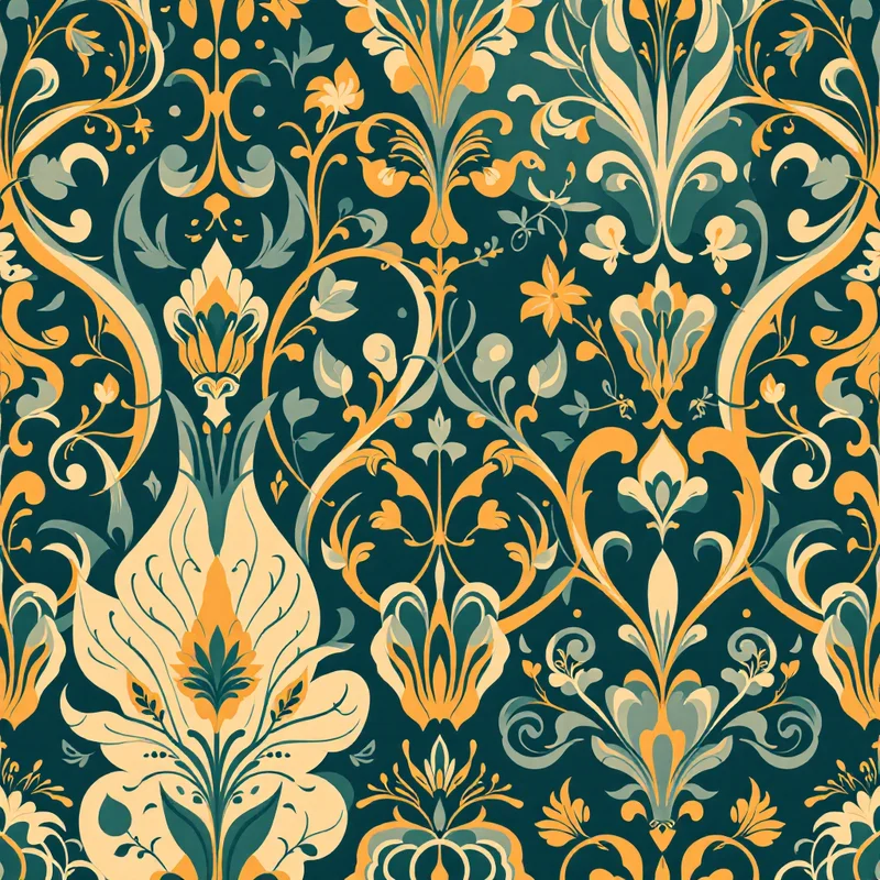
Motifs. Big stylized flowers, wavy stripes, sunbursts, rainbows and macramé-inspired textures. Palette. Harvest gold (#D9A327), avocado (#7A8A2E), burnt orange (#C4581C), brown (#5C3A21) and cream. Look. Warm, soft edges, slightly muted color, curvy forms. Use. Upholstery, bedding, kitchen goods, wallpaper. The 70s revival post covers what is coming back.
The 1980s: Memphis and neon
Motifs. Squiggles, triangles, confetti, grids and checkerboards, often scattered with deliberate randomness. The Memphis design group formed in Milan in 1981. Palette. Hot pink (#FF4FA3), electric teal (#19D3C5), purple, yellow and black. Look. Loud, flat color on white or black, with heavy outlines. Use. Streetwear, backpacks, stationery. See the 80s design guide.
The 1990s: Grunge and pastel geometry
Motifs. Flannel plaids, abstract squiggles, checkerboards, smiley shapes and small ditsy florals. Palette. Two directions. Grunge uses forest green, burgundy and mustard (#C79A2B). The pastel side uses lilac, mint and baby blue. Look. Slightly rough, sometimes photocopied, with offbeat spacing. Use. Apparel, tote bags, tech accessories. The 90s guide lays out both strands.
The late 1990s and 2000s: Y2K
Motifs. Butterflies, bubbly stars, chrome shapes, airbrushed gradients and tribal-inspired swirls. Palette. Silver, baby blue (#A9D6F5), hot pink and lime. Look. Glossy gradients, translucent plastic effects and glitter. Use. Phone wallpaper, fashion, sticker packs. The Y2K pattern guide covers motifs in depth.
Which decade for which product
- Packaging and stationery. Art Deco and 1950s atomic prints use flat color and strong shapes, which print cleanly on paper and card.
- Apparel and accessories. The 1960s mod, 1980s Memphis and Y2K prints are loud and graphic, so they read well on a jacket, a bag or a phone case.
- Home textiles and wallpaper. The 1970s earth-tone palette and Deco symmetry sit comfortably in a room because the colors are warm and the shapes repeat calmly.
Making a retro print convincing
- 1Limit the palette. Most decades used four to six printed colors at most, which is why retro prints feel coherent.
- 2Mimic the print process. Screen printing means flat color and visible overlaps. Lithography means subtle texture. Digital Y2K means smooth gradients.
- 3Age the paper, not the motif. A slight cream cast, a mild grain, and tiny misregistration at color edges sell the era better than distressing the whole design.
- 4Keep the era's scale. Seventies florals were huge. Fifties novelty prints were small and tossed.
In Pattern Weaver, Restyle changes the finish of a pattern, so you can take one motif and try it as a screen print, a lithograph or a smooth gradient.
Explore related pattern styles