

Streetwear print design operates on rules that do not exist in commercial apparel. A floral print on a contemporary blouse can sell on aesthetics alone. A streetwear graphic has to carry brand identity, reference history, sit inside a drop narrative, and survive screenshot compression on a resale app. The print is not decoration. It is the product.
This guide walks through how streetwear print design actually works inside a brand: the canon motifs every founder ends up touching, how to design for limited drops versus ongoing carryover, when to use placement prints versus all-over coverage, and the production specs that determine whether your drop ships clean or eats your margin in reprints.
What makes streetwear print design different
A contemporary womenswear print exists to flatter the body and complement the season. A streetwear print exists to communicate membership. The wearer is signaling alignment with a subculture, a city, an era, or a specific brand's worldview. That signal has to read at a distance, on Instagram, in 720p phone video, and across the back of a hoodie at a skatepark.
That changes every input. Scale runs larger than commercial fashion because the print needs to read in compressed media. Contrast runs higher because mid-tones disappear on a feed. Motif vocabulary leans toward the symbolic and the appropriated rather than the purely decorative. And the print almost always has to coexist with a logo, wordmark, or graphic the brand has already invested years in building.
If you have not mapped that brand context before you start, you are designing in a vacuum. Pull every previous drop, every logo lockup, every collab. Decide whether this print is reinforcing the existing brand language or deliberately breaking from it. Both are valid. Drift without a decision is not.
The streetwear print canon
Streetwear has a working canon of motifs that every founder ends up confronting. These are not trends. They are inherited vocabulary, and the brands that use them well do so with explicit awareness of where each one came from.
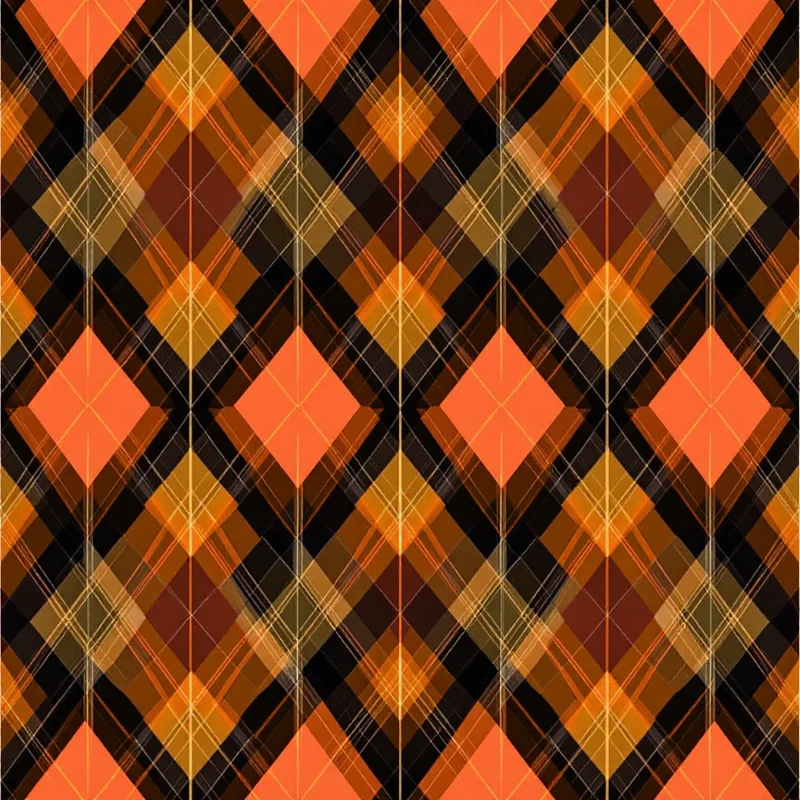
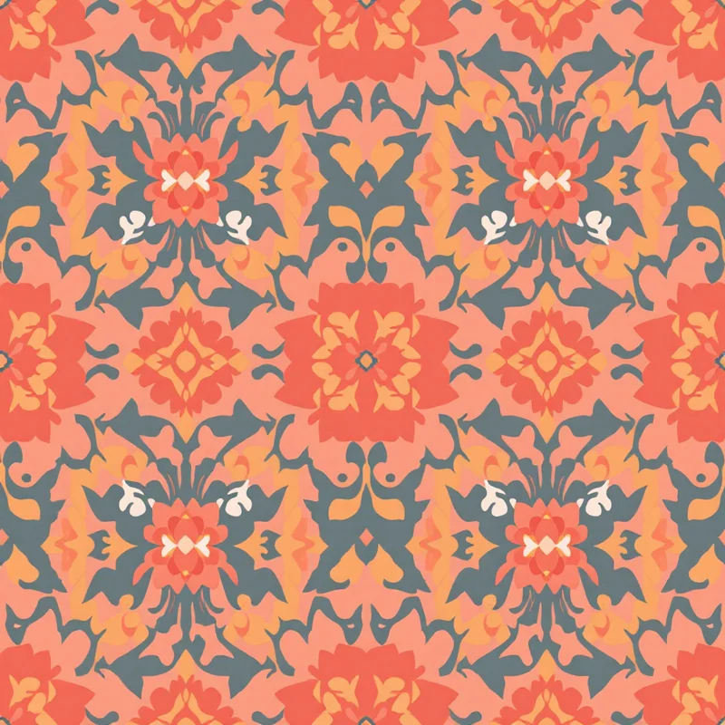
Camo. The most over-used and least understood motif in the canon. Originated as military concealment, adopted by hip-hop in the late 80s, codified into streetwear by BAPE in the late 90s with the shark-tooth and ape-head colorways. Standard woodland and digital camo are dead on arrival unless you are doing deliberate milsurp reference. Custom recolors, scaled-up arrangements, and motif substitutions (replacing the leaf shapes with logos, glyphs, or brand-specific marks) are where the work happens.
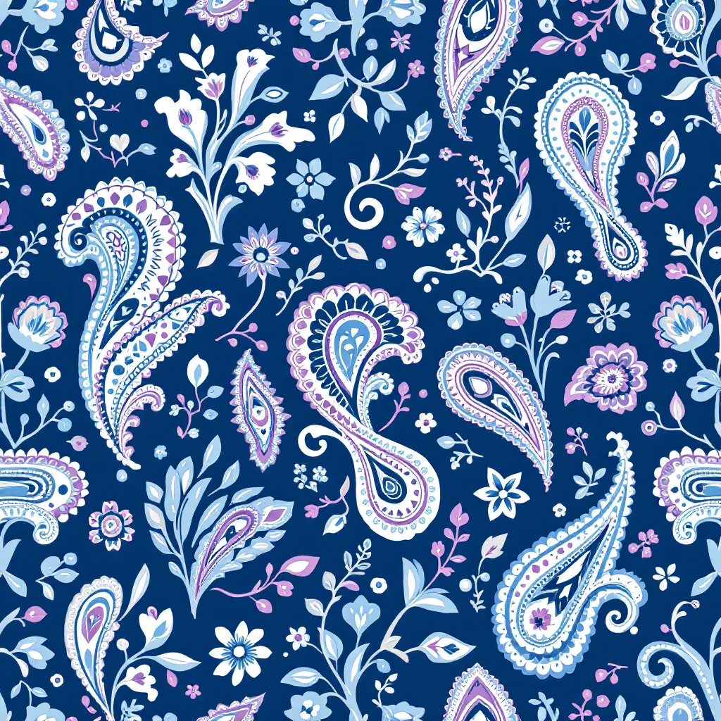
Paisley. Bandana paisley specifically. The royal blue and red bandana is a coded reference to gang culture, West Coast hip-hop, and a specific lineage that runs through Tupac, Snoop, and every brand that has cited that era. Using paisley in streetwear without acknowledging the bandana lineage reads as ignorant. Recoloring it, scaling it, and pairing it with brand-specific motifs is how labels make it their own.
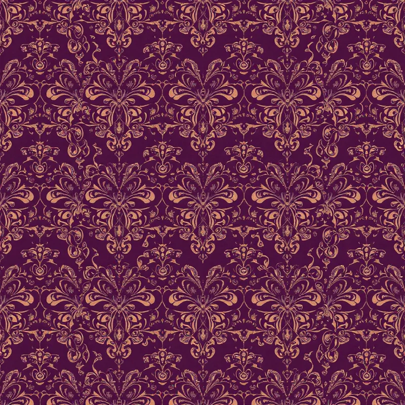
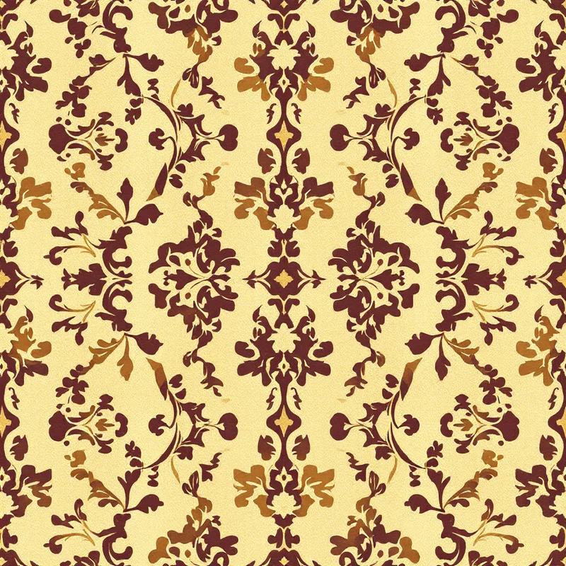
Baroque. Heavy ornament, gold-on-black, late-90s rapper aesthetic codified by Versace and absorbed into streetwear through Supreme, Off-White, and a dozen luxury collabs. Useful when the brand wants to signal aspiration without saying it. Reads as gauche when overused or when the linework is not tight.
Monogram. The brand's own wordmark or logo tessellated into a repeating field. Louis Vuitton's monogram is the reference point every streetwear brand is either copying or reacting against. Building a clean monogram requires a strong primary logo and disciplined spacing. It is the closest thing streetwear has to a house pattern.
Tribal. A category to be careful with. Polynesian, indigenous American, and African motifs have been used as decoration by streetwear brands for thirty years, almost always without permission or credit. The line between reference and extraction is real and the audience has gotten sharper about calling it out. If the brand does not have a credible cultural connection or a paid collaboration with source artisans, leave it alone.
Japanese influence. Sashiko stitching, ukiyo-e wave references, koi, oni masks, and tora (tiger) imagery flow through streetwear via Japanese brands (Visvim, Neighborhood, WTAPS) and Western brands that grew up referencing them. The same caution applies as with tribal motifs. Used with knowledge, it reads as informed. Used as wallpaper, it reads as orientalist.
Pattern Weaver's cultural pattern generator handles paisley, ikat, suzani, and other canon-adjacent motifs with controls for scale, color, and density that map directly to how streetwear print design needs to flex these references.
Drop economics shape every print decision
Streetwear runs on drops. The drop is not a marketing tactic. It is the economic structure that determines scale, lead time, inventory risk, and how a print is allowed to behave.
A limited drop is usually 200-2000 units across a small SKU range, made-to-order or short-run, with no restock. The print can be loud, weird, and uncommercial. The buyer is paying for scarcity and statement. A print that 30% of the audience hates is fine if the other 70% buys it in 90 seconds.
An ongoing collection runs across multiple seasons, usually built around carryover staples. The print has to age. It cannot reference a meme that will be dead in six months. It cannot lean so hard on a current trend that next season's restock looks stale. Carryover prints tend to lean toward the canon (monogram, scaled-down camo, bandana recolors) because the canon is durable.
Designing without knowing which side of that line a print sits on is the single most common mistake new streetwear designers make. A print built for a 500-unit limited drop will tank if it gets promoted to a carryover staple. A carryover print used in a limited drop will feel safe and underwhelming. The brief has to declare the role before the design starts.
For indie founders running fashion print design on small batches, the drop format is also a hedge against inventory risk. Smaller MOQs from digital printers and POD partners mean a 200-unit drop is now economically viable where it would have required 1,000+ units a decade ago. That has reshaped what kinds of prints are commercially possible.
Placement print versus all-over print
Streetwear uses both, and the choice is not aesthetic. It is structural.
A placement print is a graphic locked to a specific location on the garment: chest, back, sleeve, hem. The artwork is built at the final size, with no repeat, and the printer registers it to a specific position. This is the dominant format in streetwear because it works with screen printing, which is the dominant production method. Screen printing is cheap per unit at scale, durable through hundreds of washes, and produces the dense opaque inks that read in photos.
An all-over print covers the entire garment surface with a repeating pattern. This requires either a printed fabric (sublimation, digital, or rotary) that is then cut and sewn, or specialized garment-dye and all-over screen processes that are expensive and inconsistent. All-over prints in streetwear typically signal higher price tiers, more deliberate design, or collab pieces.
The choice cascades into every downstream decision. A placement print needs a single high-resolution PNG or vector file with transparent background, sized to the print area. An all-over print needs a seamless tile that repeats invisibly, sized to the fabric width, with bleed and color-managed for the specific print method.
A practical rule: if the artwork has a clear front and a clear back, it is a placement print. If the artwork has no orientation and could be cut anywhere on the fabric and still read, it is an all-over print. Designs that try to be both usually fail at both.
Print methods preferred for streetwear
The production method dictates what the print can do. Designing without knowing the method is how brands end up with prints that look great in mockup and disastrous in production.
Screen printing on knits. The default for tees and hoodies. Each color is a separate screen, so cost scales with color count. Plastisol inks sit on top of the fabric for that thick, opaque streetwear feel. Water-based and discharge inks dye into the fabric for a softer hand and vintage look. Halftones and gradients are possible but expensive and inconsistent below 55 LPI. Most streetwear screen prints use 2-6 colors, flat areas, hard edges, and deliberate halftone treatment when gradients are needed.
DTG and DTF for short runs. Direct-to-garment and direct-to-film printing make small-batch streetwear economically possible. DTG prints directly onto cotton with limited durability on dark garments. DTF prints onto a transfer film that is heat-pressed onto the garment, with better durability and broader fabric compatibility. Both handle photographic and full-color art that would be uneconomical to screen print. The trade-off is hand feel and longevity. For limited drops where the buyer expects collector-grade construction, screen is still preferred.
Sublimation for athletic and synthetic. Sublimation dyes polyester fabric at the fiber level. Soft hand, unlimited color, and excellent durability, but only works on polyester or high-poly blends and only on light base colors. This is the method behind most athletic-inspired streetwear, performance pieces, and the all-over print bottoms that have become a streetwear staple.
Embroidery for hats and heavyweight pieces. Streetwear has invested heavily in embroidered hats, jackets, and chest hits. Embroidery does not handle the same artwork as print. Files need to be digitized into stitch paths, with consideration for stitch density, thread color matching, and the minimum legible detail (roughly 2mm for fine detail, 4mm for legible text). Designing for embroidery means simplifying the artwork before handoff, not after.
The same print artwork rarely works across all four methods. Streetwear designers who run their own production decide the method first and design backward from its constraints.
Building a streetwear collection that works as a drop
A drop is not a list of products. It is a story told across 6-15 SKUs that the buyer reads in two minutes on a product page or Instagram carousel. Every piece has to do work the others cannot.
The minimum viable streetwear drop usually contains: one hero graphic tee (the most photographed piece, often the loudest print), a second tee or longsleeve in a quieter colorway or alternate graphic, one hoodie or crewneck with related but distinct artwork, one bottom (sweats, shorts, or pants) usually with all-over or hem placement print, one headwear piece (cap, beanie, bucket) with embroidered or small placement print, and accessories or socks that extend the story at a lower price point.
The prints inside that drop need to feel related without being repetitive. The standard approach is a primary motif (the hero graphic), a secondary motif that references the primary, and a tertiary treatment (monogram, tonal, washed) that ties everything together. Color palettes usually run 2-3 colorways across the drop, with the hero piece in the boldest combination and the carryover-friendly pieces in the more wearable colors.
The mistake new brands make is designing each piece as if it were standalone. The hero tee gets the wild graphic, then the hoodie gets a different wild graphic, then the bottoms get a third unrelated print, and the drop reads as a list of products rather than a collection. A useful test: if you removed the brand label, could the buyer tell that all 12 pieces came from the same drop? If not, the design system is too loose.
For founders working through this for the first time, the clothing pattern design process covers the broader workflow from concept to spec, and the principles transfer directly to streetwear drops.
The brand-versus-print balance
Every streetwear print sits in tension with the brand's existing visual identity. The brand has a logo, a wordmark, a typographic system, color codes, and accumulated reference points the audience has internalized. The print either extends that language or contradicts it. Both are valid. Drift is not.
Three working modes:
Print as brand extension. The print uses the brand's own marks (logo, wordmark, recurring graphics) as the motif. Monogram drops are the clearest example. The print reinforces the brand without saying anything new. Low risk, low ceiling. Good for carryover, foundational pieces, and anniversary drops.
Print as cultural reference. The print pulls from the canon (camo, paisley, baroque, Japanese) and recontextualizes it inside the brand's worldview. The brand label sits as a small co-sign while the canon motif does the heavy lifting. Medium risk, medium ceiling. Good for seasonal drops and territory expansion.
Print as statement. The print introduces a new motif the brand has not used before, often referencing current culture, a collaborator, or a specific subcultural moment. High risk, high ceiling. Good for hero pieces in limited drops, collabs, and brand-defining moments.
Most drops mix all three. The hero piece runs as a statement, the carryover pieces run as brand extension, and the supporting pieces sit in the cultural reference layer. The buyer reads the whole drop as a brand expression, not as a print exhibition.
Production files: what the printer actually needs
The handoff is where most indie streetwear drops fall apart. A great design ruined by a bad production file is a common failure mode.
For screen-printed placement prints. Vector file (AI, EPS, or PDF) at final print size with each color on a separate layer or as a separate spot color. Pantone references for every color. A note on the print location (e.g., "centered on chest, top of print 3 inches below collar"). A flat color callout for the garment color so the printer can choose ink that reads. If halftones are used, specify LPI and angle.
For DTG and DTF. High-resolution PNG (300 DPI at final print size) with transparent background. RGB color mode is acceptable for DTG, but most DTF printers want CMYK. A white underbase layer or instructions for the printer to generate one on dark garments.
For sublimation all-over prints. A seamless repeating tile at the fabric width (usually 60 inch / 152 cm), with bleed on all sides, in CMYK at 150-300 DPI. The tile should be tested at scale before production. Fabric pattern generation tools can output seamless tiles, but the file always needs final color management and a printed strike-off before the run.
For embroidery. A vector or high-resolution raster reference plus a digitized DST or EMB file. Most brands hand the artwork to the embroidery house and let them digitize. Always require a sew-out sample before approving production.
For both placement and all-over prints, the production-ready file workflow has gotten more accessible. AI tools handle the seamless tile generation and color management work that used to take a designer days, and a dedicated AI Pattern Generator can produce sublimation-ready files with bleed, CMYK conversion, and tile previews built in. The design judgment still belongs to the designer. The mechanical work no longer has to.
Pricing the work
A common question from designers entering streetwear print work is how to charge. Industry-rate ranges as of 2026: junior placement print design for an established streetwear brand runs $400-$1,200 per print with limited rights. Senior or signature designer work runs $2,000-$8,000 per print with broader rights. Royalty deals on hero drops can run 3-8% of net wholesale on the pieces using the artwork. Collab artists working with established brands typically negotiate a guaranteed minimum plus royalty.
In-house textile designer roles at established streetwear brands are usually salaried at $65,000-$120,000 depending on seniority and location, with the senior end concentrated in Los Angeles, New York, and Tokyo. Freelance retainers with smaller indie brands typically run $1,500-$5,000 per month for a fixed deliverable count.
Indie founders doing their own print design save the design fee but pay it back in time. Most successful indie streetwear brands eventually hire dedicated print design either in-house or on retainer because the volume and pace of drops make founder-led design unsustainable past a certain revenue point.
What to do this week
If you are working on a streetwear print right now, three concrete moves:
- 1Write the drop brief before opening any design tool. State the role (limited or ongoing), the production method, the print position (placement or all-over), the canon reference if any, and how the print extends or breaks from the brand's existing language.
- 1Pull twenty reference images, half from inside the brand's archive and half from the canon. Identify what specifically you are referencing and what specifically you are doing differently.
- 1Design at production size from the start. A placement print at 12 inches wide is a different design problem than the same artwork at 4 inches. An all-over tile at 60-inch fabric width tiles differently than one at 36-inch width. The constraint shapes the design.
The brands that win in streetwear are not the ones with the loudest prints. They are the ones whose prints fit inside a coherent brand worldview, ship on time, hold up in production, and reward the buyer for paying attention across multiple drops. The print is the product. Treat it that way.
Explore related pattern styles
Patterns for


