
Swimwear design is print design, and print design for swim is dye-sublimation design. That single fact reshapes every decision — color choice, motif scale, edge contrast, panel layout, repeat size. A floral that prints beautifully on cotton poplin can collapse into a muddy bruise on stretched polyester elastane. A bold geometric that looks balanced flat can fracture across a cup seam and read as a smudge once the suit is on a body. This guide treats swimwear print design as a manufacturing problem with an aesthetic surface, not the other way around.
The audience here is the indie brand owner sampling their first capsule, the freelance textile designer taking on swim clients, and the apparel designer expanding a ready-to-wear label into resort. The assumption is technical literacy: you know what a repeat is, you have used seamless pattern maker tools before, you understand color modes. What follows is the swim-specific layer on top.
Why Swimwear Print Design Is a Sublimation Problem First
Almost all printed swimwear on the global market is produced by dye-sublimation transfer onto polyester-elastane fabric, most commonly an 80/20 or 78/22 blend. The process: artwork is reverse-printed onto transfer paper with sublimation ink, the paper is laid against the fabric, and a heated calendar press at roughly 200°C drives the ink as gas into the polyester fibers. The dye bonds inside the fiber rather than sitting on top.
Three consequences flow from that mechanism, and they govern everything else.
First, the ink only bonds with polyester. Elastane does not accept sublimation dye, which is why pure spandex swim does not exist as a printed product and why high-elastane blends print with a slight haze. The polyester content is what carries your artwork.
Second, the process is subtractive only. There is no white ink. Anything you want to read as white must be the bare fabric showing through. That sounds obvious until you try to print a navy paisley with white piping highlights and realize every "white" line in your file is actually a hole punched in the printed area.
Third, sublimation has a unique gamut. Reds, magentas, and warm yellows print extraordinarily saturated — often more saturated than your screen shows. Deep blacks are difficult because true black requires saturation of all four process colors at high ink load, which can cause bleed and a slight bronzing sheen on the finished fabric. Mid-tone greens drift toward yellow. Cool blues hold up well but shift slightly warmer.
The practical translation: design in CMYK from the start, soft-proof against a sublimation profile if your printer provides one, and stop relying on screen RGB previews to judge color. The print will not match the screen, and the more you front-load that reality, the fewer rounds of physical sampling you burn.
Segment Conventions: Resort vs Sport vs Competitive
Swimwear is not one market. The print language differs sharply across three segments, and treating them interchangeably is the fastest way to design a beautiful suit nobody buys.
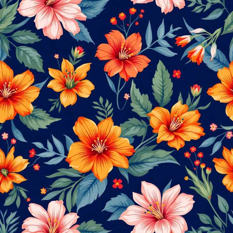
Resort and beach is the largest segment by volume. Print expectations skew toward botanical, tropical, animal, and watercolor abstracts. Density is medium to high. Color palettes lean toward warm saturated tropicals (terracotta, coral, palm green, sun-bleached gold) or oceanic cools (indigo, aqua, sea glass, sand). Repeat scale tends to be larger — a single hibiscus head might occupy 8 to 12 cm so it reads at conversational distance. Resort buyers want the suit to photograph well on a beach at 3 meters away. Subtlety loses.
Sport and active swim — surf, paddle, training one-pieces — uses a different vocabulary. Geometric, abstract, gradient, and color-blocked prints dominate. Density is lower, motifs are sharper-edged, and the palette skews higher contrast. Function reads as visual signal here: a sport suit's print should look engineered. Bauhaus-influenced grids, color-blocked panels, and crisp abstract patterns all do well. Tropical florals on a sport suit read as costume.
Competitive swim — racing, water polo, age-group club suits — is the most constrained segment. Prints are usually club identity-driven: stripes, chevrons, geometric splits, club colors arranged in panels. Density is high but motifs are simple. Print durability under chlorine matters more than nuance. Designers entering this segment usually work to a club brief rather than a pure creative one.
A useful first filter on any swimwear print concept: which of those three is this for? The answer narrows your motif library, your scale range, and your palette before you place a single object.
Which Motif Families Work Where
A rough mapping that holds up in production:
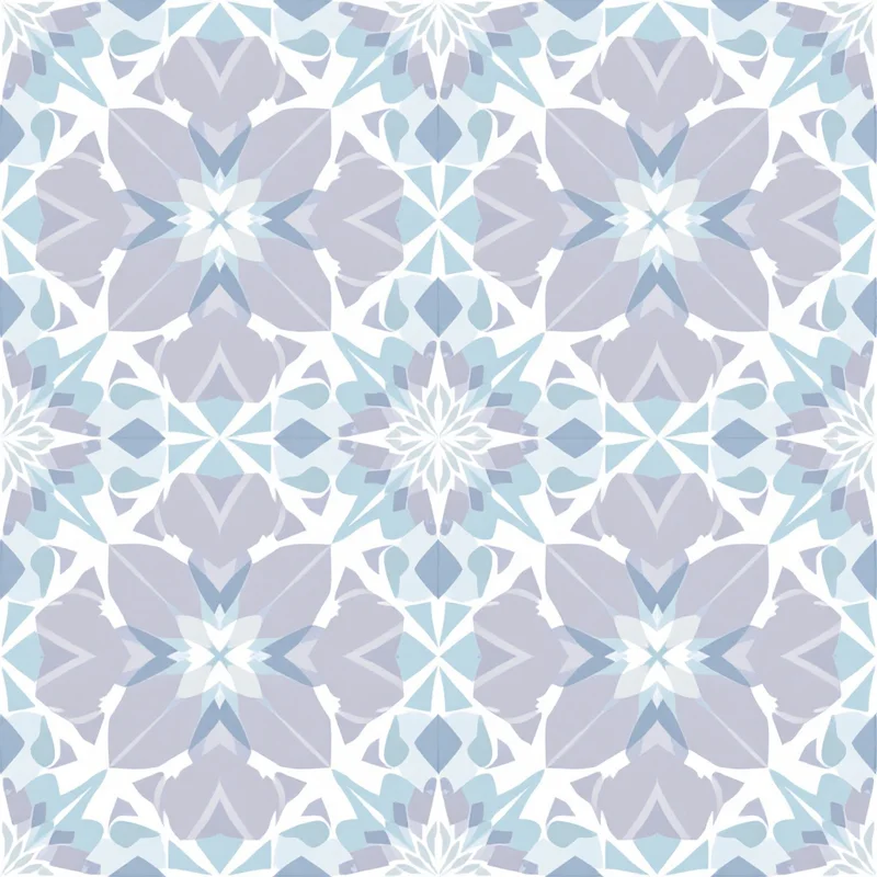
- Tropical botanical — resort, beach, vacation lines. Monstera, palm fronds, hibiscus, banana leaf, bird of paradise. Adjacent motif families like feather patterns also slot into the same resort palettes and read well at swim repeat scales. Scale large, density medium-high, palette saturated.
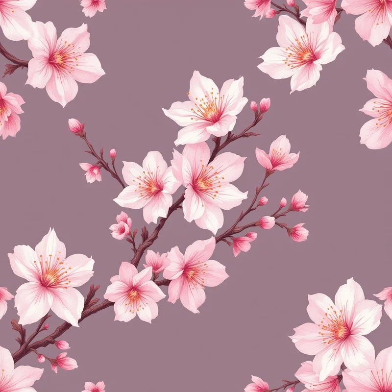
- Watercolor floral — resort and feminine sport. Loose petals, washes, edge bleed. Scale medium, density medium, palette pastel to mid-saturation. Sublimation reproduces watercolor edge softness well.
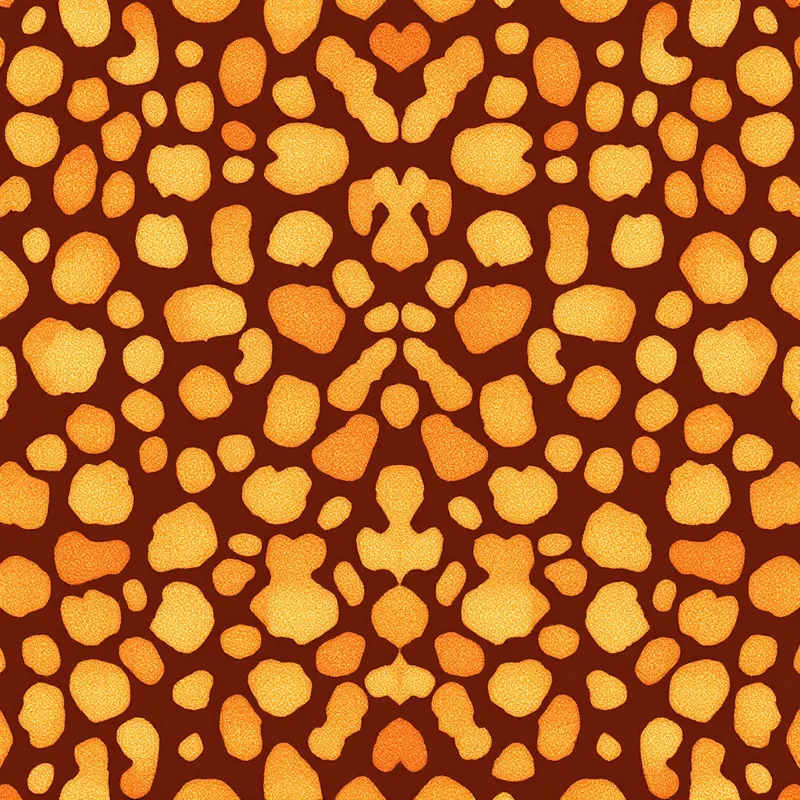
- Animal print — resort, statement swim, fashion-forward bikini. Leopard, snake patterns, zebra, peacock-feather. Scale medium, density high, palette either traditional (gold/black) or recolored (pink leopard, blue snake).
- Geometric and abstract — sport, surf, modernist resort. Bauhaus, Memphis, terrazzo, gradient blocks, color-field. Scale variable, density low to medium, high-contrast palettes.
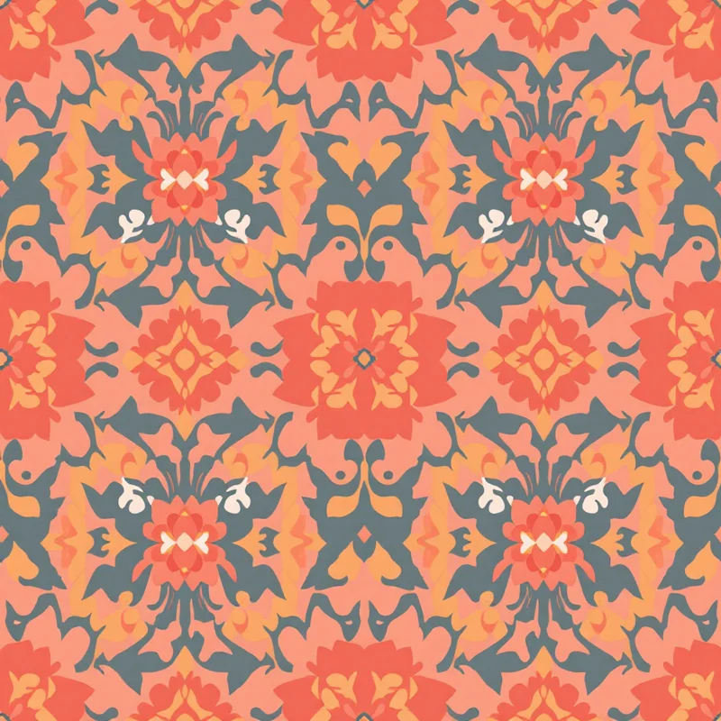
- Cultural and heritage — resort and statement, especially mid-to-luxury price points. Paisley, ikat, suzani recolored for water. These require careful color rework because traditional heritage palettes (deep indigo, oxblood, dijon) read heavy on swim; saturated tropical recolors land better.
- Tie-dye, marble, fluid abstract — broad segment overlap. Sublimation handles fluid color transitions natively, so these prints sample well with fewer surprises.
- Camo and ombré — sport and surf men's, training one-pieces, retro-inspired women's. Reads as functional and ages well across seasons.
Brands experimenting with fabric pattern generator workflows often start with a tropical botanical because it is the widest market and the most forgiving on sublimation. Animal and geometric come second once the production loop is understood.
Stretch Factor and On-Body Distortion
This is the single most under-taught topic in swimwear print design. The fabric you print onto is flat, but the suit on a body is stretched — typically 15% to 40% depending on where on the garment and what size the wearer. That stretch is not uniform. A bikini bottom side panel stretches more than the center front. A one-piece torso stretches more across the bust and hips than across the natural waist. Mens trunks stretch less overall but pull asymmetrically across the seat.
The implication: a circle printed flat becomes an ellipse on body. A 1 cm repeat becomes 1.2 to 1.4 cm in the stretched zones. Fine line work thins out and can break. Tight repeats compress and read busier.
Three working rules:
- 1Design at a slightly compressed scale. If you want a hibiscus head to read at 8 cm on body, draw it at around 6 to 7 cm flat. Tropical motifs in particular tend to look right when they are slightly smaller than intuition suggests in the file.
- 2Avoid line weights under 1.5 pt. Anything thinner risks dropping out at high-stretch zones. Outlines, stems, and decorative linework should sit at 2 pt or above on a flat repeat that will end up on a small bikini panel.
- 3Place focal motifs away from high-stretch zones. A perfectly centered face-like motif on a bikini cup is asking for distortion comedy. Symmetrical, all-over distributions hide stretch effects far better than placed focal compositions.
The same logic governs why so much luxury swim uses scattered or all-over compositions: they are stretch-tolerant. The compositions that fail on body are the ones with single hero motifs placed where the body deforms most.
Cup-and-Panel Layouts vs All-Over Prints
Swim manufacturing splits roughly into two pattern-layout strategies, and your print needs to be designed for one or the other before you begin.
All-over printing uses a single repeating tile. The print is applied to large pieces of fabric, which are then cut into garment panels. Motifs cross seams in whatever orientation the cutter places them. This is the cheapest and most common method. Repeat scale and stretch tolerance carry the visual quality.
Engineered or panel printing treats each garment piece — left cup, right cup, front bottom, back bottom — as a separately designed canvas. The print is positioned so motifs align across seams, focal elements land at intentional points, and the cups mirror each other. This costs more, requires per-size pattern files, and is the standard for premium swim where placement matters.
Most independent brands start all-over and graduate to engineered for hero styles. The decision affects your file structure from day one. An all-over print is a single seamless tile. An engineered print is a kit of placement files keyed to the manufacturer's pattern blocks.
If you are working all-over, your repeat tile should be authored at production resolution and tested for tileability before the first sample. A good ai pattern generator workflow can shortcut the early visual exploration, but the final file always wants a manual pass for tileability, edge cleanliness, and stretch-zone motif placement.
Designing for One-Pieces, Bikinis, and Mens Trunks
Each silhouette imposes different print constraints.
One-pieces have the largest continuous canvas in swim. Vertical motif flow matters because the eye reads the suit head-to-toe. Designs with strong horizontal banding can foreshorten the torso; designs with vertical flow elongate. Avoid horizontal symmetry lines that land at the natural waist on standard sizing — they create an unintended belt line. One-pieces are where engineered prints pay off most because there is room for a real composition.
Bikini tops come in dozens of cuts — triangle, bralette, balconette, halter, bandeau — and each crops the print differently. If you do not know which cut the buyer will choose, design for the smallest one (triangle), which means assuming the print will appear in narrow wedge-shaped fragments. Repeating, scattered, dense compositions survive aggressive cropping. Hero-motif compositions do not.
Bikini bottoms have side seams that stretch hard and a center-front panel that stretches less. Place denser motif activity at center, lighter activity at sides, and your print will read more balanced on body than it does in the flat file.
Mens trunks and boardshorts behave differently. The fabric is often a heavier polyester (no elastane in some boardshort constructions, which changes the sublimation behavior). The cut is more rectangular and the visible print area is large. Mens swim prints lean larger-scale, lower-density, and higher-contrast than womens — palm leaves at 20 cm rather than 10 cm, scattered rather than packed. The leg opening crops the print significantly, so bottom-edge motif density should be designed to survive cropping.
A useful exercise: take the manufacturer's flat sketch for each silhouette and digitally overlay your repeat on it. You will immediately see which cuts murder which prints.
Sublimation Bed Sizes and Tile Resolution
Sublimation paper for swim is typically 1.6 m or 1.9 m wide on a roll, fed continuously. Most commercial sublimation calendars accept rolls up to 1.9 m. The constraint on your tile size, however, is rarely the bed — it is the rendering resolution and the seamless repeat structure.
Working numbers for production-ready tiles:
- Resolution: 150 to 300 DPI at finished print size. Sublimation does not benefit from extreme DPI the way fine-line digital fabric print does, because the dye gassing softens edges slightly anyway. 200 DPI is a sensible default.
- Tile size: 50 to 60 cm square is a comfortable working size for resort patterns. Smaller tiles repeat more obviously on long garment panels. Larger tiles strain file sizes and editing tools without dramatic visual gain.
- Bleed and overlap: design with at least 1 cm of safety on every edge of your engineered panels for cutter tolerance.
- File format: TIFF at 8-bit per channel CMYK is the production standard. PSD or layered TIFF if you need to deliver editable artwork. PNG is acceptable for some smaller-volume sublimation shops but is not a true production format.
If you are using a seamless pattern maker to author tiles, export at the highest available resolution and verify the file opens cleanly in a print-production application before sending to your manufacturer.
Color Specifics That Bite
A handful of color behaviors will eat your first three sample rounds if you do not pre-empt them.
There is no true white. Everything that reads white on your file is unprinted fabric. If you change the base fabric — different supplier, different blend, different finish — your whites change.
Deep blacks bronze. A solid 100/100/100/100 black on sublimation often prints with a slight metallic sheen and bleeds at edges. Use a rich black mix (around 60/50/50/100) for solid black areas and avoid placing fine highlights inside deep black fields.
Reds and magentas over-saturate. A coral that looks soft on screen frequently prints as a clinical hot pink. Soft-proof with sublimation profiles or print the same swatch at three saturation levels and pick the one that lands.
Neighboring colors bleed slightly. Sublimation is a gas-phase process and dyes drift fractionally during pressing. Hard-edged two-color motifs with a thin separation can lose the separation. A 1-pt neutral keyline between adjacent high-saturation colors keeps the design crisp.
Pastels can look chalky. Sublimation pastels lose vibrancy compared to digital cotton printing. If your concept depends on a delicate pastel range, mock it on sublimation early — do not assume it will translate.
How to Test Print Sizing on a Body Before Production
The cheapest way to validate scale and motif placement is the strike-off body test. Order a sublimation strike-off — usually a 0.5 m by 1 m piece of fabric printed with your tile — and physically lay it on a body, dress form, or yourself. Look for three things:
- 1Motif scale at conversation distance. Step back 3 meters. Does the print read as the motif you designed, or as a noise field? If individual elements disappear, scale up by 30% to 50% and reprint.
- 2Stretch distortion. Pull the fabric across a body in the same direction the suit will pull. Do circles still read as circles? Do lines still hold? Do focal motifs still feel intentional?
- 3Skin-tone interaction. Hold the print against the range of skin tones you expect to sell into. Some palettes that look beautiful in isolation read jaundiced or greenish against certain skin. This is especially true for pale yellows, mint greens, and warm beiges.
A second cheap test is the photo test. Drape the strike-off, photograph it under daylight with a phone camera, and look at the result on a small screen. Phone-screen reduction approximates what your customer sees on the e-commerce thumbnail, and many prints that read brilliantly in real life turn to mud at thumbnail size. Adjust contrast and motif separation accordingly.
Only after at least one strike-off cycle should you commit to a full sample run. The cost of a 0.5 m strike-off is rounding error against the cost of an unsellable first production run.
Bringing It Together
Swimwear print design rewards designers who treat the print and the production as one decision rather than two phases. The motif vocabulary, the palette, the scale, the layout type, the file resolution — every choice has a sublimation reason behind it, and every choice has a body-on-stretch reason behind it. Designers from broader fashion print design backgrounds usually have the visual instincts and need to layer in the technical constraints. Designers from technical apparel backgrounds usually have the production instincts and need to push their motif and palette range.
For the first few briefs, lean on segment conventions to choose your motif family, work in CMYK from the start, design tiles in the 50 to 60 cm range, place focal motifs away from high-stretch zones, and budget for at least one strike-off round per print. After ten or so samples through the same factory, you will have an internal sense of how that supplier's sublimation behaves, and your hit rate on first samples will climb.
Designers building out a swim capsule alongside ready-to-wear can carry print files between segments, but the swim versions almost always want a palette recolor and a scale adjustment. A print authored for clothing design on cotton is rarely production-ready for swim without rework. Treat the swim version as its own deliverable. Designers expanding from print-on-demand into private-label swim can read more about that transition in the guide to custom clothing fabric without a mill, and the broader textile workflow in textile design and surface pattern design reference material.
Swim is a small canvas with disproportionate visual stakes. The suit will be photographed, posted, and judged in a tighter feedback loop than almost any other garment category. Build the production-aware design discipline early and the surface aesthetics get easier season by season.
Explore related pattern styles

