


Nobody buys a dress print in the abstract. They buy it for a Saturday market, a friend's wedding, a Tuesday meeting. That's why the cleanest way to forecast dress prints for 2027 is by occasion, since the same floral can be a right answer for one and wrong for another.
Treat each section as a direction to watch, not a measured fact.
Wedding guest and occasion dresses: florals go darker and looser
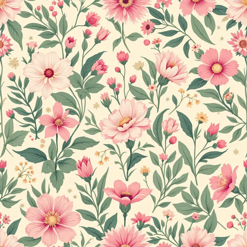
Occasion dressing is where the floral is least likely to be replaced, but expect its look to move. The pastel ditsy that has defined wedding-guest racks looks set to give ground to painterly florals on dark grounds: dahlias and peonies on aubergine (#3E1F3B), deep green or midnight, with a wet-on-wet watercolor edge instead of a crisp outline.
Scale goes up. A bias-cut midi or a long wrap dress has room for a flower close to a hand-width across. If a print will be photographed at an event, give it one clear focal flower per hip-to-hem stretch, with smaller buds filling the space around it.
Daytime dresses: dots and checks, bigger and warmer
Easy dresses for markets, picnics and weekends are where polka dots and gingham tend to live. The direction to watch is scale and color: dots in the half-inch to one-inch range (1.5 to 2.5 cm) instead of pin dots, and gingham in warm, off-standard colors, such as butter yellow with clay, or sage with cream, rather than red and white.
A few options worth testing:
- Irregular hand-cut dots with slightly wobbly edges, which read as handmade.
- Two-tone dot, where a larger dot sits over a smaller one in a close color.
- Gingham with one faded stripe line, so the check looks lived-in.
- Dots and checks together, in the same palette, for a mixed-print dress.
For the building blocks, the polka dot pattern design guide and the gingham pattern design guide cover scale and spacing.
Workday dresses: quieter and more structured
A work dress cannot compete with a spreadsheet. The 2027 direction here looks quieter: micro-prints that blur into a solid at a conference table, small geometric foulards, thin stripes with a tonal ground, and abstract brushwork in two colors. Keep the contrast low and the repeat small; a pattern that reads from across a room is the wrong tool for an office.
Evening dresses: texture over motif
Satin, jacquard and velvet already carry shine, so the print has to stay out of the way. Tone-on-tone is the strongest bet: a glossy leaf outline in black on black, or a damask-style floral woven or printed in the same hue as the fabric. If you want a visible motif, keep it large and confined to one area of the dress, such as a shoulder or a hem.
How cut changes the print
Dress silhouette matters as much as the motif itself.
| Cut | What happens to the print |
|---|---|
| Gathered or tiered skirt | Print compresses; choose a larger motif than you think you need |
| Bias cut | Print stretches on the diagonal; avoid stripes and checks unless you plan for it |
| Smocked or shirred bodice | Fine prints blur; bold, simple shapes survive |
| Wrap dress | Two panels cross; avoid directional motifs that end up sideways |
| A-line | Most forgiving; a repeat works almost anywhere |
Placement is the other lever. An engineered print puts a bigger flower border along the hem and keeps the bodice quieter, which guarantees the print lands where you want it. It costs more yardage and more planning, but it is the clearest sign that a dress was designed rather than cut from a roll.
Where to go next
Most of these directions are updates of established looks, which is typical for dress prints. If your dresses are bound for holiday wear, see the resort wear forecast.
Try a few before cutting
To see how a floral, dot or check holds up at different scales, write it out in Describe It, for example "wet-on-wet dahlias on aubergine, large scale". A seamless tile takes about 20 seconds in Pattern Weaver, and new accounts get 5 free credits.
Explore related pattern styles