


Polka dots are deceptively simple. The pattern is, on its surface, nothing more than circles repeated across a field — yet within this simple structure sits one of the most variable and commercially successful pattern vocabularies in surface design. Dot scale, dot density, dot arrangement, dot rendering style and palette all interact to produce patterns that span from refined sophistication to playful celebration, from classical reference to contemporary statement. The pattern has anchored fashion across many decades and continues to support significant commercial presence in home decor, accessories, paper goods and many other applications.
Understanding polka dot structure — the relationships between scale, density, arrangement and rendering — is what separates polka dot designs that read as deliberate and commercially strong from designs that read as generic or amateurish. This guide examines the underlying anatomy and the strategic decisions that produce successful contemporary polka dot work.
The Variables
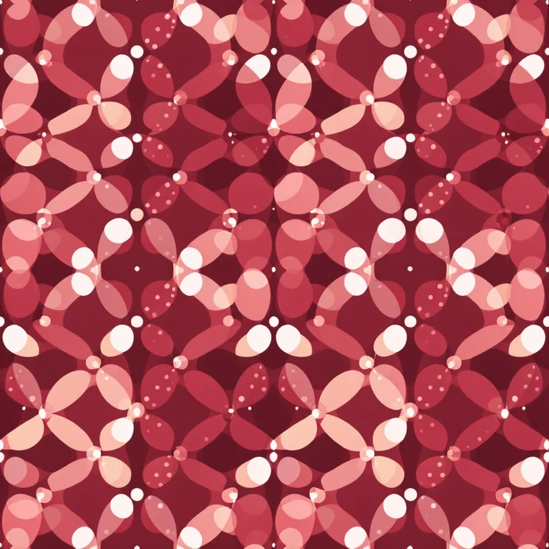
Polka dot patterns are defined by four key variables that designers should consider deliberately. Dot size — the absolute diameter of individual dots — is the most obvious variable but interacts with the others to produce significantly different effects. Dot density — the spacing between dots — affects how the pattern reads at viewing distance. Dot arrangement — the grid logic by which dots are positioned — affects the underlying rhythm of the pattern. Dot rendering — how the dots are visually executed (flat, gradient, painted, embroidered, etc.) — affects the pattern's surface character.
These four variables produce a multi-dimensional design space. Small dots in dense arrangement on flat field produce one effect. Large dots in sparse arrangement with painterly rendering produce a completely different effect. Both can be commercially successful, but they serve different applications and customer segments.
Scale Strategy
Micro polka dots — individual dots roughly 1 to 3 millimetres — read as textile texture rather than as distinct pattern at typical viewing distances. This scale is traditional for fine menswear shirting, refined fashion fabrics and applications where the pattern serves as supporting texture rather than as decorative statement.
Small polka dots — individual dots roughly 4 to 8 millimetres — read as a distinct but quiet polka dot pattern. This scale is traditional for casual shirting, summer dresses, children's wear and various everyday fashion applications.
Medium polka dots — individual dots roughly 10 to 18 millimetres — read as a recognisable decorative polka dot pattern. This scale is typical for accessories, home decor textiles, contemporary fashion statement pieces and gift wrap.
Large polka dots — individual dots roughly 20 to 40 millimetres — read as a statement pattern with explicit polka dot character. This scale is typical for contemporary statement fashion, oversized accessories, contemporary home decor pieces and contemporary wallpaper applications.
Oversized polka dots — individual dots above 50 millimetres — function almost as decorative motif rather than as textile pattern. This scale is typical for contemporary wallpaper, statement upholstery, gift wrap and design-forward applications.
The scale choice should match the application context. A polka dot blouse benefits from small or medium scale; a polka dot wall feature benefits from large or oversized scale. Mismatched scales produce designs that look awkward at the actual viewing context.
Density and Arrangement
Polka dot density — the spacing between dots — significantly affects the pattern's character. Tight density with dots close together produces busy, energetic patterns. Loose density with significant negative space between dots produces calm, sophisticated patterns. Both can succeed commercially but suit different customer preferences and applications.
The arrangement grid also affects character. Regular square grid arrangement produces patterns with strict rhythmic structure. Half-drop offset arrangement produces patterns with subtle visual movement. Brick offset arrangement produces patterns with clearer horizontal flow. Random arrangement (or randomised-feeling arrangement that actually follows underlying logic) produces patterns with organic visual character.
Combinations of these variables produce distinctive patterns. Small dense regular grid produces patterns that read as textile texture. Medium loose half-drop produces patterns that read as classical polka dot. Large sparse random produces patterns that read as contemporary statement.
Contemporary polka dot design has explored significantly more variation in arrangement than traditional polka dots typically used. Hand-drawn polka dots with intentional irregularity in size, position and rendering produce designs with handcrafted character. Multi-scale polka dot designs with small, medium and large dots mixed together produce designs with rhythmic visual variety. Coloured polka dots with palette variation across the dots produce designs with significantly more colour interest.
Palette Strategy
Traditional polka dots use single-colour dots on contrasting field. Black dots on white, white dots on black, white dots on red, red dots on white — these high-contrast traditional palettes provide the foundational vocabulary of polka dot design.
Contemporary palette variations extend significantly beyond the traditional vocabulary. Tonal polka dots — dots and field in different values of the same colour — produce patterns with subtle sophistication that work in contemporary home decor and refined fashion. Coloured polka dots on neutral field — sage green dots on cream, terracotta dots on warm white — produce patterns with grounded contemporary character.
Multi-colour polka dots use several colours of dots across the pattern, producing designs with playful or celebratory character that work particularly well in children's products, gift wrap and casual contemporary applications.
Reverse-out polka dots — coloured field with white or pale dots — produce patterns with strong colour statement and good commercial presence in contemporary applications.
Painterly polka dots — dots rendered with brush texture, watercolour wash or other organic rendering rather than as flat circles — produce designs with significantly different character than flat polka dots. These patterns work particularly well in contemporary art-influenced applications and in casual whimsical positioning.
Contemporary Applications
Fashion textiles use polka dots across all seasons, all gender positioning and essentially every fashion category. Blouses, dresses, skirts, accessories, swimwear, formal wear and children's wear all support polka dot designs at various scales and palettes. The category supports both classical interpretations and contemporary variations.
Home decor textiles use polka dots across throw pillows, drapery, table linens, bedding and accessories. The category supports both traditional small-scale polka dots and contemporary oversized statement applications.
Wallpaper applications include both small-scale traditional polka dot wallpaper and contemporary oversized statement wallpaper. The latter has grown substantially as design-forward homeowners use polka dot wallpaper for distinctive accent applications.
Stationery and paper goods use polka dots extensively across casual, children's and contemporary positioning. Gift wrap, greeting cards, journals and planners in polka dot designs have consistent commercial presence.
Children's products use polka dots as a foundational vocabulary. Bedding, clothing, nursery decor, gift items and toys in polka dot designs have very strong commercial presence in children's markets.
Branding and identity design uses polka dots in contexts where playful, accessible or friendly brand positioning is desired. The pattern's cultural associations with celebration and warmth support brand vocabularies built on approachable visual statements.
Cultural Associations
Polka dots carry specific cultural associations that affect contemporary design choices. The pattern emerged into European fashion in the mid-nineteenth century, named after the popular polka dance of the same era. The pattern's strong association with mid-twentieth-century fashion — rockabilly aesthetic, retro 1950s positioning, vintage pin-up styling — affects how contemporary polka dot designs are perceived.
Designers building polka dot collections should consider whether they are working within these vintage and retro associations or pushing toward contemporary positioning that distinguishes from them. The former vocabulary is well-established commercially; the latter requires explicit design choices to avoid reading as retro reference.
The contemporary minimalist polka dot vocabulary — small to medium polka dots in sophisticated palette with refined rendering — represents one productive contemporary positioning. The contemporary statement polka dot vocabulary — oversized polka dots in confident palette with bold rendering — represents another. Both depart from the vintage associations while still drawing on polka dot fundamental visual logic.
Common Pitfalls
Several pitfalls recur in contemporary polka dot design. The first is failing to commit to a clear scale and density strategy. Designs that fall in unclear middle territory between small/dense and large/sparse can read as muddled rather than as deliberate. Choosing a specific position along these variables and committing to it produces designs with clearer commercial identity.
The second pitfall is poor execution of the rendering style. Flat polka dots require precise execution — circles that are not actually circles, or that have slightly inconsistent sizes, read as amateurish. Painterly polka dots require enough rendering character to read as deliberate rather than as poor execution of flat circles.
The third pitfall is poor palette commitment. Polka dot palette choices should be deliberate. High-contrast traditional palettes need to commit to the contrast clearly. Tonal sophisticated palettes need to commit to the subtlety. Designs that try to split the difference often read as confused.
The fourth pitfall is misaligned arrangement. Half-drop polka dots need to half-drop precisely; random polka dots need to feel intentionally random rather than careless; regular grid polka dots need to align precisely. Inattentive arrangement produces patterns that look amateurish.
Polka dots reward designers who understand that the simplicity is deceptive. The underlying decisions about scale, density, arrangement, palette and rendering all matter, and the patterns that succeed commercially are built on deliberate choices about each of these variables. The pattern's enduring commercial presence across many decades reflects this underlying complexity rather than contradicting it — the simplicity of the surface allows the underlying design intelligence to communicate clearly when the choices are made well.
Explore related pattern styles
Patterns for


