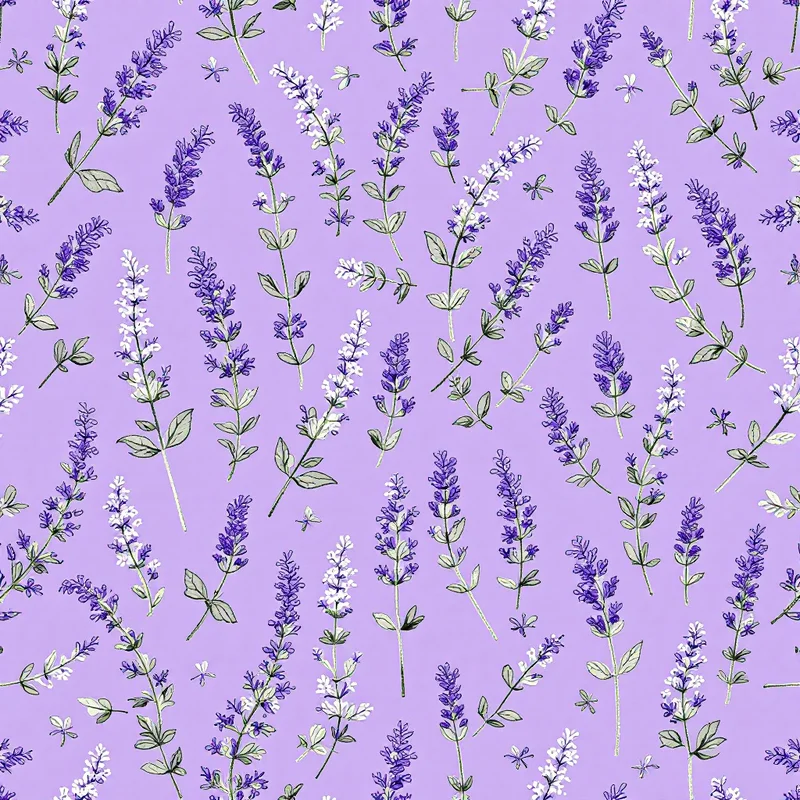
Leaves do the quiet work in a collection. Flowers get the attention, but foliage prints are what people hang on a wall for years, wear to the office and put on sheets. The direction heading into 2027 is toward foliage with a recognizable shape, tonal color and a drawing style that feels like a specimen sheet, not a stock-art jungle.
This post is about leaves and branches only. For flowers, see our floral pattern forecast.
Leaves by shape
A useful way to plan a foliage collection is to choose leaves for their silhouette. Different shapes behave differently in a repeat.
| Shape | Examples | What it does in a pattern |
|---|---|---|
| Fronds and feathers | Ferns, asparagus fern | Fine texture, airy, good for filling space |
| Long strap leaves | Eucalyptus branches, olive, bamboo | Directional, creates rhythm and diagonals |
| Fan and lobed | Ginkgo, maple, oak | Strong silhouettes, good for scattered layouts |
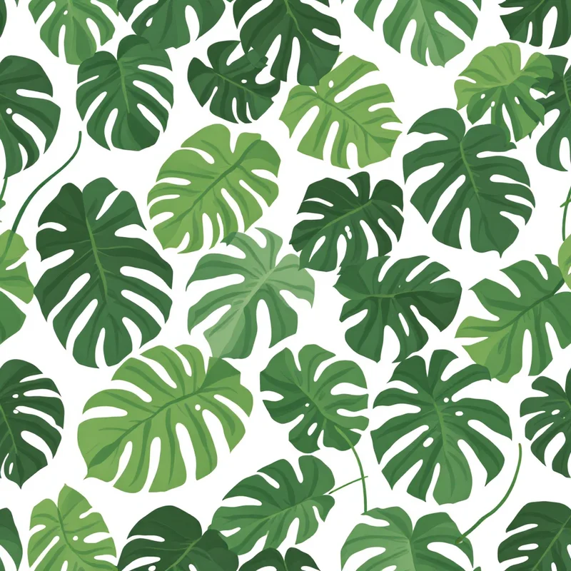
| Big and bold | Monstera, banana, palm | Statement scale, wallpaper and upholstery |
| Fine grasses | Wheat, pampas, meadow grass | Movement, works behind or between larger motifs |
The fern patterns and eucalyptus patterns categories are good starting points for the first two.
Greens are not one color
The most common mistake in foliage prints is using one green. Natural foliage mixes cool and warm greens, and a print looks more convincing with a deliberate set.
- Sage and eucalyptus: #9CAF9A, #7A9A8C, #C9D3C1
- Moss and olive: #7B8445, #5A6232, #A8A655
- Deep forest: #20372B, #2F5240, #163026
- Warm accent: #C4A35A (dried ochre) or #B5654A (autumn rust)
A good formula is one dark green for the shapes in front, two mid greens for the main field, one pale green for background shapes and one accent color used sparingly. For more on single-hue palettes, our sage green and forest green guides help.
Rendering styles
- 1Specimen-style line drawing. Fine ink line on cream, like a page from a herbarium. Suits stationery, wallpaper and linens.
- 2Cyanotype-like. White leaf silhouettes on deep blue, referencing the sun-printing process in which leaves are laid on treated paper and exposed to light. It creates a white-on-blue look that suits cushions, tote bags and wallpaper.
- 3Block-printed leaves. Slightly uneven fills, off-register color and visible texture. See our block printing pattern design guide.
- 4Tonal leaf-on-leaf. Leaves in three close greens on a green ground, with almost no outline. Quiet and architectural.
- 5Pressed-leaf collage. Leaves drawn translucent and overlapping, as if pressed under glass.
Scale and layout
- Small foliage sprigs at 1 to 2 inches (2.5 to 5 cm) make an easy ditsy for shirting, kids' and packaging
- Mid-scale branches at 4 to 8 inches (10 to 20 cm) work for dresses, bedding and cushions
- Large leaves at 12 inches (30 cm) or more suit wallpaper, upholstery and curtains
For layouts, consider a tossed scatter at different angles for apparel and a vertical stem or trellis arrangement for wallpaper. Branching motifs often look best when every branch leans the same overall direction, with a few reversals to break rigidity.
Foliage as a ground
A less-obvious use for leaves is as a background for bolder motifs. A tonal fern at low contrast, behind a large bloom or a bird, gives a print depth without competing. This works well on wallpaper and in the dense-ground approach covered in our maximalist interior forecast.
Tropical leaves, quieter
Tropical palms and monstera are staples. The shift to watch is a more restrained version: smaller leaves, monochrome green on cream, or line-only drawings. The tropical pattern design guide covers the classic version and its history, and the botanical patterns category holds the temperate and tropical options together.
Products that suit foliage
| Product | Foliage direction |
|---|---|
| Wallpaper | Large-scale ferns or ginkgo, tonal |
| Bedding | Olive branch on cream or sage |
| Dresses | Mid-scale eucalyptus in muted greens |
| Stationery | Specimen-style line drawings |
| Tote bags | Cyanotype-like leaf silhouettes |
| Kitchen textiles | Herb sprigs, olive and bay |
What to avoid
Foliage is easy to make look generic. Avoid identical copied leaves, uniform spacing and neon-bright greens. Vary leaf size and rotation, add a few curled or half-hidden leaves, and let some leaves cross the tile edge so the repeat is hidden.
Trying a foliage print
Try "pressed olive branches in sage and moss green on a cream ground, fine line detail" in Describe It, or choose a style from Browse Styles. Each pattern comes back as a seamless tile in about 20 seconds, and the Tiling Fixer repairs edges if a branch gets cut off at the border. New accounts get 5 free credits.
Explore related pattern styles