
A print file cannot be sustainable by itself. A pattern is just an image until it sits on a fiber, in a dye bath or printer, and on a product someone keeps or throws away. That's worth stating first, because it is easy for a green palette and a leaf motif to carry more promise than the product delivers.
Still, designers do make choices that change what happens downstream. These are the directions to watch for 2027, and an honest way to talk about them.
What a designer can influence
Fewer colors per print
In screen printing, each color generally needs its own screen, so a four-color print is simpler to produce than a twelve-color one. A tighter palette also makes a design easier to color-match from batch to batch. This is a design decision you control directly: try building a print in three or four colors and let value and scale do the rest. Our pattern color palette guide has methods for limited palettes.
Undyed and natural grounds
Letting the fabric's natural color show as the ground means less of the surface needs coverage. A design that uses the cloth color as one of its colors, such as indigo-style marks on a natural linen ground, is a practical way to do more with less.
- #EDE6D6 undyed linen
- #D9CDB4 oat
- #C8B898 raw cotton
- #2F4A6B indigo motif
The linen patterns category shows linen-textured grounds.
Repeat sizes that fit the fabric
If a repeat doesn't divide neatly into the fabric width, the leftover has to be cut away. Ask your printer for the printable width, then size your repeat so a whole number fits across. This is one of the most overlooked steps in production.
Placement prints and nesting
A placement print puts a motif on a specific part of a garment or product, for example a border at a hem or a motif at a cushion center. Planned well, the pieces can be arranged tightly on the fabric, which reduces offcuts. For larger runs, ask your factory how they lay out pieces before finalizing the artwork.
Timeless over trend-chasing
A print that stays wearable for years has a better chance of being kept. Some motifs that tend to outlast a single season: stripes, simple checks, botanical drawings and heritage florals. A forecast such as our home textile trends can help you pick the color, but classic structure under a current color is the longer-lasting approach.
Made-to-order thinking
If you sell through print-on-demand, products are produced after the order, not before, which avoids unsold stock. That's a structural advantage, though it doesn't make the fiber or inks any greener. See our print-on-demand pattern guide.
What a designer cannot control alone
| Factor | Who decides |
|---|---|
| Fiber type (organic cotton, linen, polyester) | Fabric supplier |
| Dye and ink chemistry | Mill or printer |
| Water and energy use | Mill or printer |
| Certifications | Independent auditors |
| How long the product is used | The customer |
Look to your printer for specifics, and ask for documentation. Our digital textile printing guide has a section on water, ink and certifications.
Natural-dye palettes: the look versus the method
Natural dyes such as indigo, madder, weld and walnut give a particular range of muted, slightly uneven color. Many designers now draw palettes inspired by them. It's fine to design with that look, but be clear:
- Natural-dye inspired means the colors resemble natural dyes
- Naturally dyed means plant or other natural dyes were actually used, and you can say which ones and who did it
Mixing the two up is a common form of greenwashing. For the aesthetic side, see our wabi-sabi pattern trend piece.
Honest wording
Words to avoid unless you can back them up: "eco-friendly", "sustainable", "green", "natural", "planet-friendly". They are vague and can be misleading.
Words that are safer when true:
- 1"Printed in three colors on undyed linen"
- 2"Made to order"
- 3"Designed to be worn across seasons"
- 4"Repeat sized to fit the fabric width"
State what you did, not what it means for the planet.
Motifs that go with the movement
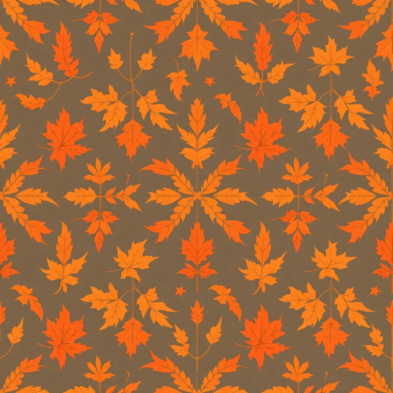
Botanical themes are the usual choice: leaves, grasses, seed heads, pressed flowers. They're not more sustainable than other motifs, but they match the muted palettes and handmade textures associated with the movement. See the botanical patterns category, and the earth tone patterns category for palettes.
A practical checklist
- Use three to five colors per print
- Let the ground color work as a design color
- Ask your printer for the printable width and size the repeat to match
- Draw a placement version with nesting in mind
- Choose a structure that will still look good in five years
- Write product copy that states facts, not feelings
Trying a limited palette
Describe It lets you set the palette in your own words: "three-color botanical block print in indigo and madder on undyed linen, hand-printed texture". Each pattern arrives as a seamless tile in about 20 seconds. New accounts get 5 free credits.
Explore related pattern styles