
Block printing is one of the oldest pattern production techniques in textile history. Wooden, metal or composite blocks carved with motif designs are dipped in dye and stamped onto fabric to produce repeating patterns across the surface. The technique has been refined across many cultural traditions over many centuries — Indian block printing centred in Rajasthan and Gujarat, Japanese katagami stencil-printed textiles, European resist-printed cottons, African mud cloth — and continues to support both traditional artisan production and contemporary commercial design influenced by the visual conventions.
For contemporary practitioners of textile design and surface pattern work using modern textile designer tools, block print aesthetic provides a distinctive vocabulary that translates effectively into digital work. The hand-stamped character, the slight registration variation, the limited palette structure and the considered motif vocabulary all contribute to designs with handmade authenticity that resonates in contemporary markets. This guide examines both the traditional block printing aesthetic and the digital design strategies that produce successful contemporary commercial work.
The Indian Block Print Tradition
Indian block printing — particularly the traditions centred in Rajasthan (Sanganer, Bagru, Jaipur) and Gujarat — represents one of the most refined block printing vocabularies in the world. The tradition involves wooden blocks carved with intricate motifs, used by skilled printers to produce vibrant patterns on cotton, silk and other natural fabrics.
The visual conventions of Indian block printing have evolved over centuries of refined practice. The motif vocabulary draws on botanical references (flowers, vines, leaves), geometric forms (medallions, borders, abstract shapes), animal references (birds, elephants, peacocks), and cultural and religious motifs. The compositions typically use a structured logic with central focal motifs surrounded by supporting elements and decorative borders.
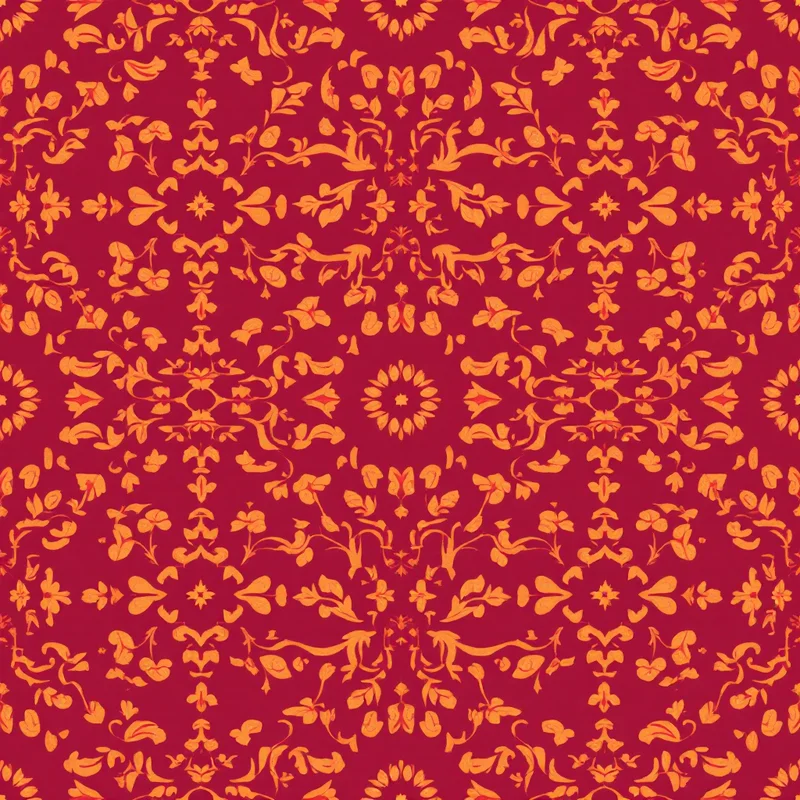
The palette conventions reflect both the cultural traditions and the natural dye sources historically available. Madder root produces the distinctive Indian red. Indigo produces deep blues. Pomegranate produces yellows. Iron oxide produces the characteristic black-grey of mordant prints. The combination of these natural dyes produces palettes with both vibrancy and depth — colours that have presence and character distinct from synthetic dye palettes.
The technical execution involves block carvers and printers working together. The blocks are carved by skilled craftspeople from teak or sheesham wood, with the carving process taking days or weeks per block depending on complexity. The printers stamp the blocks onto the fabric with practised skill, producing repeating patterns through deliberate sequential application.
The visual evidence of the hand-stamped technique is essential to the aesthetic. Slight variation in registration (where one stamp meets another), slight variation in ink coverage (lighter and heavier areas within each stamp), small breaks and irregularities in the motif edges — all of these read as authentic block print rather than as flaws.
The Japanese Tradition
Japanese block printing tradition includes both katazome (stencil printing using paste resist) and various wood block techniques used for textile production. The visual conventions emphasise restraint, considered colour relationships and refined motif execution. The palette tends toward limited colour ranges — often indigo on natural ground, or sometimes accent colours used sparingly.
The motif vocabulary in Japanese textile printing draws on nature references (waves, clouds, plants, animals), seasonal references (cherry blossoms for spring, maple leaves for autumn) and decorative geometric forms with cultural significance. The compositional logic often uses asymmetric balance and considered negative space — a different aesthetic logic than the more densely populated Indian block print compositions.
For contemporary designers, both traditions offer rich reference. Indian block print provides vibrant multi-colour vocabulary with structured composition. Japanese tradition provides restrained sophisticated vocabulary with considered negative space.
Digital Interpretation Strategies
Producing convincing block print aesthetic in digital textile printing work involves deliberately simulating the visual character of the traditional medium. Several techniques contribute to successful interpretation.
Working with motifs that have block-carved character is foundational. Block-carved motifs are typically simplified compared to their printed-illustration equivalents — fewer fine details, more confident outlines, internal structures that emphasise positive and negative areas rather than continuous tonal modeling. Digital interpretations should embrace this simplification rather than fighting it.
Including slight registration variation between repeating motifs simulates the hand-stamped character. Perfect mechanical registration reads as digital reproduction; slight variation in position and rotation reads as block print authenticity. This variation should be subtle — visible on careful inspection but not overwhelming.
Adding textural variation within solid colour areas simulates the ink coverage variation of hand-stamped printing. Slight breaks, occasional dropouts, areas with lighter or heavier saturation all contribute to authentic block print character. The textural variation should respect the underlying motif structure rather than obscuring it.
Working with palette structures that respect block print conventions matters. Limited colour palettes — typically two to five colours including any structural lines — produce designs with traditional block print character. Each colour should be applied as a flat field rather than as continuous tonal gradient.
Using palette colours that reference traditional dye sources adds authentic character. Madder red, indigo blue, ochre yellow, iron grey, sage green and earth tones all carry the visual character of natural dye palettes.
Working with motif scale that respects block printing realities matters. Traditional blocks are typically 10 to 30 centimetres in major dimension, producing motifs at corresponding scale on the printed fabric. Patterns at this scale tend to read as authentically block printed; patterns at significantly different scales may lose the connection to the traditional medium.
Motif Vocabulary
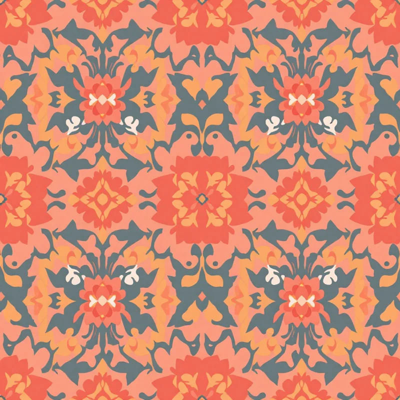
Botanical motifs are central to block printing tradition across cultures. Floral compositions, leaf vocabulary, vine and scroll patterns, and abstract botanical references all translate effectively into block print aesthetic. The simplification required by block carving makes botanical motifs read with strong silhouette and clear graphic identity.
Geometric motifs work effectively in block print, particularly the structured ornamental geometry of Indian tradition. Medallions, decorative borders, abstract geometric tessellations and ornamental geometric vocabulary all support block print interpretation.
Animal motifs work well in block print, particularly the traditional vocabulary of birds (peacocks, parrots, songbirds), elephants, abstract animal forms and stylised wildlife. The simplification required by block carving emphasises strong silhouette identity.
Cultural and ornamental motifs from specific traditions provide rich reference vocabulary. Indian paisley boteh works effectively in block print interpretation. Persian and Mughal decorative vocabulary translates effectively. Japanese seasonal motifs translate well into block print aesthetic.
Repeating border designs and frame compositions provide useful structural vocabulary for block print interpretation. The historical use of border blocks in traditional textile production provides reference for contemporary designs that use border elements as compositional anchors.
Palette Strategy
Limited palette discipline is essential to authentic block print character. Designs using two to five colours typically read as authentic; designs using significantly more colours start to lose the connection to traditional production.
Specific palette traditions provide useful reference. Indian block print red (slightly orange madder red) with cream produces classical Indian print character. Indigo blue with cream produces traditional Japanese and Indian indigo print character. Ochre and brown with cream produces traditional natural dye character. Multi-colour palettes using these traditional colours together (red, indigo, ochre on cream) produce vibrant traditional Indian block print character.
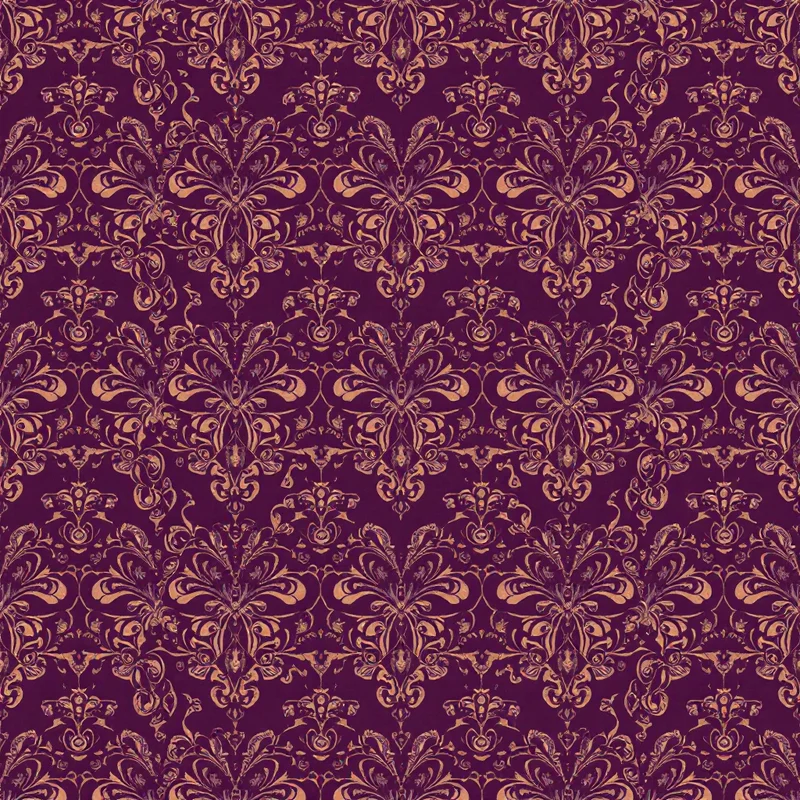
Contemporary palette variations open up significant design possibilities while preserving block print authenticity. Sage and terracotta on cream produces contemporary natural-character palette. Deep navy and forest green on cream produces contemporary sophisticated palette. Burgundy and gold on cream produces premium contemporary palette.
The substrate colour matters significantly. Pure white substrate reads as cool and modern; warm cream substrate reads as traditional and authentic. Most successful block print aesthetic designs use cream or natural substrate rather than pure white, because the warmer substrate enhances the traditional character.
Contemporary Applications
Home decor textiles use block print aesthetic extensively. Throw pillows, drapery, table linens, bedding, accessories and statement pieces support significant block print influence across many positioning categories. The category supports both literal Indian block print interpretation and more sympathetic contemporary work.
Wallpaper applications include block print aesthetic in both traditional and contemporary positioning. The handcrafted character provides distinctive alternative to perfectly digital wallpaper aesthetics.
Fashion textiles use block print aesthetic in resort wear, contemporary fashion, accessories and seasonal collections. The category supports significant variation from literal cultural reference to abstract block-influenced contemporary work.
Stationery and paper goods use block print aesthetic for premium positioning. Gift wrap, journals, greeting cards and decorative paper products with block print character carry strong commercial presence.
Respectful Cultural Reference
For designers drawing on specific cultural block printing traditions — particularly Indian and Japanese — the considerations of cultural respect discussed in earlier guides apply. Acknowledging the source tradition specifically rather than treating block print as a generic aesthetic provides appropriate attribution. Supporting originating producers materially through fair-trade arrangements and licensing supports the living traditions.
Avoiding direct copying of specific traditional designs while drawing on the broader visual logic of the tradition produces work that respects the source while remaining clearly original.
Block print aesthetic rewards designers who study the traditional vocabulary and translate its visual logic deliberately into contemporary digital work. The handcrafted character, limited palette structure, refined motif vocabulary and considered cultural references all contribute to commercial work with distinctive appeal in contemporary markets seeking authenticity and considered craft tradition. The investment in understanding the source traditions produces commercial work with depth and integrity that more superficial interpretations cannot match.
Explore related pattern styles
Patterns for


