
Forest green has quietly become one of the most commercially important palette anchors in contemporary surface pattern design. The colour family — encompassing deep forest, hunter green, pine, emerald, bottle green and various adjacent variations — sits at the intersection of botanical authenticity, sophisticated colour positioning, and the broader cultural movement toward nature-anchored design. A pattern built around forest green tends to read as grounded, considered and enduringly relevant in ways that more trend-specific palettes do not.
This guide focuses on how to design seamless patterns that use forest green as a dominant or anchoring colour. The principles apply across the major commercial pattern categories and across motif types from realistic botanicals through abstract compositions to cultural pattern vocabularies.
Understanding Forest Green
Forest green sits in a specific position within the green colour family. It is deeper than mid-saturation greens, less yellow than olive, less blue than emerald, and more saturated than sage. In hex code terms, classic forest green sits near #228b22, hunter green near #355e3b, deep forest near #2d4a3b and pine near #01796f. The specific hex value affects how the colour interacts with other palette colours and how it reads across application contexts.
The key characteristic that makes forest green commercially powerful is its perceived authenticity. The colour reads as connected to actual forest, woodland and natural plant life rather than as a fashion green or an artificial green. This authenticity provides emotional weight that pure synthetic-feeling greens cannot match.
Forest green is also distinguished by its tonal weight. The colour sits at low to medium lightness values, which gives it visual presence as a dominant palette colour and allows it to function as a grounding base for surrounding palette elements. Lighter greens — mint, pistachio, sage — work as accent colours but rarely as palette anchors. Forest green works in either role and works as palette anchor with particular power.
Why Forest Green Is Commercially Successful
The contemporary commercial success of forest green builds on several converging trends. The broader movement toward biophilic design — bringing natural elements and natural colour into interior environments — has elevated all deep botanical greens but particularly forest green. The reaction against the cold-grey palette dominance of the previous decade has driven design toward warmer, more emotionally resonant colour anchors. Forest green satisfies the warmth craving without abandoning sophistication.
Forest green also has unusual cross-segment commercial flexibility. The colour works in masculine and feminine positioning equally well. It works in vintage and contemporary contexts. It works in luxury and accessible price points. It works in interior, fashion, paper goods and accessories. Few palette anchors carry this much cross-category versatility, and the commercial categories where forest green appears as a primary palette anchor continues to expand.
The third factor is the emotional resonance. Forest green carries associations with growth, stability, traditional craft, considered taste and connection to the natural world. These associations translate into emotional appeal across many customer segments and gift contexts.
Successful Palette Structures
Several palette structures consistently support successful forest green pattern designs. The first is forest green with neutrals and natural texture. Deep forest green with warm cream, oat, tan, beige or soft white as the field colours produces patterns that feel organic, considered and immediately commercially viable. The neutral field allows the forest green to function as the chromatic anchor without competing colour relationships.
The second is forest green with warm earth tones. Forest green paired with terracotta, ochre, mustard, rust or warm brown produces patterns with strong autumnal energy and biophilic warmth. This structure works particularly well for interior textile collections, kitchen products, and any application where grounded earth palette is the goal.
The third is forest green with sophisticated accents. Forest green paired with burgundy, dusty pink, deep mustard or warm cream produces patterns with rich palette commitment that feel slightly vintage while remaining current. This structure works particularly well for premium home decor, hospitality applications and fashion textiles.
The fourth is forest green with metallic. Forest green paired with brass, gold or copper metallic colours produces patterns with luxury signal that work in premium holiday applications, packaging design and gift wrap.
A fifth approach uses forest green in cool sophisticated structure: forest green with navy, sage, slate or deep teal. This structure produces patterns with strong cool palette commitment that work particularly well in masculine fashion, contemporary interior textile and modern luxury contexts.
Motif Strategies for Forest Green
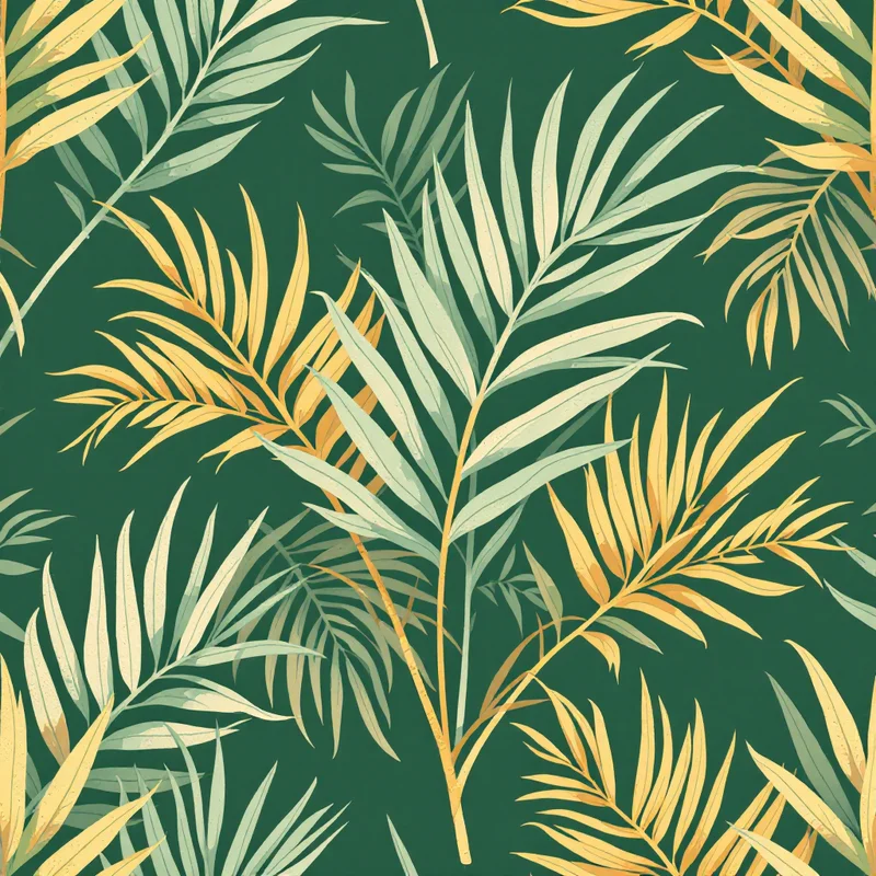
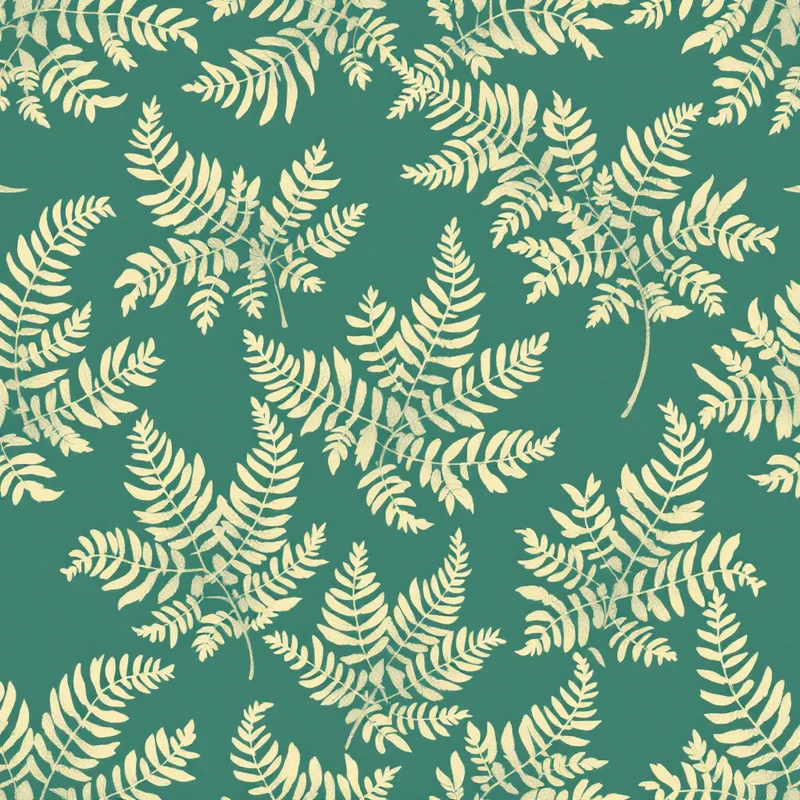
Botanical motifs are the natural partner for forest green palettes. Floral compositions, leaf studies, fern motifs, herbal illustrations, tropical foliage and abstract botanical compositions all pair effectively with forest green because the palette colour and the subject matter reinforce each other. The successful contemporary interpretations tend to combine specific botanical reference (recognisable leaf shapes, identifiable flower species) with rendering style that feels artistic rather than purely illustrational.
Animal motifs work effectively with forest green when the animal subject has natural-world associations — birds, woodland animals, insects, fish — and when the rendering style respects the palette gravitas. Whimsical or cartoon-style animal motifs tend to fight forest green palette gravitas.
Cultural pattern vocabularies use forest green effectively across many traditions. William Morris and the broader Arts and Crafts movement made forest green palettes central to their decorative vocabulary, and contemporary patterns drawing on this tradition translate the palette effectively. Scandinavian folk patterns, hunting and equestrian English country motifs, and traditional Persian and Indian textiles all employ forest green palettes extensively.
Geometric motifs can work with forest green when the geometry has sufficient gravitas. Architectural motifs, mathematical tessellations, art deco geometric vocabulary and Mediterranean tile motifs all pair effectively with forest green. Playful or children-oriented geometric motifs tend to clash with the palette.
Abstract and painterly motifs work effectively with forest green palettes when the abstract treatment has compositional substance. Painterly washes, contemporary abstract compositions, brushwork patterns and atmospheric compositions can all build on forest green as a palette anchor.
Application Categories Where Forest Green Excels
Several application categories particularly reward forest green palette commitment. Home decor textiles use forest green extensively in throw pillows, blankets, drapery, table linens and upholstery fabrics. The colour works in both traditional and contemporary positioning and provides palette anchor for biophilic and grounded interior design.
Wallpaper applications benefit substantially from forest green palette. The colour provides visual depth to interior environments without overwhelming smaller decorative pieces, and forest green wallpaper has become one of the most commercially active wallpaper segments in recent years.
Stationery applications use forest green as a sophisticated palette anchor for premium journals, planners and gift goods. The colour signals considered taste and connection to natural materials in ways that bright greens cannot.
Fashion textiles use forest green extensively in autumn and winter collections, in heritage-positioned menswear, and in nature-anchored womenswear. Forest green scarves, accessories and tailored pieces have long commercial traditions.
Wedding and event design uses forest green increasingly in autumn wedding palettes and in nature-anchored wedding aesthetics across all seasons. Forest green florals, forest green and burgundy combinations, forest green and gold palettes feature in contemporary wedding design vocabulary.
Packaging and gift wrap use forest green for premium positioning in cosmetics, food products, alcoholic beverages and gift goods. The colour signals quality and considered taste in ways that broader green palette cannot.
Common Pitfalls
Several pitfalls recur in forest green pattern design. The first is insufficient palette variation. Forest green is a strong colour that wants supporting palette to provide visual rhythm. Patterns that use only forest green and a single neutral can read as monochromatic and visually static. Successful forest green patterns typically include at least three or four palette colours that work together to provide visual interest while preserving forest green's dominant role.
The second pitfall is muddy production. Forest green can reproduce poorly in CMYK conversion, particularly when the digital file uses a specific RGB green that does not have a clean CMYK equivalent. Designers working with forest green palettes should test print proofs and may need to adjust the digital hex values to land the desired forest green hue after production.
The third pitfall is poor complement choice. Forest green paired with bright synthetic colours can feel dated or jarring. Forest green with neon pink, hot orange or electric blue tends to read as Christmas-themed or aggressively retro. The complement choices that consistently work are warm earth tones, sophisticated neutrals, considered metallics and refined cool tones.
The fourth pitfall is excessive density. Like burgundy, forest green is a heavy colour that benefits from breathing room within compositions. Patterns that fill the entire surface with high-density forest green elements can feel oppressive. Successful patterns typically use forest green as a strong but not all-encompassing palette element.
Forest green is a palette anchor that rewards thoughtful construction and respect for the colour's emotional weight. The designers who build successful forest green pattern programmes treat the colour with deliberate care, building palette structures and motif relationships that elevate forest green's distinctive character. The result is pattern work that retains relevance across many trend cycles because it is built on enduring colour fundamentals rather than fleeting fashion movements.
Explore related pattern styles
Patterns for


