Activewear has quietly become one of the most demanding corners of clothing design, and one of the most technical print categories in surface design. The garments stretch and contract, the fabrics resist dye, the silhouettes are body-conscious, and the customers expect their leggings and sports bras to look polished from every angle and under every light. A pattern that works beautifully on a flat tea towel can collapse into a muddy stripe across a thigh seam or distort into chaos at the small of a back. Designing for this category is not the same as designing for cotton apparel — the rules shift the moment you involve four-way stretch and dye-sublimation.
The good news is that activewear has also become a category where original prints win, and an independent textile designer can place work that competes with in-house teams. Bold geometric prints, painterly florals, abstract movements and culturally specific patterns are now table stakes for athleisure brands competing with monolithic black and grey logo wear. Small studios are placing their designs on yoga capsules, run clubs, pilates wear and women's sportswear lines. Getting the technical execution right is what separates designs that sell from designs that get rejected at sample stage.
Why Activewear Patterns Behave Differently
The single biggest difference between an activewear print and any other surface design is fabric behaviour under tension. Most performance fabrics are knit blends — polyester with elastane or spandex woven through — and they stretch unevenly. The horizontal stretch on a fitted legging is typically 20 to 40 per cent. Vertical stretch may be lower but is still significant. When the fabric stretches, the print stretches with it, and motifs at body extremes get distorted in ways the flat tile never showed.
This means three things at the design stage. Motifs should not have critical detail in their centres — stretch points fall most predictably on calves, thighs, shoulder blades and abdomens, and these are the areas where the print elongates most. The repeat scale should be smaller than you might choose for woven cotton, because what reads as a medium repeat on a flat fabric reads as oversized on a stretched seam. And the colour transitions should avoid hard edges between high-contrast colours, because the print process itself will introduce some bleed and the human eye reads bleed as defect when colours fight.
The second factor is the dye process. Most activewear prints are sublimated — a digital textile printing process where dye is heat-transferred from paper into the polyester fibres, becoming part of the fabric rather than sitting on top of it. Sublimation produces extremely durable, breathable prints that survive washing and stretching, but it has technical constraints. Pure black rarely sublimates to true black because the dye saturates differently than ink-based printing. Whites do not exist in sublimation — they are simply the absence of dye, which means white in your design will appear as the natural colour of the base fabric (often a slight cream or grey). And the colour gamut is wider for warm tones than cool tones, with deep reds, oranges and magentas reproducing brilliantly while certain mid-blues and forest greens require careful palette adjustment to land where you want them.
Scale and Placement Considerations
For sportswear, motif scale should be calibrated against the smallest garment the print is intended for. Sports bras and racerback tops have less continuous fabric surface than leggings or hoodies. A 25 centimetre repeat that looks balanced on a legging will be cropped awkwardly across a bra cup. A working rule for activewear collections is to aim for repeat sizes between 8 and 18 centimetres for prints that will run across multiple garment types, with larger statement scales reserved for capsule designs intended for one specific silhouette.
Placement prints — single-position designs that do not repeat — are an option for some product categories, particularly tanks and oversized sweatshirts. But for the bulk of activewear, true seamless tiles are the standard because cut-and-sew operations rely on continuous yardage and unpredictable garment cutting patterns. If your design is intended for a leggings line that may eventually expand into shorts, bras, jackets and accessories, it has to tile.
Directional motifs deserve specific attention. Stripes, paisleys, scenic toiles and other directional designs need to be rotated and tested against actual garment construction patterns. A horizontal stripe at hem level reads very differently from the same stripe across a chest seam. Many activewear designers work in non-directional or radially symmetric layouts specifically to avoid this problem, but if you are committed to direction, mock up your design on a flat garment template before approving production tiles.
Colour Strategy for Performance Apparel
Three colour strategies dominate successful activewear collections. The first is the high-contrast graphic approach: black or deep navy as a base, with one or two saturated accent colours — coral, electric blue, neon yellow, magenta — used sparingly for impact. These designs photograph well, video well, and signal energy. They are also commercially safe because the customer base for activewear skews toward expressive colour choices that are visible in motion.
The second is the tonal monochrome approach: a single colour family rendered across multiple values, producing a sculpted, sophisticated print that reads as quiet luxury. Tonal blues, tonal terracottas, tonal forest greens — these work beautifully for the premium end of athleisure where the customer wants pattern presence without overt energy. The technical advantage is that subtle bleed during sublimation is forgiving for tonal palettes, since the colours are already close together.
The third strategy is the painterly print: watercolour florals, abstract brushwork, or ombré gradients that mimic hand-painted surfaces. This approach is rising fast in premium yoga and pilates wear, where the customer is buying pieces to be worn outside the studio. Painterly prints flatter the body because the soft edges read as movement, and they hide minor distortion in stretched areas because the customer's eye expects organic variation.
File Specifications for Sublimation
The technical handoff for sublimation printing is where many surface designers lose energy unnecessarily. The actual requirements are simple. Most digital sublimation printers want files at 150 to 300 DPI, with 200 DPI being the sweet spot for cost and quality across most production houses. CMYK colour mode is standard, though some progressive shops accept RGB files and convert at the press. Embed an ICC profile if your printer specifies one — common choices are FOGRA39 for European production and GRACoL for North American — but if no specific profile is requested, sRGB with a CMYK-safe palette gives the most predictable result.
File format should be high-resolution TIFF for production, PNG for proofing, and PDF for any layout work that includes placement diagrams. Avoid JPG for production unless your printer specifically requests it — the compression artefacts that are invisible at small sizes become very visible after sublimation transfers them into fabric. For pattern repeats, deliver a single tile sized to your printer's preferred dimensions and let the print house tile it across the yardage, rather than pre-tiling and delivering a multi-metre file.
Bleed margins are a frequent source of error. For sublimated cut-and-sew apparel, add 3 to 5 millimetres of bleed at all edges of the printed paper. The dye saturates slightly during transfer, and cut edges need printed colour to extend past the actual seam line so no white fabric peeks through. If your designs are being placed onto pre-cut garment panels, your printer will provide the exact bleed specification.
Common Pitfalls and How to Avoid Them
The most common rejection at sample stage is a print that registers correctly on the technical spec but looks unflattering on the body. This is almost always a scale issue, occasionally a colour-saturation issue, rarely a true defect. Test your designs on garment templates at actual print scale before approving production. Most studios use simple Photoshop or Procreate mockups against a leggings template or yoga top template, with the pattern dropped in at production DPI.
The second pitfall is over-designing the print. Activewear customers are buying clothing, not graphic design. A print that feels appropriate as a hero on a portfolio page can read as cluttered or aggressive on a body in motion. When in doubt, reduce density by twenty per cent and increase negative space. The customer will forgive a quiet print; they will return a loud one.
Finally, watch for fabric-specific issues like pilling that can disrupt the visual continuity of fine-detail prints. Performance fabrics blends pill more aggressively than woven cotton, particularly at high-friction zones like inner thighs and underarms. Patterns with very fine line work or tight halftone dot fields lose definition as soon as pilling starts. Slightly larger motif scales and bolder colour blocking survive the wear cycle better and keep the print looking intentional after twenty washes.
Bringing It Together
Activewear pattern design rewards designers who think structurally rather than decoratively. The garment is a moving canvas with predictable distortion zones. The fabric is a chemical surface with predictable colour gamut limits. The customer wants energy or quiet sophistication, rarely middle ground. Designs that respect these constraints — and use them as creative inputs rather than obstacles — produce prints that survive production, sell at retail, and build the kind of long-term brand recognition that this category increasingly rewards. The technical limits are the discipline; the visual freedom inside them is bigger than most designers initially realise.
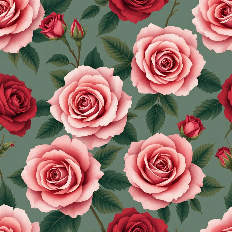
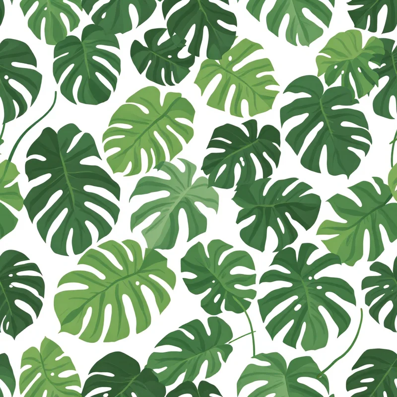
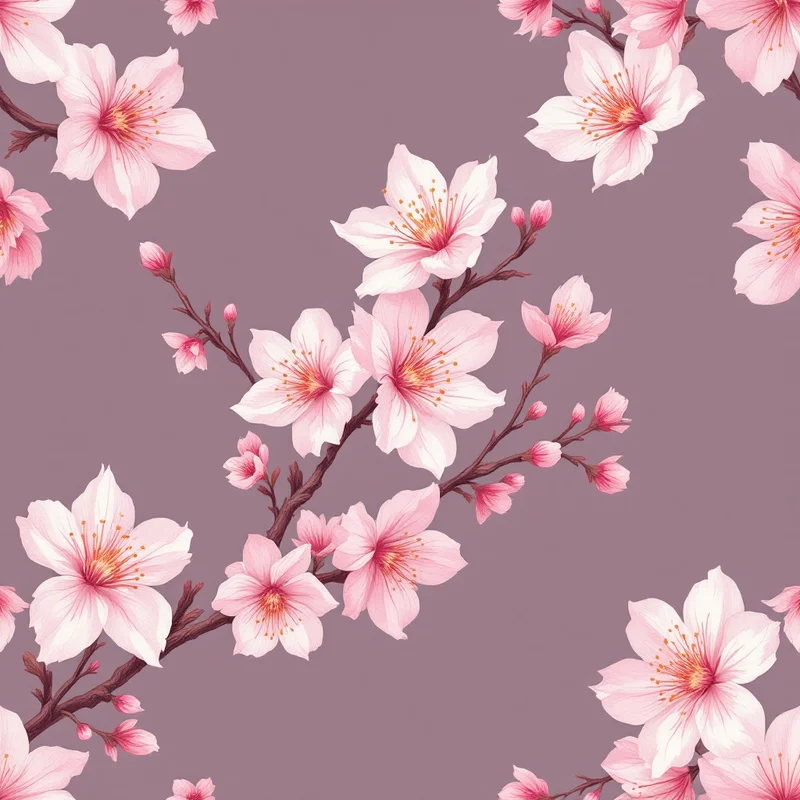
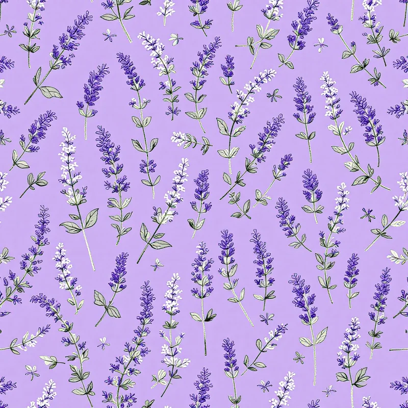
Explore related pattern styles
Patterns for


