Wrapping paper looks like the most forgiving pattern category until you actually design for it. The repeat needs to tile across a metre of paper. The pattern needs to read from across the room before the gift gets picked up. The design needs to survive being crushed, folded, taped over, and partially obscured by ribbon. And the customer's relationship to the paper lasts only minutes — from purchase, to wrapping, to tearing — but the pattern needs to be strong enough to drive both retail purchase and Instagram-worthy gift photography. These constraints make wrapping paper a fundamentally different design problem than journal covers, fabric or wallpaper.
The market is also surprisingly large and growing. Premium wrapping paper has migrated upmarket alongside the broader giftwrap-as-aesthetic trend on social media. Brands like Rifle Paper Co, Papier and others built their early growth on distinctive wrapping paper collections, and the category continues to support independent designers selling directly on Etsy, Society6, Spoonflower and standalone Shopify stores. Understanding how the design rules differ from adjacent stationery categories is what separates successful wrapping paper designers from designers whose patterns get rejected for being technically beautiful but commercially unworkable.
How Wrapping Paper Is Used
The customer journey for wrapping paper is unusual. The paper is purchased standalone, often in roll or folded sheet form, frequently impulse-bought near the register or during holiday shopping trips. It travels home, gets stored flat or rolled, gets pulled out for a specific gift, gets cut, wrapped, taped, decorated with ribbon and tag, photographed, given, and then either discarded or briefly preserved. The total functional life of a single sheet is typically less than one hour, but the visual impact during that hour is the entire purpose of the product.
This usage pattern shapes the design constraints. The pattern must hold attention at three distinct distances. At point of purchase, the customer sees a rolled or folded sheet from one to three metres away and decides whether to pick it up. At wrapping time, the customer sees the unrolled paper from arm's length and decides how to orient it on the gift. At delivery, the recipient and observers see the wrapped gift from across a room, on a table, or in a stack of presents, and the pattern needs to read as celebratory, considered, or distinctive even when partially obscured.
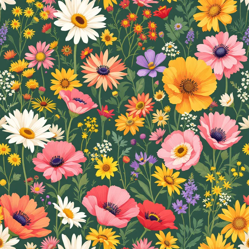
This three-distance test is why busy wrapping paper patterns underperform. A pattern with too much fine detail reads cluttered from across the room, even if it looks intricate up close. A pattern with too little visual interest reads as cheap from up close, even if it works from distance. The patterns that succeed across all three distances tend to share a few characteristics: clear motif silhouettes, generous negative space, and colour combinations that hold their identity even when the paper is creased.
Scale Strategy
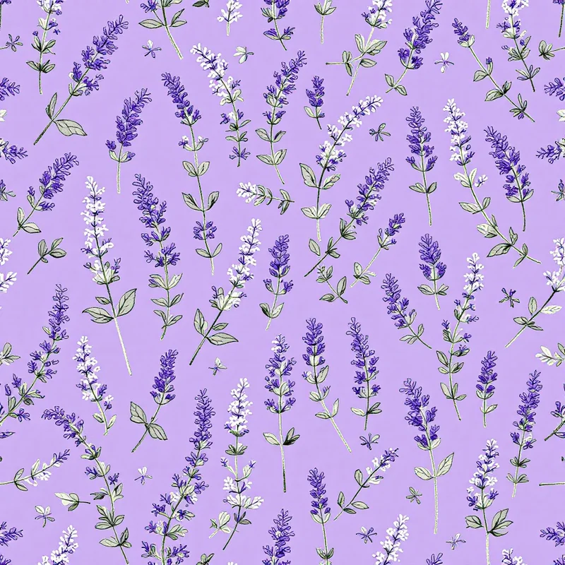
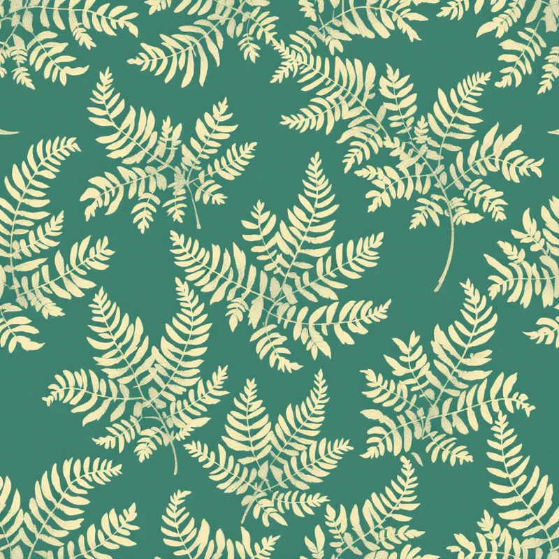
Wrapping paper repeats are typically larger than any adjacent paper goods category. Where notebook covers work well at six to ten centimetre motifs and greeting cards work at smaller, wrapping paper rewards motifs in the eight to twenty centimetre range. The reason is partly viewing distance — larger motifs read better from across a room — and partly because the paper is going to be folded, cut and crumpled, which fragments smaller motifs into incoherent visual noise.
The repeat itself needs to be carefully sized against standard paper dimensions. North American gift wrap typically comes in 30-inch (76 cm) widths and rolls of 4 to 25 feet. European gift wrap is often 70 cm or 100 cm wide. The repeat dimensions should divide cleanly into these widths so the pattern looks intentional at sheet edges. A repeat that ends mid-motif at the sheet edge looks unfinished; a repeat that completes cleanly at standard widths looks deliberate.
Non-directional patterns dominate the category. Wrapping paper gets rotated, folded, cut diagonally and oriented in directions the designer never anticipated. Patterns that look right only one way up — toile scenes with clearly horizontal compositions, scenic narratives with a clear top and bottom — require the wrapper to think about orientation, which most people will not do. Non-directional designs, radial layouts, all-over compositions and patterns with multiple readable orientations dominate commercial success in this category.
Palette and Seasonal Strategy
Wrapping paper sales are heavily seasonal, with December driving 40 to 60 per cent of annual category sales depending on the brand. Holiday collections dominate the market, but the most strategic designers also build everyday collections that sell across the rest of the year for birthdays, weddings, baby showers, anniversaries, housewarmings and general gift occasions.
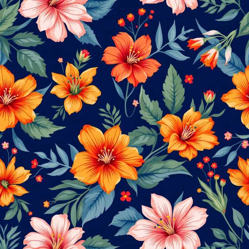
Holiday wrapping paper has well-established palette conventions. Traditional Christmas uses red, green, white, gold and silver in various combinations. Modernised Christmas extends into pink, burgundy, forest green, deep navy, and mustard. Hanukkah uses blue and silver with gold accents. Lunar New Year uses red and gold. Diwali uses warm jewel tones — magenta, orange, gold, deep purple. Designers who want to compete across multiple holiday markets need to think about palette systems that translate across these conventions while maintaining a coherent brand voice.
Everyday wrapping paper is where independent designers can build year-round revenue. The successful approaches tend to be palette-led collections — a dusty pink and sage green floral set, a warm earth-tone botanical set, a black-and-white modern geometric set — that work for any occasion. These collections need to feel current without being trend-locked, because the buyer is purchasing for unknown future gift contexts.
Premium wrapping paper opens up a third strategy: single-colour or two-colour designs printed on textured, recycled, or specialty papers, often with foil accents or letterpress effects. This segment supports higher unit prices but requires more sophisticated print production and tends to be sold through boutique retailers and online direct-to-consumer rather than mass market.
Working With Ribbon, Tag and Decoration
Customers do not see wrapping paper in isolation. They see wrapping paper plus ribbon plus tag plus often greenery or other decorative additions. The pattern needs to coordinate visually with these additions, or at least not fight them.
The most flexible wrapping paper patterns provide clear "calm zones" — areas of the pattern where the visual density drops — that allow ribbon and tag to land without competing with the print. Patterns with very even density across the whole repeat fight against ribbon placement because every spot is equally busy. Patterns with rhythmic variation between dense and open areas allow the wrapper to position ribbon and tag in the open zones for cleaner finished presentation.
Tag visibility is a specific consideration. The tag is typically a small white or natural-coloured paper attached with ribbon, and the recipient's name or message needs to be readable against the wrap behind it. Wrapping paper patterns that include white or very light areas allow tags to recede into the design. Patterns with uniform dark or saturated palettes force the tag to stand out as a contrasting element, which can be either intentional (a deliberate composition choice) or distracting (when the tag fights the pattern).
Production and Material Considerations
Standard wrapping paper is a coated machine-finish paper printed offset for mass-market runs and digital for short runs. The colour reproduction on coated wrapping paper is good but not as accurate as for premium printed goods. Saturated colours often print slightly lighter than expected, and dark colours can appear flatter than the design file suggests. Designers should expect to lose roughly 10 per cent of perceived saturation between screen and printed sheet for typical wrapping paper production.
Premium wrapping paper opens up many more material options: matte uncoated stocks, recycled kraft papers, specialty fibre papers with visible texture, metallic-based stocks, foil stamping, embossing and other finishes. Each of these requires specific design considerations. Metallic foil layers must be designed as separate vector layers with clear separation specs. Embossing requires the design to consider the raised areas as a separate composition. Recycled kraft papers shift the perceived colour of everything printed on them and often work best with two- or three-colour designs that embrace the paper tone as part of the palette.
For digital print-on-demand wrapping paper (such as through Spoonflower or similar services), the colour gamut and material consistency are more variable. Designers entering this channel should order test prints for any new design before committing the design to a collection or marketing it actively. The cost of a single test print is small relative to the cost of having customers complain about colour drift on a featured pattern.
File Specifications
For wrapping paper licensing or print-on-demand, deliver patterns at 300 DPI with the repeat tile sized to your platform's specification. CMYK is standard for offset and digital printing. Embed an ICC profile if the licensee specifies one. Provide a high-resolution preview JPG showing the pattern tiled at sheet scale so the licensee can visualise how the repeat will look on the actual product.
Include a separate document showing your colour palette as labelled CMYK swatches. This is particularly important for wrapping paper because the colour interaction with the paper substrate affects the final result, and the licensee may need to make minor palette adjustments to compensate for specific paper stocks. Having clearly labelled palette swatches makes that conversation faster and avoids unwanted creative decisions being made without your knowledge.
Wrapping paper is a category that rewards designers who think about the full customer experience, not just the surface pattern itself. The successful designs work as standalone patterns, work in combination with the wrapping ritual, work across the seasonal calendar, and translate across print qualities. Designers who treat wrapping paper as a serious commercial category — building collections with intention, designing for distance reading, respecting the constraints of the production format — build licensing relationships and retail placements that sustain creative practice across many years.
Explore related pattern styles
Patterns for


