Abstract is the pattern category with the fewest agreed names, so designers fall back on "sort of blobby" and "painterly squiggles." A cleaner system is to sort abstract prints by what drives them. Some are driven by shape, some by the mark of a hand, some by color alone, and some by optical tricks.
Shape-driven abstracts
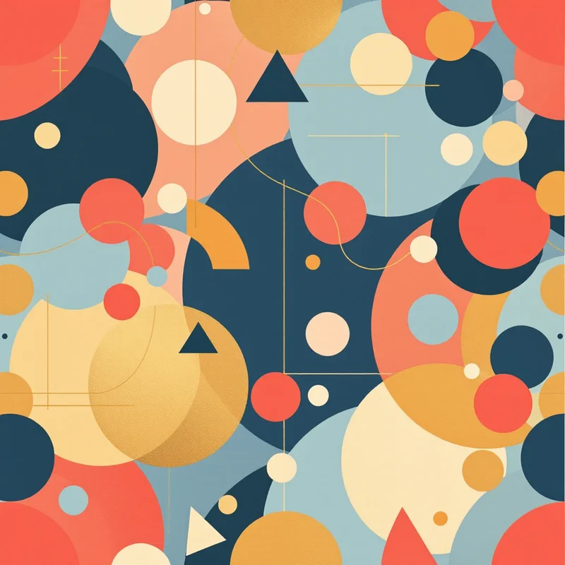
Geometric abstract. Circles, arcs, half-moons and triangles arranged loosely, with no grid. The Bauhaus school, founded in 1919, made this vocabulary famous. Reads as clean and architectural. Use for packaging, stationery and tableware. The wider geometric family is covered in types of geometric patterns.
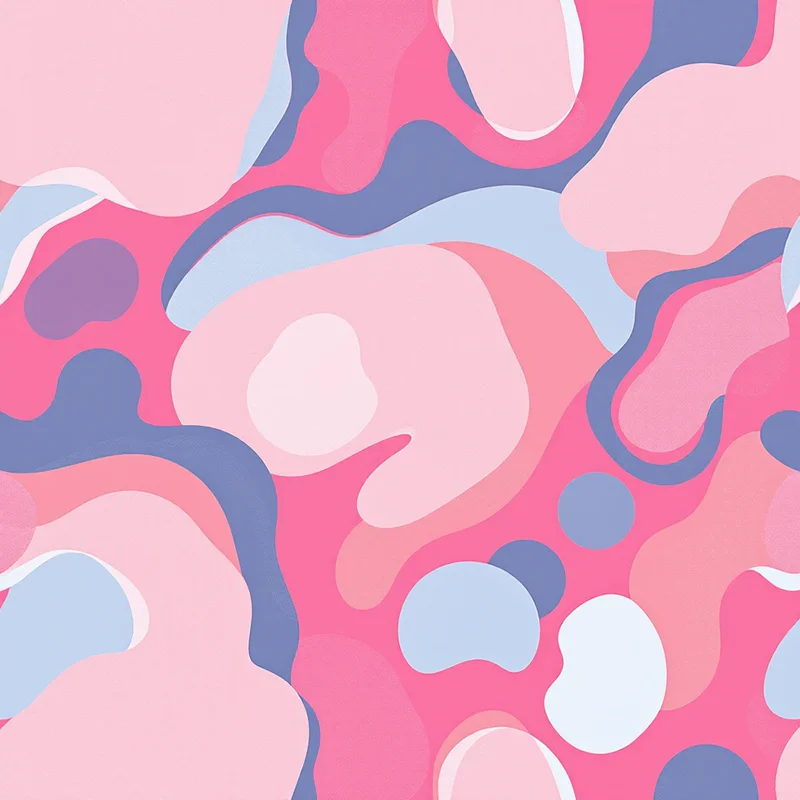
Organic shapes. Pebbles, leaves and curving blobs in flat color, in the spirit of the paper cutouts Henri Matisse made late in his career. Works for apparel, kids' goods and home textiles. Keep contours smooth and the palette to four colors.
Memphis. Squiggles, confetti, triangles and checkered bars on bright grounds, from the group of designers who formed in Milan in 1981 under Ettore Sottsass. Intentionally loud. Works for streetwear, phone cases and anything playful. Pair it with the 90s patterns or retro patterns families.
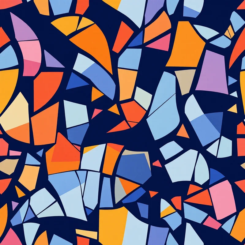
Confetti and chip scatters. Small pieces of color tossed over a plain ground. It is the abstract cousin of terrazzo, and almost as forgiving.
Mark-driven abstracts
Brushstroke. Wide, loose paint marks in layered colors. The idea comes from mid-20th-century gestural painting. Scale it large, with a few strokes per tile, and leave air between them.
Scribble and squiggle. Loose continuous lines in one or two colors on a plain ground. Good as a "blender" under a heavier print.
Continuous line. A single unbroken line that winds around the tile to suggest faces, leaves or nothing at all. Works for stationery, tote bags and branding.
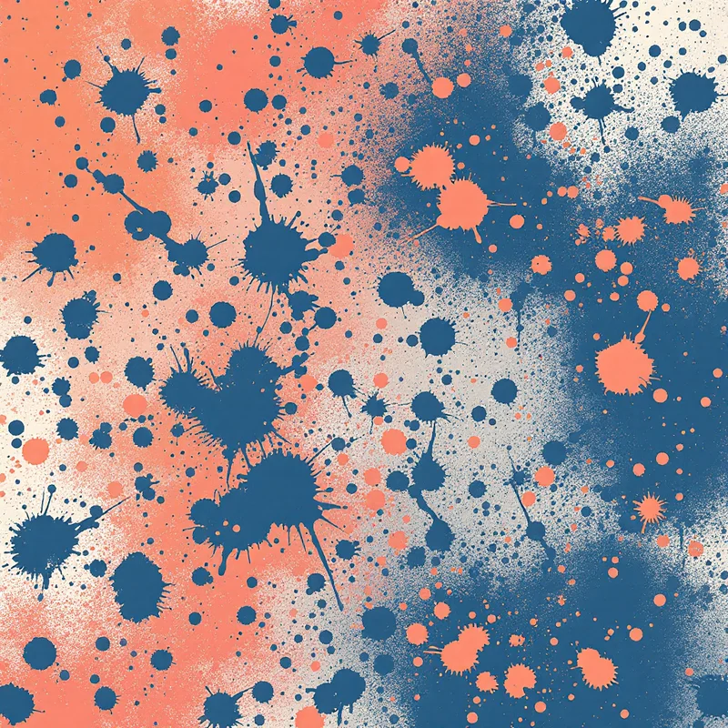
Halftone and stipple. Dots of changing size build up gradients. Halftone is a printing method turned into a look, which is part of why it feels graphic and retro.
Color-driven abstracts
Gradient and ombre. Soft blends from one color to another. They look best when the tile blends cleanly across its edges. For the technique, see gradient patterns.
Aura and glow. Blurry, layered color fields, usually in analogous hues. Popular on phone wallpaper and wellness packaging.
Watercolor wash. Translucent washes that bleed at the edges. It needs paper-like texture to look real.
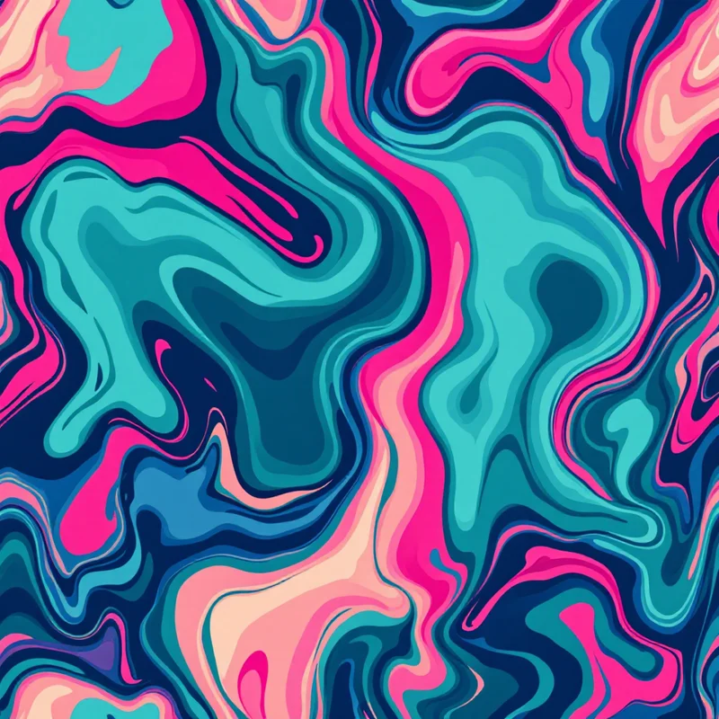
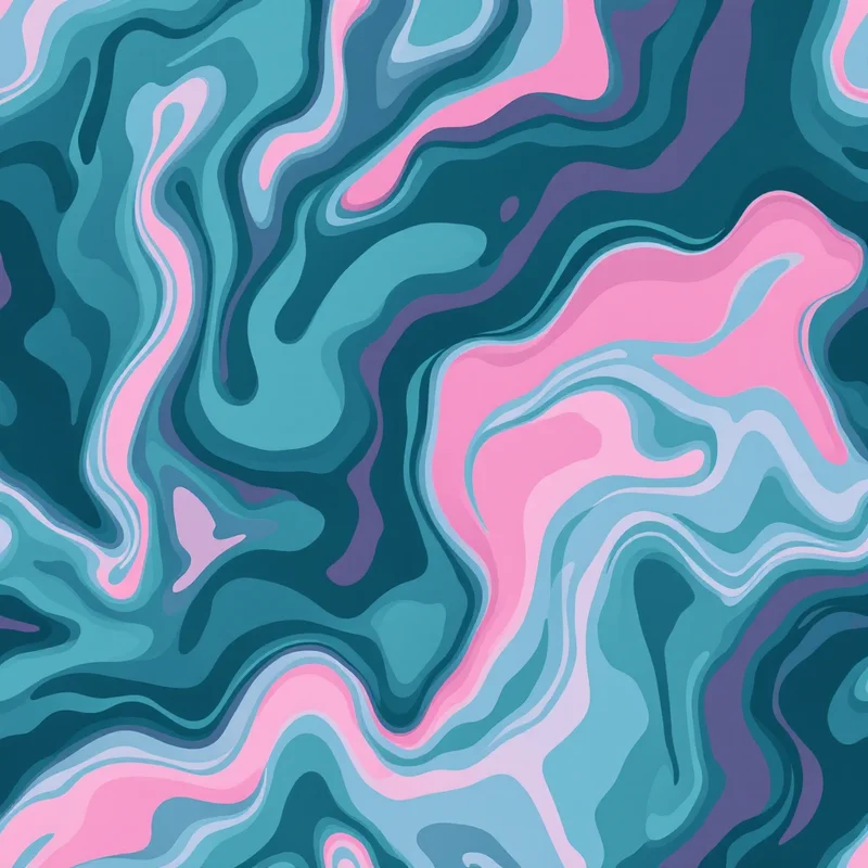
Fluid and marbled. Swirls of poured paint or ink, as in swirl patterns. Choose three to five colors and avoid mixing them into mud.
Illusion-driven abstracts
Op art. Black-and-white or high-contrast designs that appear to vibrate or bulge, a movement of the 1960s associated with artists such as Bridget Riley and Victor Vasarely. Impactful and fatiguing, so use it as an accent.
Waves and ripples. Repeated curved lines that shift in spacing to suggest movement.
Moiré. Overlaid line grids that create secondary patterns. It can be a wonderful effect and a printing problem, so test at final size.
How to choose
| If the product is | Start with |
|---|---|
| Clothing | Brushstroke, organic shapes, gradient |
| Packaging | Geometric abstract, Memphis, confetti |
| Stationery | Continuous line, aura, watercolor wash |
| Wall art or wallpaper | Fluid, large brushstroke, op art |
| Phone cases | Aura, halftone, Memphis |
Palette and scale
Abstract patterns depend on color relationships more than any other category, so work from a limited palette. A good starting point is one dark, one light and two accents, for example #1F2A44, #F3EDE3, #E4572E and #4FA3A5. The color theory guide explains how to make the pairs work.
For scale, large abstract marks read as artwork and small ones as texture. Print at actual size before you commit, and look at the pattern in a thumbnail too. If it still has a shape you can describe, it is working.
In Pattern Weaver, Describe It lets you write a prompt in your own words, such as "loose coral brushstrokes on warm cream," and Restyle changes the finish so you can see one composition as watercolor, ink or flat color.
Explore related pattern styles