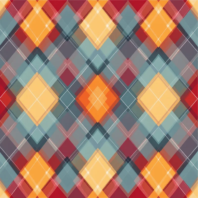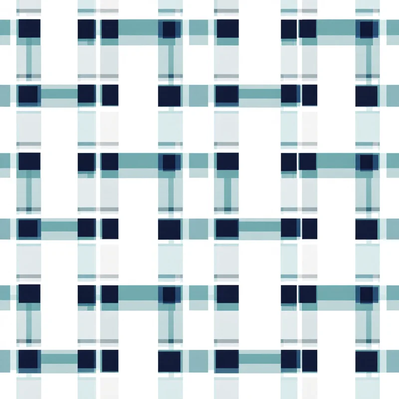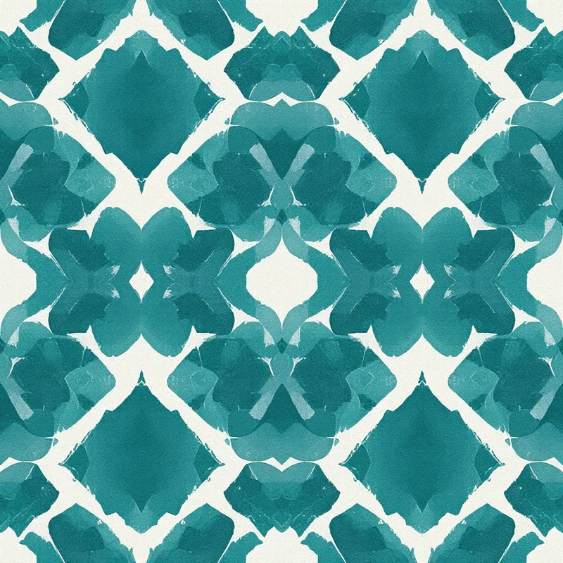


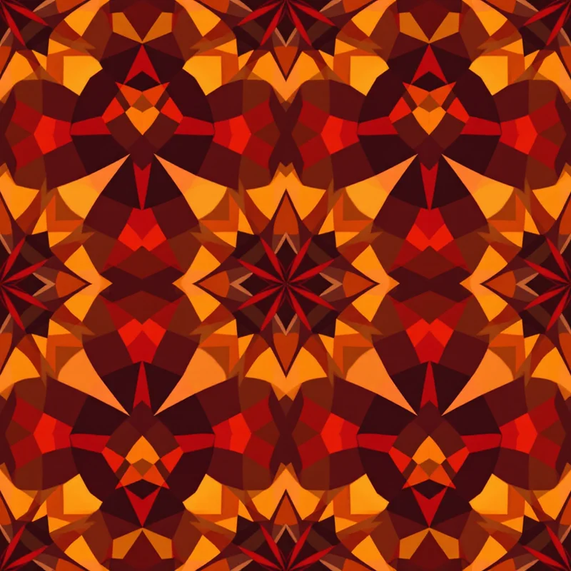
A pattern collection is supposed to read as one cohesive family, and color consistency is usually the single biggest factor in whether it actually does — yet color drift between "matching" patterns is one of the most common, avoidable problems in multi-pattern collection design.
Why color drift happens even when you're trying to match
The core problem is eyeballing. Even a designer with excellent color memory, picking a "matching" blue by eye for the fifth pattern in a collection, will rarely land on the pixel-identical shade used in the first pattern. Screen calibration, fatigue, and simple human color perception all introduce small variances that accumulate across a collection — each pattern individually looks fine, but placed side by side, the "matching" colors visibly don't match.
The fix: a locked palette, not a remembered one
The reliable solution is defining an exact palette upfront — specific hex or Pantone values, decided once — and pulling every color in every pattern in the collection from that same fixed set, rather than approximating a similar-looking shade fresh for each new design. This removes the human-memory variable entirely; a color is either the locked value or it isn't, with no room for gradual drift.
A locked palette doesn't mean every pattern looks the same
Using the same fixed palette across a collection doesn't require every individual pattern to use every color in it. A five-color locked palette can appear in different combinations and different proportions across each pattern in a collection — one design leaning heavily on two of the five colors, another leaning on three different ones — while still reading as a cohesive family, because whichever colors do appear are pulled from the identical locked set.
Checking the result side by side, not one at a time
Even with a locked palette, it's worth reviewing the full collection laid out side by side before finalizing, rather than approving each pattern individually in isolation. A locked palette prevents color drift in the values themselves, but it doesn't automatically guarantee the overall balance and proportion across the collection feels right — that's still a visual judgment call best made looking at everything together.
Building a collection from one locked palette, applied consistently across every pattern, is easiest when the palette is set once and reused deliberately. Start in the free pattern maker with 3 free credits, or browse pattern styles for the full range.
Explore related pattern styles