Stripes are the most fundamental pattern vocabulary in textile design and one of the most variable. The simple concept of alternating bands of colour produces patterns that span from quiet menswear shirting to bold nautical statements, from refined contemporary minimalism to playful children's designs, from subtle textile texture to dramatic graphic statement. The pattern has anchored more commercial textile categories than essentially any other vocabulary, and the structural variations available within "stripes" produce a design space wider than most other pattern families.
Understanding stripe design — the relationships between stripe width, stripe rhythm, stripe direction, palette structure and rendering style — provides one of the most leveraged skill sets in commercial surface pattern design. This guide examines the structural variables and the strategic decisions that produce successful contemporary stripe work.
The Structural Variables
Stripe pattern design involves several key variables that designers should consider deliberately. Stripe width — the absolute thickness of individual stripes — is the most obvious. Stripe rhythm — the pattern of stripe widths and spacing across the design — affects the underlying structure. Direction — vertical, horizontal, diagonal, or various combinations — affects how the pattern reads. Edge quality — crisp, blurred, hand-drawn, woven — affects the surface character. Palette structure — two-colour, multi-colour, tonal, or coloured-on-natural — affects the design's overall identity.
These variables interact to produce a multi-dimensional design space. Thin even vertical stripes in two colours produce one effect. Wide irregular horizontal stripes in multiple colours produce a completely different effect. Both can be commercially successful, but they serve different applications and customer segments.
Width Strategy
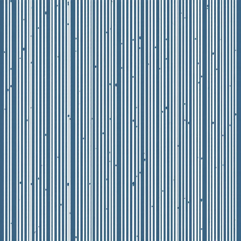
Hairline stripes — individual stripes 1 to 2 millimetres wide — read as textile texture at typical viewing distances and produce patterns with refined sophistication. This width is traditional for fine men's shirting and contemporary refined applications.
Pinstripes — individual stripes 2 to 4 millimetres wide — read as distinct but quiet stripes and provide the classical menswear suiting vocabulary. This width is traditional for tailored business suits, dress shirting and various refined applications.
Bengal stripes — individual stripes 3 to 8 millimetres wide — provide the classical casual shirting vocabulary and read as recognisable but textile-character stripes. This width works for casual shirting, summer dresses and various everyday fashion applications.
Awning stripes — individual stripes 10 to 25 millimetres wide — read as confident graphic stripes and provide the visual character of classical awning fabric. This width works for accessories, home decor textiles, statement fashion pieces and casual contemporary applications.
Bold stripes — individual stripes 30 to 60 millimetres wide — read as statement graphic patterns and provide contemporary visual energy. This width works for statement fashion pieces, contemporary home decor and design-forward applications.
Banner stripes — individual stripes above 80 millimetres — function as block graphic statements rather than as textile patterns. This width works for contemporary wallpaper, large-format wall art, statement upholstery and design-forward graphic applications.
Rhythm Variations
Beyond simple even stripes, the rhythm of stripe widths and spacing produces significant variation in pattern character. Even-rhythm stripes — all stripes the same width with consistent spacing — produce patterns with classical regularity. Awning stripe with alternating wide-narrow-wide-narrow rhythm produces patterns with traditional casual character. Multibar stripe with varied widths in repeated sequences produces patterns with rhythmic complexity.
Irregular stripe rhythm — varied stripe widths arranged in non-repeating sequences — produces patterns with contemporary character and reads as deliberately designed rather than as classical reference. This rhythm vocabulary opens up significant contemporary design possibilities while preserving the fundamental stripe identity.
Hairline stripe groupings — pairs or triplets of thin lines separated by larger spaces — produce traditional menswear vocabulary that translates well into contemporary applications. The visual character is refined and considered.
Half-tone stripes — stripes that fade in and out of intensity across the design — produce contemporary patterns with rhythmic visual interest. This vocabulary works particularly well in art-influenced contemporary applications.
Direction Considerations
Vertical stripes are the dominant direction in fashion textiles and produce slimming visual effects on the body. The direction works for shirting, dresses, tailored garments and most fashion applications.
Horizontal stripes are traditional for nautical and casual fashion vocabulary. The direction has been associated with French Breton style, classical nautical wear and contemporary casual statements. The body-broadening visual effect of horizontal stripes is well-known.
Diagonal stripes produce dynamic visual movement and work particularly well in graphic applications, contemporary fashion statement pieces and energetic compositions. The direction is less common in textile applications but works strongly in stationery, packaging and graphic design contexts.
Combined direction stripes — patterns that include both vertical and horizontal stripes, or that change direction across the surface — produce contemporary patterns with significant visual complexity. These designs require careful execution to avoid reading as visual confusion.
Palette Strategy
Two-colour stripes provide the foundational vocabulary and the strongest commercial reliability. Navy and white nautical stripes, black and white modernist stripes, red and white classic stripes, sage and cream contemporary stripes all support consistent commercial presence.
Three-colour stripes introduce additional palette variety while remaining controlled. The classical Breton stripe combination of navy, white and red provides one example; contemporary three-colour combinations like sage, terracotta and cream provide more current vocabulary.
Multi-colour stripes — patterns using four or more colours — produce designs with significant colour interest. The palette relationships need to be carefully constructed to avoid reading as chaotic rather than as deliberately designed. Successful multi-colour stripes typically work with clear palette logic — analogous colour relationships, gradient sequences, or specific cultural palette traditions (like serape or beach umbrella vocabulary).
Tonal stripes — multiple values of a single colour family — produce designs with sophisticated refinement and work particularly well in contemporary home decor and refined fashion contexts.
Contemporary Applications
Fashion textiles use stripes across essentially every category. Menswear shirting and tailoring use stripes as a foundational vocabulary. Womenswear uses stripes in dresses, blouses, skirts, accessories and outerwear. Children's wear uses stripes extensively. Swimwear uses nautical and contemporary stripes. The category supports the full range from classical reference to contemporary statement.
Home decor textiles use stripes across throw pillows, drapery, table linens, bedding and upholstery. The category supports the full range from classical ticking stripes to contemporary oversized graphic stripes. Wallpaper applications include both traditional stripe wallpaper and contemporary oversized statement applications.
Stationery and paper goods use stripes for casual, nautical, classical and contemporary positioning. Gift wrap, greeting cards, journals and planners in stripe designs have consistent commercial presence.
Branding and identity design uses stripes extensively. Striped logos, packaging and brand patterns support brand systems built on classical references (heritage stripes for traditional brands), contemporary positioning (bold modern stripes), or specific category vocabulary (nautical stripes for marine brands).
Cultural Vocabulary
Stripes carry specific cultural associations that affect contemporary design choices. Breton stripes — horizontal navy and white stripes — carry deep association with French maritime culture and Pablo Picasso. American railroad stripes carry association with denim and railway worker history. British naval stripes carry royal navy associations. Italian regatta stripes carry yachting associations. Mexican serape stripes carry distinct cultural identity.
Designers building stripe collections should consider which cultural vocabulary they are working within or whether they are building distinctively contemporary work that distinguishes from these traditions. Each cultural vocabulary has its specific motif conventions, palette traditions and commercial associations.
Common Pitfalls
Several pitfalls recur in contemporary stripe design. The first is failing to commit to a clear width and rhythm strategy. Designs that fall in unclear territory between widths and rhythms can read as muddled rather than as deliberate.
The second pitfall is poor edge execution. Crisp stripes require precise execution at the production stage. Stripes with inconsistent edges, slight wavering or sloppy alignment read as amateurish. Hand-drawn stripes need to commit to the hand-drawn character clearly rather than reading as poor execution of intended crisp stripes.
The third pitfall is poor palette commitment. Stripe palettes work best when the relationships are deliberate and the colour values support the underlying rhythm. Random palette choices produce stripes that read as confused rather than as deliberate.
The fourth pitfall is wrong direction for application. Vertical stripes on a wide-format throw pillow can read as visually busy; horizontal stripes on a tall slim drapery panel can read as awkward. Direction choices should consider the actual application context.
The fifth pitfall is excessive contrast in inappropriate contexts. Very high-contrast stripes work for graphic statement applications but can read as cheap or aggressive in refined contexts. Slightly softer contrast often produces patterns with broader commercial appeal.
Stripes reward designers who understand that the fundamental simplicity of the vocabulary opens up significant design possibility through deliberate variation. The width choices, rhythm patterns, direction strategy, palette structure and edge execution all matter, and the patterns that succeed commercially are built on careful attention to each of these variables. The enduring commercial presence of stripes across many centuries and applications reflects this underlying flexibility — the pattern is simple enough to read clearly and structured enough to support significant creative variation.
Explore related pattern styles
Patterns for


