Risograph aesthetic has become one of the most influential indie design vocabularies of the contemporary era. The distinctive visual character of the risograph printer — bold spot-colour ink, slight registration variation between colour layers, characteristic grainy texture in solid areas, vibrant unconventional palette combinations — has migrated from its original niche in zine production and independent publishing into mainstream branding, fashion textile, packaging design and surface pattern work across many commercial categories.
For pattern designers, understanding how to produce convincing risograph aesthetic in digital work opens up access to a distinctive contemporary visual vocabulary with strong commercial currency in markets craving alternatives to perfectly clean digital design. This guide examines the visual logic of risograph aesthetic and the strategies for translating it into commercial surface pattern work.
What Risograph Actually Is
The Risograph is a stencil duplicator manufactured by the Japanese company Riso Kagaku, originally developed in the 1980s as an alternative to mimeograph and early photocopying for high-volume short-run printing. The machine works by burning a stencil from a master image, applying a single ink colour through the stencil onto paper, and repeating this process for each colour in a multi-colour print.
The technical character of the printing process produces several distinctive visual features. Each ink colour is a true spot colour rather than a CMYK mixture, which produces colour saturation and vibrancy that conventional printing cannot match. The inks are soy-based rather than oil-based, with a slightly translucent quality that affects how overlapping colours interact. The registration between colour layers is mechanical rather than precise digital alignment, which produces slight variation between layers in each printed copy.
The ink coverage is irregular by nature of the stencil printing process. Solid areas show grainy texture rather than reading as flat fields. Areas with finer detail can show partial ink coverage, producing slightly textural marks rather than precise lines.
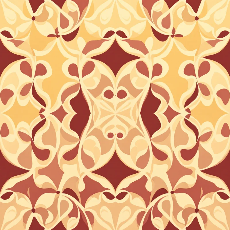
The palette is constrained by the available risograph ink colours. Most risograph printers offer between two and six colours at a time, with the colour library including some distinctive options not common in conventional printing — fluorescent pink, fluorescent yellow, fluorescent orange, federal blue, teal, hunter green and others — alongside more standard colour options.
The Visual Aesthetic
Several characteristic visual elements distinguish risograph aesthetic from other printing and design vocabularies. The bold spot-colour palette is the most immediately recognisable feature. Colours are highly saturated and read as vibrant in ways that CMYK printed colour rarely achieves. The fluorescent options particularly produce visual energy that registers as distinctly risograph-aesthetic.
The slight registration variation between colour layers produces the distinctive risograph look. Where two coloured elements should align precisely (a yellow shape overlapping with a blue shape, for example), the actual print may show slight offset between the two layers — perhaps a millimetre or two of misalignment in either direction. This intentional imperfection reads as authentic to the medium and is widely simulated in digital interpretations.
The grainy texture of solid colour areas produces visual character that flat digital fills cannot replicate. Each printed area shows subtle texture from the stencil printing process, with slight variations in ink density across the area.
The translucent overlap of multiple colour layers produces distinctive secondary colours. Where two risograph inks overlap, the resulting colour is the optical mixture of the two — sometimes producing colours that the original ink library does not include. This overlap effect provides additional palette range from limited base colours.
The compositions tend toward bold graphic statements rather than detailed illustration. The technical constraints of risograph printing — registration challenges with fine detail, grainy ink coverage that obscures subtle elements — favour confident bold designs rather than intricate detailed work.
Digital Interpretation Strategies
For pattern designers working in digital tools, producing convincing risograph aesthetic involves deliberately simulating these visual characteristics. Several techniques contribute to successful interpretation.
Working with two-colour or limited three-colour palettes establishes the foundational visual structure. Adding more colours moves the work away from authentic risograph aesthetic toward more general printed graphic vocabulary.
Selecting palette colours that reference actual risograph ink options produces patterns that read as authentically risograph. Fluorescent pink, fluorescent yellow, fluorescent orange, teal, federal blue, hunter green, golden yellow and similar colours all carry the risograph palette character. Working with these specific colours rather than approximations produces designs that read as more authentic.
Including slight registration variation between colour elements simulates the printer's mechanical alignment. Designs where coloured elements that should align precisely show slight intentional offset read as authentic; designs with perfect alignment read as generic two-colour graphic work.
Adding grain or noise texture to solid colour areas simulates the stencil printing ink coverage. The texture should be subtle and consistent — too heavy reads as gimmicky; too light reads as missing the risograph character.
Working with translucent overlap effects between colour layers produces the distinctive secondary colours of risograph printing. Yellow over blue producing green, pink over teal producing brown, fluorescent pink over yellow producing orange — these overlap effects add palette range from limited base colours.
Working at appropriate motif scale matters. Risograph aesthetic tends to work most effectively at medium to large motif scale, where the graphic boldness reads clearly and the textural character provides visual interest without being overwhelmed by scale.
Motif Strategy
Bold graphic motifs work best with risograph aesthetic. Strong silhouettes, confident shape vocabulary, clear positive and negative areas all support successful risograph-aesthetic patterns.
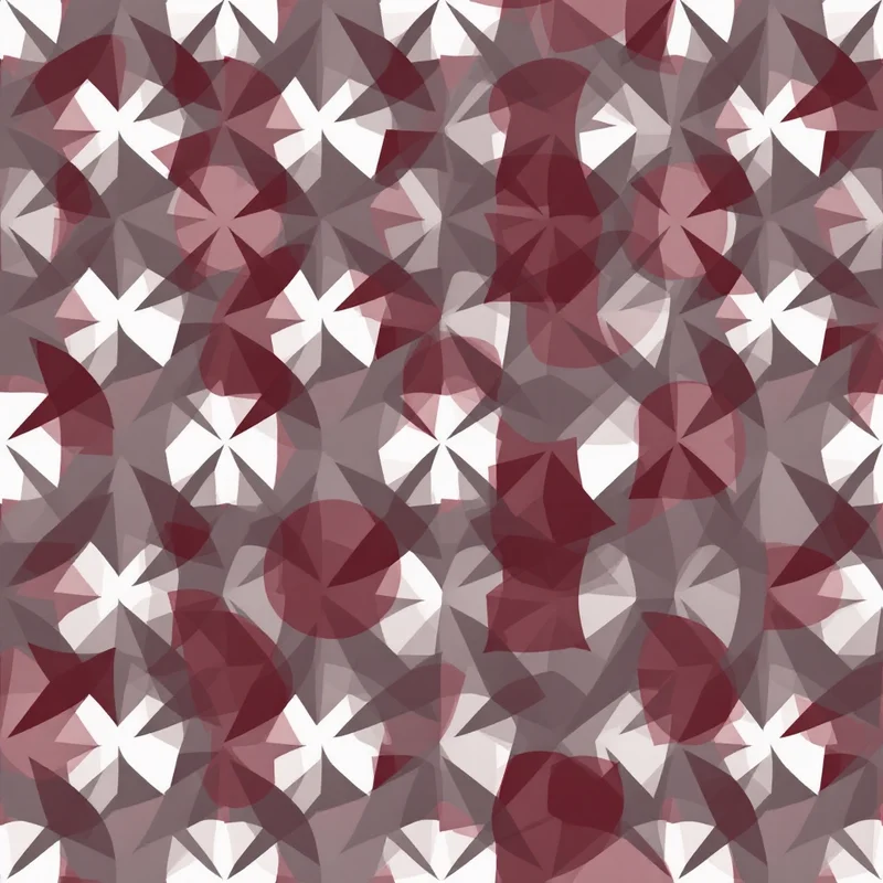
Geometric motifs translate well into risograph aesthetic. Bold geometric shapes, abstract compositions, simple repeating elements all support the bold graphic character that defines risograph work.
Botanical motifs work in risograph aesthetic when rendered with strong silhouette emphasis rather than detailed illustration. Bold leaf forms, abstracted floral shapes, simple botanical compositions all translate effectively.
Character and figure motifs work well in risograph aesthetic. The bold colour palette and graphic clarity support character illustration and figure compositions effectively, which is part of why risograph aesthetic has migrated heavily into character-driven indie illustration.
Abstract and gestural motifs work strongly in risograph aesthetic. Brushwork marks, gestural compositions, abstract gestural statements all support the medium's visual character.
Typography integrates well with risograph aesthetic. The bold colour and graphic character support typographic statements and combined image-and-text compositions effectively.
Palette Conventions
Specific palette combinations have become identifying signatures of risograph aesthetic. Fluorescent pink with federal blue produces patterns with distinctive visual energy. Hunter green with fluorescent orange produces patterns with strong autumnal character. Teal with golden yellow produces patterns with summer beach association. Black with fluorescent pink produces patterns with punk and indie character. Federal blue with golden yellow produces patterns with classical considered character.
Beyond these recognisable combinations, designers can develop their own risograph palettes by combining colours from the actual risograph ink library. The constraint of working with the actual available inks provides discipline that produces more authentic risograph aesthetic than free-form palette choices.
For multi-colour designs (three or four colours), the palette relationships need to be considered. Successful multi-colour risograph designs typically use clear hierarchical relationships between colours — one or two dominant colours with smaller-area accent colours — rather than equal-weight palette distribution.
Contemporary Applications
Editorial and publication design uses risograph aesthetic extensively. Independent magazines, zines, art books, posters and editorial illustration all draw on risograph vocabulary as foundational visual language.
Branding and identity design uses risograph aesthetic for brands seeking indie, contemporary, artistic or alternative positioning. The aesthetic signals distinctive design sensibility and contemporary cultural awareness.
Print-on-demand surface design uses risograph aesthetic extensively. Tote bags, posters, t-shirts, stationery and accessories with risograph aesthetic carry strong commercial presence in independent design markets.
Fashion textile uses risograph aesthetic in contemporary statement collections, indie-positioned brands and design-forward accessories. The category supports significant variation from literal risograph reference to looser influence.
Home decor uses risograph aesthetic in contemporary art-influenced applications, particularly in throw pillows, wall art, accessories and design-forward statement pieces.
Wallpaper applications include risograph-aesthetic wallpaper in design-forward and contemporary positioning. The bold colour palettes and distinctive character provide alternative to traditional wallpaper aesthetics.
Common Pitfalls
Several pitfalls recur in digital risograph interpretation. The first is over-perfect execution. Risograph character depends on slight imperfection; designs with perfect registration and clean ink coverage read as generic two-colour graphic rather than as risograph aesthetic.
The second pitfall is excessive imperfection. Over-simulated misalignment, excessive texture and heavy-handed simulation read as gimmicky rather than as authentic.
The third pitfall is wrong palette choice. Random colour combinations rarely produce convincing risograph aesthetic. Working with palette colours that reference actual risograph ink options produces more authentic results.
The fourth pitfall is excessive colour count. Designs using many colours lose the distinctive risograph character that depends on limited palette discipline.
The fifth pitfall is wrong motif vocabulary. Detailed illustration work fights the risograph aesthetic; bold graphic vocabulary supports it. Designers should choose motifs that complement the medium's natural strengths.
Risograph aesthetic rewards designers who understand both the technical realities of the original medium and the visual logic that the aesthetic communicates. The limited palette discipline, bold graphic vocabulary, slight imperfection and distinctive colour combinations all contribute to a vocabulary with strong contemporary commercial presence. The investment in understanding the source medium produces work with authentic character that resonates with current design audiences seeking alternatives to perfectly digital aesthetics.
Explore related pattern styles
Patterns for