


A prom outfit is built for the photograph: a flash, a backdrop, a slow group pose and a hundred phone shots. That changes how a print has to behave. Fine stripes and tiny checks can shimmer or look odd on camera, glossy satin can blow out a pale motif under flash, and a pattern that looks great flat on a screen can read as mush from six feet away. Keep the camera in mind as you read these directions for the spring 2027 season.
These are forecasts, not measured facts. They describe where prom prints seem to be moving.
Directions to watch
Printed satin florals with painterly edges
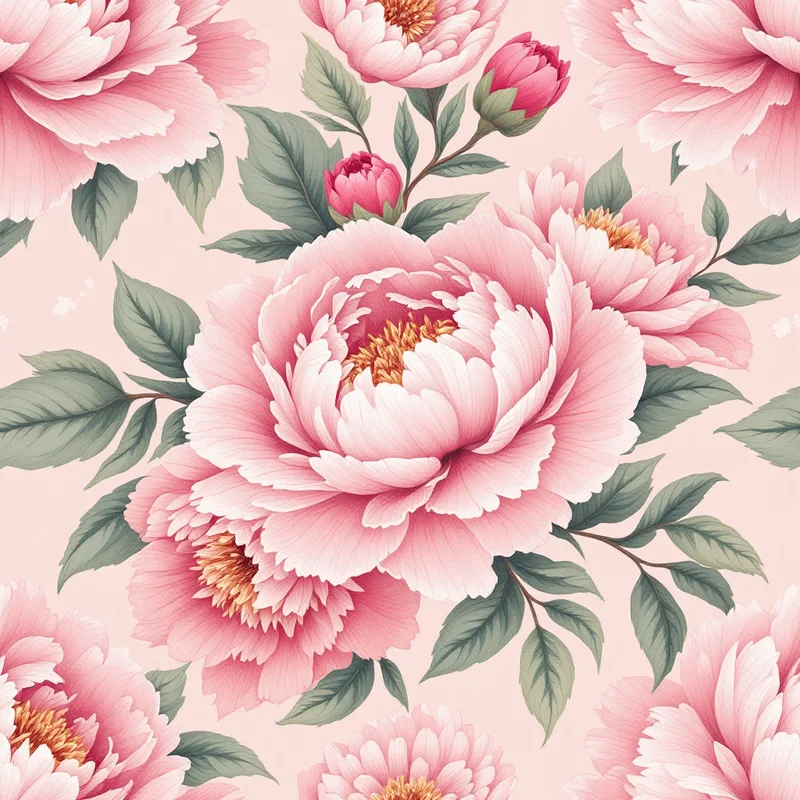
Large, softly blurred florals on satin are a natural fit, because satin deepens color and gives the print a liquid look. Expect roses, peonies and orchids drawn with watercolor-style edges, scaled at 6 to 10 inches so a single bloom can sit on a bodice. Keep the ground a rich solid and let the flowers glow against it. Browse satin patterns for ground colors and sheen references.
Sequin-effect ombre
Real sequin fabric carries its own pattern, but a printed sequin look offers a lighter alternative. Think ombre fades built from rows of overlapping discs, in a gradient from deep to pale. The trick is to vary disc size and highlight angle so it doesn't look like a flat polka dot. The sequin patterns category is the best reference for scale and highlight placement.
Bows and ribbons
The bow motif keeps growing past hair accessories, and it fits dresses, sashes and gloves. Use a clean bow silhouette with a satin-style highlight, tossed on a solid or tonal ground. The coquette pattern design guide explains the soft, romantic style behind this.
Dark romantic jewel tones
Oxblood #5A0F1B, emerald #0F5B45 and midnight #14213D, trimmed in antique gold, offer a refined alternative to pastel proms. Pair them with baroque scrolls or damask-style florals. The color of the year 2027 roundup compares the major forecasts if you want to check a palette against them.
Chrome and pearlescent finishes
A Y2K-adjacent shine is likely to continue: liquid silver, pearly lilac and holographic sheen on gowns and accessories. Glitter patterns give you texture ideas, and the Y2K pattern design guide shows how to avoid a costume feel. Use these finishes sparingly on a single piece or an accent panel.
Accessories where print fits
Accessories are an easier place for a seller to test a trend than a full dress:
- Bow ties, cummerbunds and pocket squares: a shared print with the date's dress
- Sashes and wraps: large floral or sequin-effect panels
- Clutches and wristlets: small repeats, 1 to 2 inches
- Hair bows and scrunchies: bow or satin print in coordinating colors
- Corsage ribbons: narrow bands with a tiny repeating motif
- Jacket and vest linings: a hidden bold print that surprises when the jacket opens
Couples often coordinate in small ways, and a matching print on a pocket square and a sash does that without the two outfits looking identical.
The camera test
Before you finalize a print, run through these checks:
- 1Zoom out to a phone-screen thumbnail. Does the motif still read?
- 2Photograph the sample on a plain satin or smooth fabric with the flash on, and look for blown highlights.
- 3Avoid stripes thinner than about 0.25 inch, which may cause moiré on camera.
- 4Keep contrast between motif and ground strong enough to survive flash.
Timeline for spring 2027
Prom is typically a spring event in the US, and outfits are chosen well in advance. Finish prints by December or January, list or send samples in January and February, and keep the accessories live through May. Southern Hemisphere and international markets run on different calendars, so confirm local formal dates before you plan.
To explore, use Browse Styles to move through the satin, sequin and glitter categories, or write a prompt in Describe It, such as "painterly peonies on emerald satin ground, gold highlights". New accounts start with 5 free credits, and Pro exports up to 8K for large dress panels.
Explore related pattern styles