A coquette pattern is the print equivalent of a satin ribbon tied around a wrist — soft, deliberate, slightly theatrical, and impossible to mistake for anything else. The vocabulary is tight: bows, pearls, lace, ditsy florals, hearts, the occasional cherry. The palette is pale. The mood is romantic in a way that knows exactly how romantic it is being. In the last three years the coquette pattern has moved from a Tumblr-and-TikTok aesthetic into a working print direction at fashion brands, stationery houses, and independent home goods labels, and it shows no sign of fading as a category.
This guide covers what makes a coquette pattern read as coquette, where the aesthetic came from, how to build one in Pattern Weaver, and which products carry the look best.
What is coquette pattern?
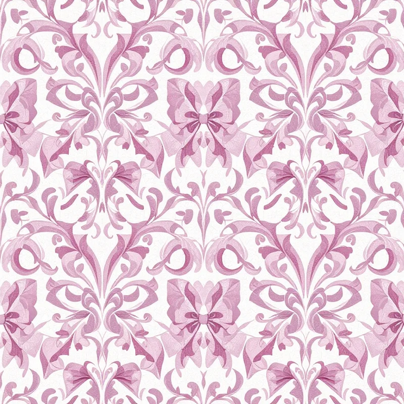
A coquette pattern is a romantic, feminine repeat built around a small, recognizable set of decorative motifs. The defining elements are ribbon bows — usually small, tied at the centre, with trailing tails — scattered pearls or beaded strings, lace edges, ditsy florals (rosebuds, forget-me-nots, lily of the valley), hearts, and occasional fruit motifs like cherries or strawberries. The scale is typically small to medium, the scatter is balanced rather than directional, and the palette stays in the pale, washed range: blush, cream, butter, dove gray, pearl white.
What separates a coquette pattern from a generic floral or a ditsy print is the presence of decorative non-floral motifs — the bow especially. A scatter of rosebuds alone reads cottagecore or Liberty. Add bows, pearls, and a hint of lace and the print swings firmly into coquette territory.
Where coquette pattern comes from
The aesthetic has deep historical roots. Eighteenth-century Rococo printed silks used scattered bows, ribbons, and tiny floral sprays as their core decorative language. Victorian boudoir textiles carried the look forward in embroidered nightwear and lace trimmings. Early twentieth-century lingerie packaging — boxes, gift wrap, sachet linings — refined the visual shorthand into something brands could mass-produce.
The current iteration emerged on Tumblr in the mid-2010s, where users tagged delicate pastel imagery with descriptors like soft, dollette, and coquette. The look exploded on short-form video platforms between 2022 and 2024, with the bow becoming a single defining motif worn as a hair ribbon, a wrist tie, a sweater accent. Designers responded. By 2025 the coquette pattern had moved from internet aesthetic to a recognized print direction at brands like Sandy Liang, Simone Rocha, Selkie, and a long tail of independent lingerie and stationery labels.
Visual hallmarks of coquette pattern
A few markers separate a successful coquette pattern from a near-miss:
The bow does work. The ribbon bow is usually the anchor motif, drawn small but with enough detail to read as silk or satin rather than gift wrap. The tails curl or fall naturally. Stiff geometric bows break the mood.
Pale ground. The background is rarely white in the harsh sense and almost never black. Cream, blush, butter, ivory, dove gray. The ground does most of the softness lifting.
Ditsy scale. Motifs are small. A coquette pattern with oversized florals reads as something else — chinoiserie, prairie, or maximalist romantic.
Balanced scatter. The repeat is not directional. Motifs sit in a balanced rhythm with breathing room. Crowding kills the softness.
Restrained palette. Two to four colors plus the ground. Pulling saturation down 10 to 20 percent from full strength gives the washed, slightly vintage quality the aesthetic relies on.
Hand-drawn feel. Even when generated digitally, the best coquette patterns avoid mechanical perfection. Slight asymmetry in the bow loops, irregular pearl spacing, hand-painted floral edges.
How to generate coquette pattern in Pattern Weaver
Pattern Weaver's studio is built for this kind of layered, motif-driven print. Four steps:
- 1Set the style and motif vocabulary. Open the studio, choose Romantic or Ditsy Floral as the base style, and type the coquette motif vocabulary into the description: ribbon bows, small pearls, lace edging, scattered hearts, tiny rosebuds, or cherries. Be specific. The more precise the motif list, the cleaner the result.
- 1Pick a pale background and palette. Choose a soft ground — blush pink, cream, butter, or dove gray. Select a romantic palette preset or build a custom one with two to four colors. Pull saturation down slightly so the motifs read washed and vintage rather than candy-bright.
- 1Tune density and scale. Set density to medium so the scatter feels balanced without crowding. Pick a scale that matches the end use — small for apparel and stationery, medium for wallpaper and home goods.
- 1Generate variations and refine. Generate three or four variations, pick the strongest, and refine. Swap a motif, shift a color, or adjust the scatter rhythm until the repeat feels soft and intentional. When the tile reads right, preview the seam to confirm it tiles cleanly and export at 8K (8192x8192 px) in PNG, JPG, WEBP, TIFF, PDF, or SVG.
The whole process takes about ten minutes from blank canvas to production-ready file. Compare that to traditional hand-painted print development, which runs to days or weeks per design, and the case for an AI pattern generator becomes self-evident for designers who need to ship multiple coquette pattern options for a seasonal range.
Color palette ideas for coquette pattern
A few palettes that consistently land:
Classic ballet. Blush pink ground, cream florals, pale pink bows with deeper rose tails, soft sage leaves. The default coquette palette and a good starting point.
Butter and cream. Butter yellow ground, ivory florals, blush bows, dove gray accents. Warmer than classic blush, reads breakfast room rather than boudoir.
Pearl and dove. Dove gray ground, pearl white motifs, blush bows, soft silver accents. The most subtle palette in the family, beautiful on silk and satin.
Cherry coquette. Cream ground, cherry red bows and fruit motifs, blush florals, soft brown stems. The bite version. Works hard on lingerie packaging and stationery.
Vintage rose. Faded rose ground, ivory florals, dusty pink bows, washed olive leaves. The most explicitly vintage palette, evocative of 1950s textile archives.
Best use cases
Coquette pattern carries hardest on products where softness is the point. Apparel is the obvious home — silk camisoles, blouses, prairie dresses, ballet wraps, sleepwear, lingerie. The look also moves beautifully into stationery (notebooks, gift wrap, planners, washi tape), accessories (scarves, hair ribbons, phone cases, jewelry pouches), and the softer end of home decor (cushions, valances, lampshades, wallpaper for bedrooms and dressing rooms).
The ditsy scale makes coquette ideal for print-on-demand catalogs, where small repeats hold detail across mugs, totes, journals, and apparel without breaking under format changes.
Less successful: sportswear, hard goods (anything stamped on metal or molded plastic), and product categories where the visual needs to read tough or unisex.
Pro tips for stronger coquette pattern repeats
A few practical notes from the studio.
Keep the bow count low. Two to four bow positions per tile is usually enough. More than that and the print starts to look novelty.
Vary motif scale within the tile. A handful of slightly larger bows or florals at anchor points, with smaller scatter motifs filling around them, gives the repeat depth and avoids the flat-grid look.
Test the [seamless tile](/blog/how-to-create-seamless-patterns/) before colorways. Get the structure right first. Color variations come last.
Avoid harsh outlines. Coquette reads soft. Hard black outlines on motifs break the mood. If the studio generates outlined motifs, lower contrast or shift the line color to a deep version of the motif color.
Restraint with hearts. A few hearts add charm. Wall-to-wall hearts swing the print into novelty territory.
Lace edges work better as borders than as scattered motifs. If using lace, consider whether the print is a border print or all-over. Mixed lace and ditsy florals can muddy the scatter.
Generate your own coquette pattern
Pattern Weaver makes the coquette pattern workflow quick. Start in the studio, set the style to Romantic or Ditsy Floral, list the motifs (bows, pearls, lace, rosebuds), and pick a pale palette. Generate three or four variations. Export the strongest in PNG, JPG, WEBP, TIFF, PDF, or SVG at up to 8K resolution. Browse the full set of categories at create if you want to extend the coquette work into adjacent directions — Rococo, vintage rose, balletcore, or French boudoir all sit nearby. Credit packs and the comparison of Free, Starter, Pro, and Max are on pricing, and every paid pack includes a commercial license from the first export. A single coquette pattern or a full seasonal capsule, the studio is built for both.


