

Leggings are the garment where a print gets stretched, folded, sat in, sweated through and photographed from behind. That makes activewear a harder print job than a dress or a shirt, and it explains why the 2027 directions below favor prints that forgive movement instead of prints that need to be seen flat.
These are forecasts to test, not measured facts.
Three rules before any trend
Stretch is part of the design. Performance knits stretch hard across hips and thighs. A circle becomes an oval, a stripe widens, a tight check shimmers. Draw for the stretched shape, not the artboard shape.
Seams cut your print. A legging usually has an inseam and an outer seam, often a center-back seam and a waistband. Large motifs will split at those lines. Either choose a pattern with no hero motif, or plan the placement piece by piece.
Darker is safer. Pale prints on thin fabric can show through when the fabric is under tension. Mid and deep palettes tend to be more forgiving, so lighter colorways need a swatch test on the real knit.
Tonal abstracts
The clearest direction is quieter: prints in one color family, such as charcoal on black, or sage (#9CAF88) on forest (#2F4A3A). They read as texture, they don't clash with a solid top, and they are easy to build into a set. Look for brushstroke fields, smudged topographic lines, soft grids and sand-ripple textures. Abstract patterns with no obvious focal point are the easiest to engineer across seams.
Camo, softened
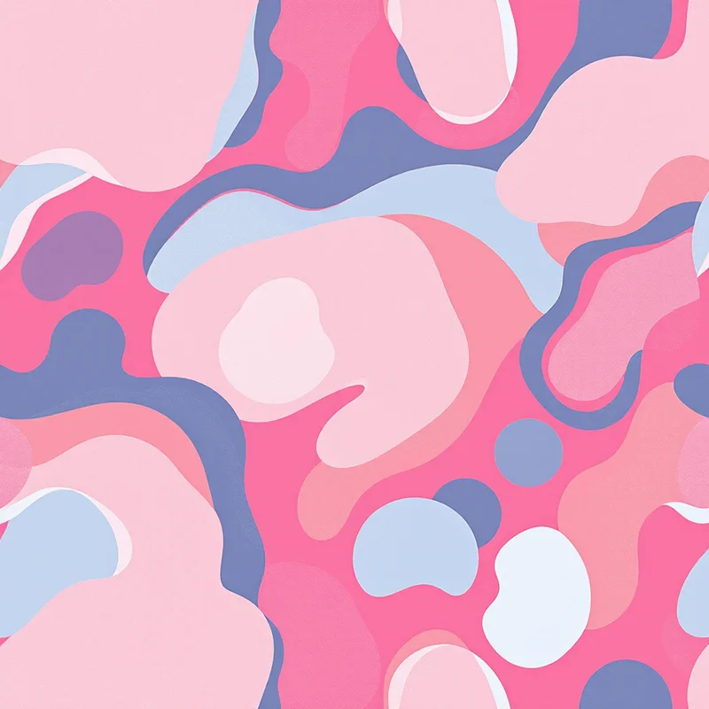
Camouflage keeps returning to gym wardrobes, but the interesting version is far from military. Think stone, oat and dusty blue; blush and cocoa; two close greens with a single bright accent. Big organic blobs with rounded edges feel more current than digital pixel camo for this category.
Gradients and ombre, built for the body
Gradients flatter movement because there is no repeat to break at the seams. Expect more of them, often arranged top to bottom so the color deepens toward the ankle, or radiating from the center back. Gradient patterns can also be applied as a panel block: a lighter panel at the thigh, a darker one at the calf.
Body-mapped panels
The larger idea is panel logic. Instead of one repeat across the entire legging, designers divide the garment into zones: side panels in a print, center in a solid, a waistband in a coordinating tone. It gives the garment a clean visual structure and turns seam placement into a design decision instead of an accident.
A quick comparison
| Direction | Best for | Watch out for |
|---|---|---|
| Tonal abstract | Sets, everyday leggings | Looking flat if contrast is too low |
| Softened camo | Leggings, shorts, jackets | Spots too large for small pieces |
| Gradient | Sports bras, leggings panels | Banding on cheap digital output |
| Body-mapped panel | Premium capsule pieces | Pattern matching across seams |
Print method matters
A common route for printed activewear is sublimation onto polyester-spandex, which holds color through the stretch because the dye goes into the fiber rather than sitting on top. Sublimation also allows full-coverage and gradient prints without the hand-feel penalty of a heavy ink layer. For the production side, read the sublimation pattern design guide.
If you are new to the category, how to design activewear prints covers the build. For prints that cross over into team uniforms, see sports kit and jersey design trends.
Check the repeat before the seam
Run a tonal abstract through a few colorways before you worry about seam placement. Pattern Weaver's Browse Styles lets you pick from 44 categories and 5,700+ styles, and Restyle changes the finish of a pattern you already like, which is one way to compare a soft camo with a tonal abstract on the same palette.
Explore related pattern styles