
Activewear print design is not fashion print design with a different label slapped on the inside seam. The fabric is different, the printing chemistry is different, the body the print sits on is in motion, and the margin for visual error widens dramatically once a leggings panel stretches 40% in one direction and 15% in the other. Anyone moving from woven-fabric textile work into performance apparel hits the same wall: the artwork that looked sharp in the flat file ends up muddy at the calf, banded at the inseam, and oddly desaturated everywhere. This guide walks through how activewear actually gets printed, what the four major print families look like in practice, how stretch deforms motifs, where to place artwork on each garment type, and how to prep files so the sublimation house does not send back a panic email.
Why activewear is polyester plus sublimation, and why that decides everything
Almost every printed performance garment on the rack today is some flavor of polyester — usually a polyester-spandex blend in the 80/20 to 92/8 range, knit into a single jersey, interlock, or warp-knit base. The choice is not aesthetic. Polyester wicks, dries fast, holds shape under repeated stretch, resists chlorine and sweat acids better than cotton, and — most relevant here — it accepts dye-sublimation ink in a way no natural fiber can.
Sublimation works by printing dispersed dye onto a transfer paper, then pressing that paper against the polyester at roughly 195-205°C. The dye skips the liquid phase and converts directly to gas, which bonds chemically with the polyester polymer chains. The result is a print that lives inside the fiber, not on top of it. There is no hand feel, no cracking, no peeling, and no measurable weight added to the garment. That is the entire reason sublimation dominates this category — a printed yoga legging needs to behave identically to an unprinted one against the skin.
This chemistry locks you into three rules that govern every design decision downstream:
- No true white. Sublimation cannot deposit white ink. Any white in your design is just the unprinted base fabric showing through. If the brand spec calls for a colored base, every "white" detail in the artwork becomes that base color instead. Design around this from the start.
- Polyester is non-negotiable for full-coverage prints. Cotton blends below roughly 65% polyester will sublimate weakly and wash out within ten cycles. Bamboo, modal, merino — none of them take sub dye well. If the brand wants a natural fiber, the conversation shifts to reactive printing or DTG, which is a different cost structure and a different look.
- Expect a 10-20% drop in saturation after pressing. Screen-bright neons print noticeably softer on fabric than they appear in the digital file. Designers compensate by oversaturating the file by 10-15% in the brightest hue channels, or by running press tests on every new ink batch.
The four sub-categories pull the print in different directions
"Activewear" is shorthand for a half-dozen disciplines with different aesthetic conventions. Treating them as one bucket is how generic prints get made.
Yoga and pilates. Calm palettes, tonal-on-tonal, botanical or mineral references, slow-flow motifs. The buyer wants something that reads well in a 60-minute class held in a softly lit studio. Bold graphic prints sell poorly here unless they are styled into the brand's "stronger" capsule. Mid to dark base tones, dusty pastels, muted earth, and washed gradients dominate.
Running. Higher visibility, more graphic confidence, often technical-looking — angular lines, fragmented camo, reflective-looking metallic gradients. The runner buyer is performance-first and accepts louder prints because the garment is read at speed, often outdoors, often in low light. Safety-adjacent oranges, electric blues, and warning yellows have a permanent seat here.
Cycling. The closest thing in activewear to traditional sportswear design. Cycling jerseys are billboards. Designers work with large-scale panel graphics, sponsor block layouts, racing stripes, and aggressive color blocking. Print direction matters because the jersey is read from behind by other riders and from the side by spectators. This category is also the most cut-and-sew dependent (covered below).
Gym, lifting, and cross-training. The "fashion-fitness" axis. Strong silhouettes, statement colorways, animal influence including cow print patterns, marble, terrazzo, snake, and overtly fashion-leaning surface design. This is the sub-segment that has pulled activewear toward streetwear over the last five seasons. Print scale here is also the most variable — small marled textures sit comfortably next to oversized graphic panels.
Knowing the sub-category before opening the file decides the palette, motif scale, and contrast ceiling. A run print pushed into a yoga capsule reads as aggressive; a yoga print pushed into cycling reads as weak.
The four print families that cover most of the market
Within those sub-categories, almost every activewear print falls into one of four families. Mixing them within a collection is fine; mistaking which family you are working in is not.
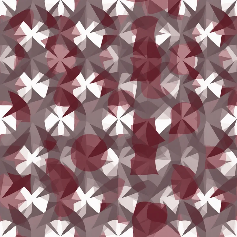
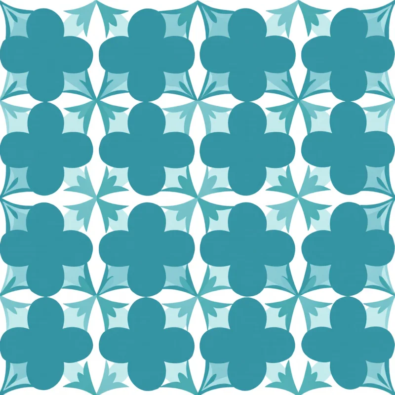
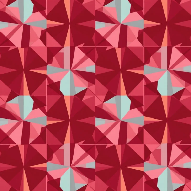
Bold graphic. High-contrast, hard-edged, often illustrative or typographic. Big motifs, deliberate negative space, frequently asymmetric. This is where sportswear graphic design and surface pattern design overlap. Think racing stripes, oversized florals on a saturated base, geometric blocking. Bold graphic prints are the most forgiving on stretch because the eye accepts large shapes deforming — a 14cm motif stretched to 18cm still reads as the same motif.

Ombre and gradient. Smooth color transitions across the garment, often top-to-bottom or diagonal. Visually simple, technically the hardest of the four to execute well. Sublimation handles gradients beautifully — there is no halftone dot to worry about — but banding shows immediately on solid color transitions, especially in mid-grey, dusty pink, and pale blue. Gradient activewear lives or dies on file resolution, dither settings at the RIP, and a careful eye on the panel seams (a gradient that breaks across a side seam looks broken, not designed).
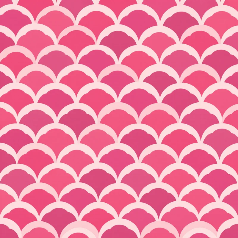
Tonal. A single hue family, low contrast, often texture-driven — marled, brushed, pebbled, watercolor, fibrous. Many premium activewear tonals draw directly on marble patterns where the veining handles the density work without raising contrast. Tonal prints are the workhorse of premium activewear because they read as "considered" without competing with the wearer's body. The technical risk is the opposite of gradient: tonal prints can become invisible. If the lightest and darkest tones are within roughly 15 LAB units of each other, the print disappears at three meters and you have effectively sold a solid.
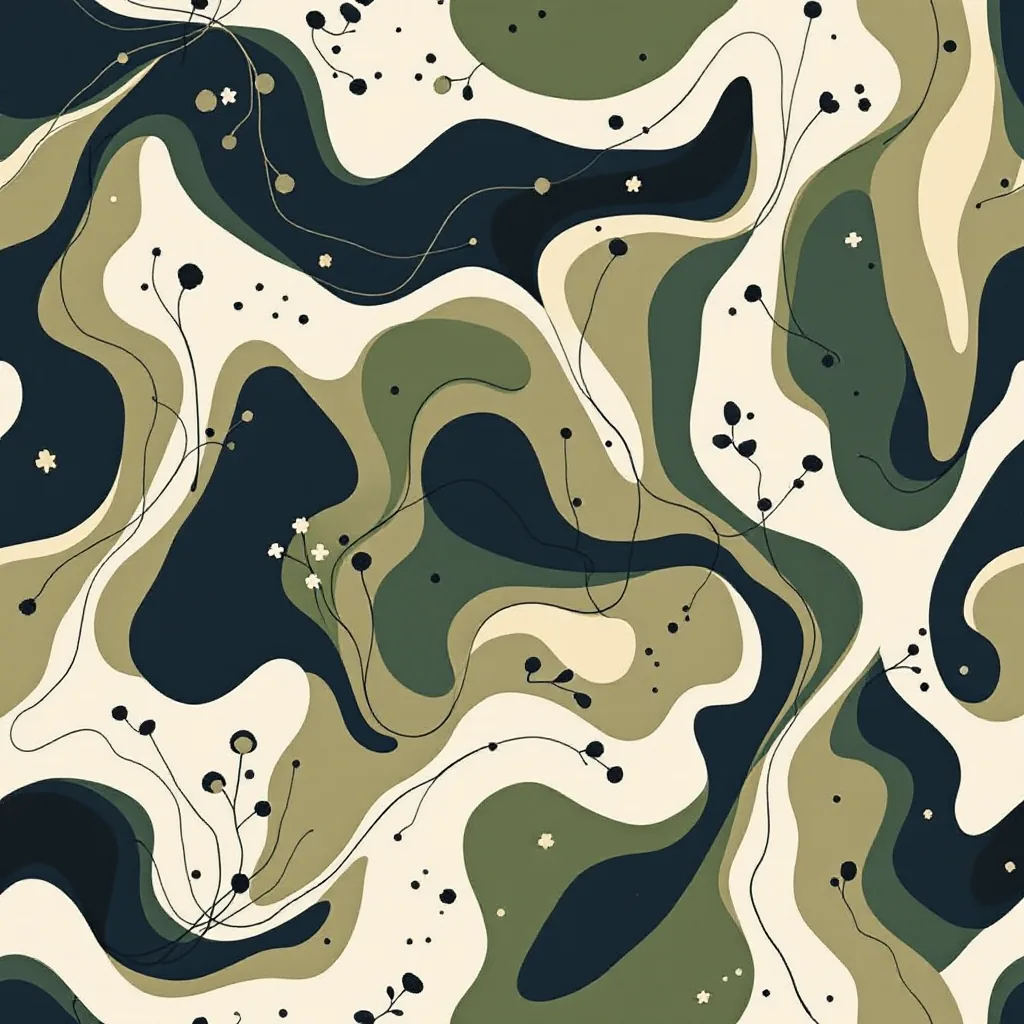
Camo and disruption patterns. Originally military, now its own design language. Modern activewear camo ranges from realistic terrain-style multi-color to abstracted, fashion-led camo where the silhouettes have become any shape that breaks up the surface — pebbles, blobs, fragmented shards, glitch tiles. This family scales well across the leg and torso because the eye does not register exact repeat boundaries.
Stretch math: how fabric deformation eats your motifs
The single most undertaught topic in activewear print design is what stretch actually does to artwork. Performance knits commonly stretch 30-50% in the dominant direction and 15-25% in the cross direction. When the wearer moves, those numbers spike further at the knee, glute, and shoulder.
A 5cm circular motif placed at the front of the thigh of a size M legging will sit at roughly 5×5cm flat. Pulled onto the body, it deforms to approximately 6.5×5.5cm at rest and stretches further during a squat. A 1cm fine-line motif at the same location will deform from 1cm to roughly 1.3cm — a 30% scale change that is invisible to the wearer because nobody can see a fine line clearly under stretch in the first place.
Two practical rules emerge:
- Motifs below roughly 8mm at flat scale tend to dissolve under stretch and motion. Either commit to fine texture (where the loss of individual motif legibility is intentional, as in tonal work) or scale up to 15mm+ where individual motifs remain readable.
- Always design with the stretch axis in mind. Most leggings stretch more horizontally (around the leg) than vertically (down the leg). A circular motif will become an ellipse on body. If a perfect circle matters to the design, draw it as a slightly vertical ellipse in the flat file so it reads as a circle when worn. This sounds excessive until the first sample comes back with eggs instead of dots.
A working compiler workflow helps here — building the pattern in a tool like the seamless pattern maker and then manually scaling the flat file 110-115% horizontally before placement is the simplest pre-distortion technique that survives review.
Print placement: leggings, sports bras, tanks, shorts
Activewear is almost never printed as continuous yardage and then cut. It is printed as garment panels — front leg, back leg, side panel, gusset — on transfer paper sized to the panel, then pressed individually before sewing. This is called cut-and-sew sublimation, and it is the defining production method of the category.
That changes how placement works.
Leggings. The four-to-eight-panel construction means a print is composed of separate pressed pieces meeting at seams. Continuous all-over patterns must be designed to repeat across panel boundaries — if the motif lines do not match at the inseam, the leg looks misaligned. Decorative side stripes, color-blocked panels, and contrast gussets are all opportunities, not obstacles, because each panel is its own canvas. The back glute panel is the most photographed area on social media for any consumer activewear brand; the print needs to look intentional there above everything else.
Sports bras. Two or three panels typically — front, back, sometimes a separate band. The bust apex stretches the most, so radial or geometric prints centered on the bust will warp noticeably. Asymmetric placement, side-weighted graphics, and tonal textures handle the bust deformation better than centered logos or symmetrical motifs.
Tanks and tees. The easiest placement target because most performance tops are two-panel (front, back) with set-in sleeves. Front-of-chest graphic placement, full-back panel artwork, and continuous wraparound prints all work. The shoulder seam is the place where pattern alignment most often visibly fails.
Shorts. Side panels are the dominant placement area, often used for racing-stripe-style vertical graphics or sponsor block layouts. The front and back can carry full prints, but waistband elastic compresses the upper print significantly — designers usually leave the top 4-5cm of the panel less detailed.
Brands working through a textile design studio for the surface work and then a separate cut-and-sew sublimator for production need to share panel templates between both teams from day one. The garment block must drive the artwork, not the other way around.
Cut-and-sew vs cut-and-place printing
Two production methods dominate, and the print file is built differently for each.
Cut-and-sew sublimation. The pattern pieces are nested on transfer paper, printed at full scale, pressed to fabric, then cut to the pattern shape and sewn. Every panel can have its own custom artwork. This is the method behind almost all premium activewear, custom team kits, and pro cycling. It is more expensive per unit because each garment requires its own print layout, but it allows panel-specific design — racing stripes that align across the side seam, gradient bases that flow from waistband to ankle, panel-specific motif scaling.
Cut-and-place sublimation. A continuous repeating pattern is printed across a roll of fabric (or larger paper rolls pressed onto a roll of polyester), then panels are cut wherever they fall. This is cheaper, faster, and used for mass-market activewear, especially leggings under the $40 retail price point. The trade-off is no control over where the print lands — the same legging style cut at different positions on the roll will look meaningfully different. Designers working for cut-and-place production must design seamless repeats that look acceptable anywhere they get cut.
For cut-and-place, every pattern needs the same seamless treatment as any other surface pattern work — true edge-matching, no visible grid lines, and motif distribution dense enough to avoid obvious "empty" panels. An AI pattern generator workflow speeds the seamless repeat step considerably, but the technical brief — palette locked to brand, motif scale set to the smallest panel, stretch-aware sizing — still needs to be controlled by the designer.
Sublimation file prep that doesn't get rejected
Sublimation transfer printing happens on large-format paper printers with their own quirks. The submission spec varies between print houses, but the consensus baseline is:
- CMYK color space, with a print-house-specific ICC profile. Designing in RGB and converting at the last minute leads to dull blues and grey blacks. Get the printer's profile and design with it soft-proofing in the file from the start. Sublimation gamut is wider than CMYK offset in the cyan-to-magenta range and narrower in the yellow-orange range — designs heavy in warm oranges suffer most.
- 300 DPI at final print size. For a full legging panel measuring roughly 110×60cm, that is approximately 13,000×7,100 pixels. Files under this resolution show pixel-stepping on hard motif edges once pressed and stretched.
- Mirrored layout. Transfer paper is mirrored before pressing because the printed side faces down against the fabric. Most professional sub print houses handle the mirror flip themselves, but always confirm — some require the file submitted pre-mirrored, some require it un-mirrored, and a mismatch wastes the entire print run.
- No transparency, no spot colors, no embedded layers. Flatten everything. PSD or TIFF for raster, AI or PDF for vector, all converted to flat raster at final resolution before submission. Layered files cause rasterization mismatches between the designer's RIP and the print house's RIP.
- Bleed of 10-15mm beyond the panel cut line. Cut-and-sew pieces shift slightly during pressing and cutting; without bleed, panels show fabric-colored edges at the seam.
The mirror step in particular trips up first-time activewear designers coming from fashion print design backgrounds, where rotary or digital direct printing on woven fabric does not require any pre-press mirroring.
The fitness-fashion crossover and what it does to print direction
The line between activewear and casual wear has effectively dissolved at retail. Leggings worn to brunch, sports bras worn under blazers, technical tees in office settings — the category that fashion calls "athleisure" pulled activewear print direction sharply away from sport conventions over the last decade.
What this means in practice:
- Brand-aligned colorways now outsell sport-spec colorways in most direct-to-consumer activewear ranges. Muted earth, dusty mauve, fog grey, and matte black move faster than the safety-orange-and-electric-blue palettes that defined performance in the 2010s.
- Fashion print references now appear on technical fabric. Animal print activewear, terrazzo activewear, marble activewear, paisley activewear — all categories that did not commercially exist in performance ranges before 2018, now standard.
- Print scale has shifted larger. "Fashion-scale" motifs (15-30cm) sit on leggings now, where sport convention historically capped at 5-10cm. The big-motif look only works on cut-and-sew construction because cut-and-place repeat density limits motif size.
The implication for designers is that activewear print briefs increasingly read like contemporary clothing design briefs with technical constraints layered on top. Surface pattern designers from the home and fashion textile world are entering activewear faster than the reverse direction.
Putting it together: a realistic project workflow
A small brand commissioning a 6-print activewear capsule typically moves through:
- 1Brief locked to sub-category and family. Yoga? Run? Gym? Bold graphic, gradient, tonal, or camo? Each print should clearly belong to one box.
- 2Panel templates from the manufacturer. The block defines the canvas. Build to the panel, not to an abstract square.
- 3Palette built in CMYK with the print house's ICC profile. Test print a strip of pure color blocks before designing if budget allows.
- 4Motif scale calibrated to stretch. Anything below 8mm pre-stretch is texture, not motif. Anything above 15mm is a feature element.
- 5Repeat construction for cut-and-place, or panel-specific artwork for cut-and-sew. Different files, different workflows.
- 6File output mirrored if required, flattened, 300 DPI, bled, named per panel.
- 7Strike-off sample before bulk. Always. The press, the paper batch, the polyester batch, and the room humidity all shift the final result.
A fabric pattern generator workflow can compress the surface-design step from weeks to days, but the panel templating, stretch math, and submission prep remain manual and unavoidable. The brands shipping the best-looking activewear right now are the ones treating the print file as a manufacturing document, not an art file.
Activewear print design rewards designers who understand the chemistry, respect the stretch, and design to the panel. The category will keep absorbing pattern languages from fashion — explore statement prints and bold cultural references if the brand allows it — but everything pours through the same technical funnel: polyester, sublimation, panel, press. Get those four right and the print survives the gym.
Explore related pattern styles


