
Nursery and baby decor is one of the most stable commercial categories in surface pattern design. New parents purchase decor, textiles, clothing and gift items in concentrated bursts around pregnancy and the first year, generating reliable demand year after year regardless of broader economic conditions. The aesthetic conventions of the category are specific, somewhat conservative, and remarkably durable — a well-designed nursery pattern can earn licensing royalties for ten years or longer with relatively minor refreshes.
But the category is also more disciplined than it looks from outside. The customer is making decisions about an environment that will hold their newborn child. The emotional stakes are high, the safety considerations are real, and the visual conventions are tight. Designers who carry purely aesthetic ambitions into the category — bold modern statements, edgy colour, distinctive ironic detail — often find their work commercially rejected even when it is artistically strong. The patterns that succeed here have learned to operate within the specific emotional logic that parents bring to nursery purchasing.
What Parents Are Actually Buying
The decision-making process for nursery decor is not the same as for any other home category. Parents are buying with two timelines in mind. The immediate timeline is the newborn period: soft, calming, easy to clean, appropriate for round-the-clock use in a sleep-deprived household. The longer timeline is the toddler and early childhood period: patterns the child will see, recognise, eventually have opinions about, and may carry forward into childhood memories.
This dual timeline shapes commercial pattern strategy. Patterns aimed primarily at the newborn period lean toward soft, restful, neutral-palette designs — tonal botanicals, gentle abstracts, soft animal silhouettes, dusty pastels. Patterns aimed at the longer arc lean toward designs with more visual interest, recognisable motifs and slightly more saturated palettes that the toddler can engage with — playful animals, simple narrative scenes, gentle geometric patterns and softly stylised florals.
The strongest collections cover both ends by offering coordinated palettes across a range of motifs with varying density and energy. A new parent can purchase a calm swaddle blanket alongside a more engaging crib sheet alongside a playful wall art print, all coordinated, supporting the dual-timeline reality of how the nursery will actually be used.
The second factor is gendered colour conventions. The category has shifted significantly over the past decade away from strict pink-for-girls, blue-for-boys palettes, and the most commercially successful contemporary collections embrace gender-neutral palettes — sage and cream, terracotta and oat, dusty blue and warm white, soft yellow and grey. Designers entering the category today should generally avoid strongly gendered palette presentations except where licensee requirements specifically demand them, because the broader market has moved toward inclusive palette strategies.
Motif Choices That Work
A small group of motif categories dominates commercial nursery success. Soft animal characters — bears, rabbits, foxes, deer, elephants, woodland creatures, ocean creatures — are perennials. The successful renderings tend toward simplified, slightly stylised silhouettes rather than realistic illustrations, because the simpler forms read better at varying scales and have longer aesthetic shelf life as decorative motifs.
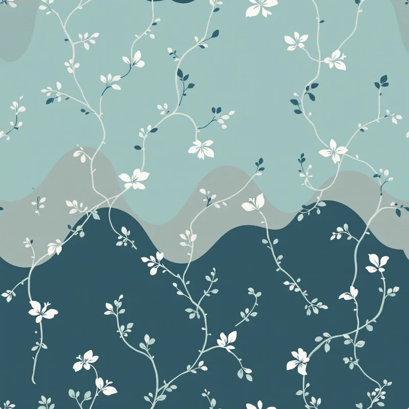
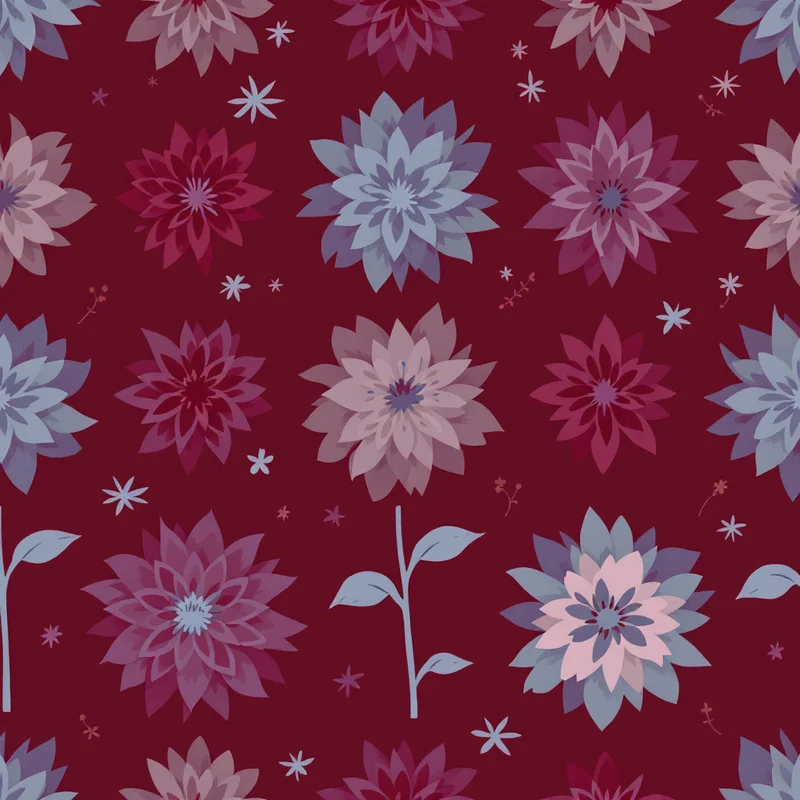
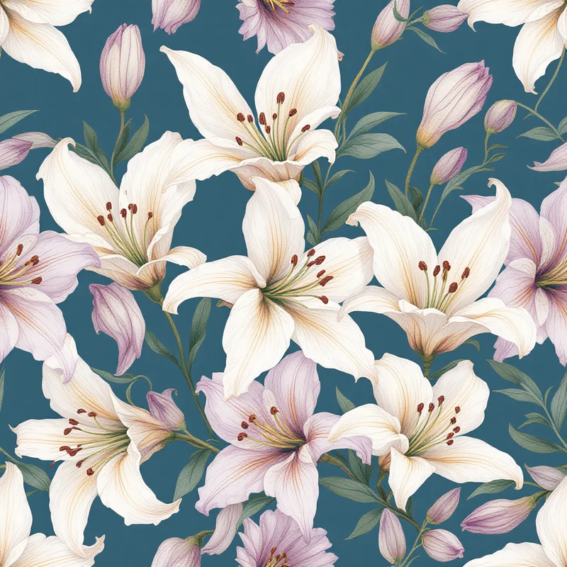
Botanical motifs — leaves, gentle florals, abstract botanical shapes, eucalyptus, ferns — are an enormous segment. The conventions favour soft renderings rather than crisp graphic ones, with watercolour, gouache and brush-textured looks dominating successful collections. Tropical botanicals (palm leaves, monstera) work for some collections but read more strongly in older-child rooms than newborn nurseries.
Star, moon and cloud motifs are dependable performers across decades. The successful renderings emphasise gentle, dreamy interpretations rather than realistic astronomical accuracy. Simple linework, soft silhouettes, twinkle accents and dreamy gradients all work in this segment.
Geometric patterns — dots, simple shapes, gentle stripes — provide quiet supporting roles in nursery collections. They rarely anchor a collection but they coordinate strongly with featured motif patterns and provide variety for products like swaddles, bedding accents and accessories. The successful geometric nursery patterns tend toward irregular, hand-drawn renderings rather than crisp digital geometry.
Narrative scenes — woodland tableaus, ocean scenes, garden scenes — represent a growing premium segment for nursery wallpaper, larger fabric pieces and statement crib bedding. These compositions need to read coherently across multiple viewing distances and to feel timeless rather than locked to a specific moment.
Scale and Composition
Nursery pattern scale needs to be calibrated against the specific products in the collection. Swaddle blankets are large fabric pieces typically 120 by 120 centimetres, and they reward medium to large motif scales because the fabric is folded, wrapped and bunched in ways that fragment smaller motifs. Crib sheets are smaller fitted pieces that show roughly an 80 by 130 centimetre surface area, and they handle medium motifs well. Wall art prints, decals and wallpaper segments work at any scale depending on the product format.
The cleanest collection strategy is to design patterns at a master scale that can be exported at variants for different product applications. A primary pattern designed at, for example, a 30 centimetre repeat can be tiled smaller for crib sheets, presented at native scale for swaddles, and enlarged for wall art applications.
Density is a critical variable. Dense all-over patterns work well for product applications where the visual interest of the surface is the main attraction — wallpaper, swaddles, gift wrap. Lower-density patterns with more negative space work better for products where the pattern provides atmosphere rather than statement — crib sheets, throw pillows, accent products.
For collections that span multiple density levels, a useful rule is to design the dense hero patterns first, then derive coordinating quieter patterns by reducing motif density while preserving palette and key motif elements. This produces collections that feel internally coherent rather than like assemblages of unrelated designs.
Palette Strategy
Nursery palettes have evolved markedly in recent years. The dominant contemporary conventions favour soft, slightly desaturated, warm-leaning palettes that feel calming and timeless. Sage green, dusty pink, warm cream, oat, terracotta, soft mustard, warm grey, dusty blue and gentle peach are recurring palette elements across many successful collections.
The successful palettes tend to avoid both extremes. Highly saturated bright primaries feel aggressive in nursery contexts and have shorter aesthetic shelf life. Very low saturation desaturated palettes feel cold and clinical. The sweet spot is gentle saturation — colours that have warmth and life without overwhelming the calm of the room.
Three palette structures recur successfully. Earth-tone palettes anchor around terracotta, mustard, sage, cream and warm white, producing collections with a grounded, almost vintage feel that translates well across boy, girl and gender-neutral nurseries. Soft cool palettes anchor around dusty blue, sage, blush, cream and grey, producing collections with a gentle, sophisticated feel. Warm pastel palettes anchor around soft pink, peach, butter yellow, cream and gentle mint, producing more traditionally feminine collections that still feel current rather than dated.
Within each palette structure, including a strong neutral base — warm cream, soft white, or pale oat — provides crucial breathing room for surrounding products and decor. Nurseries are visually busy environments with cribs, changing tables, toys, clothes, swaddles, books and wall art all competing for attention. Patterns with neutral bases coordinate easily with surrounding decor; patterns with saturated bases force more aggressive coordination demands.
Safety and Product Considerations
Nursery products are subject to safety regulations that affect material choices, dye certifications and product specifications. Patterns intended for crib bedding, swaddles and direct-baby-contact products typically need to be printable on OEKO-TEX certified textiles and using inks free from heavy metals and certain chemical compounds. As a designer, you typically do not own these certifications directly, but you should be aware that licensees may require specific palette compositions to remain within certifiable ranges, and you may need to adjust palettes to remove problematic pigments.
For wallpaper and wall art products, low-VOC certifications and removable/reposition-friendly substrates dominate the contemporary nursery market. These products do not affect your pattern design directly but do affect colour fastness and finish quality, which licensees may flag during pre-production review.
Building a Nursery Collection
The strongest nursery collections are built as small ecosystems. A coordinated set of six to twelve patterns sharing a palette and thematic anchor can populate a complete nursery — wallpaper, crib bedding, swaddles, gift wrap, wall art, throws, mobiles, and ancillary products. This integration is what licensees and direct customers value most: the ability to commit to a single aesthetic that carries across the room.
Successful collections include several layers. One or two hero patterns anchor the collection visually — the bold botanical, the recognisable animal scene, the statement motif that defines the collection identity. Three or four secondary patterns coordinate with the hero through shared palette and motif family — gentler florals, simpler animal silhouettes, quieter narrative elements. Two or three texture patterns provide neutral connective tissue — dots, gentle stripes, irregular geometrics — that allow products to coordinate without competing.
Naming the collection thematically helps both licensee adoption and direct-consumer marketing. "Wildflower Meadow." "Woodland Friends." "Ocean Voyage." "Soft Botanical Garden." The name signals what the collection is about and gives the customer a clear identity to commit to.
Nursery pattern design rewards designers who balance aesthetic ambition with the specific emotional logic that parents bring to nursery purchasing. The category does not reward edge, irony, or aggressive aesthetic statements. It rewards warmth, calm, gentle joy, and timeless visual choices that support both immediate newborn use and the longer arc of a child growing into the room. The designers who thrive here treat the constraints as creative inputs and build collections that licensees, retailers and parents return to year after year.
Explore related pattern styles
Patterns for


