

Navy blue is the most versatile colour in commercial pattern design. The colour family — encompassing classic navy, French navy, indigo, midnight, ink blue and various adjacent variations — operates as a reliable palette anchor across more commercial categories than any other colour. From traditional men's tailoring to children's bedding, from heritage stationery to contemporary kitchen textiles, from nautical apparel to wallpaper, navy carries commercial weight that few colours can match. For pattern designers, mastering navy is one of the single highest-leverage palette skills in the discipline.
This guide focuses on how to design seamless patterns built around navy as a dominant or anchoring colour. The principles apply across commercial categories and motif vocabularies, and they hold true across both heritage and contemporary positioning.
Several factors make navy the most commercially flexible colour in pattern design. Navy sits at a tonal value that functions as a near-neutral while retaining colour identity. It is dark enough to provide structural weight in compositions, light enough to avoid the heaviness of true black, and chromatic enough to read as a colour rather than as a grayscale element.
Navy also has unusually broad cultural neutrality. The colour does not signal a specific gender, season, occasion or aesthetic movement as strongly as most other colours do. Burgundy carries autumn associations. Yellow carries spring associations. Pink carries gendered associations. Forest green carries woodland associations. Navy carries general associations with stability, considered taste and quality without locking the pattern into a specific category.
The third factor is heritage and tradition. Navy has been used in commercial textile and decorative design for centuries — military uniforms, naval clothing, indigo workwear, classical menswear tailoring, heritage home textiles — and this long commercial history has built deep customer comfort with navy as a default high-quality choice. Customers do not need to be sold on navy. They already expect it to read as quality.
Different navy variants serve different palette purposes. Classic navy sits near #001f3f or #000080 in hex code terms and reads as a confident, slightly cool dark blue. French navy sits slightly warmer at #002654 and reads as more luxurious and considered. Midnight blue at #191970 is darker and slightly more violet, reading as more mysterious and atmospheric. Indigo at #4b0082 leans purple and reads as more bohemian. Ink blue at #1f3a4d is more grey-shifted and reads as more contemporary and modernist.
The specific navy variant affects how the colour interacts with surrounding palette colours and the overall character of the pattern. Designers should be specific about which navy they are working with rather than using "navy" generically — the differences are perceptible and consequential.
Successful Palette Structures
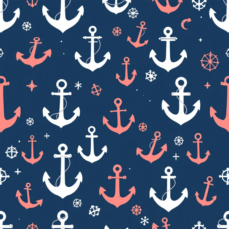
Five palette structures consistently support navy-based pattern designs. The first and most enduring is navy with white. The combination of deep navy and crisp white creates the foundation of countless commercial pattern categories: nautical stripes, classical toiles, heritage menswear patterns, modern minimalist designs and countless others. The success of this combination across centuries reflects its essential graphic clarity — navy provides visual weight, white provides breathing room, and the two together create patterns that read clearly at any scale.
The second is navy with warm complements. Navy paired with cream, mustard, terracotta, warm rust or coral produces patterns with significant palette warmth and complementary contrast. This structure works particularly well for autumn collections, vintage-inspired designs and contexts where palette warmth is desired without abandoning navy's anchoring presence.
The third is navy with cool sophistication. Navy paired with sage green, dusty blue, slate grey or soft lavender produces patterns with tonal sophistication and considered restraint. This structure works particularly well in contemporary home decor, sophisticated stationery and contemporary fashion textiles.
The fourth is navy with bold accent. Navy paired with hot pink, electric coral, bright yellow or vivid orange produces patterns with strong colour contrast that reads as confident and contemporary. This structure works particularly well in fashion accessories, contemporary product design, and applications where visual energy is desired without compromising navy's palette gravitas.
The fifth approach uses navy with metallic accents. Navy with gold, brass, silver or copper produces patterns with explicit luxury signal that work particularly well in premium gift wrap, holiday applications, packaging and luxury home decor.
Different motif categories interact with navy in distinct ways. Nautical motifs are the natural pairing — anchors, ropes, stars, marine life, classical sailing references all coordinate with navy through the colour's deep cultural connection to maritime tradition. The successful contemporary interpretations tend to update the rendering style (less literal, more design-forward) while preserving the palette tradition.
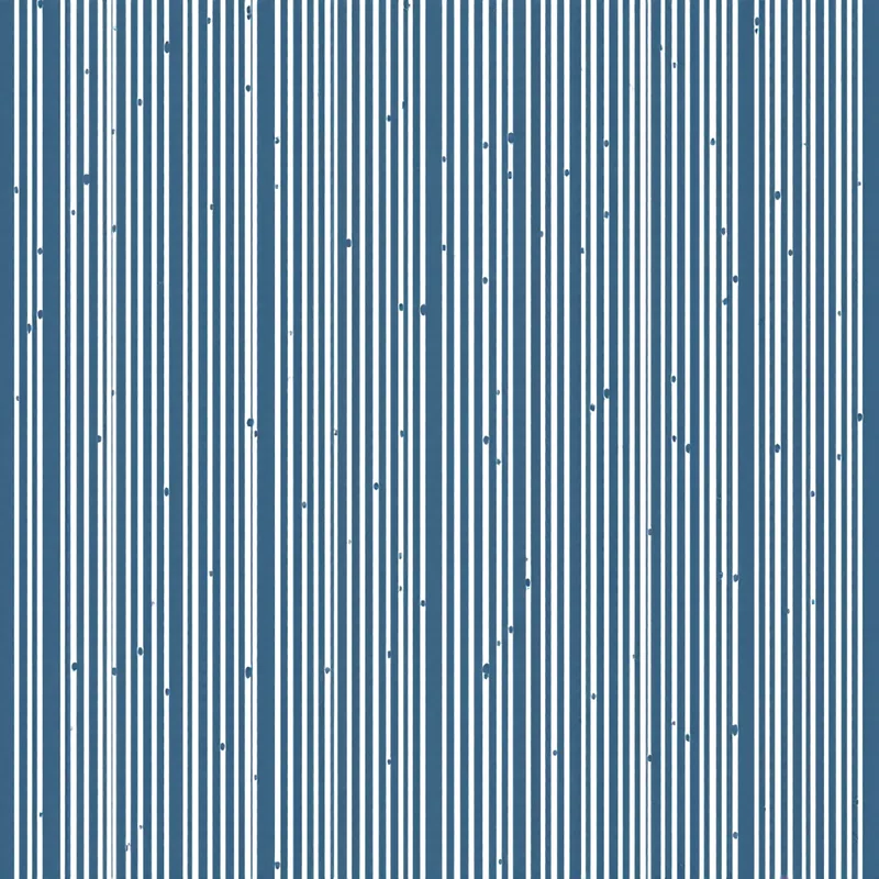
Geometric motifs work effectively with navy across the full range from playful to formal. Polka dots, stripes, chevrons, classical geometric vocabulary, mathematical tessellations and contemporary geometric compositions all pair with navy effectively. The colour's neutrality allows the geometry to dominate the design while navy provides structural weight.
Floral motifs work effectively with navy in two distinct directions. Dark floral compositions with navy as the dominant field colour and brighter florals against that field produce patterns with rich palette commitment and slight vintage character. Lighter floral compositions with navy as an accent or supporting colour produce patterns with cleaner contemporary feel.
Cultural pattern vocabularies use navy across many traditions. Japanese indigo and shibori traditions, Indian indigo block prints, Indonesian batik, North African and Mediterranean textile traditions and Scandinavian folk patterns all employ navy palettes extensively. Designers working in cultural vocabulary find navy a versatile palette anchor.
Animal motifs work across the spectrum with navy. From whimsical children's-room animal patterns to sophisticated equestrian motifs to traditional natural history illustration references, navy supports many animal motif treatments.
Abstract and painterly motifs work effectively with navy palettes. Painterly washes in navy variations, contemporary abstract compositions, brushwork patterns and atmospheric compositions all build on navy as a reliable palette anchor.
Application Categories
Navy excels across an unusually broad range of commercial applications. Home decor textiles use navy as a foundational palette colour across throw pillows, blankets, drapery, table linens and upholstery in both contemporary and traditional positioning. Few colours appear in more home decor product categories.
Wallpaper applications benefit from navy's ability to anchor rooms across many decorative styles. Navy walls coordinate with diverse furniture and decor choices and provide visual depth without overwhelming.
Fashion textiles use navy as a primary anchor across menswear, womenswear, children's wear, accessories and footwear. The colour works in formal, casual, athletic, vintage and contemporary positioning across all seasons.
Stationery and paper goods use navy extensively in premium positioning — sophisticated journals, planners, gift wrap and greeting cards. The colour signals quality and considered taste reliably.
Nautical and outdoor product categories use navy as essentially the default palette colour. Boating apparel, beach products, outdoor gear, swim accessories and similar categories build extensively around navy palette anchor.
Children's products use navy across bedding, clothing, nursery decor and gift items. The colour works in both traditional and contemporary children's positioning and avoids the gender-coded associations that affect some other colour choices.
Branding and identity design uses navy extensively as a reliable corporate colour that signals quality, stability and considered taste across many industry categories.
The strategic question for designers building navy-based pattern collections is whether to commit to a single specific navy variant across the collection or to use navy variants strategically across different patterns within a collection.
Single-variant commitment produces collections with strong internal coherence. All patterns share the same specific navy, and the supporting palette colours coordinate against that single anchor. This approach works particularly well for collection-based licensing where the licensee needs all patterns to coordinate reliably.
Strategic variant usage opens up more visual variety within a collection. Some patterns use classic navy, others use French navy or midnight blue, with each variant chosen to support the specific motif and palette structure of the individual pattern. This approach works particularly well for portfolio-based selling through platforms where each pattern is sold independently.
For print-on-demand platforms specifically, designers should be aware that the same navy hex value can print significantly differently across different platforms and product applications. Testing actual production output before launching a navy-based design programme is essential because the colour shift between digital file and printed product can be substantial.
Common Pitfalls
Three pitfalls recur in navy pattern design. The first is treating navy as a neutral rather than as a colour. Navy is visually heavier than true neutrals like cream, white or grey, and patterns that assume navy will recede the way a neutral would often end up with the navy dominating the composition in ways the designer did not intend. Designers should plan navy as a primary palette presence, not as background.
The second pitfall is muddy production. Some navy variants can shift unpredictably during CMYK conversion or digital printing. Designers should verify the actual printed navy through proof testing and adjust the digital file if necessary to land the desired variant.
The third pitfall is excessive contrast without breathing room. Navy paired with high-contrast bright colours can produce visually aggressive patterns that read as cheap or dated when used in heavy density. Successful navy patterns typically balance visual contrast against negative space and tonal hierarchy.
Navy blue is a palette anchor that rewards mastery. The designers who build successful navy pattern programmes treat the colour with deliberate care, choose the specific navy variant that fits the design intent, and build supporting palette structures that elevate navy's distinctive character. Because navy works across so many commercial categories, navy fluency is among the highest-leverage skills in surface pattern design — the colour is always relevant, always commercially viable, and always rewarding for designers who put in the time to learn its specific possibilities.
Explore related pattern styles
Patterns for


