
Linocut printing has become one of the most influential aesthetic vocabularies in contemporary surface pattern design. The distinctive visual character of carved marks against printed field — high contrast, slight irregularity, the visible texture of the cutting tool against the linoleum block — produces patterns with handmade authenticity that resonates strongly in contemporary commercial markets craving alternatives to perfectly clean digital aesthetics. For pattern designers working in digital tools, understanding how to interpret and execute the linocut aesthetic produces work with distinctive contemporary appeal across many application categories.
The linocut tradition itself dates from the early twentieth century, when linoleum became available as an alternative to the harder woodblock material that had dominated relief printmaking for centuries. The softer linoleum was easier to carve, more affordable than woodblock and allowed for both rougher and finer carving than wood would support. The technique was embraced by Picasso, Matisse and many early-twentieth-century artists, and developed as both a fine art medium and an accessible vocabulary for textile and decorative design.
The Visual Logic of Linocut
Several characteristic visual elements distinguish linocut from other printmaking and design vocabularies. The carved mark is the foundational element — every visible feature in a linocut print is either an area where the linoleum has been left raised (which prints with the chosen ink colour) or carved away (which appears as the paper or substrate colour). This binary structure produces patterns with explicit graphic clarity.
The marks themselves carry the character of the cutting tool. V-shaped gouges produce specific mark profiles. U-shaped gouges produce different mark profiles. Wide flat gouges produce broad sweeping marks. The marks have slight irregularity from the handmade cutting process — neither perfectly straight nor perfectly curved, with the slight wavering and texture that registers as authentic handcraft rather than as mechanical reproduction.
The contrast structure is typically binary — printed colour against substrate. Traditional linocut uses one ink colour against paper, producing two-tone designs with extreme graphic clarity. Multi-colour linocut uses multiple sequential prints with separate carved blocks, producing patterns with limited but considered colour palettes.
The ink coverage often shows slight irregularity. Areas where the block did not fully ink up appear as lighter texture; areas where the block was over-inked appear as solid colour with slight bleed at edges. This irregularity reads as authentic handcraft rather than as poor execution.
The composition typically emphasises strong silhouette over fine detail. Linocut's binary structure rewards motifs with confident outlines and bold internal shapes rather than motifs that depend on subtle gradation or fine internal detail. The carving process makes very fine detail challenging, so successful linocut designs work within these material constraints rather than against them.
Translating Linocut to Digital Pattern Design
For digital pattern designers, producing linocut-aesthetic work involves deliberately simulating the visual logic of the traditional medium. Several techniques contribute to convincing linocut interpretation.
Working in true two-tone palette — one bold colour and one substrate colour — establishes the foundational visual structure. Adding more colours moves the work away from authentic linocut toward more general printed graphic aesthetic.
Drawing motifs with slight intentional irregularity simulates the hand-carved character. Edges that are slightly wavering rather than perfectly straight, curves that have slight inconsistency rather than mechanical smoothness, internal lines that vary slightly in width — all of these features signal handmade execution.
Including textural irregularity within solid colour areas — slight breaks, occasional dropouts, small textural variations that simulate uneven ink coverage — produces convincing linocut character. These details should be subtle rather than overstated; excessive irregularity reads as careless rather than as deliberate aesthetic choice.
Using mark vocabulary that mimics the actual marks of carving tools — V-shaped lines, U-shaped marks, broad sweeping cuts — produces patterns that read as carved rather than as drawn. Studying actual linocut printmaking provides useful reference for this mark vocabulary.
Working at appropriate scale matters. Linocut details work most effectively at scales where the carved character reads clearly — patterns scaled too small can lose the linocut texture; patterns scaled too large can show every digital imperfection in the simulated marks. Most successful linocut-aesthetic patterns work in medium-scale applications where the carved character provides visual texture without being overwhelmed by scale.
Motif Strategy
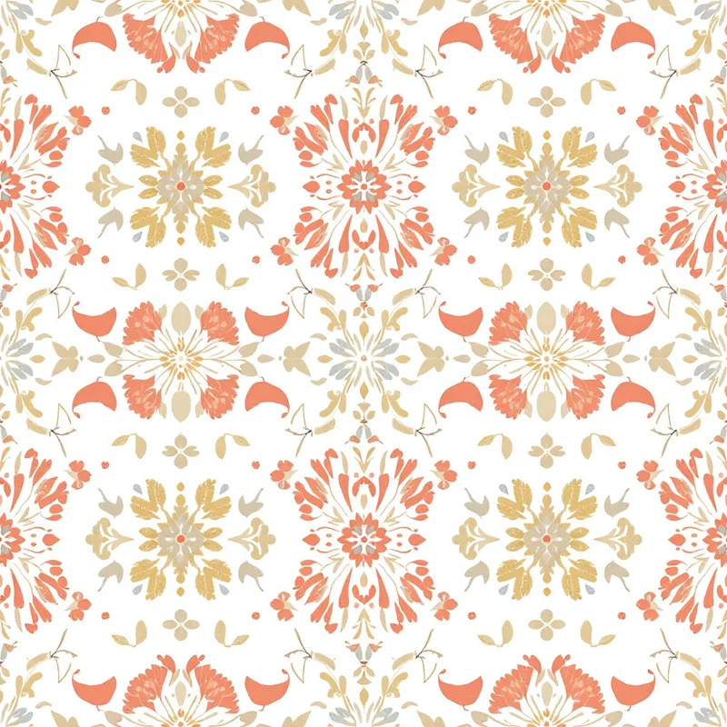
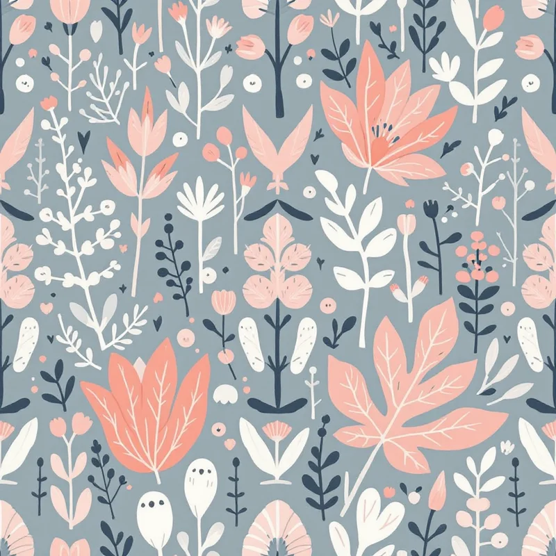
Botanical motifs are perhaps the most natural pairing with linocut aesthetic. The bold silhouette character of carved marks works particularly well for leaf forms, floral compositions and botanical illustrations. Many of the most celebrated linocut works in twentieth-century printmaking — Matisse cutouts, Picasso linocuts, traditional Japanese woodblock botanicals — use botanical subjects.
Animal motifs work effectively in linocut aesthetic, particularly when the rendering emphasises silhouette and graphic clarity. Bird studies, fish prints, insect compositions and bold animal silhouettes all translate well into linocut vocabulary.
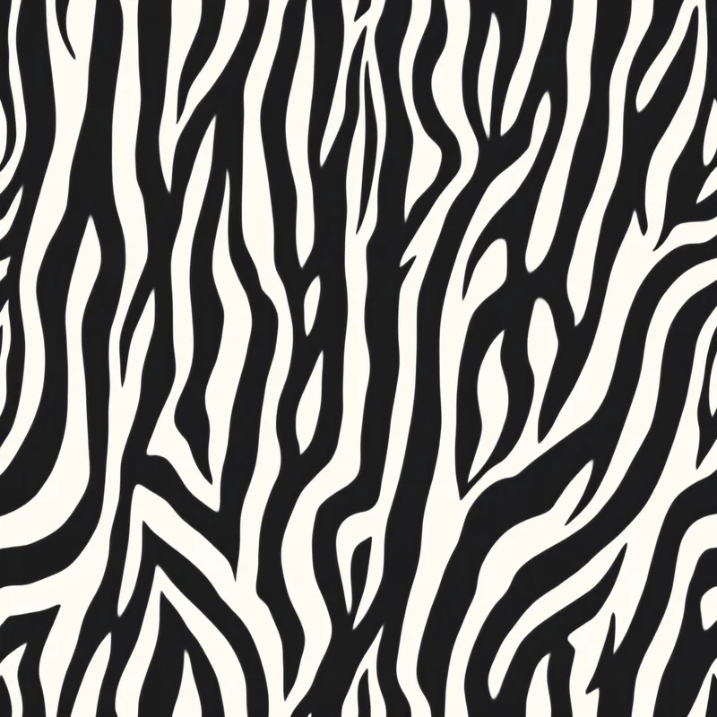
Geometric motifs work well in linocut when the geometry has slight irregularity that reads as carved rather than as mechanically perfect. Stripes with slight wavering edges, dots with hand-rendered character, geometric tessellations with carved-mark variation all produce patterns with authentic linocut feel.
Abstract and graphic motifs work effectively in linocut, particularly compositions that emphasise mark-making and gesture. Brushwork-style marks, abstract compositions with strong silhouette and graphic statements with confident binary contrast all support linocut interpretation.
Typography and decorative lettering work well in linocut aesthetic. Hand-carved letterforms with the character of relief printing have been used in book illustration, posters and decorative arts for centuries.
Palette Strategy
Traditional single-colour linocut uses one ink against paper, with black against cream paper being the most foundational combination. This palette produces patterns with maximum graphic clarity and reads as authentic to the historical tradition.
Single-colour variations expand the palette while preserving the two-tone structure. Forest green against cream, terracotta against cream, deep navy against cream, burgundy against cream — all of these produce patterns with significant character variation while preserving linocut authenticity.
Reverse-out single colour — coloured field with cream or paper-tone motifs — produces patterns with strong colour statement that work particularly well in contemporary home decor and statement fashion applications.
Two-colour linocut uses two ink colours plus the substrate colour, producing three-tone patterns. The classical reduction-print technique allows for this approach. The palette choices typically involve careful relationships — analogous colours, complementary contrasts or culturally specific combinations.
Multi-colour linocut (using three or more ink colours) becomes increasingly difficult to maintain authentic linocut character. The clean limited-palette structure is part of what makes linocut distinctive, and palettes with many colours move toward more general printed graphic aesthetic.
Contemporary Applications
Home decor textiles use linocut aesthetic across throw pillows, drapery, table linens, kitchen textiles and accessories. The handmade character of the aesthetic resonates strongly in contemporary biophilic and craft-positioned interior design.
Stationery and paper goods use linocut extensively in premium positioning. Greeting cards, gift wrap, journals and planners with linocut aesthetic carry strong commercial presence in the premium and design-forward segments. The aesthetic signals considered taste and craft authenticity.
Fashion textiles use linocut aesthetic in contemporary positioning, particularly in seasonal collections, accessories and design-forward apparel. The category supports both literal linocut interpretation and looser linocut-influenced work.
Wallpaper applications include linocut-aesthetic wallpaper in both traditional and contemporary positioning. The pattern's hand-printed character provides distinctive alternative to perfectly digital wallpaper aesthetics.
Book and editorial design uses linocut extensively for distinctive illustration and decorative elements. Children's books, literary illustration and editorial design all draw on linocut vocabulary.
Branding and identity design uses linocut for brands wanting to signal craft authenticity, traditional values, considered handmade character or specific aesthetic positioning aligned with the linocut tradition.
Common Pitfalls
Several pitfalls recur in digital interpretation of linocut aesthetic. The first is over-perfect execution. Linocut character depends on slight irregularity; perfectly clean digital marks read as fake linocut rather than as authentic. Designers should embrace deliberate imperfection in mark execution.
The second pitfall is excessive irregularity. Overdone simulation of carved marks reads as careless rather than as authentic. The balance between deliberate handmade character and competent execution is essential.
The third pitfall is wrong palette choice. Linocut palettes work most reliably with limited colour count and considered relationships. Multi-colour designs typically lose the distinctive linocut character that makes the aesthetic commercially valuable.
The fourth pitfall is wrong motif scale. Linocut character requires sufficient scale to read; designs scaled too small lose the carved-mark texture.
The fifth pitfall is digital perfectionism in linework. Hand-drawn lines for linocut should have slight wavering and tool-mark character. Perfectly drawn digital lines read as artificial rather than as authentic linocut.
Linocut aesthetic rewards designers who study the traditional medium and translate its visual logic deliberately into digital work. The carved-mark character, limited palette structure, bold silhouette emphasis and slight imperfection that define authentic linocut all contribute to a vocabulary that retains strong commercial presence in contemporary applications craving alternatives to perfect digital aesthetics. The investment in understanding the traditional medium pays returns across many years of commercial application.
Explore related pattern styles
Patterns for


