
The greeting card is the smallest commercial canvas most surface pattern designers will ever work with. A standard A6 card measures 105 by 148 millimetres. After folding, the front cover is the same dimensions. After accounting for printer bleed, safe zones and any required clear space for typography, the actual designable area shrinks further. Inside that compressed space, the pattern needs to do everything at once: communicate occasion, set tone, provide a backdrop for messaging, drive impulse purchase at retail, and survive the technical limits of mass-market card printing.
Greeting card pattern design is therefore an exercise in extreme economy. Every motif counts. Every colour relationship counts. Every centimetre of negative space counts. Designers who carry textile or wallpaper habits into the category — large-scale repeats, rich detail intended for close inspection, complex tonal palettes — often produce cards that read as muddy or cluttered at actual print size. The designers who thrive in this space have learned to design for the constraints, not against them.
The Card Market Landscape
The greeting card category is divided into several distinct segments with different commercial logic. Mass-market cards are sold at supermarkets, drugstores and bulk retailers, with unit prices typically between two and five dollars. These are high-volume, low-margin products with strict cost constraints on production. The design strategy here favours bold, broadly appealing patterns that telegraph occasion clearly and avoid risk.
Premium cards are sold at boutique stationery shops, museum gift stores, and high-end online retailers, with unit prices typically between five and ten dollars or more. The design strategy here can afford to be more distinctive, more aesthetically committed, and more clearly artisanal. Pattern-led cards thrive in this segment because the customer is partly purchasing the card as a small piece of art that the recipient may display.
Print-on-demand cards through platforms like Society6, Redbubble, Minted and Etsy sit somewhere between these poles. The unit margin is moderate, the production quality is digital rather than offset, and the design strategy needs to balance distinctiveness against the algorithm-driven discovery patterns that drive sales on each platform.
Independent designers can sell into any of these segments but should design with the specific segment in mind. Patterns designed for boutique premium cards often translate poorly to mass-market production because the colour subtlety gets lost. Patterns designed for mass market may feel under-considered in premium contexts.
Pattern Strategy at Card Scale
The single most important shift for greeting card pattern design is reducing motif count. A pattern that distributes twelve motifs across an A6 card front gives each motif less than one square inch of real estate. At normal viewing distance, those motifs read as visual noise rather than as discrete decorative elements. Successful card pattern designs typically feature between two and six clearly readable motifs across the visible card front, with the rest of the composition being supporting texture, negative space, or background colour.
This does not mean card patterns are simpler than larger-format patterns. The detail per motif can still be high. The colour relationships can still be sophisticated. The composition can still be considered. What changes is the spatial logic: fewer elements, each given enough breathing room to read at small size, supported by a clear hierarchy of primary, secondary and background levels.
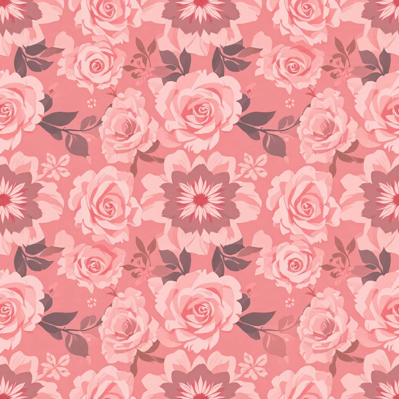
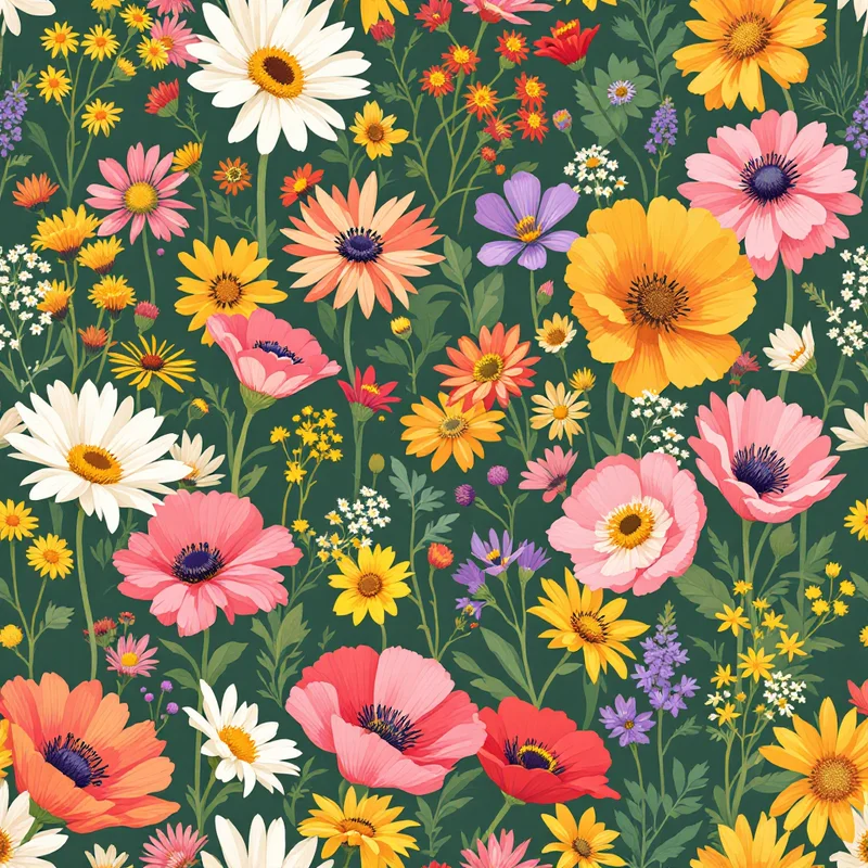
Motif silhouette matters more on cards than at any other scale. A motif with a clear, identifiable silhouette reads instantly. A motif whose impact depends on internal detail will lose its identity at card size. Floral designs benefit from chosen flowers with distinctive shapes — peonies, sunflowers, daisies, tulips — rather than visually ambiguous species. Geometric designs benefit from confident, simple shapes — circles, hexagons, sweeping arcs — rather than complex tessellations that fragment at small scale.
Typography Integration
Most greeting cards combine pattern with typographic message. "Happy birthday." "Congratulations." "Thinking of you." "Just because." The pattern needs to either provide a clear zone for typography or work as a frame around typography that is part of the design system.
The two dominant approaches both work, but they require very different pattern thinking. Frame patterns are designed with deliberate negative space — typically in the centre or as a horizontal band — where typography lands cleanly without competing with pattern elements. This approach works particularly well for cards intended for licensee use where different typography may be added by different publishers. The pattern delivers the visual atmosphere; the typography delivers the specific message.
All-over patterns require typography to be designed as part of the composition. The pattern fills the entire card front with continuous repeat, and the typography is overlaid on top of the pattern in a way that respects the colour relationships and creates intentional contrast. This approach works particularly well for designer-published cards where the same designer controls both the pattern and the typographic treatment. The total composition reads as a single integrated design rather than as a layered combination of pattern plus text.
The technical consideration that connects both approaches is contrast. Typography on a patterned background needs sufficient contrast against the pattern's average tone to remain readable. White or light typography on a busy pattern often fails because the pattern's light areas blend the type into invisibility. Dark typography on saturated pattern often fails because the pattern's dark areas swallow the type. The reliable solution is to design a contrast structure into the pattern itself — clear lighter zones for dark type, clear darker zones for light type — rather than retrofitting typography onto a pattern designed without it.
Occasion-Driven Design
Greeting cards are fundamentally occasion-driven products. The customer is purchasing a card for a specific moment: a birthday, a wedding, a sympathy, a thank you, a holiday, a celebration. The pattern needs to either signal the occasion clearly through motif choice and palette, or signal it more subtly through palette and tone with the typography providing the specific occasion message.
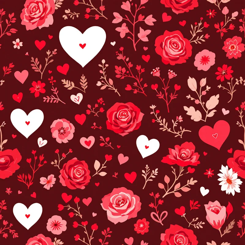
Birthday cards dominate the category by volume and reward joyful, colourful, energetic designs. Pattern choices that succeed in this segment include confetti, balloons, abstract celebrations, florals in bright palettes, party scenes, and any composition that telegraphs warmth and energy at first glance.
Wedding cards reward elegant, considered, sometimes restrained designs. Pattern choices that succeed include botanical wreaths, classic florals, gold-accented geometrics, soft tonal abstracts and patterns that evoke ceremony and meaningful occasion without veering into theme-park territory.
Sympathy and condolence cards reward quiet, soft, dignified designs. Pattern choices that succeed include muted florals, soft botanical studies, gentle abstracts and tonal compositions that provide warmth without celebration. The pattern strategy here is to support the message without competing with it.
Holiday cards have their own conventions that overlap with wrapping paper but differ in important ways. Christmas cards reward both traditional and modern interpretations. Hanukkah, Diwali, Lunar New Year and Eid cards reward designs that honour the visual conventions of each holiday while remaining elevated rather than literal.
Everyday cards — thank you, thinking of you, congratulations, just because — represent a growing segment that rewards patterns with broad emotional appeal: warmth, kindness, gentle celebration. These patterns often outsell occasion-specific designs over the long run because the customer can purchase them for many different recipients.
Production Considerations
Mass-market card printing is typically four-colour offset on coated stock between 250 and 350 gsm. The colour reproduction is reliable but compressed compared to premium printing. Saturated CMYK colours print well; soft pastels can lose definition; very dark colours can flatten. Patterns intended for mass-market production should be tested in proof at actual size to verify the palette translates.
Premium card printing opens up specialty options: foil stamping for metallic highlights, embossing for tactile dimension, die-cutting for distinctive silhouettes, edge painting for premium finish. Each of these adds production cost but creates differentiation that justifies the higher price point.
Print-on-demand card production is digital, with quality that has improved dramatically but still varies between platforms. The reliable approach is to design at 300 DPI in the platform's specified colour mode (typically sRGB for most platforms), with proper bleed and safe-zone margins. Test prints are essential before launching a card actively.
For file delivery to licensees, deliver patterns at 300 DPI in CMYK with embedded ICC profile, plus a layered file showing pattern, recommended typography zone, and any specialty layers (foil, emboss) as separate vector elements. Include a mock-up showing the pattern at actual card size so the licensee can immediately see how the design works in context.
Building Card Collections
The strongest card programmes are built around collections rather than single designs. A coordinated set of six to twelve cards sharing a palette and motif family allows for cross-product applications, gift box sets, retailer assortments and direct-to-consumer subscription products. The collection structure also supports occasion expansion — the same visual world can populate birthday cards, thank you cards, sympathy cards, holiday cards and everyday cards with appropriate motif and message variations within each card.
Successful collections are built with intentional motif hierarchy. The hero pattern anchors the collection — bold enough to be a signature, recognisable enough to identify the collection across products. Supporting patterns coordinate with the hero through shared palette and motif family while providing visual variety. Texture and background patterns provide quiet options for cards that need to support typography prominently. The full collection feels like one designer's voice rather than like a folder of unrelated files.
Greeting card pattern design rewards designers who respect the constraints of the small canvas, understand the emotional logic of occasion-driven purchase, and build collections with intentional commercial structure. The category is competitive but the customers are loyal, the licensing channels are accessible, and the body of work compounds across many years. The cards that succeed are not necessarily the most ornate or the most complex — they are the cards that do the job of being right for the occasion, right for the moment, and right for the recipient.
Explore related pattern styles
Patterns for


