
Ceramics is one of the oldest and most enduring applications of decorative pattern. Tile, tableware, pottery and architectural ceramics have carried surface pattern for thousands of years, and the contemporary ceramic industry continues to license and produce surface designs at significant volume across home decor, hospitality, retail and consumer markets. For pattern designers, ceramics represents a category that rewards careful attention to format, scale, palette and the specific technical realities of how patterns transfer to ceramic surfaces.
The category is also broader than most designers initially realise. Beyond decorative tile and tableware, ceramic surface design appears on bathroom fixtures, kitchen backsplashes, decorative pottery, ceramic accessories, planters, vases, mugs and an enormous range of consumer ceramic products. Many of these applications operate at the licensing scale where independent designers can build sustainable royalty streams across years of production.
How Ceramic Pattern Application Works
Ceramic surfaces receive patterns through several technical methods, each with different design implications. Decal transfer is the dominant method for consumer ceramic decoration. The pattern is printed onto a slip transfer paper using ceramic-grade inks, applied to the bisque-fired ceramic surface, and then fired again at high temperature to fuse the pattern permanently into the glaze. This produces highly durable patterns with good colour reproduction and the ability to handle complex multi-colour designs.
Direct screen printing onto ceramic surfaces is used for tile and some decorative pottery. The screen-printed ceramic ink is applied directly to the ceramic body before firing, producing patterns that fuse into the surface during firing. The colour gamut is somewhat limited compared to decal transfer but the production is faster and the cost lower for high-volume tile production.
Digital ceramic printing has emerged as a significant technology over the past decade. Inkjet printers using ceramic-grade inks can print directly onto bisque ceramic surfaces with colour reproduction approaching photographic quality. This opens up complex multi-colour designs and short-run customisation that were previously impractical, and it has democratised access to ceramic pattern licensing for independent designers.
Hand-painted ceramic decoration remains commercially significant for premium pottery, artisanal tile and craft-positioned ceramic products. The patterns designed for hand-painting need to consider the practical realities of manual application, but they can achieve aesthetic effects that mechanical printing cannot replicate.
Each of these methods has implications for how pattern files should be prepared and what design choices will translate effectively from screen to fired ceramic surface.
Format Considerations
Ceramic format is more constrained than most pattern applications because the surface is rigid, three-dimensional, and shaped by functional requirements. A tile is a flat rectangle. A plate is a circle with a raised rim. A mug is a curved cylinder. A vase is a complex three-dimensional surface that wraps the pattern around continuously varying contours. Each of these formats requires different design approaches.
Flat tile is the most accessible format for pattern designers because it operates similarly to other flat surface design applications. Standard ceramic tile sizes vary by market — common sizes include 10 by 10 centimetres, 15 by 15 centimetres, 20 by 20 centimetres, 30 by 30 centimetres and larger format tile up to 60 by 60 centimetres or beyond. Each size affects motif scale and compositional strategy.
Single-tile compositional designs treat each tile as a complete framed composition. The pattern fills the tile with a self-contained design that is meant to be appreciated as a discrete unit. This approach works well for decorative tile applications where individual tiles are displayed as focal points or used as accent pieces in a broader tile installation.
Multi-tile pattern designs treat groups of tiles as a single larger composition. A four-tile composition (two by two) might form a complete medallion. A nine-tile composition (three by three) might form a larger scene. These designs require precise alignment between tiles and need to account for the visible grout lines that will separate tile edges in installation.
Repeating tile patterns extend across many tiles in a continuous repeating field. Each tile is part of a larger surface pattern that continues across the installed wall or floor. These designs need to repeat seamlessly across tile edges and need to look intentional when viewed at the scale of the full installation.
Plate and bowl design works within circular or oval format with raised rim considerations. The rim area is typically a separate band where decorative borders, motifs or framing elements can sit, while the centre of the plate provides a larger circular field for primary pattern or compositional design. Successful plate designs often use a clear hierarchy between rim treatment and central composition.
Cylindrical and curved ceramic format — mugs, vases, pitchers — requires designs that wrap around the surface continuously or in defined panels. Wrap-around continuous designs work like cylindrical wallpaper, where the pattern repeats horizontally and may continue from top to bottom of the vessel. Panel designs treat specific zones of the vessel as separate compositions.
Palette and Glaze Realities
Ceramic palettes are constrained by the chemistry of ceramic inks and the firing process. Colours behave differently when fired into glaze than they do as digital files or as ink on paper. This is the single biggest technical reality that designers need to understand when working with ceramic applications.
Certain colours fire reliably and reproduce accurately. Cobalt blue, classic underglaze blue, sage green, ochre, terracotta red, deep charcoal and warm black are all reliable in ceramic production and have been used for centuries because they hold their colour through firing. Other colours are less reliable. Pure bright reds can shift toward orange or brown during firing. Certain greens can fade or shift hue. Pure pink can be difficult to achieve and may require palladium-based pigments that are expensive and difficult to source.
Digital ceramic printing has expanded the available palette significantly, but designers working with traditional decal transfer or screen printing should consult with their producer about palette feasibility before finalising designs. A palette that looks beautiful on screen may need adjustment to translate accurately through the firing process.
Colour relationships also shift during firing. A palette that has strong contrast in digital file may show reduced contrast after firing because some colours saturate while others mute. Designers experienced with ceramic production often deliberately exaggerate contrast in the design file to compensate for the predictable firing shifts.
Cultural and Heritage Conventions
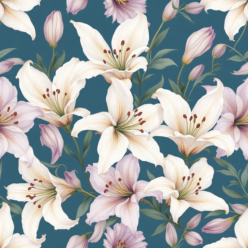
Ceramic pattern has deep cultural and historical conventions that designers should understand even when they choose to depart from them. Blue and white underglaze patterns originating in Chinese porcelain traditions remain enormously commercially successful in contemporary ceramic markets — willow patterns, transferware, contemporary blue and white variations all build on this heritage.
Mediterranean tile traditions — Portuguese azulejo, Spanish ceramic, Italian maiolica, Greek pottery — offer rich design vocabularies that translate effectively into contemporary ceramic licensing. Moroccan zellige and broader Islamic geometric ceramic traditions provide another deep vocabulary of mathematical pattern and colour that remains commercially current.
English china traditions — willow pattern, Wedgwood blue and white, transferware, Spode designs — provide a vocabulary that remains commercially active in premium tableware. Japanese ceramic traditions — imari, kutani, contemporary studio pottery — offer aesthetic vocabularies that translate into both heritage and contemporary contexts.
Contemporary ceramic design draws on these traditions while building distinctive contemporary direction. The most commercially successful contemporary ceramic patterns tend to evoke heritage references while feeling current rather than directly imitating historical sources. Pure heritage replication has its market but is increasingly niche; sympathetic contemporary interpretation of historical vocabulary has broader appeal.
Production File Specifications
For ceramic decal transfer production, deliver pattern files at high resolution (typically 300 DPI minimum) in CMYK or in the specific colour mode requested by the ceramic producer. Many ceramic producers work with custom Pantone-like systems for their available colour pallete, and the design file may need to be matched against the producer's specific colour library.
For tile production, the file should reflect the actual tile dimensions plus appropriate bleed (typically 3 to 5 millimetres at all edges) for production tolerance. Multi-tile compositions should be delivered as separate files for each tile in the composition, with a clear specification of how the tiles align when installed.
For three-dimensional ceramic applications — mugs, vases, plates — the file should be delivered as a flat unrolled or unwrapped surface that the producer can apply to the curved ceramic body during decal application. The producer typically provides a specific template showing the unrolled surface shape for each ceramic product.
Colour proofing for ceramic production usually requires a physical fired sample because the colour shifts from digital to fired surface are difficult to predict reliably from screen preview. Most ceramic producers will provide a sample fired tile or sample fired product for approval before full production.
Building a Ceramic Design Programme
For pattern designers building ceramic licensing programmes, the strongest commercial strategies tend to combine heritage references with contemporary distinctiveness, work across multiple ceramic product formats with coordinated designs, and develop relationships with specific ceramic producers who can provide technical guidance and consistent production quality over time.
The category supports both broad and niche positioning. Broad positioning serves the mainstream home decor and tableware market with designs that work across many product applications and palette variations. Niche positioning serves specific heritage markets (traditional blue and white collectors, Moroccan tile enthusiasts, mid-century modern collectors) with designs that satisfy specific aesthetic communities deeply.
Ceramic pattern design rewards designers who respect the technical realities of the production process, understand the cultural and historical conventions of the category, and develop relationships with ceramic producers that allow for the iteration and refinement that good ceramic design requires. The category supports sustainable licensing income across many years for designers who put in the time to learn its specific demands.
Explore related pattern styles
Patterns for


