Burgundy is one of the most powerful colours a pattern designer can build around. The colour family — encompassing wine, maroon, oxblood, claret and bordeaux — carries deep historical associations with luxury, gravitas and emotional richness, and it remains one of the most reliably commercial colour positions in surface pattern design. A pattern grounded in burgundy reads as serious, considered, and aesthetically ambitious in ways that brighter reds rarely achieve. Used carelessly, it can also read as heavy, dated, or oppressive — making the difference between a successful burgundy pattern and a failed one largely a question of palette construction and surrounding colour choices.
This guide focuses specifically on how to design seamless patterns that use burgundy as the dominant or anchoring colour. The principles apply across textile, wallpaper, stationery, and gift wrap applications, and they hold across motif categories from florals to geometrics to cultural patterns.
Understanding Burgundy
Burgundy is a deep, slightly muted red with brown or violet undertones that distinguish it from purely saturated red. Different specifications of burgundy lean in different directions. Wine burgundy has more purple undertone and reads as cool and slightly luminous. Oxblood has more brown undertone and reads as warm and earthbound. Claret sits between with balanced undertones. Maroon traditionally describes a darker, more brown-shifted burgundy.
In hex code terms, burgundy typically sits in the range from #722f37 (classic claret) through #800020 (true burgundy) to #4a0e1f (deep wine) and #8b0000 (dark red leaning into oxblood). The specific hex value affects how the colour interacts with other palette colours and how it reads across screen and print.
Burgundy is a tertiary or quaternary colour in colour theory terms, meaning it has been mixed from multiple primaries and contains complexity that pure primary red does not. This complexity is precisely what gives burgundy its emotional weight and sophistication. It is also what makes burgundy more demanding to use well in pattern palettes — small shifts in burgundy hue produce significant shifts in the overall character of the design.
Why Burgundy Reads as Sophisticated
The emotional response to burgundy as sophisticated rather than aggressive has deep cultural roots. Burgundy has been associated with luxury textiles, fine wine, religious vestments, academic regalia and aristocratic interiors for centuries. The colour carries this cultural inheritance into contemporary design contexts where it continues to signal gravitas and considered taste.
The optical reason for this effect is that burgundy has lower saturation than pure red, which prevents it from being visually aggressive even at deep tonal value. The eye reads pure saturated red as urgent (think of warning signs, alarms, fire). The eye reads burgundy as rich (think of velvet curtains, leather libraries, vintage wine). The same wavelength range, but with different saturation, produces fundamentally different emotional responses.
For pattern designers, this means burgundy can serve as a dominant colour in compositions where pure red would feel oppressive. A burgundy and cream floral reads as sophisticated. A pure red and cream floral reads as Christmas-themed or graphic. The palette structures that succeed differ because of this fundamental optical difference.
Successful Palette Structures
Four palette structures consistently support successful burgundy-based pattern designs. The first is burgundy with neutrals: deep burgundy as the dominant colour, with warm cream, oat, beige, soft white or warm grey as the field colours. This structure creates patterns that feel timeless, slightly vintage, and immediately commercially viable. The neutral field gives the burgundy room to breathe without competing chromatic relationships.
The second is burgundy with warm complements: deep burgundy with golden ochre, mustard, terracotta, warm rust or peach. This structure produces patterns with rich autumnal energy that work particularly well in seasonal applications and in interior design contexts where warm palette commitment is desired. The complementary warm tones bring out the warmth in the burgundy and create patterns that read as harmonious rather than monochromatic.
The third is burgundy with cool sophistication: deep burgundy with sage green, forest green, navy, deep teal, dusty blue or grey. This structure produces patterns with strong colour contrast and considered sophistication that work particularly well in premium home decor and fashion applications. The cool complement provides visual tension that elevates the design beyond a simple monochromatic palette.
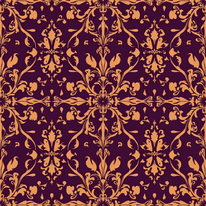
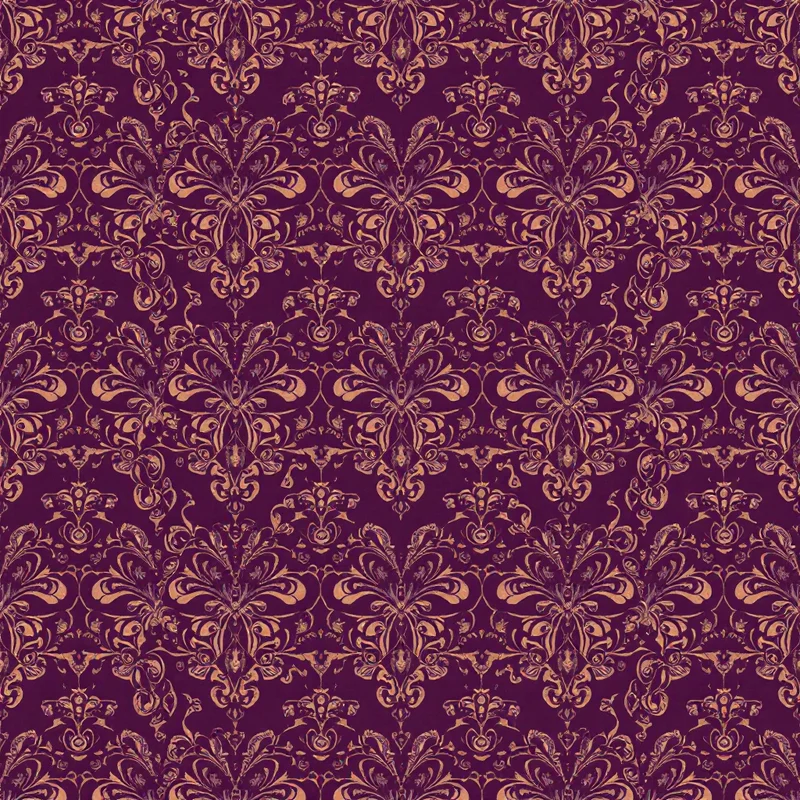
The fourth is burgundy with metallic accents: deep burgundy with gold, brass, copper or champagne metallic colours. This structure produces patterns with explicit luxury signalling that work in premium gift wrap, holiday applications, and luxury home decor. The metallic accents provide highlight and visual rhythm against the deep burgundy field.
A fifth approach worth noting uses burgundy in monochromatic structure: multiple values of burgundy from very deep wine through medium claret to lighter dusty rose, with only neutral white or cream as field. This structure produces tonal patterns with significant visual depth from the burgundy palette alone, and it appeals to design-forward customers who want palette commitment without colour breadth.
Motif Strategies for Burgundy Patterns
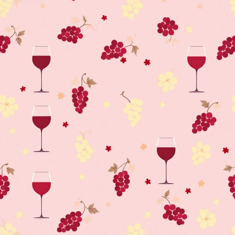
Different motif categories interact with burgundy palettes differently. Floral motifs are perhaps the most natural pairing — burgundy florals draw on the rich tradition of damask florals, antique botanical illustrations, and decorative wallpaper traditions that have used burgundy as a primary palette for centuries. The successful contemporary interpretations tend to update the motif treatment (looser rendering, more contemporary composition) while preserving the palette tradition.
Geometric motifs work well with burgundy when the geometry is structured rather than playful. Art deco motifs, classical ornamental geometry, mathematical tessellations, and architectural motifs all pair effectively with burgundy palette. Playful or childlike geometric motifs tend to fight burgundy because the palette gravitas conflicts with the motif's energy.
Cultural patterns frequently use burgundy as a primary or supporting palette colour. Persian carpets, Indian textiles, Turkish kilims, North African textiles and Renaissance European decorative arts all employ burgundy palettes extensively. Designers working in cultural pattern vocabulary find burgundy a natural palette anchor.
Animal motifs work well with burgundy when the animal subject has cultural luxury associations — equestrian motifs, vintage botanical illustrations of game animals, heritage hunting and natural history references. Casual or whimsical animal motifs tend to fight the palette.
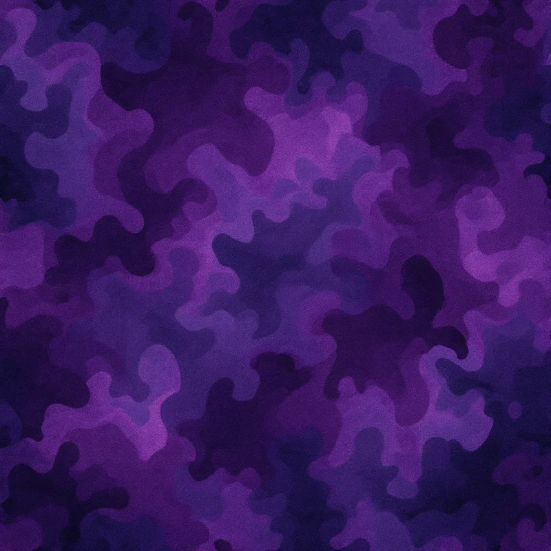
Abstract and painterly motifs can use burgundy effectively when the abstract treatment has emotional weight. Burgundy washes, painterly compositions and contemporary abstract patterns can build on burgundy as an anchor for serious aesthetic statements.
Common Pitfalls
Three pitfalls recur in burgundy pattern design. The first is excessive density without breathing room. Burgundy is a heavy colour and patterns that fill the entire surface with high-density burgundy elements feel oppressive rather than rich. Successful burgundy patterns typically reserve burgundy for a specific compositional role and use lighter or neutral colours to provide the visual breathing room that allows the burgundy to register without overwhelming.
The second pitfall is poor complement choice. Burgundy paired with pure saturated colours can feel jarring or clashes. Burgundy with hot pink reads as fashion-victim. Burgundy with bright orange reads as Halloween. Burgundy with electric blue reads as nightclub. The complement choices that consistently work are warm earth tones, sophisticated cool tones, considered metallics and refined neutrals.
The third pitfall is muddy reproduction in production. Burgundy is a colour that can reproduce poorly in production environments that have not been carefully managed. CMYK conversions can flatten burgundy to a generic dark red. Sublimation printing can shift burgundy toward brown. Digital print on uncoated paper can mute burgundy significantly. Designers working with burgundy palettes should test print proofs and adjust the digital hex values if necessary to land the desired hue after production.
Applications Where Burgundy Excels
Burgundy patterns work particularly well in several application categories. Home decor textiles — throw pillows, blankets, table linens, drapery — frequently use burgundy as a palette anchor for autumn and winter collections, and increasingly for year-round collections in premium home positioning. Wallpaper applications benefit from burgundy's ability to anchor a room without overwhelming smaller decorative pieces.
Fashion textiles use burgundy in seasonal collections (autumn-winter rotations) and in heritage-positioned collections (preppy menswear, classical womenswear, accessories with vintage references). Burgundy scarves, ties, pocket squares and accessories have long-running commercial traditions.
Stationery and paper goods use burgundy in premium positioning — leather-look journal covers, sophisticated greeting card collections, gift wrap for formal occasions, wedding stationery and academic-themed designs.
Wedding and event design uses burgundy extensively in autumn wedding palettes and in formal, sophisticated wedding aesthetics across all seasons. Burgundy florals, burgundy and gold combinations, burgundy and sage palettes all feature in wedding design vocabulary.
Burgundy is a palette anchor that rewards careful construction. The designers who build successful burgundy pattern programmes treat the palette with the seriousness it deserves — selecting motifs that respect the colour's weight, building structural palette relationships that elevate the burgundy rather than competing with it, and respecting the production realities that affect how the colour reproduces in finished products. The result is a category of patterns that retains aesthetic and commercial relevance across many years of changing trend cycles.
Explore related pattern styles
Patterns for


