
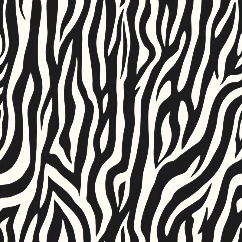
Black and white pattern is the foundation of surface design. The two-colour combination — pure black and pure white, or their slightly modulated relatives — represents the original visual vocabulary of decorative pattern, predating coloured pigments by tens of thousands of years and continuing to dominate certain commercial categories today. Tribal patterns, early textiles, traditional printmaking, classical typography and many cultural patterns built their visual systems around black and white before colour pigments became accessible. For contemporary pattern designers, black and white remains one of the most commercially powerful and aesthetically enduring vocabularies available.
What makes black and white particularly interesting in contemporary commercial design is its position outside trend cycles. While palette trends shift between earthy warm tones and cool sophisticated greys and bold saturated colours and back again, black and white maintains stable commercial presence regardless of what the colour cycle is doing. A black and white pattern is rarely "of its moment" because it is always available. This stability is what makes mastering monochrome pattern design one of the highest-leverage investments a pattern designer can make.
Why Monochrome Is So Powerful
Several characteristics make black and white pattern uniquely powerful in surface design. The pure contrast between black and white creates the maximum optical signal available in any visual design — no other colour combination matches the immediate clarity and impact of pure black against pure white. This optical maximum makes monochrome patterns read clearly at any scale, any distance, and any production quality.
The absence of colour also removes a layer of design decision-making and customer interpretation. Coloured patterns carry emotional and cultural associations through their palette choices — these can support the design or fight against it depending on customer context. Black and white patterns carry their meaning through composition and motif alone, which makes them less context-dependent and more commercially flexible across customer segments.
Black and white pattern also coordinates with essentially any surrounding decor or fashion context. A black and white throw pillow works against any wall colour. A black and white scarf works with any outfit. A black and white wallpaper accent wall coordinates with any furniture choice. This coordination flexibility makes monochrome patterns particularly valuable in commercial applications where the customer's surrounding palette is unknown.
The Spectrum of "Black and White"
Pure black (#000000) and pure white (#ffffff) represent one specific position within the monochrome family, but most successful contemporary black and white patterns use slightly modulated variants. True pure black can read as oppressively dark in large areas, and pure white can read as clinical or cold. Many designers work with off-black and off-white variants that retain the visual power of monochrome while softening the extremes.
Off-blacks include charcoal (#36454f), ink black (#1a1a1a), warm black (#1c1c1a) and slightly brown-shifted blacks that read as black while having more visual warmth. These variants reproduce more reliably in print production than pure black, which can flatten or appear as a single muddy dark mass in certain printing processes.
Off-whites include warm cream (#fffaf0), ivory (#fffff0), soft white (#f8f8f8), eggshell (#f0ead6) and similar variants. These off-whites provide breathing room without the clinical coldness of pure white and read as more sophisticated in many design contexts.
Including subtle grey tones — light grey (#d3d3d3), medium grey (#808080), dark grey (#4a4a4a) — within nominally black and white patterns adds tonal variety while preserving the monochrome character. Many successful contemporary monochrome patterns use a three or four-step tonal palette of true black through medium grey to off-white, producing patterns with significant visual depth from the limited palette.
Compositional Strategies
The successful black and white patterns tend to leverage the extreme contrast of the palette through specific compositional strategies. The first is high-contrast graphic composition: bold black motifs against white field, or white motifs against black field, with deliberate clarity of motif silhouette and minimal tonal variation within each colour. This approach produces patterns with maximum graphic impact and works particularly well for fashion textiles, statement decor and contemporary branding applications.
The second is balanced tonal composition: a roughly equal distribution of black and white across the design surface, often through alternating motif treatments or geometric tessellation. This approach produces patterns with strong rhythmic visual presence and works particularly well for wallpaper, tile design and large-format applications where the pattern needs to read across substantial surface area.
The third is field-and-detail composition: white field with detailed black motifs, or black field with detailed white motifs. The dominant colour establishes the visual ground while the contrasting colour provides motif detail. This approach produces patterns with significant visual interest at close inspection while reading cleanly from medium distance, and it works particularly well for home decor textiles and premium stationery.
The fourth is hand-drawn or organic composition: black ink-style marks, brushwork, organic shapes or hand-rendered motifs against white, often with deliberate irregularity that reads as artisanal rather than mechanical. This approach produces patterns with handcrafted character that works well in contemporary art-influenced applications.
Motif Strategies for Monochrome
Different motif categories work in distinctive ways within monochrome palettes. Geometric motifs are perhaps the most natural pairing with black and white — stripes, polka dots, chevrons, checkerboard, geometric tessellations and abstract geometric compositions all gain visual power from monochrome treatment. The high contrast emphasizes the geometric clarity.
Floral motifs work effectively in monochrome when the rendering style emphasizes botanical clarity over colour subtlety. Ink-drawn florals, silhouette florals, vintage botanical illustrations and bold graphic floral compositions all translate effectively to monochrome treatment. Watercolour florals and softly tonal floral approaches typically translate poorly because the colour subtlety is fundamental to those treatments.
Cultural pattern vocabularies use monochrome extensively across many traditions. African mud cloth and adinkra symbols, Polynesian tribal tattoo patterns, Mexican folk decorative motifs, Japanese sumi-e style brush patterns, traditional Chinese ink painting motifs and many other cultural traditions employ black and white as primary palette. Designers working in these vocabularies find monochrome a natural anchor.
Animal motifs work effectively in monochrome when the rendering style emphasizes silhouette and graphic clarity. Bold animal silhouettes, abstract animal patterns and stylised wildlife compositions all gain visual power from monochrome treatment.
Typographic motifs and text-based patterns gain extreme clarity from monochrome treatment. Patterns combining text with decorative elements work particularly well in black and white because the typographic legibility is maximised against high-contrast field.
Abstract and painterly motifs work in monochrome when the abstract treatment has sufficient compositional substance to support the limited palette. Brushwork patterns, ink wash compositions and abstract compositions with strong tonal structure all work effectively as monochrome patterns.
Production Considerations
Black and white patterns are typically the most production-forgiving of any palette structure. The two-colour or near-two-colour limit reduces the number of variables that can affect production quality and makes the patterns suitable for essentially any production process from premium offset to economical screen printing to digital direct-to-substrate.
Specific considerations for production include managing pure black areas to avoid muddy reproduction in certain print processes. Solid pure black in large areas can flatten in offset printing or appear as a muddy dark mass in low-quality digital printing. Including some tonal variation (subtle grey shading, fine textural detail, or modulating the black slightly) provides production resilience without compromising the monochrome character.
White areas in monochrome patterns rely entirely on the substrate colour to provide the "white" — the white is simply the absence of ink rather than a printed colour. This means the perceived whiteness depends on the substrate. Bright white paper produces crisp white. Off-white substrate produces cream-toned white. Coloured fabric produces fabric-coloured "white". Designers working with monochrome patterns should understand which substrate the design will be produced on and adjust expectations accordingly.
For file delivery, monochrome patterns can be delivered as CMYK files (where the black channel does most of the work), as grayscale files (which can simplify some production workflows), or as monotone files with custom ink specifications for specialty production. The choice depends on production specification.
Application Categories Where Monochrome Excels
Black and white patterns excel across multiple commercial categories. Fashion textiles use monochrome patterns extensively in seasonal collections, in heritage tailoring vocabulary, and in contemporary fashion-forward statements. Stripes, polka dots, geometric prints and modern graphic patterns all support consistent fashion textile commercial presence in monochrome.
Home decor uses black and white patterns across throw pillows, blankets, drapery, table linens, wall art and tile design. The category supports both highly graphic monochrome statements and quieter tonal monochrome patterns with subtle grey variation.
Wallpaper applications include both bold statement monochrome wallpaper and quieter tonal monochrome wallpaper. The monochrome wallpaper segment has expanded substantially over the past decade as design-forward homeowners increasingly use wallpaper as expressive accent rather than as background.
Stationery and paper goods use monochrome extensively in premium positioning — sophisticated journals, planners, gift wrap and wedding stationery all support significant monochrome design work. The high contrast supports typographic integration particularly well.
Branding and identity design uses monochrome as the foundation of countless commercial brand systems. Black and white logos, monochrome packaging and monochrome brand patterns provide the visual flexibility needed for brand systems that operate across many production contexts.
Tattoo design draws on monochrome pattern vocabulary extensively, and the increasing interest in tattoo-influenced surface design has driven contemporary monochrome pattern work in fashion and home decor applications.
Black and white pattern design rewards designers who understand that the palette restriction is the discipline, not the limitation. The compositional decisions, motif choices, contrast structures and rendering style all become more important precisely because the palette cannot carry the design alone. The monochrome patterns that succeed are built on strong compositional fundamentals that would also succeed in colour but that gain particular clarity from the monochrome treatment. Mastering this vocabulary builds skills that translate across every other palette structure and supports commercial work that retains relevance across many years of changing design trends.
Explore related pattern styles
Patterns for


