The phrase "art nouveau pattern" pulls up roughly the same image in most designers' heads — an iris twisting around a stem in three flowing lines, a peacock feather curling across a wallpaper tile, a Mucha-style border framing a poster. That mental shortcut is mostly right. Art nouveau is one of the most visually identifiable pattern styles in design history, and one of the easiest to recognize when it works and the easiest to spot when it doesn't. This guide breaks down what defines the style, how to generate a seamless art nouveau pattern in Pattern Weaver, the palette and motif vocabulary that reads as period-accurate, and the use cases where art nouveau still earns its place in commercial work in 2026.
What is art nouveau pattern?
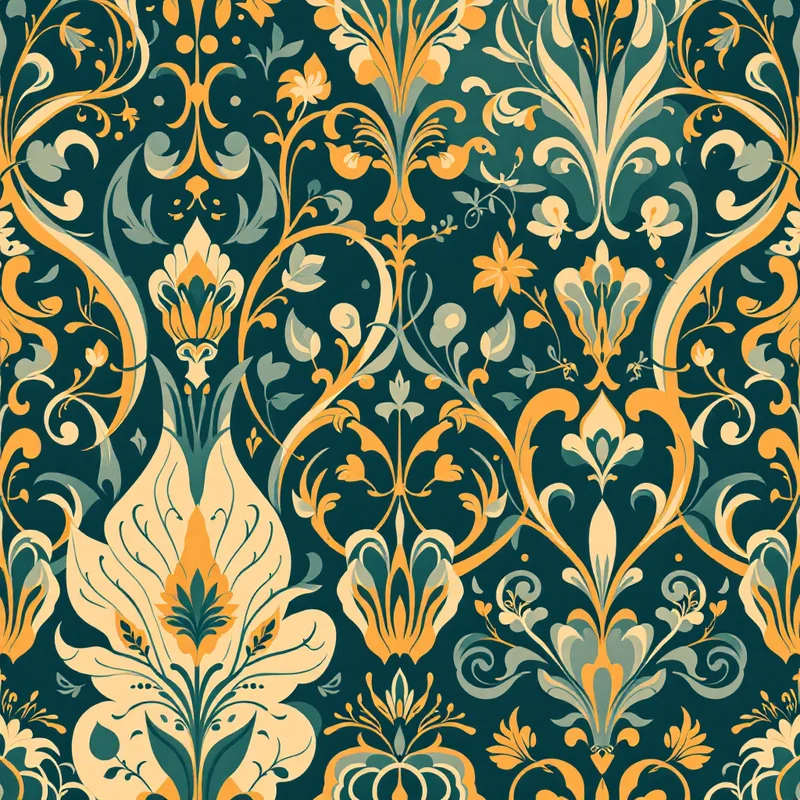
An art nouveau pattern is a decorative repeat built around long, asymmetric organic curves — the famous "whiplash" line — combined with stylized botanical or figurative motifs. The style emerged as a deliberate rejection of the heavy, gridded, classical revival ornament that dominated mid-Victorian design. Where Victorian wallpaper marched in rigid columns, art nouveau flowed. Where Victorian color schemes were dense and dim, art nouveau lightened and clarified. The pattern is meant to feel like nature pressed into design — flowers, vines, feathers, and water all abstracted into a single continuous line.
The style has structure underneath the flow. Every art nouveau pattern is built on a hidden geometric scaffold — usually a tilted grid, an ogee, or an interlocking S-curve — that organizes the seemingly free motifs into a repeating tile. The skill of the style is hiding that scaffold so well that the eye reads only the curves.
Where art nouveau pattern comes from
Art nouveau crystallized in Europe between 1890 and 1910, with four main centers shaping the visual vocabulary. In Paris, Alphonse Mucha and Hector Guimard built the lush, botanical, figure-heavy version that most people picture first — Mucha's posters for Sarah Bernhardt and Guimard's Paris Metro entrances are the canonical references. In Brussels, Victor Horta translated the curves into architectural ironwork and interior pattern. In Vienna, Gustav Klimt and the Secession movement pushed the style toward gold leaf, geometric tessellation, and a colder symbolist mood. In Glasgow, Charles Rennie Mackintosh and Margaret Macdonald built the most geometric and architectural branch, with elongated rose motifs and silver-rose palettes.
The style spread fast through the decorative arts because it suited the new printing technologies of the period — chromolithography for posters, machine-printed wallpaper, and rotary textile printing. By 1914, art nouveau had largely given way to art deco's harder geometry, but the visual language has had repeated revivals: the 1960s psychedelic poster scene, the 1970s decorative revival, and the current 2020s wave in fashion print and wallpaper.
Visual hallmarks of art nouveau pattern
A pattern reads as art nouveau when it carries most of these signals at once: long, asymmetric whiplash curves that don't repeat in mirrored pairs; stylized botanical motifs (iris, lily, poppy, peacock feather, wisteria, ivy) flattened into linear silhouettes; a hidden ogee or tilted grid scaffold; muted period color (sage, rose, peacock teal, mustard, cream); ornamental linework — often sepia or warm charcoal rather than black — outlining the major shapes; and an overall sense of growth rather than construction.
What art nouveau patterns almost never have: hard right angles, symmetrical mirror axes, naturalistic rendering, photographic detail, sharp geometric chevrons, or saturated primary colors. When any of those appear, the pattern slides toward another style.
How to generate art nouveau pattern in Pattern Weaver
The studio handles the heavy lifting on curve continuity and seamless repeat, but the inputs still matter. The five-step flow:
- 1Pick the art nouveau style. Open the studio and choose Art Nouveau from the style list. Select a substyle — Mucha-school floral, Glasgow School geometric, or Vienna Secession ornamental — to anchor the curve vocabulary.
- 1Choose your botanical motifs. Pick one or two primary motifs from the period vocabulary: iris, lily, poppy, peacock feather, wisteria, ivy. Two motif families maximum keeps the pattern coherent — three or more starts to read as Victorian clutter.
- 1Set the color palette. Apply a muted period palette — sage, rose, peacock teal, mustard, cream ground — or push it modern with jewel tones on ivory. Three to five colors works best. Avoid pure black outlines unless the work is explicitly in the linocut tradition.
- 1Dial in density and scale. Set density to medium so the curves have room to flow without crowding. Scale should be large enough that single motifs read clearly at the intended final size — large for wallpaper, medium for apparel, small for packaging trim.
- 1Generate and refine. Generate the tile, check the seamless repeat preview, and regenerate with the same Pattern DNA if any edge curve breaks. Export at 8K for wallpaper or large-format textile work. The whole loop takes about two minutes.
Color palette ideas for art nouveau pattern
Period-accurate palettes lean muted and slightly desaturated. A reliable starting set: sage green (#A8B89C), dusty rose (#D4A5A5), peacock teal (#2E6B6B), warm mustard (#D4A84A), cream ground (#F5EDD6). Mucha-school work adds gilded ochre (#B8924A) and pale gold accents. Glasgow School palettes lean cooler — silver-rose (#C9A8AC), soft slate (#7A8B95), pale celadon (#C5D4C0), and warm ivory grounds.
Modern revivals push the saturation higher. A current Pinterest-friendly art nouveau pattern palette might run deep emerald, aubergine, antique gold, and blush over a cream ground. Anything that reads as muted earth tones plus one jewel accent will land in the right register.
Best use cases for art nouveau pattern
The style still earns its place across several commercial categories. Wallpaper is the obvious one — art nouveau patterns work especially well in entryways, dining rooms, and small statement spaces where the curves can be read at full tile size. Apparel print suits the smaller-scale Mucha-school florals for dresses, scarves, and blouses; the larger Glasgow School geometrics work for outerwear linings and accessories. Packaging benefits from the ornamental border vocabulary — tea, perfume, soap, and natural-products brands lean on art nouveau because the curves signal craft and botanical content without saying it directly. Stationery, book covers, and editorial illustration use the style for period pieces and for any project that wants to feel handmade-luxurious. Home accessories — cushions, ceramics, lampshades — sit comfortably in the style too.
Browse all the pattern categories to see which use case fits your project best.
Pro tips for stronger art nouveau pattern repeats
A few rules that separate convincing art nouveau patterns from the ones that almost get there:
Use no more than two motif families per tile. Iris plus ivy works. Iris plus peacock plus wisteria starts to look Victorian.
Let one curve dominate. Every successful art nouveau pattern has a primary whiplash that organizes the whole tile, with secondary curves supporting it. If every curve has equal weight, the eye reads chaos.
Hide the grid. The scaffold under the pattern should never be visible. If the eye can find the repeat axis, the pattern reads as machine-made rather than grown.
Outline in sepia, not black. Pure black outlines push the work toward art deco or comic-illustration territory. Sepia, warm charcoal, or deep aubergine read more period-accurate.
Vary line weight. Whiplash curves should taper — thick at the curve apex, thin at the line ends. Flat uniform-weight curves read as vector clipart.
For deeper technique on the seamless repeat side, the guide on how to create seamless patterns covers tile edge construction in detail. For the AI workflow specifically, how to make a pattern with AI walks through the broader Pattern Weaver flow. And for designers planning to sell the work, pattern design for print on demand covers the platform and pricing side.
Generate your own art nouveau pattern
Pattern Weaver makes it possible to produce a finished, seamless, commercially-licensed art nouveau pattern in roughly two minutes — the same work that would take a manual designer half a day to draft and another half day to clean up for repeat. The studio knows the whiplash curve vocabulary, the period motif library, and the muted palette structure, so the inputs stay small and the output stays consistent.
Open the studio to start a new art nouveau pattern, browse pricing for credit packs (commercial license included on all paid tiers, exports up to 8K in PNG, JPG, WEBP, TIFF, PDF, and SVG), or explore the blog for more pattern style guides. Art nouveau is one of the most rewarding styles to design in once the basic vocabulary clicks — the curves do most of the work, and the studio handles the math.


