The phrase "aesthetic patterns" carries weight in 2026 that it did not five years ago. What started as Tumblr-era mood collecting has hardened into a working design vocabulary — coquette, dark academia, cottagecore, Y2K, coastal grandmother — each one with a tight visual code that print designers, wallpaper studios, and apparel brands now build entire collections around. This guide pulls together twelve mood-driven aesthetic patterns ideas with the palette, motif, and repeat guidance to turn each one into a usable surface design.
The structure throughout is practical. Every direction below comes with a color suggestion, a motif note, and a sense of what end use it sells into best. None of these are theoretical — they all come from patterns that move on print-on-demand platforms or sit in current retail collections right now.
What is aesthetic patterns?
An aesthetic pattern is a repeating surface design organized around a mood rather than a single motif family. A floral pattern is a category of shape; a cottagecore pattern is a category of feeling that happens to use florals as one of its tools. The distinction matters because aesthetic patterns succeed or fail on whether they deliver the emotional read, not on whether the individual motifs are technically beautiful.
That definition explains why a Y2K butterfly pattern in muted earth tones reads wrong even though butterflies and muted earth tones are both fine on their own. The mood demands hot pink, chrome, and acid green. Get the palette wrong and the pattern stops being Y2K, regardless of what shapes are on it.
Where aesthetic patterns comes from (history/origin)
The lineage runs through three internet eras. Tumblr in the early 2010s established the practice of curating images around a vibe rather than a topic — the original soft grunge, pastel goth, and seapunk boards taught a generation of designers to think in moods. Instagram and Pinterest in the late 2010s standardized the visual vocabulary and made it searchable. TikTok between 2020 and 2024 named the aesthetics, accelerated their adoption, and gave each one a tight enough definition that designers could brief them like product categories.
The current twelve most-commercial aesthetics — the ones below — all trace through that pipeline. They feel internet-native because they are.

Visual hallmarks of aesthetic patterns
A few markers separate strong aesthetic patterns from weak ones across every direction:
One mood per tile. Blending coquette and dark academia in the same pattern almost never works. Each aesthetic has its own line quality, palette, and motif logic. Pick one and commit.
Palette carries the mood. Color does most of the emotional work. The same bow motif reads as coquette in pastel pink, preppy in navy and white, gothic in black and oxblood. The palette decides the aesthetic.
Motif scale variation. A flat repeat with every motif at the same size reads as wallpaper from 2003. Modern aesthetic patterns vary scale across the tile — a hero motif, mid-tier supporting shapes, small fillers — so the eye has rhythm.
Line quality matches the aesthetic. Coquette wants soft, hand-drawn lines. Y2K wants crisp vector edges. Dark academia wants engraved or etched line work. The drawing technique is part of the vibe.
The 12 aesthetic patterns directions
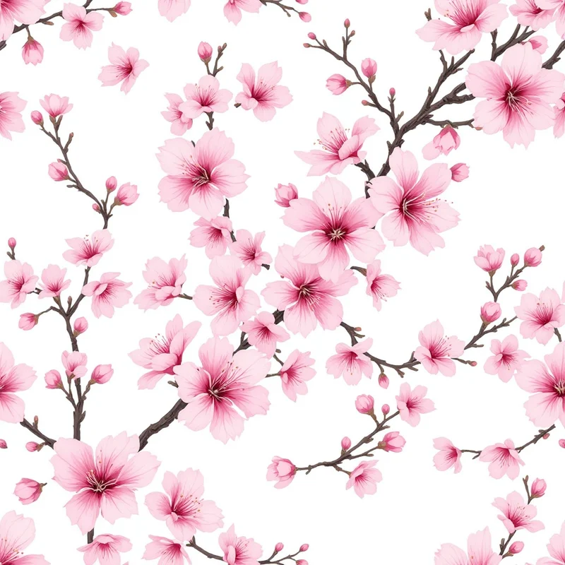
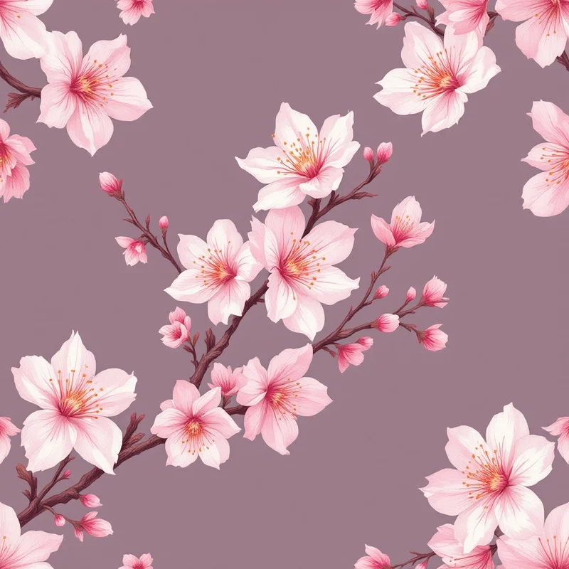
1. Coquette. Bows, ribbons, hearts, pearls, lace edging. Palette: blush pink, cream, soft red, antique gold. Best end use: stationery, accessories, lingerie packaging.
2. Dark academia. Tartan plaids, oak leaves, quills, classical busts, book spines. Palette: deep burgundy, forest green, cognac, ivory. Best end use: scarves, journals, wallpaper for studies.
3. Cottagecore. Wildflowers, mushrooms, vintage botanicals, breadcrumbs, hens. Palette: sage, butter yellow, dusty rose, terracotta. Best end use: aprons, kitchen textiles, soft furnishings.
4. Y2K cyber. Butterflies, stars, swirls, lowercase logos, chrome shapes. Palette: hot pink, acid green, electric blue, silver. Best end use: phone cases, jewelry packaging, festival apparel.
5. Coastal grandmother. Linen textures, citrus, hydrangeas, woven jute. Palette: warm white, sand, sage, soft denim. Best end use: tea towels, summer wallpaper, gift wrap.
6. Minimalist line art. Single-weight continuous line faces, abstract bodies, organic curves. Palette: cream, terracotta, charcoal — usually two colors only. Best end use: notebooks, ceramics, packaging.
7. Cyber cute (kidcore). Smiley faces, fruit, rainbows, cartoon clouds. Palette: cherry red, bubble blue, sunshine yellow, mint. Best end use: t-shirts, stickers, kid-adjacent products.
8. Mob wife / leopard maximalism. Animal prints, gold chains, baroque scrolls. Palette: black, leopard tan, gold, oxblood. Best end use: scarves, coats, statement homewares.
9. Boho earth. Geometric tribal motifs, sun shapes, hands, moons. Palette: rust, ochre, terracotta, cream. Best end use: rugs, throws, wallpaper accents.
10. Vaporwave / soft retro. Marble busts, palm leaves, gradients, grids. Palette: peach, lavender, teal, pale pink. Best end use: tech accessories, posters, beverage packaging.
11. Whimsigothic. Crescent moons, eyes, snakes, tarot iconography, vines. Palette: black, plum, emerald, antique gold. Best end use: candles, occult-adjacent product, wallpaper.
12. Romantasy. Florals with thorns, swords, dragons, gothic frames. Palette: deep teal, blood red, gold, midnight blue. Best end use: book covers, bookish merchandise, journals.

How to generate aesthetic patterns in Pattern Weaver
The studio is built to take a mood and ship a tileable repeat in one session. The workflow is the same across all twelve directions above.
- 1Pick a mood, not a motif. Name the aesthetic before opening the studio. Coquette, dark academia, cottagecore — one mood per pattern, no blending. Open Pattern Weaver's studio to start.
- 1Choose a palette that carries the mood. In the color controls, pick a preset that aligns with the aesthetic or build a custom 3-5 color stack. Add one unexpected accent color to separate your aesthetic patterns from generic versions of the same direction.
- 1Generate and refine the motif. Use the prompt and style inputs to generate three or four motif variations. Pick the one with the strongest line quality and clearest silhouette, then regenerate within that direction. Vary motif scale across the tile.
- 1Lock the repeat and check the seams. Run the seamless tile check to confirm edges meet cleanly. If a motif crosses the seam awkwardly, nudge the layout or regenerate that region until the tile reads as continuous fabric.
- 1Export at the right size. 2K for digital, 4K for apparel, 8K (8192×8192 px) for wallpaper and large-format print. PNG for crisp digital, JPG for photo-style printing, TIFF for the cleanest production handoff. PDF and SVG also export depending on end use.
Color palette ideas for aesthetic patterns
A quick reference for palette pairings that consistently work for aesthetic patterns:
- Coquette: blush pink, cream, antique gold, one accent of dusty sage.
- Dark academia: burgundy, forest green, cognac, ivory, oxidized brass accent.
- Cottagecore: sage, butter yellow, dusty rose, terracotta, soft slate accent.
- Y2K: hot pink, acid green, electric blue, chrome silver, jet black accent.
- Coastal grandmother: warm white, sand, sage, soft denim, citrus accent.
- Whimsigothic: black, plum, emerald, antique gold, blood red accent.
The accent color is doing more work than the rest of the palette combined. It is what separates a strong aesthetic pattern from a hundred similar ones on the same platform.
Best use cases
Aesthetic patterns translate across surfaces, but each direction has natural homes.
Apparel and print-on-demand is the highest-volume use case. Cottagecore, coquette, and Y2K dominate t-shirts, tote bags, and accessories. The pattern design for print-on-demand guide covers sizing, file prep, and platform-specific export settings.
Wallpaper rewards moods with larger motif scale and quieter color contrast — dark academia, coastal grandmother, and whimsigothic do particularly well here. Scale primary motifs up by 30-50% from apparel sizing.
Stationery and packaging is where coquette, minimalist line art, and vaporwave shine. The smaller surface area means tighter motif scale and stronger single-image impact.
Home textiles — cushions, throws, kitchen linens — fit cottagecore, boho earth, and coastal grandmother almost without modification. Earth-toned aesthetics travel best into interior product.
Accessories — phone cases, jewelry packaging, hair accessories — are where Y2K, cyber cute, and mob wife maximalism dominate.

Pro tips for stronger aesthetic patterns repeats
A few habits separate competent aesthetic patterns from memorable ones.
Resist the obvious motif. Coquette without bows is harder and more interesting than coquette with bows. Dark academia without tartan can still read as dark academia if the palette and line quality carry the mood. Skipping the cliché motif once or twice per collection differentiates the work.
Vary density across the collection. A coordinated set of three or four aesthetic patterns — one dense, one mid, one sparse — sells harder than three dense patterns in the same direction. The sparse one becomes the breathing pattern that makes the dense ones work.
Test the pattern on the actual end product. A coquette repeat that looks gorgeous in the studio can read as overwhelming on a 60-inch wallpaper drop. Mock it up at final size before exporting. Pattern Weaver's create page has category browsers that show patterns at real-world scale.
Build collections, not one-offs. Single aesthetic patterns rarely sell. Collections of three to five within a direction become product lines. The how to create seamless patterns guide covers the repeat technicalities that make collections coherent.
Lean on the studio's prompt vocabulary. The how to make a pattern with AI walkthrough covers the specific prompt phrasings that produce the strongest aesthetic results, especially for moods that the studio has not seen named explicitly before.
Generate your own aesthetic patterns
The twelve directions above are starting points, not endpoints. Aesthetic patterns work best when the mood is committed to, the palette earns its place, and the repeat is built around a specific end use rather than a generic feed image.
Pattern Weaver was built for this work. Pick a direction from the list, open the studio, and ship a tileable repeat in the next twenty minutes. Free credits get the first patterns out the door for testing. Paid tiers on pricing — Starter, Pro, and Max — include commercial licensing, larger export sizes up to 8K (8192×8192 px), and the format range needed for production: PNG, JPG, WEBP, TIFF, PDF, and SVG. The studio handles the seamless repeat math; the work that remains is the part that matters — picking the mood, owning the palette, and shipping the pattern.


