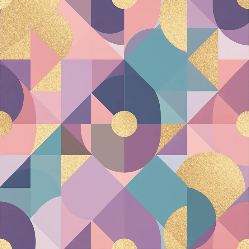

A bikini top is one of the smallest canvases a print designer ever gets. Two triangles, a band and a pair of ties have to carry the whole idea, and then a one-piece or a pair of swim trunks asks for something completely different. That tension runs through every 2027 direction below: a print that looks good on a flat artboard and a print that looks good on a body in motion are not always the same print.
Everything here is a forecast, a set of directions to watch rather than measured results.
Tropical gets quieter
The jungle-green and hot-pink tropical that has defined vacation swimwear for years looks set to cool down. Expect the leaf and flower to stay while the saturation drops: faded hibiscus in sun-washed coral (#E8836B) on sand (#EADBC8), palm shadows in olive and bone, monstera drawn as a tonal outline on a nearly matching ground.
A tropical floral print in four close colors is easier to mix and match across tops and bottoms, which matters because separates are bought piece by piece. Fewer colors also means fewer problems when a bottom is cut from a different part of the print than its matching top.
Water as pattern, not picture
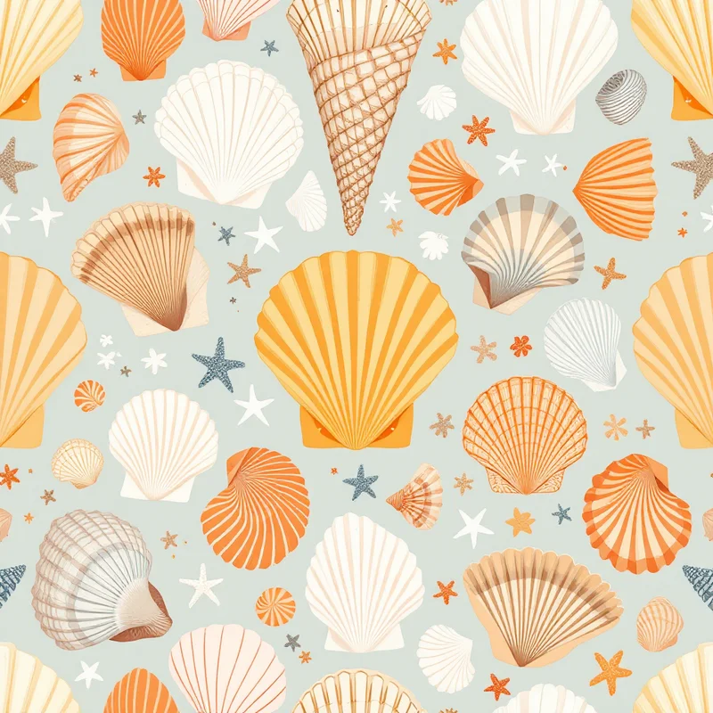
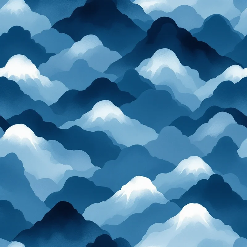
Instead of printing a picture of the sea (waves, shells, a fish), designers are moving toward prints that behave like water: marbled swirls, ripple lines, the wobbly light that sits on the floor of a pool. These work on swimwear for a practical reason. They have no obvious up or down and no motif to slice in half, so they survive being cut in any direction.
If you want a nautical reference without the cliché, pull from ocean patterns and keep the palette to three or four tones: deep teal, seafoam, a pale aqua highlight and one warm accent.
Prints built for ruching
Ruched, shirred and gathered fabric breaks a print into folds. A large, high-contrast motif gets lost in the pleats, while a mid-tone small print reads as a pleasant texture. Expect more swim prints designed to be seen through ruching: tight micro-dots, small ditsy sprigs, painterly gradients.
Stretch matters too. Swim fabric elongates across the body, so a circle on the artboard can become an oval on the wearer. Draw round motifs slightly tall if you know the stretch direction.
Animal print, off the usual palette
Leopard and zebra never leave swimwear, but the colorways keep moving. Look for leopard in pistachio and lilac, zebra in chocolate and cream, snake scale in sea-glass green. Abstract the spots a little so they read as texture, not as a literal pelt. Animal patterns in a soft palette also pair with plain colored separates, which is how many swimsuits end up being worn.
Scale by piece
| Piece | Scale guidance |
|---|---|
| Bikini top | Motif under about 3 inches (7 cm), or a true all-over ditsy |
| Bikini bottom | Same scale as the top so the set reads as a pair |
| One-piece | Mid-scale motifs of 4 to 6 inches (10 to 15 cm) have room to breathe |
| Swim trunks | Larger repeats work, but check the side seam and waistband |
The unglamorous brief
Chlorine, sunscreen, salt and sun all age a print. Whatever palette you choose, ask for a strike-off on the actual swim fabric, usually a nylon or polyester blend with spandex, before you commit to a run. Pale pastels and dense darks can wear differently, and you only learn that on the real material.
For the full build process, from artboard setup to seam placement, see the guides on how to design swimwear prints and swimwear pattern design. For the vacation context these prints usually live in, read the resort wear forecast.
Draft the palette first
Before sketching separates, try the palette as tiles. Describe It in Pattern Weaver takes a prompt in your own words, such as "faded hibiscus on sand, tonal, small scale", and the seamless tile comes back in about 20 seconds. New accounts get 5 free credits.
Explore related pattern styles