Summer color is easiest to think about as light. At noon the world is bleached and bright, at golden hour everything turns amber, at dusk the sky goes coral and violet, and at night the water is nearly black. Four palettes follow, each tied to one of those moments, along with products where they tend to sit well.
Noon: lemon, cyan and white
High-key, almost bleached colors, with plenty of white to let the brights breathe.
- #FFF3A3 sun-bleached lemon
- #F4D03F lemon
- #4CC9F0 cyan
- #BDEBF7 pool
- #FFFFFF white
This palette suits swimwear, beach towels, stationery and kids' products. Keep white ground space generous. The yellow patterns category has more ideas for yellow-led prints.
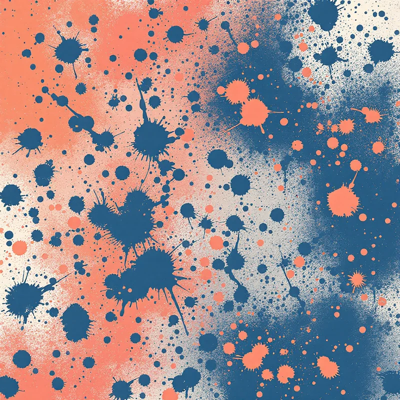
Golden hour: orange, apricot and amber
The warmest, most photogenic summer palette. It works best when it is truly orange-led, not a pale peach.
- #F28C28 saturated orange
- #FFB86B apricot
- #F6D8A8 sand
- #C75B12 burnt orange (anchor)
- #FFF4E0 warm white
It suits dresses, scarves, bedding, wallpaper and resort wear. Orange is a strong anchor for terracotta transitions later in the year; see our autumn 2027 color forecast for how the same hue deepens. Browse orange patterns for ideas.
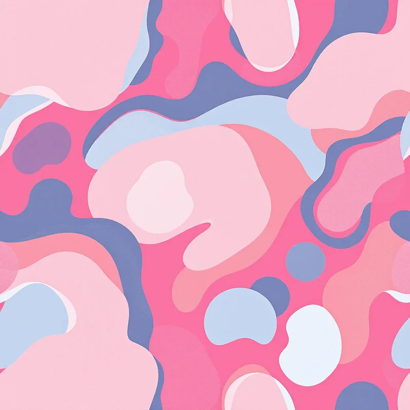
Dusk: coral, magenta and violet
A hotter, more dramatic palette with pink and purple leaning toward sunset.
- #FF6F59 coral
- #E63E7B hot pink
- #8E4DBF violet
- #2C1E4A dusk indigo (anchor)
- #FFD9C7 peach glow
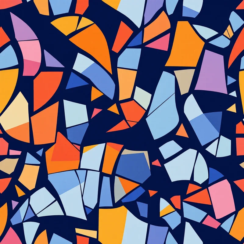
It suits festival wear, party prints, phone cases and swim. The sunset gradient can be rendered as a literal ombre or as flat color blocks: for blocks, try wide stripes or concentric arches.
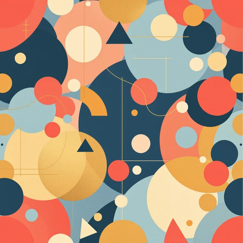
A cool counterpoint that gives hot palettes somewhere to rest.
- #0B3C49 deep teal
- #12606E teal
- #1D3557 navy
- #9FB8C0 moonlight silver
- #E8F1F2 foam
It suits swimwear linings, men's shirts, bedding and wallpaper. Use it as the dark anchor in any of the three palettes above. The turquoise patterns category is a good place to find the blue-green range.
Combining summer palettes
| Combination | Feel | Best for |
|---|---|---|
| Golden hour and night swim | Warm and cool balance | Resort wear, towels |
| Noon and dusk | Playful, pop | Kids, swim |
| Dusk and night swim | Evening, glam | Party and festival prints |
| Noon and golden hour | Sunny, tropical | Kitchen, picnic, gift wrap |
Tropical prints often pull from several palettes at once. Our tropical pattern design guide shows how to balance leaves, flowers and sky colors.
A rule for bright colors: one hero
Summer palettes often fail through too many saturated colors competing at once. A reliable structure:
- 1One dominant color, covering around half the print
- 2One supporting color, covering around a third
- 3One neutral (white, sand or navy)
- 4One tiny accent, in the opposite temperature
For example, orange dominant, sand supporting, navy neutral and a flick of turquoise as the accent.
Printing summer brights
Saturated oranges and turquoises can look duller in CMYK than on a monitor, because they sit at the edge of what print can reproduce. The mismatch is often the biggest surprise for first-time fabric printers. Read our CMYK vs. RGB guide before committing, and always request a printed swatch.
The base cloth matters as well. A natural or ivory cotton makes every color warmer than the same file printed on bright-white fabric, so check the fabric's base shade with your printer if brightness matters.
Summer on the beach and beyond
If your summer collection leans coastal, the stripes and navy-and-white combinations in our coastal print forecast pair nicely with golden hour and night swim. For swimwear fit and print placement, see the swimwear pattern design guide.
Testing summer palettes
Put the palette into words in Describe It: "tropical leaves in saturated orange, apricot and sand with a turquoise accent on a warm white ground". Each pattern appears as a seamless tile in about 20 seconds, and Restyle can change the finish if you want to try another look. New accounts get 5 free credits.
Explore related pattern styles
