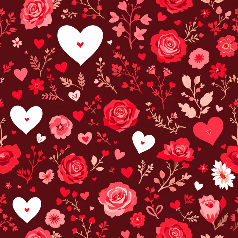
Red and green are not the problem. Equal amounts of fully saturated red and fully saturated green are. The two sit opposite each other on the color wheel, so side by side at full strength they vibrate, and the whole print looks louder than it is.
Every palette below fixes that the same way: one color leads, one supports, one shows up in small doses. Use the hex codes as starting points and adjust to your screen and printer.
The fifteen palettes
| Palette | Hex codes | Works well on |
|---|---|---|
| Cranberry and Cream | #8E1B3A, #F5EBDD, #3F5B3E | Table linens, stockings |
| Blush and Gold | #F4C9CF, #C79A4B, #7A1F2E | Gift wrap, cards |
| Ice and Silver | #DCEBF5, #A9B8C6, #2F4B6E | Wallpaper, packaging |
| Forest and Brass | #1F3B2D, #B08D3C, #F1E6D0 | Velvet, ribbon, feature walls |
| Chocolate and Red | #4A2C2A, #B3262B, #F2E3D0 | Gift wrap, mugs |
| Midnight and Gold | #0F1A33, #D4AF37, #EDE6D6 | Cards, phone wallpaper |
| Sage and Terracotta | #9CAF88, #C4673F, #F3EADB | Handmade-look textiles |
| Peppermint and Mint | #E63946, #FFFFFF, #BFE5D0 | Kids, candy packaging |
| Plum and Pine | #4B1D3F, #2E4A3A, #D8B26E | Statement wallpaper |
| Burnt Orange and Teal | #C25B27, #1F5F63, #F0DEC0 | Retro prints |
| Lavender and Silver | #B7A8D6, #C9CED6, #4A3F6B | Ornaments, cards |
| Black, White and Red | #111111, #FFFFFF, #C1121F | Plaid, sweaters |
| Teal and Coral | #0E7C7B, #FF6F59, #F2C14E | Warm-climate holiday |
| Oatmeal and Charcoal | #E8DFD0, #BFB4A3, #4D4A47 | Minimal wrap, gift tags |
| Navy and Rust | #1F2A44, #B7512E, #EFE3CF | Flannel, throws |
Four that need a note
Chocolate and Red. Brown is the grounding neutral that stops red from reading as fire-engine. Keep the brown darker than the red so the value order is clear.
Black, White and Red. This is the palette behind buffalo plaid and many novelty prints. It has only three values, so it survives tiny scales and cheap printing, which is why it shows up on sweaters and flannel.
Peppermint and Mint. The mint is doing the work of a green without any of green's heaviness. Use the red sparingly; it is your accent, not your ground.
Teal and Coral. Christmas does not have to be cold. For beach, tropical and Southern Hemisphere buyers, this pairing keeps the holiday mood with a warm-weather palette.
Three checks before you commit
- 1Grayscale test. Convert the design to black and white. If the motifs vanish into the ground, the colors are too close in value, however different they look in hue. Cream on pink and gold on white are the classic offenders.
- 2Proportion. A workable starting split is roughly six parts the ground color, three parts the supporting color and one part the accent. Shift it, but keep one color clearly in charge.
- 3Print reality. Hex codes describe light, not ink. Bright pinks, saturated reds and vivid greens often shift duller in CMYK, and no CMYK mix makes gold look metallic. For the difference, see CMYK vs RGB in pattern design.
Choosing by product, not mood
The same palette behaves differently on different surfaces. Glossy coated paper keeps jewel tones bright, uncoated kraft mutes them, and fabric absorbs ink and mutes them further. Dark palettes such as Forest and Brass or Midnight and Gold shine on paper and velvet, while pale ones like Ice and Silver or Oatmeal and Charcoal suit uncoated stock, linen and anything that will be written on.
If you are building a whole collection, pick one palette and let each print lean on a different member: the hero print uses the leading color as ground, the blender flips it, and a stripe or check carries the accent. How to match colors across a collection goes deeper on that approach, and color theory for pattern designers covers why these pairings work.
To try a palette quickly, start from red and white patterns or gold patterns in Browse Styles, or write the color mix in your own words in Describe It. Pattern Weaver gives new accounts 5 free credits, enough to test a few of these side by side.
Explore related pattern styles