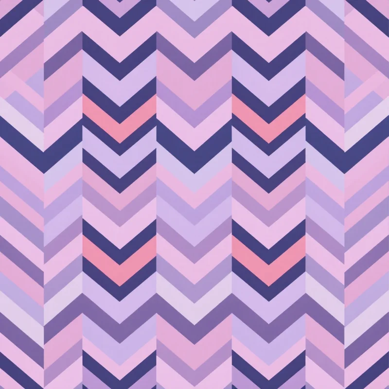
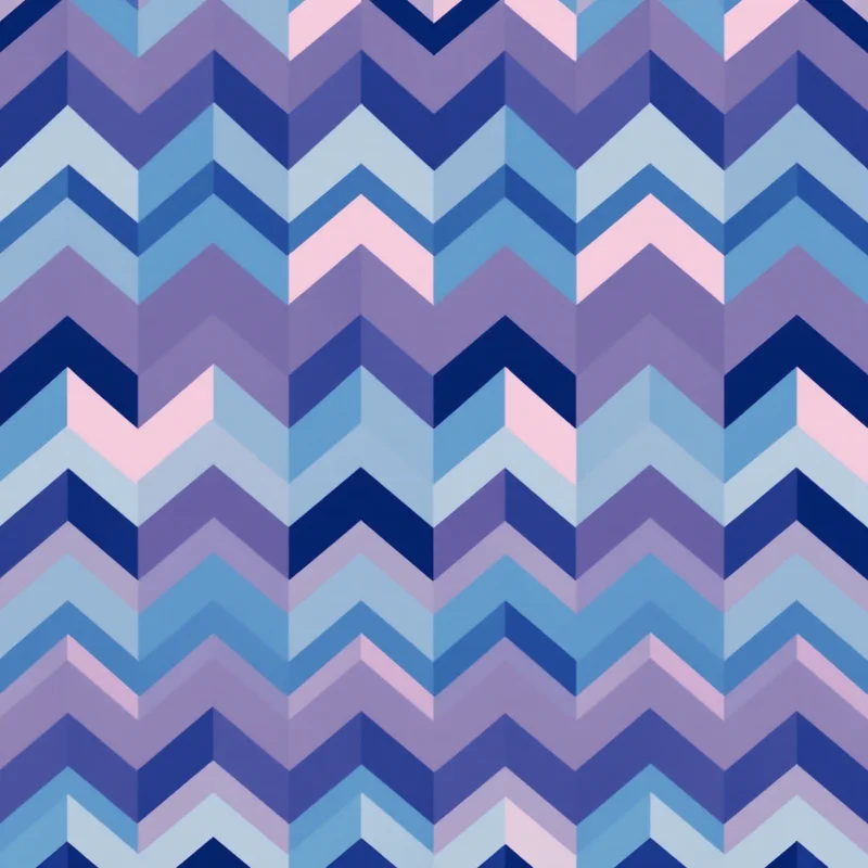
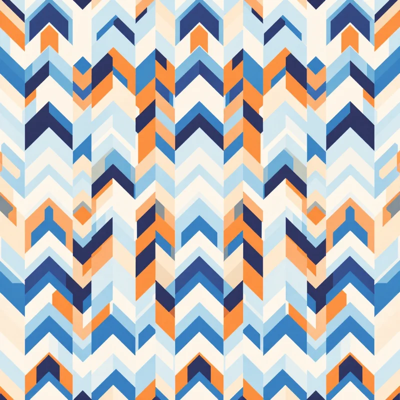
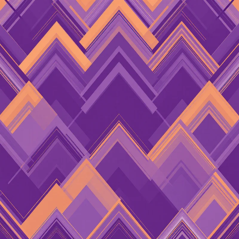
Chevron is one of the most instantly recognizable geometric motifs in commercial design, and its simplicity is exactly what makes it so adaptable — the same basic zigzag reads completely differently depending on angle, stripe width, and color.
Where chevron comes from
The zigzag chevron shape has roots in military heraldry as an insignia stripe, long before it became a decorative textile and graphic motif. It moved into mainstream design through mid-century modern movements, where its clean geometric repetition suited that era's broader aesthetic, and it's cycled in and out of fashion and interior trends repeatedly since.
Chevron versus herringbone
The distinction trips people up constantly: chevron's V shapes meet cleanly at a point, running as continuous unbroken zigzag lines. Herringbone offsets and breaks those V shapes at each column, so they interlock like fish bones rather than meeting at a clean point. Chevron reads bolder and more graphic; herringbone reads more textured and tailored.
How angle changes the read
A steep, narrow-angle chevron — closer to a tight zigzag — reads sharp, energetic, and slightly aggressive. A wide, shallow-angle chevron reads calmer and more architectural, closer to a stretched wave than a sharp zigzag. Nurseries and athletic branding lean toward the steeper, higher-energy angle; interior and home decor applications more often reach for the calmer, wider angle.
Color and width decisions
High-contrast chevron (black and white, or two strongly opposing colors) reads bold and graphic. Low-contrast, tonal chevron in adjacent shades reads subtle and textural, almost reading as a solid color from a distance until you look closely. Stripe width interacts with scale the same way — thin, tightly-packed chevron reads as fine texture; wide, generously-spaced chevron reads as a bold statement print.
Where chevron works best
Chevron patterns suit nurseries, athletic wear, and mid-century-revival interiors particularly well, and the same underlying geometric structure scales cleanly from a small accessory print to a large wallpaper or upholstery application without needing structural changes — just a scale and color adjustment.
Chevron patterns in any angle, width, or colorway can be generated as a seamless, production-ready tile. Start in the free pattern maker with 3 free credits, or browse pattern styles for the full range.
Explore related pattern styles