Ski-town style is moving off the mountain. The chunky knit, the striped headband and the little round resort patch are all candidates to turn up on sofas, mugs and socks owned by people who have never clipped into a binding. That is the après-ski trend, and expect it to carry through the winter of 2026 and past the holidays.
These are directions to watch, not measured results. Here is how to turn each one into a pattern you can sell.
What après-ski means as a look
Après-ski is French for "after skiing," the hours in the lodge once the boots are off. Visually that means warm wood, wool, firelight, hot drinks and a layer of retro color. If a print feels like it belongs on a lodge wall or a lodge sweater, it is on the right track.
1. Retro ski badges and patches
Round and shield-shaped resort patches, a peak with a rising sun, a banner with a made-up place name and an "est." year. Expect to see them scattered as a toss on flannel-look grounds.
- Draw the patches at 1.5 to 2.5 inches with a thick stitched outline and a satin-stitch texture.
- Invent your resort names. Never reproduce a real resort's or brand's logo.
- Keep to three or four colors per patch so the group reads as a family.
2. Knit bands and Nordic yokes
Horizontal bands of diamonds, snowflakes, pine trees and stepped stars, as on a ski sweater. They work as stripes for socks, throws and tea towels. Fair Isle knitting patterns explains the stranded-knit structure, and the Norwegian patterns category is a direct source for the Nordic version.
Build the band on a grid. Knit motifs are pixel-like, with stepped diagonals and no curves, and they look more authentic when you respect that.
3. Alpine motifs
Edelweiss, pine cones, cable-car lines against a ridge, chalet fronts with carved balconies, folk-style heart and star cutouts on shutters, ibex and chamois. These suit wallpaper, linen and wrapping paper. Draw them in a calm, slightly folk-art style with plenty of ground showing.
4. The lodge table
Fondue pots, mugs of cocoa, mulled wine glasses, pretzels, cheese wheels, crossed skis, boots, goggles and thermoses. This is a conversational print territory for cocktail napkins, aprons and mugs. Use a flat graphic style and a limited palette, and scale the objects up to 2 or 3 inches so they read as characters, not clutter.
5. Seventies stripes and eighties neon
Two retro ski-suit looks:
- 70s color blocking: broad chest and sleeve stripes in rust, mustard, cream and brown. The 70s pattern revival guide covers the earth-tone and groovy directions behind it.
- 80s neon: angular zigzags and geometric shards in hot pink, electric blue and yellow on white.
Palettes
Lodge:
- Rust `#B5522B`
- Mustard `#D9A23B`
- Forest `#2F4A3A`
- Cream `#F2E8D5`
- Navy `#1F2F4A`
Neon:
- Hot pink `#FF3E8A`
- Electric blue `#12B5E5`
- Yellow `#FFD23F`
- White `#F5F5F0`
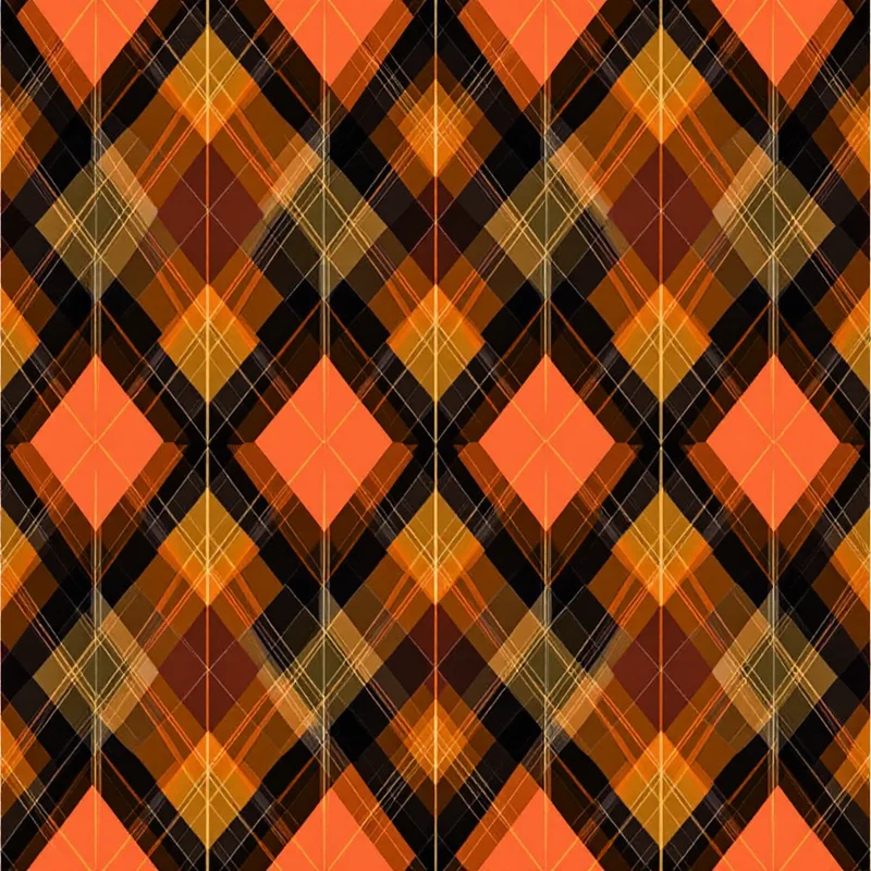
Plaid and flannel look are the natural grounds under either. See plaid and tartan pattern design for plaid anatomy and palettes, and flannel patterns for ready-made references.
Products to watch
Socks and beanies, fleece throws, sweater and sweatshirt graphics, enamel-look mug prints, tea towels, cocktail napkins, trays and cabin wallpaper. Because the aesthetic is about winter in general and not a single holiday, it can keep selling after December 25, which most Christmas prints can't.
Putting it into practice
Pick one direction and make a three-print mini-collection: a hero (the badge toss), a coordinating stripe (the knit band) and a quiet blender (small pine or snowflake dots). Keep the palette identical across all three.
Browse Styles in Pattern Weaver lets you pick from 44 categories and 5,700+ styles, so you can start from the Norwegian or retro category and adjust. Once you have a tile, Product Mockups, which are free, put it on 20 products so you can check how a badge toss looks on a mug or a pair of socks.
Explore related pattern styles