Wrapping paper is the fastest-moving corner of holiday design. A roll is cheap, it is bought once a year, and a wrong color guess costs a retailer very little, so shifts show up here before they reach tablecloths or pajamas. Five directions are worth watching this season.
Matte and kraft stocks are taking over from shine
The biggest change is physical, not graphic. Expect more uncoated, matte and kraft-toned papers printed in one or two colors, with the paper itself doing half the design work. Part of the pull is practical: glitter, heavy foil and plastic lamination often keep paper out of household recycling, and the common rule of thumb is the scrunch test (if the paper stays crumpled in your fist, it is more likely to be recyclable).
Metallics are not disappearing. They are shrinking to accents: a foil rule along a stripe, a handful of gold stars, a metallic ink bow on a matte ground. If you design for gold, think of gold as the punctuation rather than the sentence.
Palettes are moving browner and deeper
Fire-engine red and primary green are giving way to richer relatives. These are the pairings to expect:
| Palette | Hex codes | Feels like |
|---|---|---|
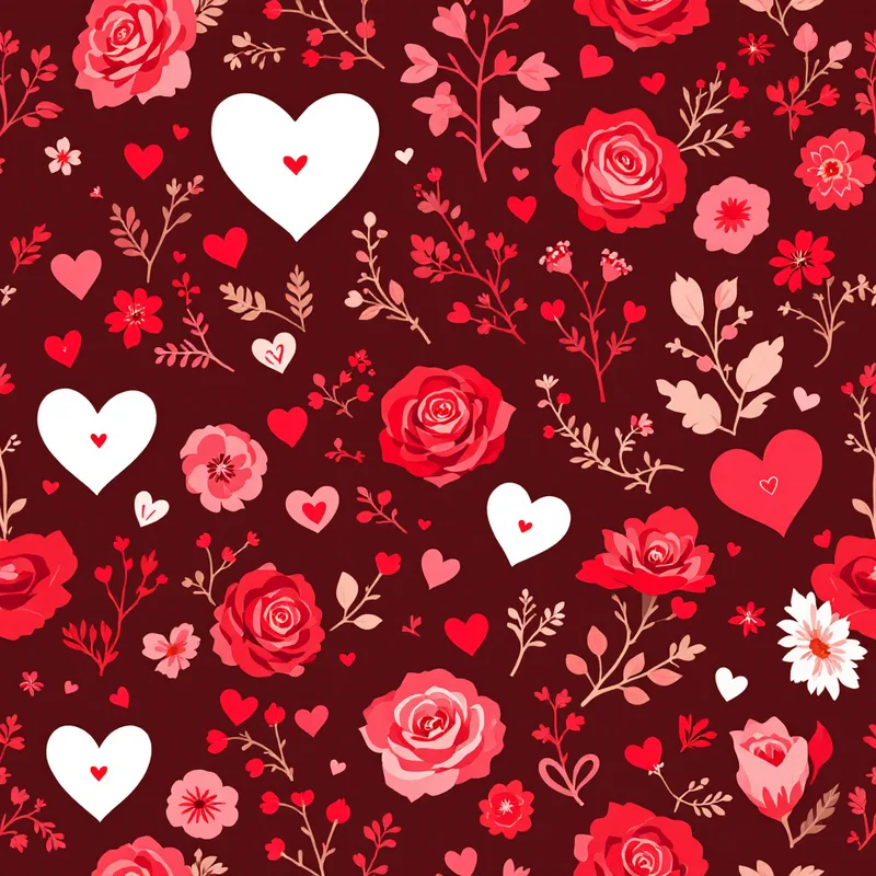
| Cranberry and chocolate | #8C1C3A, #4B2E2B, #F3E6D5 | Dark, warm, grown-up |
| Pine and blush | #2F4A3A, #F2C6CB, #FFF7EE | Soft contrast |
| Ink blue and cream | #1F2A44, #EFE3CF, #B7512E | Cold-weather classic |
| Olive and tomato red | #6B6B3A, #C8402B, #F6EBD9 | Slightly retro |
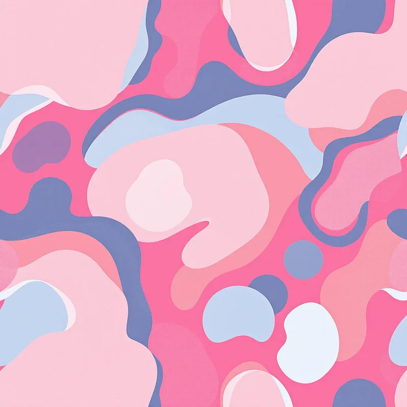
Pink beside red is the quiet one to watch. It is moving from novelty toward mainstream, and it works because the two share a hue family and differ mainly in value.
One large motif instead of a scattered crowd
Small tossed motifs are still the safe default, but oversized single motifs are gaining ground: a bow the size of a dinner plate, one ornament cropped by the sheet edge, a candy stripe scaled up until it reads as graphic. A big, simple shape holds up when paper is folded around a box, because you see a fragment and the fragment still looks designed. Ribbon-and-bow prints in particular fit the broader bow wave running through fashion and pink-and-bow aesthetics.
Quiet fillers: checks, gingham, thin stripes
As the hero prints get bigger, the supporting prints get calmer. Gingham, small checks, pinstripes and lightly textured solids are the pieces that let a pile of gifts look coordinated without matching. Expect these in two-tone versions, often red or green on cream, and in plaids that lean on texture rather than loud contrast. Think of them as the supporting cast: pick one filler and let it appear in two colorways, so a pile of gifts still feels like one family. For the plaid family specifically, see Christmas plaid and tartan patterns.
Reuse is becoming part of the design
Fabric wraps in the style of furoshiki, the Japanese tradition of knotting a square cloth around a gift, are likely to keep growing, along with reversible two-sided paper and tags designed to be saved. For designers that means a wrap print should survive being seen twice: once on the gift, once folded into a drawer.
What to take from this if you design a roll
- Pick a matte-friendly palette. Saturated pure reds tend to print flatter on uncoated stock, so build in a deeper tone.
- Keep metallics as a separate, small layer so a printer can swap in foil or leave it as ink.
- Draw one statement motif and two quiet coordinates, then test all three in a stack.
For fundamentals on repeat size and roll formats, the wrapping paper pattern design guide covers the how-to, and gift wrap and stationery trends for 2027 looks a year ahead. If you want a quick way to sketch these directions, Browse Styles in Pattern Weaver offers 44 categories and 5,700+ styles, and each pattern comes back as a seamless tile in about 20 seconds.
Explore related pattern styles