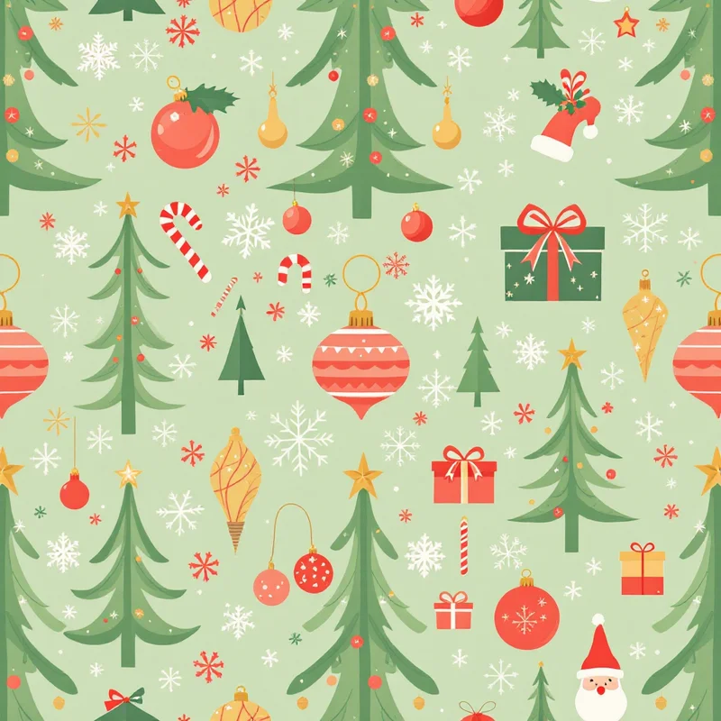
A phone lock screen is glanced at many times a day, usually for under a second, so a Christmas wallpaper has to work as a mood and not as a picture. The ones that feel aesthetic share a few traits: one palette, one idea and a lot of room for the clock.
Three looks that hold up
Moody and candlelit
Dark ground, warm light. Think deep forest green #12251B or near-black burgundy #2A0E14 with a few small golden lights, pine silhouettes and the odd star. Add a soft glow rather than a hard outline, and keep contrast gentle so white clock digits stay crisp.
Motifs: tiny string lights, candle flames, holly in silhouette, bare branches with a few baubles.
Minimal and airy
Warm white #F7F4EC or pale oat #E9DFC9 with a very small scatter of motifs: a single-line tree, tiny stars, a sprig. Negative space is the whole design. Use one accent such as rust #A5472F or pine #3C5A46 and let the rest breathe. Minimalist Christmas patterns goes into spacing in depth.
Vintage and filmy
Faded reds and creams, a little grain, and motifs from old cards and ornaments: glass baubles, Santa silhouettes, hand-lettered greetings. Slightly desaturated colors, uneven edges and a paper texture make it feel like a photograph of a card. See vintage Christmas pattern ideas for the full retro palette.
Respect the lock screen layout
Wallpapers are not viewed bare. Software puts things over them:
| Zone | What sits there | What to do |
|---|---|---|
| Top third | Clock, date, widgets | Keep calm, low contrast, no focal motif |
| Middle | Notifications arrive here | Put the main subject slightly above center |
| Bottom | Shortcut buttons, home indicator | Avoid fine detail |
| Home screen | Grid of app icons across the middle | Keep the pattern low-contrast and mid-scale |
Because the layout varies by device and by the user's widget choices, a safe composition is a gentle gradient or small scatter at the top, a focal element just above center and a soft base. Phones also zoom or shift wallpapers slightly for depth effects, so keep key details away from the outer edges.
Pair the lock screen with the home screen
Many people run two wallpapers: an expressive lock screen and a calmer home screen. If you are designing both, keep the palette identical and lower the contrast on the home version, because app icons sit across the whole grid. A single-color tile at low contrast is usually enough, and it makes the lock screen feel like the featured piece.
Why seamless patterns work for phones
A pattern tile is flexible. You can set a small repeat across the screen without worrying about aspect ratio, or choose a large-scale tile that crops to a tall rectangle. It also avoids the problem of one-off illustrations where the clock lands on the face of the subject. If you want a pattern-based lock screen:
- Use a small to medium repeat so the clock never lands on one big motif.
- Make the pattern calm toward the top by using a vertical gradient mask, or choose a tile with even density.
- Pick a tile with no obvious focal point, so cropping can't hurt it.
Phone wallpaper pattern design covers sizing and tiling choices for any season.
Export checklist
- Tall format, about 9:19.5, and 3000 pixels or more on the long side.
- Leave edge margins for parallax and cropping.
- Check on both light and dark clock styles, since the clock color may change.
- Test with notification banners on top.
Other directions
If this is not your style, cute Christmas wallpaper ideas covers kawaii, pastel and character looks, and Christmas desktop wallpaper ideas handles wide screens. You can also browse Christmas wallpaper and aesthetic wallpaper styles directly.
To make your own, Describe It in Pattern Weaver lets you write the mood in your own words, such as candlelit pine silhouettes on deep green, and each pattern comes back as a seamless tile in about 20 seconds. Pro exports up to 8K if you want a crisp result for the biggest phones and tablets.
Explore related pattern styles