
Packaging design has its own trend clock, driven as much by shelf economics and production constraints as by aesthetic fashion. For 2027, the direction is a genuine reversal of the flat-color-block minimalism that has defined direct-to-consumer packaging since roughly 2019.
Illustrated all-over pattern is taking back shelf space
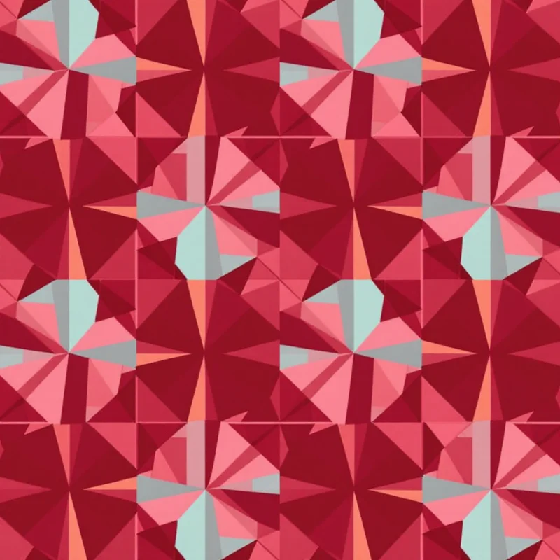
Skincare, supplements, and specialty coffee — three categories that went almost uniformly minimalist over the last five years — are showing real movement back toward illustrated, patterned packaging. The flat single-color box with a small logo and clean sans-serif type is starting to read as dated rather than premium, and brands are responding with botanical and abstract all-over patterns that give a product shelf presence without needing a bigger box or louder type.
Small scale wins on the production side
Packaging pattern has a structural constraint most other categories don't: the artwork gets die-cut, folded along creases, and often shrink-wrapped, all of which distort a repeat. Large, directional motifs show visible misalignment at every fold line. Small-scale, low-directionality patterns — fine texture, tight ditsy-style repeats, subtle geometric grids — survive that distortion far better, which is why packaging trend reports consistently favor smaller scale than wallpaper or textile forecasts for the same season.
Saturated, brand-forward color over neutral backgrounds
Kraft-brown and off-white minimalist backgrounds are giving ground to saturated, brand-color-forward palettes — a package that reads its brand color from across a store aisle rather than relying on logo placement to do that work. This tracks the same maximalist color swing showing up in stationery and home textiles for the same season, arriving in packaging slightly later because packaging development cycles run longer.
What this means for anyone designing packaging now
If you're specifying packaging pattern for a 2027 launch, keep the repeat small and non-directional so it survives die-cutting and folding intact, lean toward a saturated background color rather than a neutral one, and don't assume your category has to stay minimalist just because it has for the last few cycles — several categories that did are actively reversing that call right now.
Every direction here — fine-scale texture, saturated color, illustrated botanical and abstract patterns — can be generated as a seamless, print-ready tile sized to your exact packaging dimensions. Start in the free pattern maker with 3 free credits, or browse pattern styles for the full range.
Explore related pattern styles