
Châteaucore emerged as an Etsy trending aesthetic in early 2026, arriving at precisely the moment when design culture felt saturated with either hypermodern minimalism or aggressively nostalgic cottage aesthetics. Châteaucore occupies the elegant middle ground: the refined, aged elegance of French country estates—not the cheerful rusticity of cottagecore, but the faded grandeur of centuries-old aristocratic interiors.
The name signals the aesthetic clearly. "Château" references the grand estates of French aristocracy; "core" places it in the emerging trend category alongside cottagecore, dark academia, and other cultural aesthetic movements. But where cottagecore emphasizes pastoral simplicity, Châteaucore emphasizes inherited luxury—the kind of beauty that comes from old money, careful curation, and the passage of time rather than from rustic authenticity or modern wealth.
Châteaucore patterns capture that sensibility: damasks that hint at Versailles, toiles that echo 18th-century French wallpapers, sun-bleached color palettes that suggest decades of afternoon light fading expensive fabrics. It is romantic but not sentimental, elegant but not cold, aged but not shabby. It is how a room looks when it has been beautiful for a hundred years and no one has bothered to update it.
What is Châteaucore?
Châteaucore is a pattern and design aesthetic inspired by the interiors of French country estates and grand châteaux. It combines traditional French pattern forms—damask, toile de Jouy, brocade-inspired geometry—with color palettes suggesting age, faded elegance, and sun-exposure: dusty ivories, faded golds, soft grays, bleached teals, and muted blues.
Châteaucore patterns prioritize elegance over exuberance. Motifs are refined, spacing is generous, and the overall impression is one of cultivated taste accumulated over generations rather than contemporary design choices. The patterns feel inherited rather than designed—as if they have always been there, seen through soft light in rooms that have never needed updating.
The aesthetic rejects both extremes: it is not the bright, primary-colored toile of modern retro decor, nor is it the minimalist sophistication of contemporary luxury design. It is specifically the quietly elegant, slightly faded, unapologetically old-fashioned beauty of spaces that predate contemporary design consciousness.
Why Châteaucore Resonates Now
Châteaucore emerged from a cultural convergence in 2026.
Cottagecore fatigue. Cottagecore—the aesthetic of pastoral English country living—dominated design culture from 2020-2024. By 2025-2026, saturation set in. Châteaucore offered a way forward by maintaining the romanticism and nostalgia of cottagecore while trading its rural simplicity for refined, aristocratic elegance.
Maximalism's evolution. The maximalist movement of the 2020s encouraged abundance and visual richness. Châteaucore channels that richness through the lens of European historical elegance—not eclectic collecting but carefully curated inherited taste.
TikTok and "quiet luxury" conversations. Social media trends around "old money aesthetic" and "quiet luxury" (understated, refined, inherited rather than flashy) created cultural conversation about elegance that does not announce itself. Châteaucore is that aesthetic in pattern form.
Desire for historical grounding. Unlike trend-driven aesthetics, Châteaucore roots itself in actual historical French interiors. That authenticity appeals to design audiences seeking substance beyond pure aesthetic novelty.
Etsy's naming of Châteaucore as a trending aesthetic gave the emerging movement visibility and social proof. Pinterest followed, and contemporary home decor brands began incorporating the style into their collections.
Defining Visual Elements of Châteaucore Patterns
Châteaucore draws from specific historical French pattern traditions, updated through a contemporary vintage lens.
Damask Motifs and Ornamental Symmetry
Damask—the formal, symmetrical floral-geometric pattern historically used in fabrics and wallpapers—is the visual anchor of many Châteaucore designs. Traditional damask features a central motif (often a stylized leaf or flower) arranged in perfect bilateral symmetry, surrounded by scrollwork and supporting ornaments.
Châteaucore damask maintains this structure but simplifies the ornament. Lines are more refined, details are less dense than ornate Victorian damask, and the overall effect is less theatrical. The damask reads as elegant rather than dramatic.
Toile de Jouy Influence
Toile de Jouy—the 18th-century French pattern tradition of narrative scenes, pastoral landscapes, or architectural vignettes rendered in a single color on a cream or white background—appears frequently in Châteaucore designs. Rather than exact historical reproduction, Châteaucore takes the toile sensibility of refined illustration set against neutral grounds and applies it to more abstract forms.
A Châteaucore toile might depict not a bustling harvest scene but a more impressionistic landscape—a solitary tree, a distant château, a garden urn. The narrative is subtle, the illustration refined, and the overall impression is of understated elegance.
Scrollwork and Flourishes
Refined scrollwork—curved, botanical-inspired lines that frame and separate motifs—characterizes much Châteaucore geometry. These scrolls are not as ornate as Rococo excess but more elaborate than purely geometric forms. They suggest careful penmanship, historical precision, and refined taste.
Subtle Distressing and Aged Effects
The defining visual characteristic that separates Châteaucore from straightforward historical French patterns is the suggestion of age. Patterns incorporate very subtle distressing—slightly irregular line weights, faded areas, the visual impression of being seen through faded, aged fabric. This is not heavy distressing (which would read as shabby) but a very light suggestion that the pattern has existed for decades and has been mellowed by time.
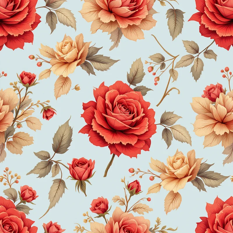
Botanical and Architectural Elements
Châteaucore patterns frequently incorporate botanical motifs—roses, vines, urns—and architectural elements like columns, gates, and fountains, all rendered with refined illustration rather than photorealistic detail. These elements are scaled generously and spaced with plenty of breathing room.
Châteaucore Color Palettes
Color is where Châteaucore most clearly communicates its "faded grandeur" aesthetic.
Ivory and soft gray is the foundation of many Châteaucore palettes. Ivory replaces pure white, suggesting aged fabric. Soft gray provides subtle contrast and structure without the severity of true black or charcoal.
Dusty gold and cream evokes aged, sun-faded gilding. The gold is not bright but muted, warm, and slightly washed-out—the color of gold leaf or metallic paint after decades of light exposure.
Faded teal and taupe is a cooler Châteaucore option. The teal is grayed and muted rather than saturated, suggesting antique painted woodwork or aged glazed ceramic. Taupe grounds the palette in earthy warmth.
Soft lavender and cream draws from the historic use of purple dyes in expensive 18th-century fabrics. The lavender is pale and slightly desaturated—not vibrant but present, suggesting age and fading.
Dove gray, blush, and sage creates a particularly refined, contemporary take on historical French palettes. Soft, muted, complex without being saturated.
Charcoal with soft metallic accents offers a more dramatic Châteaucore direction while maintaining the faded elegance principle. The charcoal provides contrast, while silver or dusty gold accents suggest refinement without excess.
The consistent principle: all colors are muted, slightly desaturated, and warm-toned. Vibrant, saturated, or cool colors undermine the faded elegance that defines Châteaucore. Even dark colors in the palette are warm and dusty rather than pure or cool.
Châteaucore vs. Cottagecore, French Country, and Traditional Damask
The distinctions matter because they determine how effectively a pattern communicates Châteaucore's specific aesthetic.
Châteaucore vs. Cottagecore. Cottagecore is pastoral and cheerful—emphasis on natural materials, rural simplicity, and connection to earth and agriculture. Châteaucore is aristocratic and refined—emphasis on inherited elegance, centuries of accumulated taste, and the quiet confidence of old money. Cottagecore features apple orchards and wildflowers; Châteaucore features estate gardens and salon walls.
Châteaucore vs. French Country. French country design—a popular interiors style—borrows from French rural and regional aesthetics: warm, practical, unpretentious. Châteaucore borrows from French aristocratic aesthetics: formal, refined, inherited. French country patterns are bright, accessible, and cheerful. Châteaucore patterns are muted, reserved, and elegantly restrained.
Châteaucore vs. Traditional Damask and Toile. Historical damask and toile are intentionally formal, symmetrical, and explicitly ornamental. Châteaucore uses those forms but filters them through a lens of age and fading. The patterns are slightly simplified, colors are muted and dusty, and the overall effect is "historical pattern seen through time" rather than "historically accurate reproduction."
Châteaucore vs. Dark Academia. Dark academia (another emerging 2026 aesthetic) emphasizes gothic, moody, intellectual spaces. Châteaucore is lighter and more romantic, though both share a sense of inherited sophistication and historical grounding.
Commercial Applications for Châteaucore
Châteaucore's refined elegance makes it particularly suited to luxury, heritage, and feminine-leaning applications.
Wallpaper and Interior Design
Châteaucore wallpaper is seeing significant growth in boutique hotels, high-end residential design, and interior designer collections. The style works for feature walls, powder rooms, bedrooms, and smaller intimate spaces where pattern intensity matters. A single Châteaucore wallpapered wall anchors an entire room's aesthetic.
Premium Stationery and Paper Goods
Invitation suites, personalized stationery, notebooks, and greeting cards increasingly feature Châteaucore patterns. The aesthetic signals elegance, refinement, and occasion-appropriate taste—particularly suited to wedding stationery, personal correspondence, and luxury gift items.
Fashion and Accessories
Scarves, dress fabrics, and structured fashion pieces incorporating Châteaucore patterns appeal to design-conscious consumers seeking refined, historically-grounded aesthetics. The patterns work particularly well on silk, linen, and other natural fabrics that enhance the aged elegance sensibility.
Home Fragrance and Luxury Goods Packaging
Beauty, home fragrance, and premium goods brands use Châteaucore patterns on packaging to communicate heritage, refinement, and cultivated taste. The aesthetic aligns particularly well with historical fragrance houses, luxury linens, and artisanal home goods.
Heritage and Historical Site Branding
Museums, historical properties, heritage tourism brands, and historical preservation organizations use Châteaucore patterns in branding and marketing collateral. The aesthetic authentically connects to historical interiors while communicating to contemporary audiences.
How to Create Châteaucore Patterns
Creating successful Châteaucore patterns requires balancing historical inspiration with contemporary restraint and aging effects.
Study Historical References
Before designing, study actual French château interiors, 18th-century damask designs, and historical toile de Jouy patterns. These provide the authentic foundation that gives Châteaucore its credibility. The more specifically you understand the historical source, the more effectively you can authentically simplify and fade it.
Simplify and Refine the Motif
Rather than copying ornate historical patterns exactly, choose one core motif—a damask form, a toile scene, a botanical element—and refine it. Remove ornamental excess. Simplify without losing elegance. The result should feel like a distilled version of the historical form.
Apply Fading and Aging Subtly
This is Châteaucore's key distinction. Apply very light distressing or fading effects that suggest age without creating a worn, shabby aesthetic. Slightly irregular line weights, tiny gaps or worn areas, very subtle color fading—these communicate that the pattern has existed for time without looking damaged.
Use Historically-Informed Color
Select muted, warm-toned palettes inspired by aged fabrics and sun exposure. Test your colors against historical color swatches to ensure they read as authentically faded rather than merely pale or desaturated.
Generous Spacing and Breathing Room
Châteaucore patterns tend toward medium to low density—generous spacing between motifs, plenty of background showing. This creates visual rest and the sense of refined, intentional design rather than ornamental excess. The background is as important as the pattern.
Using Pattern Weaver for Châteaucore
Pattern Weaver now includes Châteaucore as a dedicated substyle within the Vintage and Era categories. Select "Châteaucore" from the substyle menu to automatically weight the prompt toward damask and toile influences, muted color palettes, subtle aging effects, and refined botanical geometry. You can then adjust density and scale to match your application.
The Châteaucore preset includes historically-informed color palettes and distressing treatments that maintain authenticity while generating fresh variations.
Châteaucore's Growing Presence and Future
Châteaucore is establishing itself as a lasting aesthetic rather than a passing trend. Its grounding in actual historical French design, combined with its appeal to contemporary design audiences seeking refined and inherited rather than flashy and trendy, gives it longevity beyond other 2026 trend movements.
Expect Châteaucore to expand through 2026 into premium hospitality, luxury residential design, high-end retail, and heritage brand identities. The aesthetic's association with quiet luxury, inherited taste, and centuries-old elegance positions it as increasingly valuable as design culture matures beyond pure novelty-chasing.
The broader design implication is that nostalgia and historical inspiration are evolving. Rather than exact historical reproduction or ironic retro pastiche, designers increasingly aim for authentic refinement—patterns and aesthetics grounded in real historical traditions but interpreted through contemporary eyes, with contemporary restraint and contemporary understanding of elegance.
Châteaucore represents that evolution applied to French historical aesthetics. It honors the elegance of château interiors while acknowledging that contemporary beauty need not shout—refined, muted, aged, and effortlessly elegant is its own form of power.
Explore related pattern styles
Patterns for