
Coral is the color of optimism made visible. Situated between orange and pink at the precise intersection where warm energy meets approachability, coral (#FF7F50 and its variants) communicates confidence without aggression. The color references tropical reef ecosystems, coral-colored flowers, sunrise light, and the warmth of living coral systems. Unlike pure orange, which can feel juvenile, or pure pink, which carries gender associations, coral achieves a sophisticated warmth that reads as universally appealing.
The commercial success of coral patterns lies in their ability to energize a design while maintaining contemporary relevance. Coral patterns feel current without being trendy — the color has substantial staying power. The challenge in designing coral patterns is managing the color's inherent energy; without thoughtful restraint, coral can overwhelm. With intentional supporting color choices and motif clarity, coral patterns create powerful, memorable brand experiences.
The Character of Coral
Coral (#FF7F50 and its spectrum variants) is fundamentally an optimistic color. The pinkish-orange tone references both warmth and approachability. Unlike hotter oranges, coral maintains sophistication through its pink undertones. Unlike cooler pinks, coral maintains energy and vibrancy.
Warmth and Accessibility
Coral's warmth communicates friendliness and energy, yet the pink undertones prevent it from reading as aggressive or juvenile. This balance is strategically important — the color is energetic without being overwhelming. Coral reads as confident and approachable simultaneously. In branding contexts, this combination communicates brands that are both authoritative and welcoming.
Tropical and Natural Associations
Coral's material connection to reef ecosystems gives it inherent authenticity. The color immediately triggers associations with tropical destinations, coral gardens, living natural systems, and sustainable ocean awareness. These associations provide powerful narrative opportunity for brands in lifestyle, sustainability, travel, and wellness categories.
Saturation and Brightness
Coral's saturation is moderate — not maximally intense like neon, but vivid enough to read as energetic. This saturation level is commercially versatile. Coral works in high-fashion contexts where energy and distinctiveness matter, yet it also works in lifestyle applications where sophistication is required. The saturation is neither intimidating nor weak.
Photogenic Quality
Coral photographs exceptionally well. Both in digital contexts (screens and photography) and in print production, coral maintains its vibrancy and appeal. This photogenic quality makes coral particularly effective in lifestyle marketing, fashion photography, and product presentation. Brands that prioritize visual marketing frequently choose coral.
Motifs That Leverage Coral's Energetic Character
Coral's tropical associations and energetic warmth suggest particular motif directions.
Botanical and Floral Patterns
Botanical patterns on coral feel authentically tropical and living. Tropical florals, palm leaves, flowering vines, and botanical arrangements all read as naturally suited to coral foundations. The color amplifies the botanical subject matter's energy and vitality. Detailed botanical illustrations, stylized tropical flowers, and leaf patterns are among the most commercially successful coral pattern categories.
Nature-Inspired Abstract Forms
Organic, flowing abstract patterns reference natural systems without depicting specific subjects. Wavy forms suggesting water, branching patterns suggesting growth, and cellular or geological patterns all work beautifully on coral. These patterns feel contemporary and allow for substantial creative freedom while maintaining the nature connection coral suggests.
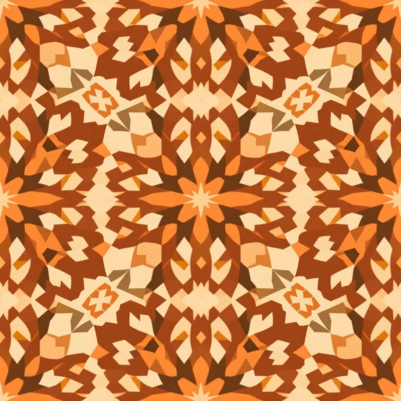
Geometric and Contemporary Structures
In contrast to nature-inspired approaches, clean geometric patterns on coral create energetic contemporary statements. Linear patterns, grid structures, hexagons, and modular geometrics on coral read as modern and design-forward. This approach appears frequently in contemporary fashion and lifestyle branding.
Reef and Underwater Imagery
Stylized or abstract representations of coral reefs, underwater ecosystems, and aquatic life reference the color's material origins authentically. Flowing, organic compositions suggesting reef structure work particularly well. This motif direction is increasingly popular in ocean-conscious and sustainability-focused branding.
Tropical Scenes and Landscape References
Simplified, stylized representations of tropical landscapes — palm trees, sunset scenes, beach imagery — work well on coral. The color becomes a natural element of the depicted landscape rather than an arbitrary background choice. This approach is popular in travel, tourism, and lifestyle brands.
Minimalist and Line-Based Patterns
Conversely, sparse patterns on coral create impact through simplicity. A single line motif, minimal geometric shape, or subtle mark-based pattern on coral reads as intentionally modern and sophisticated. This approach prevents coral from feeling overwhelming while leveraging the color's energetic foundation.
Color Palettes That Balance Coral's Energy
Coral's vivid warmth requires careful supporting color choices. The color's energy can overshadow weak supporting colors, yet it harmonizes beautifully with intentional palette partners.
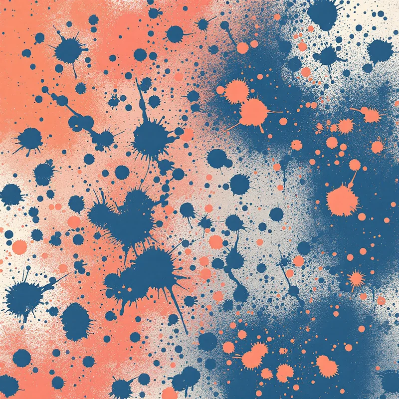
Coral + Turquoise or Aqua: The most naturally complementary coral pairing. Turquoise (blue-green) provides cool opposition to coral warmth, creating visual excitement and tropical authenticity. This combination dominates beach-inspired, tropical, and summer-themed pattern applications. The palette reads as inherently vacation-oriented.
Coral + Navy: A more sophisticated coral pairing. Navy provides cool contrast and grounds coral's energy with visual weight. This combination works well in contemporary fashion, branding, and sophisticated lifestyle applications. The palette reads as intentionally modern rather than purely tropical.
Coral + White or Off-White: A clean, bright approach. White or cream provides maximum contrast and allows coral patterns to dominate without visual competition. This combination works well in minimalist applications and in cases where pattern clarity and brightness are priorities.
Coral + Soft Yellow or Cream: A warm, harmonious pairing that emphasizes the tropical warmth. Soft yellow or cream creates warmth alongside coral without competing for attention. This combination works well in organic, natural aesthetic applications.
Coral + Deep Teal: An advanced complementary approach using deep blue-green as supporting color. This palette creates substantial visual contrast while maintaining tropical authenticity. Works well in bold, contemporary applications.
Coral + Blush or Dusty Pink: A warm, harmonious pairing that emphasizes coral's pink undertones. Soft pink creates compatibility while maintaining distinct color identity. This combination appears in romantic, playful, and contemporary applications.
Coral + Sage or Muted Green: A nature-inspired pairing that emphasizes botanical associations. Sage (soft, muted green) provides cool relief while maintaining natural aesthetic. Works well in botanical pattern applications.
Commercial Applications for Coral Patterns
Coral patterns have found strong commercial relevance across diverse applications. The color's energy and tropical associations make it particularly valuable in lifestyle, fashion, and wellness branding.
Fashion and Contemporary Apparel
Coral is a prestige color in contemporary fashion. Seamless coral patterns appear on dresses, blouses, swimwear, and accessories. The color reads as high-energy and modern in fashion marketing contexts. Fashion brands in the contemporary and lifestyle markets regularly feature coral pattern collections, particularly for spring and summer seasons.
Home Décor and Lifestyle Products
Coral home furnishings, pillows, bedding, and lifestyle products have experienced significant commercial growth. The color's optimistic associations and photogenic quality make it popular in lifestyle marketing. Coral patterns appear in upholstery, textiles, and home accessories across price points.
Wellness and Lifestyle Branding
Brands in wellness, yoga, fitness, and healthy living frequently adopt coral as primary brand color. The color communicates energy, vitality, and optimism — all values aligned with wellness positioning. Coral patterns in yoga apparel, wellness packaging, and health-focused branding are increasingly prevalent.
Travel and Hospitality Design
Coral is a signature color in resort, beach, and tropical hospitality contexts. Coral patterned wallcoverings, textiles, and branded environmental design create memorable tropical aesthetic. Hotels, resorts, and beach-oriented hospitality brands frequently specify coral patterns.
Sustainable and Eco-Conscious Branding
Coral's connection to coral reefs and marine ecosystems makes it a natural choice for ocean-conscious and sustainability-focused brands. Brands emphasizing ocean protection, sustainable materials, and environmental responsibility increasingly adopt coral branding. The color communicates both optimism and awareness.
Packaging and Consumer Products
Coral packaging for food, beverages, beauty, and lifestyle products has become increasingly prevalent. The color's photogenic quality and positive associations make it commercially effective. Brands positioning themselves as modern, energetic, and consumer-friendly frequently choose coral.
Digital and Technology Branding
Forward-thinking technology and digital brands are adopting coral as primary or accent color. The color communicates innovation, energy, and user-friendliness. Coral patterns in digital applications, app design, and tech branding create memorable, distinctive visual identity.
Designing Coral Seamless Patterns
Creating compelling coral patterns requires managing the color's energy and ensuring motif clarity remains strong. The technical challenge lies in preventing the pattern from becoming visually overwhelming while leveraging coral's inherent vibrancy.
Energy Management Through Density
Coral's visual energy means pattern density matters significantly. Very dense, complex patterns on coral can create visual fatigue. Medium density patterns where individual motifs remain distinguishable tend to work best. Test your patterns at multiple density levels to find the balance where the pattern reads as energetic without exhausting the viewer.
Motif Clarity and Visual Separation
Given coral's intensity, motif clarity is essential. Supporting color choices must provide sufficient contrast that pattern elements read distinctly. If the pattern includes motifs in darker colors, ensure the contrast is clear. Lighter supporting colors typically provide natural contrast.
Saturation and Undertone Accuracy
Coral sits in a sensitive area of the color spectrum. A coral that skews too much toward orange loses the pink sophistication. A coral that skews too much toward pink loses energetic warmth. When designing, test your coral at multiple hue positions to ensure you have captured true coral warmth rather than a variant.
Suggested Generation Approach
Using Pattern Weaver's color palette system, select or create a true coral foundation, then choose botanical, abstract, or geometric substyles that align with your brand's energy level. The platform's preset coral palettes include natural supporting colors like turquoise, navy, and white. Generate variations at different complexity and density levels. Evaluate which motif complexity, density, and supporting color combination achieves the energy level and sophistication your application requires.
Balance and Visual Pacing
Coral patterns benefit from visual pacing — areas of pattern intensity balanced with areas of visual rest. Negative space becomes particularly important in coral applications. Ensure your pattern includes sufficient breathing room that the viewer is not overwhelmed. White or light-colored background fields provide effective visual rest.
Coral in Contemporary Design
Coral's prominence in 2026 design reflects broader shifts toward optimism and energy-forward branding. Following years of minimalist and neutral aesthetic dominance, contemporary design celebrates vivid, confident color application.
The Optimism Narrative
Contemporary branding increasingly emphasizes positive, future-focused messaging. Coral communicates optimism, energy, and possibility — narratives aligned with contemporary brand values. Companies across sectors are adopting coral to communicate forward momentum and user empowerment.
Tropical and Vacation Aesthetics
Following pandemic-era travel restrictions, tropical and vacation aesthetics have become increasingly prominent in commercial design. Coral is a natural component of tropical and vacation narratives, making the color commercially relevant across hospitality, fashion, and lifestyle categories.
Digital-First Color Thinking
Coral photographs and renders beautifully in digital contexts. As brands increasingly prioritize digital presence and visual marketing, colors like coral that perform exceptionally well on screens gain prominence. Coral's photogenic quality gives it substantial competitive advantage in digital-first branding.
Inclusive and Gender-Neutral Positioning
Historically coded as feminine, contemporary design has repositioned coral as universally appealing and gender-neutral. This expansion of applicability has broadened coral's commercial viability. Luxury brands, technology companies, and masculine-leaning categories now incorporate coral, ensuring the color remains relevant across diverse applications.
Sustainability and Ocean Awareness
Coral's material connection to reef ecosystems aligns with growing ocean and environmental consciousness. Brands emphasizing sustainability, ocean protection, and environmental responsibility increasingly adopt coral as visual manifestation of these values. This narrative positioning ensures coral remains culturally relevant.
Coral seamless patterns endure because they balance energetic optimism with contemporary sophistication. The color communicates positive brand values while remaining visually versatile across botanical, abstract, geometric, and minimalist pattern vocabularies. Whether rendered as tropical florals, reef-inspired abstractions, or clean geometric statements, coral provides a foundation of warmth and confidence that elevates any pattern vocabulary. That inherent vibrancy, combined with the color's broad commercial appeal and photogenic quality, makes coral one of the most commercially successful colors in contemporary pattern design.
Explore related pattern styles
Patterns for