Cottagecore has matured from a pandemic-era TikTok aesthetic into one of the most commercially durable design languages of the decade. The appeal is universal — a nostalgic fantasy of self-sufficient rural life rendered through gentle florals, wildflower meadows, wildlife motifs, and folk-art traditions. For pattern designers, cottagecore offers one of the richest visual vocabularies available and consistent year-round market demand.
Key takeaway: Authentic cottagecore lives in the color palette more than the motifs. Sage, cream, terracotta, dusty rose, and mushroom red — applied with low saturation — are what separate real cottagecore from generic florals.
The Cottagecore Palette
The single biggest mistake in cottagecore design is over-saturating. Real cottagecore palettes feel sun-faded, as if the pattern has been sitting in a farmhouse window for decades. Sage green replaces mint. Dusty rose replaces pink. Ochre replaces yellow. Cream replaces white. Rusty terracotta replaces orange.
Mushroom red — that specific deep, warm red associated with Amanita toadstools — deserves its own mention. It appears in roughly a third of successful cottagecore patterns and brings visual anchoring to otherwise soft compositions.
For every pattern you design, build a five-color palette where no color reaches full saturation. If a color feels "loud," desaturate it by 15–25% and test again.
Botanical Motifs That Work
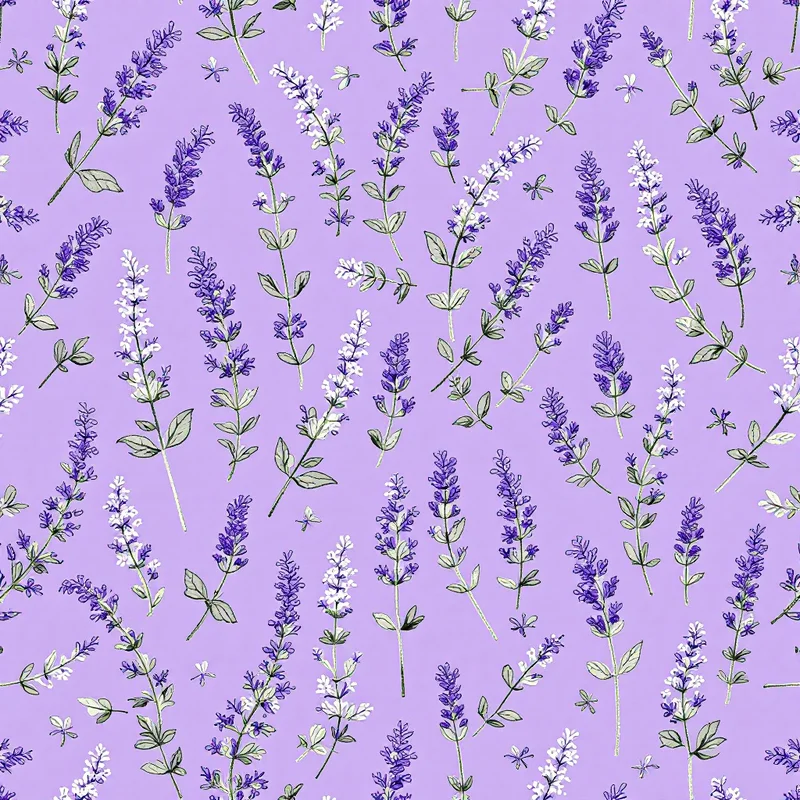
Not every flower reads as cottagecore. The motifs with the strongest aesthetic fit are wildflowers (not cultivated garden flowers), herbs (lavender, chamomile, sage, rosemary), vine-forming plants (ivy, grape leaves, wild rose climbers), and specific heritage species like hollyhocks, foxgloves, poppies, and cornflowers.
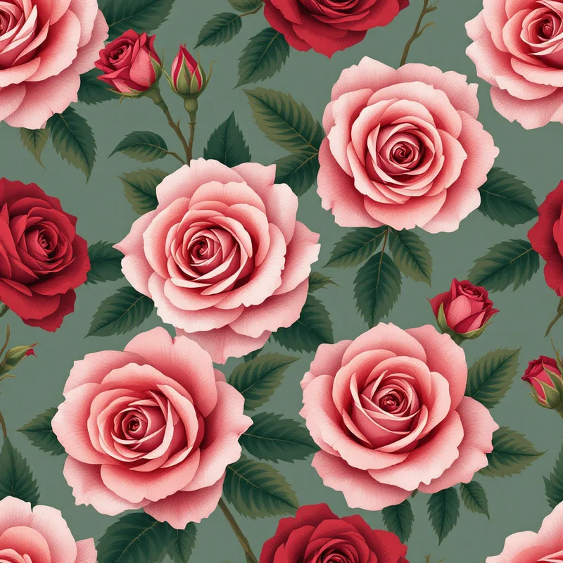
Modern hybrid flowers — large roses, ornamental dahlias, hybrid lilies — read as formal garden rather than cottagecore. Stick to species that feel like they could grow wild on a country lane. Loose scattered compositions beat structured grids; cottagecore should feel happened-upon rather than arranged.
Explore botanical patterns paired with the watercolor render style for the most authentic results.
The Mushroom Trend
Mushroom motifs deserve their own category within cottagecore. Red-capped toadstools with white dots are the single most recognizable cottagecore symbol, followed by clustered chanterelles and earth-toned forest mushrooms. The search volume for "mushroom pattern" has climbed steadily for four years running with no signs of slowing.
For product work, mushroom patterns perform exceptionally well on tea towels, aprons, tote bags, notebooks, and enamel mugs. The whimsical quality appeals across demographics — young adults buying phone cases and grandmothers buying dishcloths alike.
Animals in Cottagecore
The animal vocabulary is specific. Rabbits, foxes, hedgehogs, deer, bees, butterflies, and songbirds read immediately as cottagecore. Domestic animals (cats, dogs, sheep, chickens) also work when rendered with a folk-art sensibility. Anything too exotic — tigers, parrots, tropical fish — breaks the aesthetic.
Render animals in soft silhouettes or gentle line illustrations. Hyperrealistic wildlife photography-style illustrations feel too literal for cottagecore. Browse nature patterns for animal-inclusive botanicals.
Folk-Art Influences
Authentic cottagecore draws from specific folk-art traditions rather than generalized countryside imagery. French provincial prints (small floral scatterings on cream). Scandinavian folk florals (stylized geometric flowers in red and blue). English chintz (dense botanicals). American quilt traditions (block-based geometric florals). Eastern European peasant embroidery (cross-stitch and needlework motifs).
Referencing a specific tradition gives your patterns depth and makes them stand out from the sea of generic "cute floral" designs saturating Etsy and Redbubble. Even if buyers can't name the tradition, they respond to the visual coherence.
Cottagecore for Product Categories
Home textiles — tea towels, aprons, table runners, curtains, and bedding. This is the strongest cottagecore market. Use moderate-density botanical repeats in sage and cream palettes. Aim for motif scales that read well at arm's length.
Stationery — greeting cards, notebooks, journals, and planner inserts. Smaller motif scales work here. Dense ditsy prints perform well because stationery surfaces are small.
Apparel — dresses (especially prairie-style and cottagecore dress collections), blouses, scarves, and children's clothing. Medium-scale florals and animal prints both sell. The audience is fashion-forward but seeking the cottagecore aesthetic specifically.
Phone cases and digital accessories — mushroom patterns dominate this category. Butterfly and wildflower patterns follow closely. See the phone case use-case guide for specs.
Gift wrap and packaging — scaled-up botanicals and animal motifs in heritage palettes. Works exceptionally well for handmade soap, candle, and food packaging.
Seasonal Timing
Cottagecore is evergreen but has clear seasonal peaks. Spring (March–May) is the biggest traffic period, driven by Easter, Mother's Day, and general post-winter demand for fresh florals. Autumn (September–October) is the second peak, driven by mushroom trends, harvest imagery, and earth tones. Summer and late winter are valleys but never dead.
For Etsy and Spoonflower sellers, listing cottagecore patterns roughly three weeks before each seasonal peak captures the search traffic buildup. See the Etsy pattern selling guide for listing strategy details.
Next Steps
Open the pattern studio, pick a cottagecore sub-direction (mushrooms, wildflowers, folk florals, or wildlife), and build out a five-pattern mini collection in a shared palette. Coordinating collections sell 3–4× better than standalone designs because customers buy the set.
For technical pattern construction, see the seamless repeat pattern guide and the half-drop repeat guide — both are especially relevant for dense cottagecore florals.
Explore related pattern styles
Patterns for


