
The Spring/Summer 2026 runways have spoken, and the verdict is clear: print is back in full force. After several seasons of muted minimalism and logo-driven branding, designers across Milan, Paris, London, and New York returned to the power of pattern — big, bold, and unapologetically expressive. What we saw on the catwalks this season was not trend recycling but genuine reinterpretation, with heritage prints pushed through a decidedly modern filter.
Whether you design fabrics for fashion labels, create prints for home textiles, or sell digital patterns through print-on-demand platforms, these five dominant trends (plus one bonus resurgence) define the print landscape for the season ahead. Here is what is driving the conversation — and how each trend translates from runway to real-world application.
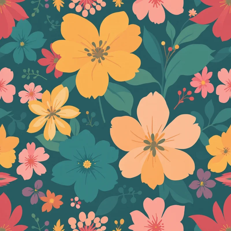
1. Oversized Florals
If there was a single print story that dominated Spring 2026, it was the supersized floral. Erdem opened London Fashion Week with a collection drenched in blown-up garden roses that spilled across silk midi dresses and structured coats, each bloom large enough to fill an entire bodice panel. Miu Miu followed with painterly peonies on oversized shirting, their edges deliberately soft and blurred as though lifted from a half-finished oil painting. Valentino and Dries Van Noten echoed the sentiment with their own scaled-up botanical patterns, proving this was not a single-house experiment but a full directional shift.
What separates these florals from the maximalist blooms of past seasons is their artistic quality. These are not photorealistic prints or digitally perfect repeats. They borrow from the language of fine art — visible brushwork, pooling pigment, deliberate color bleeds. The influence of watercolor rendering is unmistakable, with petals that look dipped and dragged rather than drawn. The palette has shifted too: where last year's florals leaned into saturated primaries, Spring 2026 favors dusty rose, terracotta, sage, and muted mauve layered over dark grounds like navy, espresso, and charcoal.
For textile designers, the opportunity here is in scale and confidence. Ditsy florals still have their place, but the pieces generating the most buzz this season are the ones where a single flower commands an entire half-meter repeat. The trend favors loose, organic compositions over rigid grid-based layouts — think scattered garden rather than wallpaper geometry. If you are working with botanical motifs, push the scale slider further than feels comfortable. The runway evidence suggests that bolder is better.
2. Polka Dots
The polka dot, perhaps the most elemental of all repeating patterns, received a full-blown rehabilitation on the Spring 2026 runways. Dries Van Noten was the loudest champion, sending out look after look built on dots — but never the expected version. His dots came in mismatched scales within a single garment, layered large circles over micro-dots, mixed matte and glossy finishes, and paired unexpected color combinations like chocolate brown dots on lilac or tangerine spots on cobalt blue.
Carolina Herrera took a more refined approach with precise, evenly spaced dots on flowing evening gowns, while Comme des Garcons deconstructed the motif entirely, printing half-dots and irregular ovals that only suggested the original form. The common thread across all interpretations was a refusal to treat the polka dot as quaint or nostalgic. These were modern geometric patterns with attitude.
The commercial potential is significant. Polka dots are one of the most universally flattering and recognizable print types, which makes them low-risk for retailers and accessible for independent designers. The Spring 2026 evolution opens up creative territory: play with irregular spacing, introduce a second or third dot size into the same repeat, or experiment with unconventional color pairings. The dot is no longer just black on white. It is a canvas for chromatic experimentation.
3. Checks and Plaids
Burberry has always owned the check, but Spring 2026 felt like a broader cultural reclamation of the motif. Creative director Daniel Lee sent out a collection steeped in British heritage checks — tartan, gingham, windowpane, and their signature nova check — but recontextualized through relaxed silhouettes and unexpectedly earthy tones. Sand, burnt sienna, forest green, and cream replaced the brand's traditional beige-red-black palette, giving the prints a warmth that felt less corporate and more countryside.
Beyond Burberry, plaid and check patterns appeared across collections from Etro, Celine, and Miu Miu, each bringing their own regional spin. Etro's checks were woven through with paisley-influenced details. Celine kept things razor-sharp with monochrome windowpane on tailored suiting. Miu Miu went preppy with oversized gingham in candy pastels. The range of interpretation shows how versatile the underlying geometric structure of checks really is — the same grid framework supports everything from grunge flannel to Riviera chic.
For surface pattern designers, this trend invites exploration at the intersection of heritage and modernity. The strongest check patterns this season layer two or three colorways with subtle shifts in line weight, creating depth and dimension within a seemingly simple grid. There is also a clear appetite for checks that reference vintage patterns without replicating them — borrowing the proportions and rhythm of mid-century plaids but rebuilding them with a contemporary color vocabulary. Earth tones with one unexpected accent color (a flash of electric blue in an otherwise khaki plaid, for example) are particularly effective.
4. Bold Stripes
Simon Porte Jacquemus has always understood the south of France, and his Spring 2026 collection distilled that understanding into stripes — thick, confident, Riviera-ready. Horizontal bands of cobalt and white on boxy camp shirts. Diagonal stripes in terracotta and cream on flowing trousers. The width was generous, the palette was warm, and the effect was instantly vacation-ready. This was not pinstripe territory. These were statement stripes, the kind that announce themselves from across the room.
Prada echoed the direction with graphic vertical stripes on structured outerwear, while Loewe offered a more experimental take, printing stripes that warped and curved around the body as if projected rather than printed. The stripe trend for Spring 2026 favors width and boldness — minimalist patterns that achieve maximum impact through simple repetition and confident color choices rather than complexity.
From a design perspective, the appeal of stripes is their clean versatility. A well-designed stripe pattern works at virtually any scale, coordinates easily with other prints in a collection, and translates across product categories from apparel to upholstery to packaging. The 2026 direction suggests leaning into wider stripe widths (think 3-5 cm at full scale) and two-tone or three-tone palettes. Avoid overthinking it. The stripe collections that landed hardest on the runway were the ones that committed to simplicity — a limited palette, a clear rhythm, and zero unnecessary embellishment.
5. Abstract Prints
At the other end of the spectrum from heritage checks and classic stripes, several major houses made a case for pure abstraction. Chanel's Spring 2026 collection featured silk scarves and lightweight jackets printed with compositions that resembled mid-century color field painting — large irregular shapes in muted jewel tones with soft, almost atmospheric edges. There was no identifiable motif, no figurative reference point. The prints existed purely as color, form, and movement.
Proenza Schouler pushed further into gestural territory with prints that looked like magnified details of abstract expressionist canvases — energetic brushstrokes, splattered pigment, and raw drips frozen in silk. Jil Sander took a more restrained approach, using subtle tonal shifts and organic shapes that suggested landscape or topography without depicting it literally. All three houses demonstrated that abstract patterns can carry the same emotional weight and commercial viability as their figurative counterparts.
This trend is particularly exciting for pattern designers working with AI generation tools, because abstraction thrives on unexpected combinations. The most compelling abstract prints this season blurred the line between intentional composition and controlled accident — patterns that felt discovered rather than designed. When creating abstract work, the key is in editing and curation rather than over-directing. Set broad parameters around color mood and energy level, then let the process surprise you. The results often have more vitality than anything assembled element by element.
Bonus: The Snake Print Comeback
No spring trend roundup would be complete without addressing what happened in the animal print category. After leopard dominated for several consecutive seasons, Spring 2026 saw a decisive shift toward snake and reptilian prints. Bottega Veneta, Roberto Cavalli, and Stella McCartney all featured python-inspired patterns, ranging from realistic scale textures in muted neutrals to stylized, almost graphic interpretations in unexpected colorways like dusty pink and slate blue.
What makes this iteration feel fresh is the treatment. Rather than photorealistic reptile skin, the strongest versions abstract the pattern — keeping the sinuous, asymmetric scale structure but rendering it through painterly, digital, or even geometric techniques. The underlying animal pattern vocabulary is recognizable, but the execution is distinctly 2026. For designers, snake print offers a useful middle ground between the wild energy of leopard and the subtlety of texture-only patterns. It reads as sophisticated and slightly daring without overwhelming a garment or product.
Where These Trends Intersect
The most interesting design territory often lies at the crossroads of multiple trends. A botanical floral rendered in a loose, abstract style. A check pattern with stripe-like proportions. Polka dots arranged in an organic, almost floral scatter. The Spring 2026 runways themselves demonstrated this blending — several collections mixed two or three of these print families within a single look, suggesting that the real direction is not any one trend in isolation but the willingness to cross-pollinate between them.
This also reflects how modern print collections are built. A strong collection for Spring 2026 might include an oversized floral hero print, a coordinating check, a simple stripe blender, and a small-scale dot for contrast — all sharing a unified color palette. The ability to work across print families while maintaining cohesion is what separates a trend-aware collection from a trend-chasing one.
How to Create Trending Patterns
Each of the trends above is fully achievable with AI-powered pattern generation. Whether you want to explore oversized botanicals, reimagined polka dots, heritage checks, bold stripes, or contemporary abstracts, The pattern generator lets you select a style direction, dial in your color palette, and generate production-ready seamless tiles in minutes. The advantage of working with AI is speed of exploration — you can test dozens of variations on a single trend direction in the time it would take to sketch a few options by hand, then refine the results that resonate.
Browse all available pattern styles to see the full range of directions, explore specific render styles like watercolor or ink to shape the aesthetic, or jump straight into the studio and start designing. The trends are mapped out. The tools are ready. The rest is creative direction — and that part is yours.
Explore related pattern styles
Patterns for

