

Japanese pattern design carries a depth of tradition that few other cultural design languages match. Individual motifs have names, meanings, historical provenance, and specific usage contexts developed over more than a thousand years. For pattern designers, working in the Japanese tradition means learning a vocabulary rather than just a palette — but the reward is access to some of the most refined and enduring pattern forms ever created.
Key takeaway: Japanese pattern motifs are named and carry meaning. Seigaiha (waves), asanoha (hemp leaves), seigaiha sakura (cherry blossom waves) aren't decorative shapes — they're cultural signifiers with centuries of use. Learning them separates informed design from generic "Asian-inspired" work.
Core Traditional Motifs
Seigaiha (青海波) — the overlapping wave pattern. Arguably the most recognizable Japanese geometric pattern, consisting of concentric arcs creating a fish-scale or wave-crest effect. Traditionally in indigo blue but works in every palette. Symbolizes peaceful seas and good fortune.
Asanoha (麻の葉) — the hemp-leaf pattern. Six-pointed star shapes based on the structure of hemp leaves, arranged in a tessellating grid. Traditionally associated with children's clothing because hemp grows quickly and straight, symbolizing healthy growth.
Shippō (七宝) — the "seven treasures" pattern. Overlapping circles creating a four-petaled flower shape at each intersection. Symbolizes harmony and good fortune.
Kikkō (亀甲) — the tortoise-shell hexagonal pattern. Six-sided shapes tessellating like a turtle's shell. Associated with longevity.
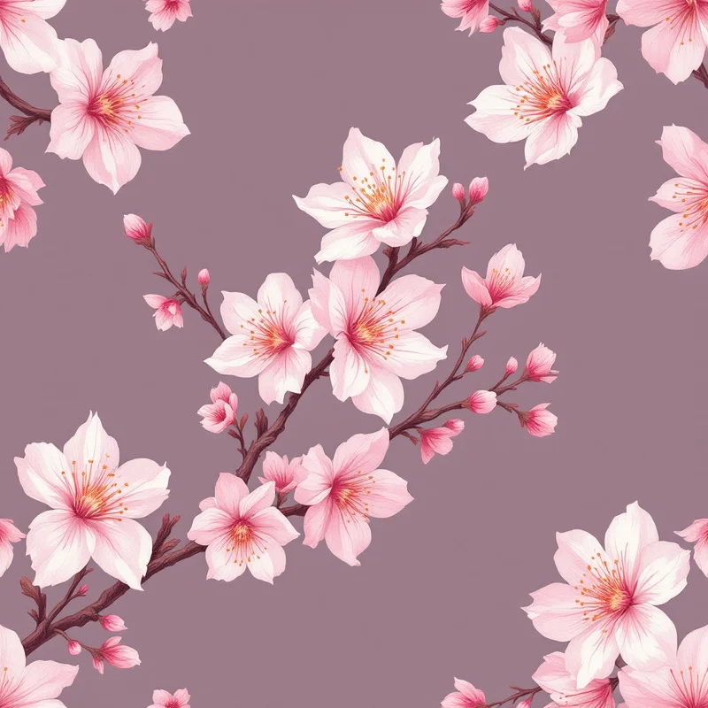
Sakura (桜) — cherry blossom motifs. Used throughout Japanese design in spring-themed products. Works at every scale from tiny scattered blossoms to large-scale single flowers.
Koi (鯉) — carp motifs, traditionally rendered in bold colors with flowing water effects. Symbolizes perseverance and strength.
Tsuru (鶴) — crane motifs, often paired with pine branches. Symbolizes longevity.
Karakusa (唐草) — scrolling vine patterns. Often used as border elements but can fill entire compositions.
See cultural patterns for the broader library and botanical patterns for sakura and other florals.
Traditional Palettes
Historic Japanese palettes favored natural dye colors with specific cultural resonances:
Ai (indigo blue) — from indigo plant fermentation. The single most iconic Japanese textile color. Ranges from light cornflower to almost-black deep indigo. Associated with workers' clothing historically and now with contemporary minimalist design.
Beni (red) — from safflower. A specific warm red that differs from European crimsons.
Kinchaku-cha (tea brown) — muted brown tones associated with tea ceremony aesthetics.
Shironeri (raw silk cream) — the warm off-white of unbleached silk.
Kuro (black) — in traditional contexts, a warm near-black rather than pure black.
Sumi (ink black) — the grayscale of ink painting, ranging from light gray wash to deep black.
Contemporary Japanese pattern design often uses just two colors from this palette — indigo and cream, or ink black and cream — achieving striking minimalism through color discipline.
Ink Painting Influence
Japanese ink painting (sumi-e) contributes a distinct aesthetic direction within Japanese pattern design. Patterns rendered as if drawn with a loaded brush, with tonal washes and expressive line variation, create a meditative quality quite different from geometric seigaiha or asanoha patterns.
Try the ink render style for sumi-e-inspired patterns. Bamboo, pine branches, and single sakura blossoms all work beautifully in this rendering.
Woodblock Print Tradition
Ukiyo-e woodblock prints (Hokusai, Hiroshige) influence another direction within Japanese pattern design. Characterized by flat color areas with crisp outlines, stylized landscapes, and a specific palette of indigo, red, yellow ochre, and black, these prints translate into pattern work with careful attention to color separation and line weight.
The woodcut render style produces appropriately period results.
Minimalism and Negative Space
One quality separates authentic Japanese design from Western imitations: the treatment of negative space. In Japanese design, empty space is active — it has weight, meaning, and visual function equal to the filled elements. A Japanese-inspired pattern with too-high density loses its authenticity.
For pattern generation, err toward sparse or medium density rather than heavy. Let the ground color breathe. A single sakura branch across a mostly-empty ground feels more Japanese than a dense scatter of sakura blossoms.
Seasonal Awareness
Japanese design is deeply seasonal. Sakura (spring), chrysanthemums (autumn), pine (winter), and specific flora for each month. For commercial work, seasonal Japanese patterns perform best when released aligned to their traditional seasons — sakura patterns peak in March–April, chrysanthemum patterns in September–October.
Product Categories
Stationery — Japanese pattern stationery (washi tape, notebooks, envelopes, sticker sheets) is a massive global market. Authentic design sells consistently at premium prices. See the stationery guide.
Packaging — luxury tea, sake, cosmetics, and food packaging frequently use Japanese-inspired patterns. See packaging.
Textiles — fashion prints (especially kimono-inspired apparel and accessories), home textiles, and interior fabrics. See textiles.
Wallpaper — minimalist Japanese-inspired wallpaper is a premium niche in interior design. See wallpaper.
Paper products — origami papers, gift wrap, and chiyogami-style decorative papers are their own category with dedicated buyers.
Combining with Adjacent Styles
- Japanese + Scandinavian = Japandi — a fusion aesthetic combining Japanese restraint with Scandinavian warmth. See the Scandinavian pattern design guide.
- Japanese + botanical — sakura, chrysanthemums, and other Japanese flora extend naturally into contemporary botanical pattern work.
Building a Japanese Collection
A strong Japanese mini-collection:
- A seigaiha wave pattern (hero)
- An asanoha hemp-leaf pattern (geometric blender)
- A sakura or seasonal botanical
- A sumi-e ink-wash minimalist pattern
- A solid indigo or cream ground
All in a tight two-to-three color palette. Open the pattern studio to begin, or see the cultural pattern category for more traditional motif inspiration.
Explore related pattern styles
Patterns for
