
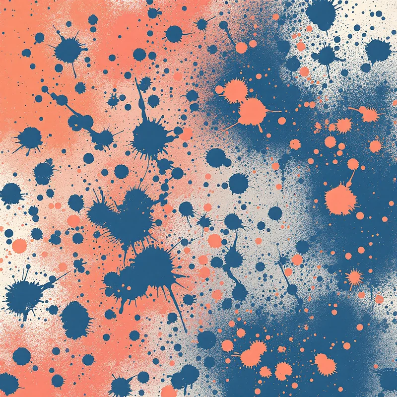

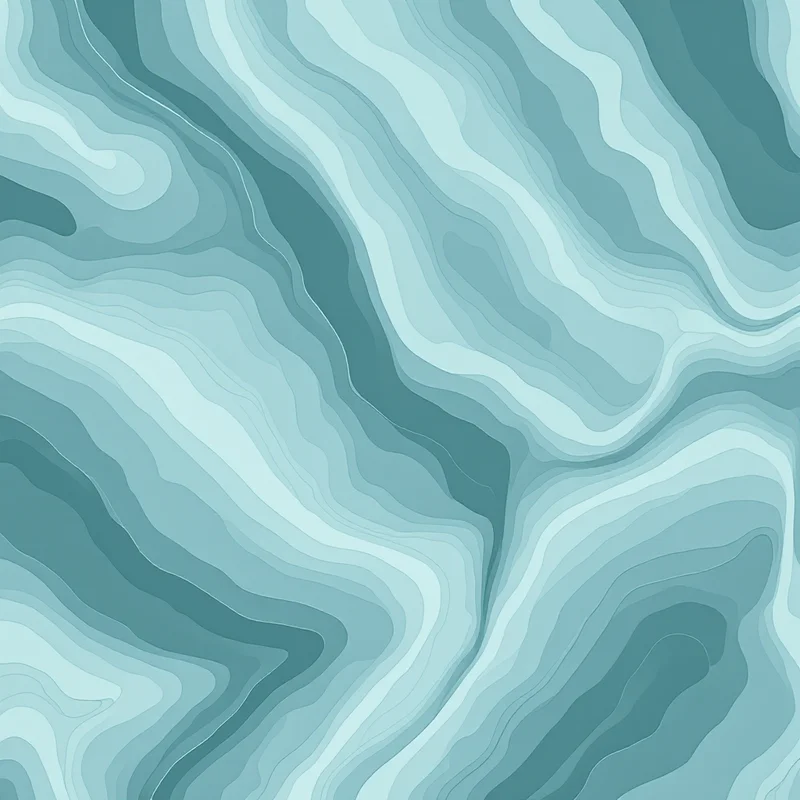
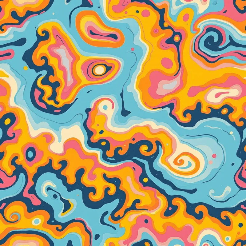

Thick strokes, saturated color fills, and the unmistakable energy of felt-tip marker illustration. Your marker patterns carry the bold, confident look of hand-drawn commercial art — vivid pigment with slight edge bleed, visible stroke direction where colors overlap, and the kind of graphic punch that stops a scroll and demands attention. This rendering style brings the look of professional marker illustration to seamless surface design.
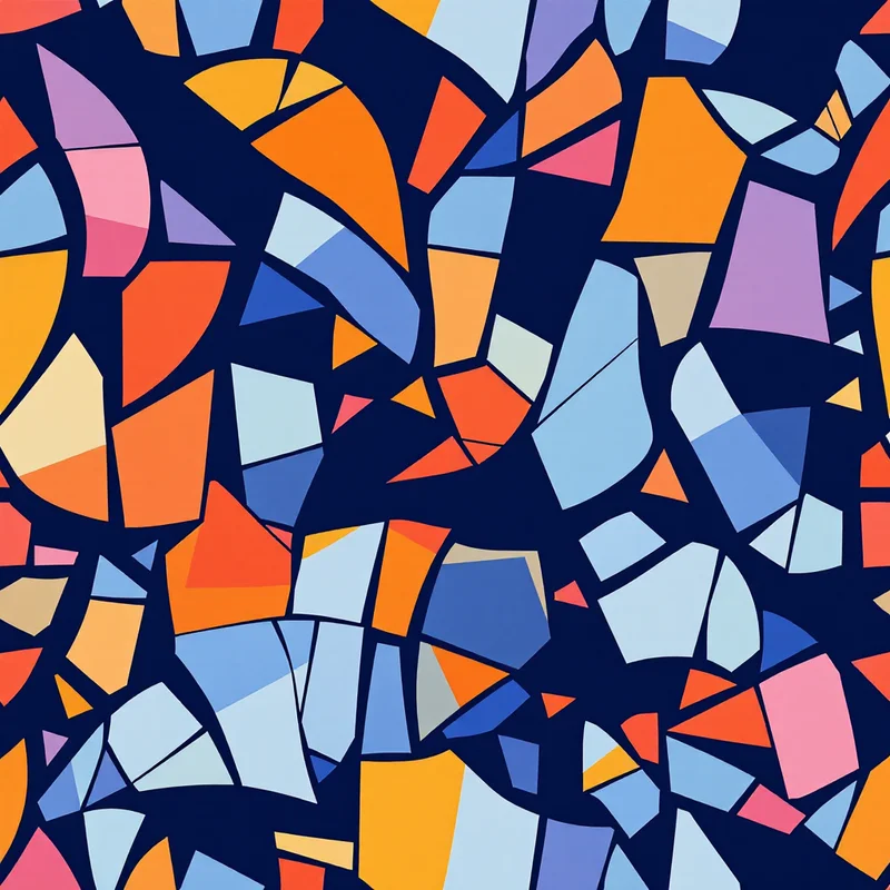
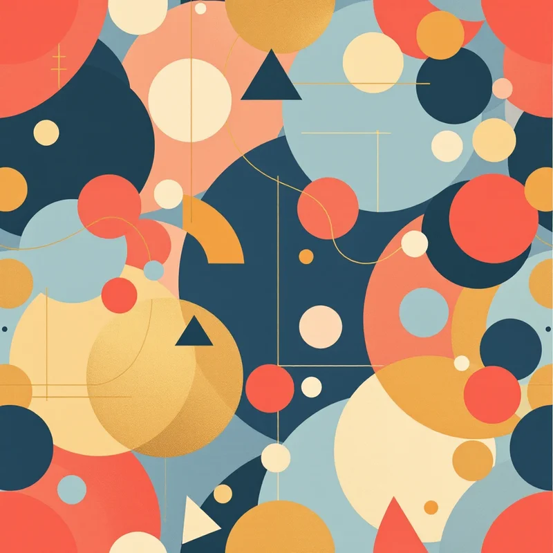
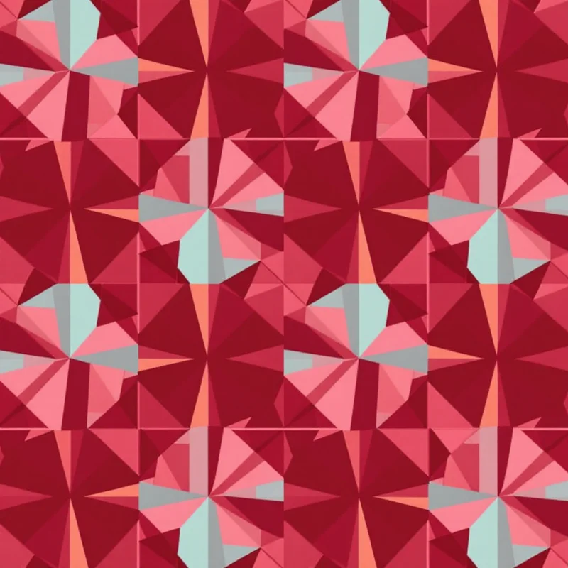
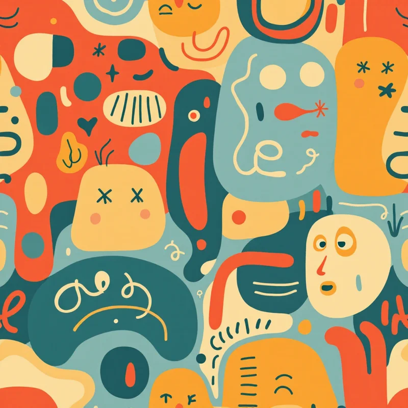
Marker rendering works across every category in your Pattern Weaver library with distinctive results. Botanicals come out bold and graphic, with saturated petals and thick outlines that pop at any scale. Geometric patterns gain an energetic, hand-drawn quality that feels more approachable than rigid digital precision. Animals rendered in marker style look like they came straight from a fashion illustrator's sketchbook — confident, stylized, and full of character. Abstract compositions become vivid, punchy art pieces with the immediacy of a freshly drawn concept board.
In fashion, marker-style patterns deliver a youthful, contemporary energy that works across streetwear, athleisure, and trend-driven ready-to-wear. The bold saturation and graphic outlines read clearly on garments from t-shirts to dresses to activewear. Brands targeting Gen Z and millennial audiences reach for this aesthetic because it communicates creative confidence and artistic authenticity — the design equivalent of speaking in a strong, clear voice.
For children's products and educational materials, the marker aesthetic is a natural fit. The bold, saturated colors are visually engaging for young audiences, while the hand-drawn quality feels playful and approachable. Children's apparel, school supplies, backpacks, lunchboxes, and nursery wallpaper all benefit from the bright, energetic character of marker rendering. It reads as fun without being overly cartoonish, which appeals to parents and kids alike.
Print-on-demand sellers find strong performance with marker-style patterns because the bold colors and graphic quality translate well to the wide range of substrates POD platforms offer. Phone cases, tote bags, mugs, notebooks, and apparel all benefit from the high contrast and saturated palette. The bold aesthetic holds up on dark and light backgrounds alike, giving you flexibility across product mockups and colorway variations.
You control saturation intensity, stroke weight, and color overlap behavior. Push the saturation for neon-bright, attention-grabbing designs, or dial it back for a more refined illustration quality with softer marker tones. Adjust density from sparse, editorial-style scattered motifs to dense, all-over prints where color fills the entire tile. Switch palettes instantly — the same marker botanical in tropical brights versus muted earth tones serves completely different markets.
Your marker patterns export at up to 8K resolution for large-format printing, or at standard DPI for digital products and print-on-demand uploads. The bold strokes and saturated fills maintain their graphic impact at every scale, from a small sticker to a large-format wall mural. Every tile is seamless and production-ready, with the kind of hand-drawn energy that makes printed products feel illustrated rather than manufactured.
Combine marker rendering with any substyle in the library for results that feel fresh and commercial. Marker tropicals for resort accessories. Marker geometrics for bold stationery lines. Marker food illustrations for packaging and kitchen textiles. Every combination delivers the confident, saturated aesthetic that makes marker one of the most immediately recognizable illustration styles in commercial design.