
Pattern design is one of those creative skills that hides in plain sight. The shirt you are wearing, the wallpaper in your favorite coffee shop, the wrapping paper on a birthday gift -- every one of those surfaces started as a single tile designed by someone who understood how repeating patterns work. If you have ever wanted to create your own, this guide covers everything you need to go from zero to a finished, usable pattern tile.
What Is Pattern Design?
Pattern design is the art of creating a visual motif that repeats across a surface to form a continuous, cohesive design. It sits at the intersection of illustration, graphic design, and engineering. The creative part is choosing what to draw and how it should look. The engineering part is making sure that single tile connects to copies of itself without any visible breaks.
Pattern vs. Print
People often use "pattern" and "print" interchangeably, but they mean different things. A print is any image applied to a surface -- a single illustration on a t-shirt, a photograph on a mug, a logo on a tote bag. A pattern is a specific type of print where a design unit repeats across the entire surface. All patterns are prints, but not all prints are patterns.
The distinction matters because patterns have a unique technical requirement: the tile edges must match. A standalone print can have any composition. A pattern tile must be engineered so that when placed next to copies of itself, the design flows seamlessly from one tile to the next.
What "Seamless" Means
A seamless pattern is one where you cannot see where one tile ends and the next begins. When tiled across a surface, the motifs, lines, colors, and background merge into what appears to be one continuous design. There are no visible edges, no awkward cuts through motifs, no color shifts at the boundaries.
Seamlessness is what separates hobby-level work from professional, production-ready design. A fabric printer does not want grid lines running through a roll of cotton. A wallpaper installer does not want visible seams between panels. Achieving seamlessness is the core technical challenge of pattern design, and it is the part that modern tools have made dramatically easier.
Where Patterns Are Used
Patterns appear in more places than most people realize:
- Textiles and fashion -- apparel fabric, upholstery, curtains, bedding, scarves. This is the largest market for surface pattern design.
- Home decor -- wallpaper, tiles, rugs, lampshades. Patterns define the mood of a room.
- Packaging -- gift wrap, shopping bags, tissue paper, product boxes.
- Stationery -- notebook covers, greeting cards, planner pages, envelopes.
- Digital products -- website backgrounds, app interfaces, social media templates.
- Branding -- brand patterns used across business cards, presentations, and marketing collateral.
A single botanical pattern tile might end up on a dress, a set of cushions, a notebook cover, and a website background -- all from one file exported at different resolutions.
Core Concepts Every Beginner Should Know
Before you create your first pattern, you need to understand five fundamental concepts. These are the building blocks of every repeating design.
Motif
The motif is the individual element that repeats. It could be a rose, a triangle, a paisley, or an abstract brushstroke. The motif is the "what" of your pattern -- the thing the viewer's eye is drawn to.
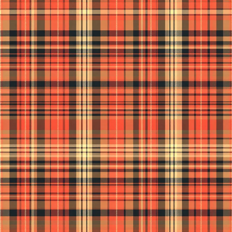
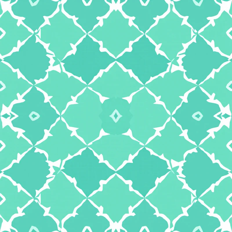
Simple patterns (polka dots, stripes, gingham) use one motif repeated uniformly. Complex patterns (chintz florals, toile scenes, tropical jungle prints) combine many motifs at different scales to create depth and visual richness.
Repeat
The repeat is how the motif is arranged across the surface. It defines the underlying grid structure. The main repeat types are:
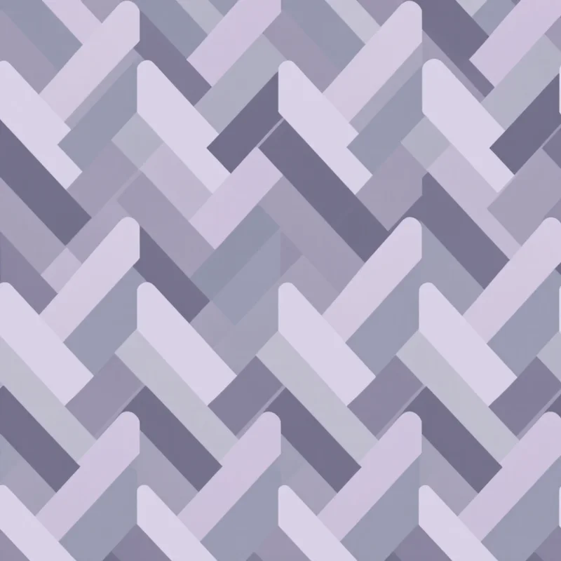
- Straight grid (block repeat) -- tiles placed directly adjacent with no offset. Simple, predictable, works well for geometric designs where the grid is part of the aesthetic.
- Half-drop -- every other column shifts down by 50% of the tile height. This is the most popular repeat type in commercial textile design because it breaks up the visible grid and makes the repeat harder to spot. It is the default choice for florals, botanicals, and most organic motifs.
- Brick (half-brick) -- the horizontal version of half-drop, where every other row shifts sideways by 50% of the tile width. Named after the way bricks are laid.
- Mirror -- alternating tiles are flipped horizontally, vertically, or both. This creates built-in symmetry and is fundamental to damask, art deco, and many traditional woven patterns.
The repeat type you choose has a significant impact on how the final tiled pattern looks and feels. Half-drop is a safe starting point for most designs.
Scale
Scale refers to how large the motif appears relative to the surface it will be applied to. A large-scale floral might have blooms the size of your hand, while a small-scale ditsy version of the same flower might have blooms the size of a fingernail.
Scale is relative to the end product, not to your screen. A motif that looks perfectly proportioned on your monitor might be overwhelmingly large when printed on fabric, or so tiny it becomes an indistinct blob on wallpaper. Always consider the final application when deciding on scale.
Density
Density describes how much of the tile's surface area is occupied by motifs versus background. Think of it as a spectrum: at one end, a few scattered stars on a wide-open sky; at the other, a tightly packed field of wildflowers where you can barely see the ground.
Minimalist patterns thrive at low density. Maximalist prints, like William Morris tapestries or tropical jungle designs, work at high density. Most commercial patterns sit in the middle -- enough motifs to create visual interest, enough background to keep it from feeling claustrophobic.
Color Palette
Color is arguably the most important decision in pattern design. A beautifully drawn motif in the wrong colors will not sell. An average motif in a perfect palette will.
Start with 3 to 5 colors. Use the 60-30-10 rule: 60% dominant color (usually the background), 30% supporting color (the main motifs), 10% accent (small details and highlights). This creates a natural visual hierarchy that the eye finds satisfying.
Consider the end use. Fashion follows seasonal color forecasts. Home decor leans toward timeless neutrals with statement accents. Packaging can go bolder. Digital products perform well with high saturation and strong contrast.
Your First Pattern -- Step by Step
Ready to make something? Here is a practical walkthrough for creating your first seamless pattern tile.
1. Start with Inspiration
Look around you. Nature is the most reliable source -- leaves, flowers, feathers, shells, animal markings, water ripples. Geometry is another strong starting point -- grids, tessellations, spirals, symmetry. Cultural and historical patterns offer rich visual vocabularies -- ikat, shibori, art nouveau, mid-century modern, Scandinavian folk art.
Collect images that catch your eye. You are not copying -- you are identifying what draws you in. Is it the color? The rhythm? The mood? Understanding your own taste is the first step to developing a design voice.
2. Choose a Motif Style
Based on your inspiration, pick a motif family. If you are drawn to nature, try a simple botanical -- a single leaf or flower. If you prefer structure, try a geometric shape like a hexagon or chevron. If you want something playful, try a conversational motif like fruit, animals, or everyday objects.
For your first pattern, keep it simple. One or two motif types, clearly defined shapes, no intricate details. Complexity is easier to add later than to remove.
You can explore hundreds of style and substyle options in the style library to see what resonates.
3. Decide on Your Repeat Type
For a first pattern, half-drop is your safest bet. It works with nearly every motif type and hides the repeat well. If you are making a strictly geometric pattern (stripes, grids, tiles), a straight block repeat may be more appropriate.
4. Set Your Color Palette
Pick 3 to 5 colors. One for the background, one or two for the main motifs, and one accent. Test your palette by looking at small swatches side by side -- do they feel cohesive? Is there enough contrast between the motif colors and the background for the motifs to be clearly visible?
5. Generate or Draw Your Tile
This is where the method splits depending on your tools. If drawing by hand, sketch your motifs, scan them, and arrange them in your tile while carefully managing the edges. If using digital tools, build the tile in your design application and use offset or cloning features to handle edge matching. If using an AI tool, head to the studio, select your style, set your parameters, and generate.
6. Preview It Tiled
Never judge a pattern tile in isolation. Always preview it repeated at least 2x2, ideally 3x3 or larger. This reveals problems that are invisible on a single tile: awkward spacing, visible seams, motif collisions at tile boundaries, uneven density, and repetition that is too obvious.
This step catches most mistakes. If something looks off, go back and adjust before exporting.
7. Export for Your Use Case
Once you are happy with the tiled preview, export the tile at the resolution and format required for your end use. For digital applications, PNG at screen resolution is fine. For print-on-demand platforms, 4K PNG at 150-300 DPI. For professional fabric or wallpaper printing, 4K to 8K TIFF at 300 DPI in CMYK with bleed margins.
Tools for Pattern Design
Traditional Methods
The original approach: draw motifs by hand with pen and paper, cut the tile, swap halves, fill gaps, and repeat until the edges match. Then scan the artwork and digitize it. This method builds deep understanding of how repeats work, but it is time-intensive and has a steep learning curve for edge matching.
Digital Design Software
Professional surface designers typically use Adobe Illustrator for vector patterns (clean lines, infinitely scalable, easy color editing), Adobe Photoshop for raster patterns (painterly textures, photographic elements, complex blending), or Procreate on iPad for hand-drawn digital artwork that can be exported and tiled. These tools offer full creative control but require significant skill and time investment to master the technical side of seamless tiling.
AI-Powered Tools
A newer category that removes the technical barrier entirely. the pattern generator is an AI-powered pattern design studio where you describe what you want -- or select from over 600 styles and substyles -- set your colors, density, and scale, and generate a seamless tile in seconds. The AI handles edge matching, motif placement, and compositional balance. You focus on creative direction.
This approach makes pattern creation accessible to people who have creative vision but not years of technical training. It is also a powerful rapid prototyping tool for experienced designers who want to explore ideas quickly before committing to a full manual process.
Common Mistakes to Avoid
Every beginner makes some version of these errors. Knowing them upfront will save you time and frustration.
Motifs too large for the intended surface. A motif that looks great filling your screen might be absurdly oversized when printed on a pocket square or stationery. Always think about the physical scale of the final product. When in doubt, go smaller -- small-scale patterns are more versatile.
Ignoring the tile edges. The most common beginner mistake. You pour effort into the center motifs and forget that the edges are where the tile meets its copies. If a motif is cut off at the right edge, it must continue seamlessly at the left. If the background color shifts at a boundary, the seam shows when tiled.
Too many colors. It is tempting to use every color that catches your eye, but restraint makes a pattern feel polished. Start with 3 to 5. You can always add more in later variations once the core design is working. Patterns with too many colors look chaotic in repeat and are more expensive to produce in screen printing.
Not previewing in repeat. A single tile can look gorgeous on its own and terrible when tiled. The repeat is where density problems, spacing issues, and visual "rivers" (unintended lines of empty space running through the tiled pattern) become apparent. Always, always preview your pattern tiled before calling it done. This single habit will improve your work more than any other.
Forgetting about the background. The background is not dead space -- it is an active part of the design. Its color, texture, and the amount of it visible between motifs all affect how the pattern reads. Treat the background as a design element, not an afterthought.
Where to Go from Here
The best way to learn pattern design is to make patterns. Start simple -- a polka dot, a stripe, a basic geometric grid. Then add complexity gradually: try a two-motif floral, experiment with half-drop vs. brick repeat, test different color palettes on the same motif.
Pay attention to the patterns around you in daily life. Look at clothing, restaurant wallpaper, product packaging, and book covers. Once you start noticing, you will see repeats everywhere -- and you will start understanding how they are built.
When you are ready to experiment, the studio lets you explore styles, adjust parameters, and generate tiles without any technical setup. It is a fast way to build intuition for what works -- and to create patterns you can actually use.
Explore related pattern styles

