

Color is the single most important decision in pattern design. The same motif in different colors creates completely different moods, appeals to different markets, and performs at different price points. A designer who understands color theory makes intentional choices. Everyone else is guessing.
The Foundations
The color wheel organizes hues in a circle: red, orange, yellow, green, blue, violet. Three relationships matter for pattern design:
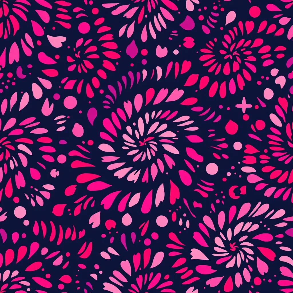
Complementary — colors opposite each other (red/green, blue/orange, yellow/violet). High contrast, high energy. Use complementary colors for patterns that need to pop — packaging, activewear, children's products.
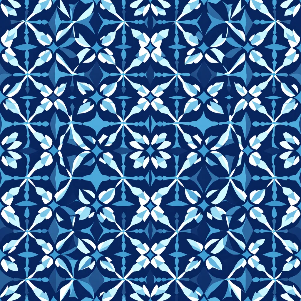
Analogous — colors adjacent on the wheel (blue, blue-green, green). Harmonious and calm. Use analogous palettes for sophisticated patterns — luxury textiles, home decor, premium branding.
Triadic — three colors equally spaced on the wheel (red, yellow, blue). Balanced but vibrant. Use triadic palettes for patterns that need energy without chaos — fashion prints, bold stationery, event design.
Beyond hue, two properties matter enormously: saturation (how vivid or muted a color is) and value (how light or dark). Most palette problems are not about choosing the wrong hue — they are about mismatching saturation or value across the palette.
Building a Pattern Palette
Start with one color. This is your dominant — it sets the emotional tone of the entire pattern and usually covers the most area (background or main motifs).
Add 1-2 supporting colors. These carry the secondary elements and should relate to your dominant through one of the three wheel relationships above. Supporting colors should share a similar saturation level with your dominant — mixing a highly saturated coral with a dusty sage creates visual discord.
Add a neutral. Every good pattern palette includes at least one neutral — white, cream, grey, charcoal, navy, or black. The neutral is where the eye rests. Without it, the pattern feels relentless.
Add an optional accent. A small amount of a high-contrast or unexpected color creates focal points and visual interest. The accent is used sparingly — 5% to 10% of the total design — but it can make the entire pattern come alive.
The 60-30-10 Rule
A reliable formula for color distribution: 60% dominant, 30% supporting, 10% accent. This is not rigid — many great patterns deviate from it — but it is a solid starting point when you are unsure how to balance your colors.
In practice, the dominant usually covers the background and the largest motif areas. The supporting colors carry the secondary motifs and details. The accent appears as small highlights, outlines, or tiny motifs that draw the eye.
Contrast and Readability
A pattern needs enough contrast between motifs and background for the design to be "readable" — meaning the viewer can distinguish the shapes at the intended viewing distance.
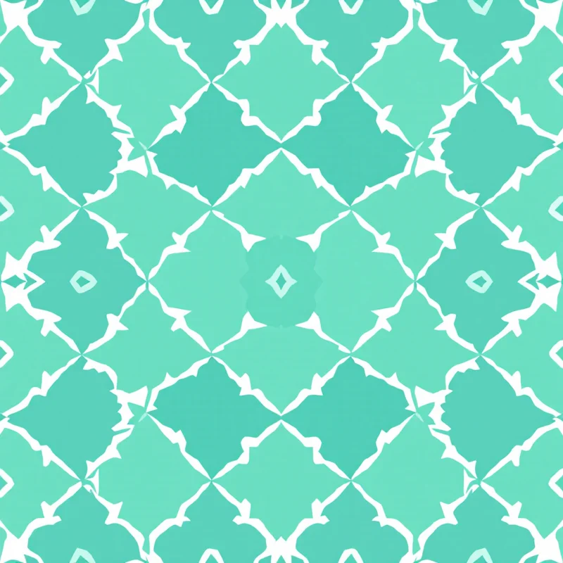
Low contrast (light motifs on a slightly lighter background) creates a subtle, textural effect. The pattern reads as a solid from a distance and reveals its detail up close. This works for luxury textiles, quiet packaging, and sophisticated branding.
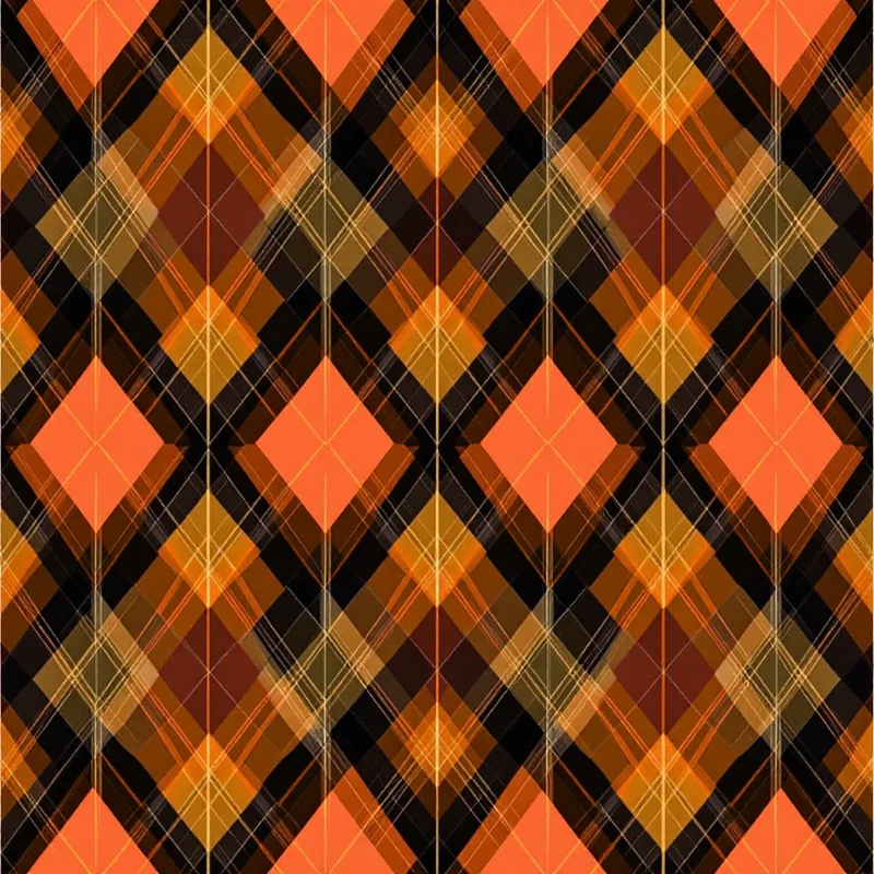
High contrast (dark motifs on a light background, or vice versa) creates a bold, graphic effect. The pattern commands attention from across the room. This works for fashion statements, children's products, and packaging that needs shelf presence.
Test your pattern in greyscale. If all the values look the same when you remove the color, the pattern will look muddy and undefined. Good patterns maintain readability even without color.
Color and Market
Different markets have established color expectations:
- Children's — bright, saturated primaries and secondaries. High energy.
- Luxury — muted, desaturated tones or rich jewel tones (emerald, sapphire, garnet). Low contrast.
- Home decor — neutral-based with 1-2 accent colors. Timeless over trendy.
- Activewear — bold, high-contrast, high saturation. Electric blues, neon greens, hot pinks.
- Bridal — pastels, whites, gold, and blush. Soft and romantic.
- Eco/sustainable — earth tones, botanical greens, undyed neutrals. Grounded and natural.
Research your target market before committing. A palette that is perfect for one market may be completely wrong for another — even on the same pattern.
Colorways
A colorway is the same pattern redesigned in a different palette. This is standard professional practice and dramatically increases the commercial value of every pattern you design.
Create at minimum 3 colorways:
- 1Lead — your strongest, most trend-forward palette. This is the one that gets attention.
- 2Safe — neutral, commercial, broadly appealing. This is the one that sells in volume.
- 3Seasonal — aligned with current trend forecasts. This is the one that feels timely.
Changing colors is not as simple as swapping swatches. Each colorway should be rebalanced so the contrast, readability, and mood work with the new palette. A pattern that reads beautifully in navy and gold may need motif weight adjustments when converted to pastel pink and white.
Practical Tips
Never evaluate colors in isolation. A swatch looks different on its own than it does surrounded by other colors in a pattern. Always test colors in context.
Match saturation across the palette. Mixing a vivid red with a dusty teal creates visual friction. Keep all your colors at roughly the same saturation level for cohesion.
Check on multiple screens. What looks warm on your calibrated monitor may look cool on a phone or laptop. And printed colors will look different again. Design with awareness that your screen is not the final output.
Use seasonal forecasts strategically. Pantone and WGSN publish color trend reports that many brands follow. Aligning your palette with these forecasts makes your patterns more commercially relevant — buyers are already looking for those colors.
Explore related pattern styles
Patterns for

